How to Display More than One Symbol on a SharpChart

Displaying more than one stock or other ticker symbol on a single SharpChart is a powerful feature that allows you to compare the price action of two or more symbols visually. Price data can be added for up to nine additional symbols (depending on the member's service level) by using the Price indicator. The price data can be added above, below, or even overlaid on the price plot of the main symbol.

This in-depth tutorial walks you step-by-step through using price indicators to create a market overview chart that shows the Dow, S&P 500, S&P 400, and S&P 600 on a single chart.

Tutorial: Creating a Market Overview SharpChart with Four Index Symbols

Create the SharpChart

Step 1: Enter Symbol for Main Chart

The Dow ($INDU) will be the main symbol on our SharpChart. There are several ways to create a new SharpChart, but the easiest is to enter the symbol in the Create-a-Chart box at the top of the page and then click Go.

When you want to see more than one stock on a chart, type in the symbol for the main chart in StockCharts.com.
Type the symbol for the main chart in the Create-a-Chart box.

Step 2: Clear Overlays and Indicators

To simplify the chart, let's remove any Indicators and Overlays from the default chart. The quickest way to do that is to click the Clear All link in the Overlays section and repeat the process with the Clear All link in the Indicators section.

Clear all indicators and overlays on your chart by clicking the Clear All and then the Update button.
Remove any indicators and overlays from your chart by clicking the Clear All links in the Overlays and Indicators sections.

Note: You may want to make other changes to the chart, such as changing the size or the color scheme. We're using the “Spruce” color scheme in this example.

Add Other Ticker Symbols to the Chart

You can use the Price indicator to add ticker symbols to your chart. In this example, we'll add $SPX, $MID, and $SML to the chart.

Step 3: Add Ticker Symbols for the Secondary Charts

Select Price from one of the blank indicator dropdowns, and then enter the ticker symbol you want to chart in the Parameters box. In this case, we will use $SPX for the S&P 500. Ensure the Position dropdown is set to Below, so the $SPX price plot will appear below the main $INDU price plot.

Add the ticker symbols of the secondary charts by first selecting Price from the Indicators dropdown menu and then adding ticker symbol in the Parameters box.
Select the Price indicator and add the ticker symbol of the secondary price plot into the Parameters box.

Once these changes have been made, your chart should look similar to the chart below.

Chart displaying secondary chart below primary chart.
Here the secondary price plot is displayed below the primary price plot.

Step 4: Adding More Charts

To add the other two indexes, repeat the previous step two more times. Remember to change the values in the Parameters boxes to $MID and $SML.

In StockCharts, you can compare more charts by adding them below the primary chart using the Price indicator.
Add more charts by entering the ticker symbols and positioning them below the primary price plot.

Your chart should look similar to the one below.

Chart of $INDU compared to $SPX, $MID, and $SML using StockCharts.com
Here, you see a chart of $INDU with $SPX, $MID, and $SML positioned below. This compares the performance of the four indexes.

Changing the Style of the Price Indicators

By default, the Price Indicator displays a relatively compact line chart, but you can adjust the settings to something more suitable for your analysis needs.

Step 5: Set Style and Color for Price Indicators

First, let's display the three Price Indicators as candlestick charts instead of line charts. To do this, select Candlesticks from the Style dropdown menu next to each of the three Price Indicators. This changes the style from - Auto - to Candlesticks.

Select the chart style for your secondary charts using the Style dropdown menu
Select the Style for the secondary price plots in the Indicators section.

Step 6: Set the Height of Each Secondary Chart

All four price plots are candlestick charts, but the three Price Indicator plots are short. Let's change the three Price Indicator plots to be 80% as tall as the Dow price plot.

You can do this by changing the Height setting of each Price Indicator to 0.8.

Set the heights of the secondary charts using the Reset All Heights feature.
Set the height of the secondary price plots using the Height setting.

After making the style changes to the Price Indicators, your chart should look similar to the one below.

Chart showing secondary charts adjusted to 80% of the height of primary chart.
Chart with the heights of the secondary charts adjusted at 80% of the primary chart.

Time Scales

You may have noticed that while there are date/time labels along the bottom of the main price panel and below the last indicator panel, there aren't any for the other two indicator panels. Fortunately, they are easy to add to our chart.

Step 7: Adding Time Scales to All Price Plots

In the Indicators area, select Date/Time Axis in the empty indicator dropdown. Since you need to add time scales for two price plots, repeat the process in the following blank indicator dropdown that appears. You have two Date/Time Axis indicators listed in the Indicators area.

Add time scales to all charts using the Date/Time Axis selection from the Indciators dropdown menu.
Add time scales for all price plots by selecting Date/Time Axis in the Indicators dropdown menu.
Step 8: Reordering Date/Time Axis

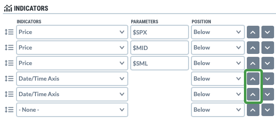
Since the indicators appear on the chart in the order they are listed, you'll need to move the two Date/Time Axis indicators—one directly below the $SPX Price Indicator and the other directly below the $MID Price Indicator. Click the upward-pointing Reorder arrows (outlined in green in the screenshot below) until those two “Date/Time Axis” indicators are directly below the $SPX and $MID indicators.

Reordering Date/Time Axis so they're directly below the corresponding price plots.

Once they have been moved in place, your Indicators area should look like this:

Time scales set to display below corresponding chart.
The Date/Time Axis is arranged to display below the corresponding price plot.

The Final Product

The finished chart will look similar to the one below.

Chart displaying all customized settings in StockCharts.com
After customizing your settings and updating the chart, you should have a chart that meets your criteria.

Click here to see a live version of this chart.


Bonus Y-Axis Settings

In addition to the settings covered above, you can customize the y-axis on a Price Indicator panel in two ways. They are as follows:

  • Inverting the Chart: This setting can be helpful for $VIX and other volatility-focused symbols. To invert the y-axis of the price plot so that the high values are at the bottom and the low values at the top, simply add a comma and a second parameter, “inverted,” in the “Parameters” box for your Price Indicator.

  • Using Log Scale: By default, the Price Indicator is plotted using an arithmetic scale, but if your main price plot uses a log scale, you may want to use the same on your Price Indicator. To change the Price Indicator to use a log scale, simply add a comma and a second parameter, log, in the Parameters box for your Price Indicator.

Last updated

Was this helpful?