Loading...
Loading...
Loading...
Loading...
Loading...
Loading...
Loading...
Loading...
Loading...
Loading...
Loading...
Loading...
Loading...
Loading...
Loading...
Loading...
Loading...
Loading...
Loading...
Loading...
Loading...
Loading...
Loading...
Loading...
Loading...
Loading...
Loading...
Loading...
Loading...
Loading...
Loading...
Loading...
Loading...
Loading...
Loading...
Loading...
Loading...
Loading...
Loading...
Loading...
Loading...
Loading...
Loading...
Loading...
Loading...
Loading...
Loading...
Loading...
Loading...
Loading...
Loading...
Loading...
Loading...
Loading...
Loading...
Loading...
Loading...
Loading...
Loading...
Loading...
Loading...
Loading...
Loading...
Loading...
Loading...
Loading...
Loading...
Loading...
Loading...
Loading...
Loading...
Loading...
Loading...
Loading...
Loading...
Loading...
Loading...
Loading...
Loading...
Loading...
Loading...
Loading...
Loading...
Loading...
Loading...
Loading...
Loading...
Loading...
Loading...
Loading...
Loading...
Loading...
Loading...
Loading...
Loading...
Loading...
Loading...
Underlying all of the tools on StockCharts.com is our extensive price database, which contains data for over 30,000 ticker symbols. After each trading day, over 1 million new data items are added to the database. This means you can access stock quotes and up-to-date information on the stock, bond, crypto, and currency markets. Read on to learn more about the price data we make available on our website.
Markets We Cover. We offer data from several major exchanges, plus other financial data..
Real-Time Data. We offer different kinds of real-time and delayed data to our members, depending on the data plan chosen by the user.
Users can chart pre-market and after-hours price data for many US symbols.
Members can display data bars for anything from 1 minute to 1 year, depending on the specific symbol and the member's service level.
We adjust our price data to remove the effects of fund distributions, dividends, and stock splits from our charts. This article gives all the details on this adjustment process.
The historical price data offered on our site depends on the specific symbol, data bar period, and member's service level.
Now that you've created your StockCharts account, you're ready to join the StockCharts community. The first step is to log in.
You should have received your User ID and password via email. If you didn't, please contact our Support staff.
We recommend you change your initial password to a new one that is between 7 and 20 characters in length. It may contain letters, numbers, and/or hyphens.
To log in to your account, click the Log In link in the upper right corner of any of our web pages (see image below). You will then be prompted to enter your User ID and password.
Note: The first time you log in, you will be prompted to accept our . You won't need to do this on future logins.
Once you log in, you will see Your Dashboard, the heart and soul of StockCharts.com. The page has several panels arranged in different ways, most of which can be customized to display what is important to you.
There are several ways to move around StockCharts.com. Each of our pages has helpful links at the top (the “Page Header”) and the bottom (the “Page Footer”) that can get you where you need to go. In addition, we have our and our helpful .
Most of the pages on our website have an area at the top called the page header that can help you navigate to anywhere you need to go. Each page header contains the following:
View the stock market clearly with the charts, tools, and analysis available in StockCharts. Explore the different indicators, overlays, and annotation tools to better understand the market.
StockCharts.com wants to help you make smarter financial decisions. So, we're providing you with the best financial analysis and data visualization tools through two powerful charting platforms— and .
The main focus of our charting tools is , a branch of investment analysis that uses a stock's price history to forecast its future behavior. In addition to our award-winning , we provide
We offer real-time data from two sources: exchange real-time data for NYSE/Nasdaq/TSX/LSE and BATS real-time data for NYSE/Nasdaq.
Exchange real-time data comes directly from the appropriate exchange. We consider data quotes from those exchanges to be the “official” quotes for each security, and they should be extremely close to real-time values found on other sources. In addition, exchange real-time data contains accurate volume data. We highlight exchange real-time data bars in green.
We currently offer exchange real-time data for the NYSE, Nasdaq, TSX, and LSE exchanges. There is an additional charge from the exchanges for their real-time data.
The BATS exchange provides BATS real-time data for no additional charge. BATS data is only available for US stocks. For liquid stocks, BATS data is similar to NYSE/Nasdaq data. For thinly traded stocks, BATS data can differ significantly. BATS data quotes don't contain useful volume information, so we do not display volume on BATS charts. We highlight BATS real-time data bars in yellow. Click here for more information about the BATS real-time data available on our site.
We offer extended-hours trading data for many US symbols. For US markets, after-hours trading data covers the 4 hours after market close (4:00 PM–8:00 PM Eastern time), and pre-market data covers the 5.5 hours before the market opening for the day (4:00 AM–9:30 AM Eastern time).
Pre-market and after-hours price quotes are available on the Symbol Summary page during pre- and post-market trading sessions.
In addition, extended hours data can be charted on both SharpCharts and StockChartsACP charts. Check the Extended Hours checkbox in the Chart Attributes section of the SharpCharts Workbench or on the Chart Settings panel in StockChartsACP. When this box is checked, extended hours bars will be added to your intraday chart in color-coded sections (purple for after-hours, blue for pre-market) if extended hours data is available for that symbol.
Note that securities are generally more thinly traded during pre-market and after-hours sessions than during regular market hours. Extended-hours price bars will only be shown if trading activity has occurred during that bar's timeframe. Volume data and volume-based indicators are not available for any extended hours bars.
Historical pre-market and after-hours data are available, going back approximately ten trading days.
StockCharts Logo
Utility Links
Main Menu
Create-a-Chart Bar
You can always return to the StockCharts homepage by clicking on the StockCharts logo in the upper left corner of any of our pages. You will be redirected to Your Dashboard if you are a logged-in member.
Our Utility links are located in the upper right corner of our pages. This area looks different depending on if you are logged in or logged out.
If you are logged out, you will see the following buttons in the upper right corner of our pages:
Login: Members can click this button and enter their User ID and password to log in to their StockCharts.com account.
Free Trial: Non-members can click this button to sign up for a free one-month trial.
If you are logged in, you can click on your name or the “person” icon in the upper right corner to see a handy member menu:
Your Account: Click here to change/update your account settings.
Add-Ons and Upgrades: Click here to visit the StockCharts Marketplace and purchase additional tools to use in your account.
Your Notifications: Click here to view recent notifications (including alert notifications) sent to your account. You can also configure email notifications for new commentary articles from this page.
Your Dashboard: Click here for access to Your Dashboard.
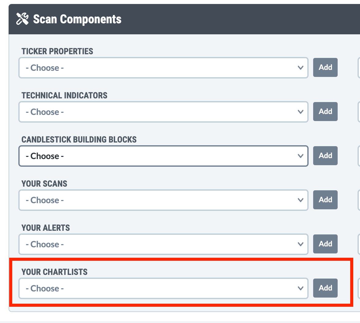
Your ChartLists: Click here for quick access to all your saved ChartLists.
Your Scans: Click here to view all of your saved scans.
Your Alerts: Click here to view all of your saved alerts.
Support Center: Click here to go to our online Support area.
Ask a Question: Click here to ask us a question or get help with a problem.
Contact Us: Click here to contact us using our Support Request Form.
Log Out: Click here to log out of your account. Typically, you would do this using a shared computer, such as those found at a public library.
Remember, if logged in, you will see the person icon and/or your name at the top of the page. Your name may not be displayed on smaller screens, but you can always access the menu by clicking on the person icon.
Below the StockCharts logo at the top of the page are several navigation links that you can use to move into each of the main areas of the website. These include the following:
Charts & Tools: Links and descriptions for our most popular charting tools
Scans & Alerts: Links and descriptions for our stock screening and alerting tools
Market Analysis: Links and descriptions for research tools that help you analyze the market or individual securities
Articles & Videos: Access current market commentary from our experts
Your Dashboard. This members-only dashboard provides access to all of our most used tools, reports, and commentary, including members-only features
On the right side, you'll see links to the following:
ChartSchool: Our comprehensive educational articles about technical analysis
Help: Visit our online Support Center, report a problem, see what's new on our site, and more
Search: Click on the magnifying glass icon and enter search terms into the search box
Note that these main menu links might be hidden in a dropdown menu on smaller screens. Select the three horizontal lines icon on the right side of the header to access this important menu.
Above the main menu is our Create-a-Chart bar, which you can use to quickly access many charting tools from almost anywhere on the StockCharts website.
The Create-a-Chart bar's dropdown menu lets you select which one of our charting tools you want to use. The menu is initially set to “SharpCharts,” our standard bar/candlestick charts. The full list of tools available in the menu is below:
Symbol Summary: A high-level summary with technicals, fundamentals, and more.
SharpChart: Our main bar/candlestick charting tool.
ACP: Our interactive Advanced Charting Platform.
Point & Figure: Charts with columns of X's and O's.
GalleryView: Four predefined charts for studying different periods.
Seasonality: Average monthly returns for a ticker symbol.
Options: Options chains for ticker symbols that trade options.
Interactive PerfChart: Overlaid performance lines for up to 10 different ticker symbols.
CandleGlance: Up to 30 different mini-charts on one page.
RRG: Charts showing relative strength and momentum for a group of symbols.
Symbol Lookup: Search our symbol catalog for a specified phrase.
Next to the menu is a long text box where you can type in a phrase, typically one or more ticker symbols, that goes with your charting tool selection. You can use commas to separate multiple symbols if you enter more than one ticker symbol.
Note that the long text box has a built-in auto-complete feature. As you type the name of a stock, index, or mutual fund we support, the symbols that match what you have typed so far will be automatically displayed. This can be useful if you need help determining the ticker symbol you want.
You can select the symbol you want from the list or click More Results For at the bottom to see more ticker symbols matching your search. If you already know the ticker symbol you want, just type the symbol in this box and click Go (or press “Enter” on the keyboard) to create a chart for that symbol.
Step-by-Step Instructions. Using the Create-a-Chart Bar to Find Ticker Symbols
If you often select a specific tool other than SharpCharts, you can specify that tool as the default to use on the Create-a-Chart bar. Click the star next to the tool you'd like to set as the default.
The default tool (indicated with a yellow star) will be pre-selected each time you use the Create-a-Chart bar in the future.
All ChartSchool and Support Center pages also have a list of links just below the header called “breadcrumbs.” These can also help you navigate pages within ChartSchool or the Support Center. Click any links in that line to return “up the chain” links.
At the bottom of most pages on our site is a dark blue Page Footer, which has additional links to commonly used resources. You can find links to popular tools, educational resources, and more here.
The Page Footer also contains icon links to our social media pages: Facebook, X (formerly Twitter), YouTube, and LinkedIn.
You can also sign up for our ChartWatchers Newsletter from the Page Footer. Enter your email address in the signup box at the top of the Page Footer, and click the Sign Up button.
The Site Map is a high-level diagram of all the pages on StockCharts.com. It's useful for moving quickly from one website area to another. It gives a big-picture view of how the most important pages on our site are organized. Click any links on the Site Map page to go directly to the corresponding page.
Our search functionality allows you to find commentary and educational articles that contain specific keywords and phrases. It also lets members search for ticker symbols or for places on the site where a specific ticker symbol is mentioned (including in their own ChartLists).
The Site Search box is on the right side of the Page Header on most web pages. Just click the magnifying glass icon next to the main tabs in order to access the box. Then, simply add your search criteria and press Enter.
By default, searching in the Search box in the top right corner of our website will show you recent commentary articles, plus educational content from ChartSchool and the Support Center. Use the buttons below the search box to choose a different area to search:
Entire Site: Searches the Support Center, ChartSchool, plus commentary articles from the last two years.
Entire Site (w/Archives): Same as the Entire Site option, but adds in commentary articles that are more than two years old.
Symbol Catalog: Search for ticker symbols available on our site.
Symbol Mentions: Searches for mentions of a specific ticker symbol across our site, including commentary articles, predefined scan results, Public ChartLists, and for members, their own ChartLists.
Both the Entire Site and Entire Site (w/Archives) options search commentary articles plus educational content from ChartSchool and the Support Center. The only difference is that the option with archives also includes older market commentary.
Below is an example of the search results you might see when searching the site for "macd":
The icon at the beginning of each results indicates what type of article it is. The newspaper icon indicates a commentary article, the graduation cap indicates a ChartSchool article, and the question mark icon indicates a Support Center help article.
Whether it is an educational or commentary article, you can click the article's title to access the full text of the article. For commentary, you can click the author's name to see a list of articles by that author, or click one of the tags to see other commentary articles tagged with that topic.
To search for ticker symbols available on our site, select the Symbol Catalog option below the search box. You can search for ticker symbols by symbol, company name, sector/industry, and more.
Below is an example of the search results you might see when searching the Symbol Catalog for "energy":
Use the menu in the leftmost column to launch different kinds of charts/tools for that symbol, including SharpCharts, P&F charts, Symbol Summary, options chains, and more.
To find places where that symbol is mentioned on our site, click the speech bubbles icon in the rightmost column for that symbol.
In addition to clicking the speech bubbles icon next to a symbol in the symbol search results, you can access symbol mentions directly by choosing the Symbol Mentions option below the search box and typing in the ticker symbol.
Below is an example of the symbol mentions search results you might see when searching Symbol Mentions for Ford (F):
The results are divided into different sections:
Symbol Details (grey): This section gives basic information about the ticker symbol, plus links to launch a SharpChart, GalleryView, P&F Chart, or Seasonality Chart for the symbol. For indexes and market indicators, additional information will be available in this section.
Predefined Scans (purple): This section shows recent predefined scans that the symbol has turned up in. Click on the scan name to see the full predefined scan results.
Public ChartLists (red): This section shows Public ChartLists that mention the symbol. Click on the list name to launch the full Public ChartList.
Your Saved Charts (blue): For members, this section will show any saved charts you have for the symbol. Click on the saved chart name (in the right column) to launch the saved chart in the workbench, or click the list name (in the middle column) to launch the full ChartList.
Articles (green): This section shows recent commentary articles that mention the symbol. Click on the article title to launch the full article. Clicking on the author's name will show recent articles by that author, and clicking on a tag will show recent articles that have been tagged with that topic.

Many of the features in StockCharts can be used from any device with a web browser. You don't need additional plugins or software downloads to view charts.
To take advantage of the advanced features and functionality in StockCharts, become a member. You can visit our subscription page to learn about the benefits of subscribing or watch the video below.
Not sure about which features will help you with your investment strategy? The video below will help you get started with StockCharts. Please look over the information on the rest of this page to dive deeper into the analysis tools.
Have any questions? Please ask our friendly Customer Support staff.
StockCharts provides many technical analysis tools. You can create and customize charts, analyze markets, and find securities to invest in using either our SharpCharts Workbench or StockChartsACP.
Cool Tip: Our technical analysis tools are documented in our Support Center. We also have a plethora of Instructional Videos that demonstrate the use of these tools. Our commentators frequently write about using our tools to create their commentary.
SharpCharts: Our flagship charting platform, SharpCharts (New and Classic), allows you to create charts for any of our system's thousands of ticker symbols. The SharpCharts Workbench allows you to customize your charts any way you want and save the results in a ChartList for later review. SharpCharts supports all popular technical indicators, overlays, and charting types—bars, candlesticks, line, Renko, Kagi, etc.
StockChartsACP: We also offer our dynamic chart analysis and trading platform called StockChartsACP. (“ACP” stands for “Advanced Charting Platform.”) StockChartsACP (“ACP” for short) is an interactive web application that lets you quickly create, customize, and save interactive charts, run technical scans, and even trade directly from your charts. ACP also supports several Plug-ins from our industry partners, which you can install to add powerful analysis tools.
Learn More: SharpCharts | StockChartsACP
Adding annotations to SharpCharts charts is a snap. Click the Annotate icon and add trendlines, text, curves, shapes, and advanced technical line studies like to your charts. Once you have finished adding your annotations, you can save your chart in a ChartList for later review. All your saved annotations will be automatically updated as more data is added to the chart.
Note: The annotation tools in StockChartsACP are built in to the charting platform.
Learn More: ChartNotes | ACP annotation tools
Are you looking for stocks or ETFs that meet specific criteria? As a StockCharts member, you can access our Scan Engine, which filters out stocks and ETFs that meet your required conditions. And if you want to design your own scan, check out the Advanced Scan Workbench. Then, set up Alerts in the Technical Alert Workbench to let you know as soon as stocks begin to meet your criteria.
We also offer tools for creating specialty charts. These include Point & Figure charts, which use X's and O's to display price action; PerfCharts, which allow you to compare the performance of several different stocks on one chart; Seasonality Charts, which show the months that are best for a given stock; RRG Charts, which give an interactive, non-traditional look at a stock's relative strength; and colorful MarketCarpets, which show you winners and losers at a glance.
Learn More: Other Charting Tools
Want a quick overview of current market conditions? StockCharts includes several continuously updated market reports, such as the Market Summary report, which shows the performance of many popular market indexes and ETFs; the Sector Summary report, which allows you to find the strongest stocks in the strongest industries quickly; and the exclusive StockCharts Technical Rank (SCTR) report that ranks securities based on their overall technical strength.
Learn More: Market Analysis Reports | SCTR Rankings
In addition to charting services, StockCharts.com provides expert market commentary from some of the biggest names in the industry. We have an extensive collection of free technical market commentary in the Articles area of our site. In addition, members can read our paid market commentary from Larry Williams, and Martin Pring.
If video commentary is more your thing, check out StockCharts TV; our YouTube channel features our latest videos packed with up-to-date market commentary.
Learn More: Market Commentary | StockCharts TV
on all aspects of technical analysis. You can find articles about every indicator, overlay, and chart type we support, with definitions, chart examples, interpretation guidelines, formulas, and spreadsheet examples. It's a comprehensive free resource for anyone interested in technical analysis.
Our Instructional Videos can also help you get up to speed quickly with StockCharts.com. Each video is 5–10 minutes long and covers a specific area or tool on the website.
Finally, the Support Center (where you are now) contains in-depth documentation on all our features and ways for you to contact our Customer Support Team with questions or suggestions.
Cool Tip: Having trouble finding the info you need in the Support Center or ChartSchool? Click here to use our "Ask a Question" ChatBot!
Learn More: Educational Resources | Customer Support
The annotation tools in ChartNotes are grouped into four categories: Line Tools, Text Annotation Tools, Shape Tools, and Line Studies Tools.
Click on one of the categories below to get more information on how to access specific annotation tools and draw those annotations on your charts.
Line Tools: Trendlines, Vertical Lines, Horizontal Lines, Support/Resistance Lines, and Parabolas.
Text Annotation Tools: Text Notes, Callout Boxes, Arrows, Price Boxes, Percentage Change and Elliott Wave Labels.
: Rectangles, Ellipses, and Triangles.
: Fibonacci Retracements, Quadrant Lines, Fibonacci Arcs, Fibonacci Time Zones, Cycle Lines, Cycle Circles, Sinewaves, Raff Regression Channels, Andrews' Pitch Forks, Fibonacci Fans, Harmonic Patterns (XABCD) and Speed Resistance Lines.
You've got questions? We've got answers here in the StockCharts Support Center!
Feel free to browse through the articles below, or if you are short on time, use our AI-driven Search feature to find what you need quickly. You can also contact our human-driven Support Team for assistance.
TO QUICKLY FIND ANSWERS: to use our "Ask a Question" ChatBot
TO REVIEW OUR FREQUENTLY ASKED QUESTIONS:
For US securities data, we offer real-time data from two different sources.
Official real-time data comes directly from the NYSE and Nasdaq exchanges, along with exchange fees. This is the “official” data for a particular stock; if you place a typical trade order with your broker, they will execute the trade using those prices.
Our BATS real-time data comes from the BATS exchange. BATS (“Better Alternate Trading System”) is a growing electronic exchange based in Kansas City that provides all of its real-time trading data for free. Their data is often similar to the “official” data from the exchanges, but there can be differences in the data that you should be aware of.
So, what exactly are those differences?
BATS data is only available for US stocks.
Our database has daily, weekly, and monthly data bars for each ticker symbol. For the stocks that we track, we also have intraday data bars available in 1-, 2-, 3-, 5-, 10-, 15-, 30-, 60-, and 120-minute durations, as well as increments that divide the day's trading into equal size bars: 39-minute (10 bars per day), 65-minute (6 bars per day), 78-minute (5 bars per day), 130-minute (3 bars per day), and 195-minute (2 bars per day).
Subscribers can create charts using any of the periods listed above. Non-members can only chart daily and weekly bars.
Mutual Funds only report one data point daily (after the market closes) and thus can only be charted as lines on daily charts.
Do you need to download daily, weekly, or monthly data to Excel? PRO StockCharts subscribers can download data from as far back as 1970.
Follow these steps to download daily, weekly, or monthly data to a CSV file (Excel readable) when using the New SharpCharts Workbench:
We use the following conventions with our ticker symbols, to indicate the exchanges that the symbols belong to, the asset types, and more.
US stocks have symbols that consist of letters without any other symbols - such symbols indicate that that stock is listed on either the NYSE, Nasdaq, or Amex Exchanges
Often, it can be useful to study the ratio of two datasets to determine things like the relative strength of a stock compared to an index. StockCharts users can create ratios from two ticker symbols in our database. On our website, wherever you can enter a single ticker symbol, you can also enter two symbols joined together with a colon character (“:”), and we will use the ratio of those two symbols. We call such a combination of symbols a “Ratio Symbol.”
Here is an example of a ratio symbol in use:
Have you wondered what a particular index is or how it is calculated? Good news! You can use our Index Catalog to learn that information.
The Index Catalog can be accessed from the StockCharts' . On the Symbol Catalog page, scroll down and click the “Index Catalog” link at the bottom of the page. A direct link to the Index Catalog is .
Several ticker symbols we recognize do not represent actual data in our database. Instead, these symbols contain data that is useful in very specific contexts. We call these ticker symbols “Pseudo-Symbols.” One prominent pseudo-symbol we have is:
$ONE. This index always contains the value “1” for all its data fields. It is mainly used to generate the reciprocal of any other ticker symbol in our database by using it in the first position of a Ratio Symbol - e.g., $ONE:$VIX. This is one easy way to create an inverse chart.
In addition to the chart editing functionality on the SharpCharts Workbench, other trading tools are built right into the workbench. Below your charts, you will find access to your ChartStyles, ChartLists, Alerts, and other tools and resources for researching the current chart's ticker symbol, such as options data and historical price data.
The tools in the Saved Charts section allow members to view a ChartList in Summary View, view and edit chart comments for the current chart, and browse through thumbnails of their saved charts in the ChartList Library, all without leaving the workbench.
So, you’re viewing your ChartLists regularly, and you get an alert notification. Before taking action, you must analyze the chart to identify an ideal entry point.
In the SharpCharts Workbench, you can view the option chain of a stock or ETF that has options available. Click Options under Tools & Resources in the menu on the left.
The option chain will reveal which strike prices options activity is more active and whether there’s more call or put activity. This can be helpful, especially before earnings, because it gives you an idea of what price moves traders anticipate.
To view the option chain, click Options, and if the stock or ETF of the chart you’re analyzing has options available, the option chain will display below the chart. The option chain below shows strikes between 67 and 85 for options expiring on February 9, 2024.
The Show All Columns is checked, but unchecking the box will show fewer columns. You can view option greeks, volatility, volume, open interest, and price data.
It’s impossible to view all your ChartLists at once, so it’s a good idea to set alerts so you don’t miss any critical price action. Whether it’s your favorite stock hitting a specific price level, if a sector is making a new high, or if a stock is crossing above a moving average, you’ll receive an alert notification depending on the alerts you set up.
Cool Tip: StockCharts Members can create simple or advanced alerts and receive notifications when a specific price is reached. Setting alerts in StockCharts is simple. Here’s a .
In the SharpCharts Workbench, you can access your custom and predefined alerts directly from the workbench. The alerts are listed along the left menu under Alerts.
For many of the tools on our site, you can create a specific ChartStyle that will be used for charts displayed by that tool. For example, you can create a special CandleGlance ChartStyle that will be used whenever you display a CandleGlance chart. (Think of it as the Default ChartStyle for the tool.) These ChartStyles can currently be used for charts in our CandleGlance, GalleryView, Market Summary and Industry Summary.
To set up one of these special tool-specific ChartStyles, simply create a new ChartStyle from the SharpCharts Workbench, and be sure to save it using the tool-specific ChartStyle name listed below. For complete instructions on creating a ChartStyle, visit our .
ChartNotes provides you with a wide variety of line-drawing tools. Watch our Line Tools video or read on below to learn more about how to use and apply these utilities.
Each Line Tool available in ChartNotes is listed and described below in more detail. Here is a screenshot of where you can find the Line Tools menu.
ChartNotes allows you to create shapes and filled regions on your chart using a number of different shape-drawing tools. Watch our Shapes video or read on below to learn more about how to use and apply these utilities.
Each Shape Tool available in ChartNotes is listed and described below in more detail. Here is a screenshot of where you can find the Shape Tools menu.
The ChartList Reports feature allows StockCharts members to turn on daily or weekly ChartList Reports for any of their saved ChartLists. After the market closes, you'll receive an email with a performance summary of all the stocks/funds/indexes on that list.
The daily ChartList Report includes a performance summary for the most recent trading session, while the weekly report includes a performance summary for the most recent trading week. Below is an example of a daily ChartList Report for a ChartList called "Paper Industry Companies."
These reports are a great way to monitor your portfolio(s), track your own unique set of market indexes, follow specific groups like the Dow Industries, and more.
Want to access your StockCharts account, see how the market is doing, or keep an eye on your ChartLists while you're on the go? The StockCharts mobile app for iPhones and iPads is a great companion.
If you're a StockCharts member, download the StockCharts app from the Apple App Store. Enter your StockCharts login credentials and view market summaries, your ChartLists, or a chart of any ticker symbol you choose.
Nasdaq Stock Exchange (US)
Amex Stock Exchange (US)
BATS Exchange (US)
TSX Stock Exchange (Canada)
TSX-Venture Stock Exchange (Canada)
Canadian Securities Exchange (Canada)
NEO Exchange (Canada)
London Stock Exchange (UK)
National Stock Exchange of India (India)
We have datasets for most ticker symbols in each market we cover, but that doesn't necessarily mean we have all ticker symbols. We don't automatically provide quotes for extremely low-priced stocks since technical analysis techniques do not work with such stocks, and the charts for those stocks can be highly misleading.
If you would like to see a ticker symbol for a stock in a market we cover and that symbol isn't in our database, you can request that we add that symbol by using our Symbol Request Form.
In addition to securities data from the markets listed above, StockCharts offers data for a wide range of indexes, market breadth indicators, economic indicators, cryptocurrencies, currencies, commodities, and futures. Details of those offerings can be found in our Index Catalog.
If you'd like to chart your own data, our User-Defined Index feature allows you to create and chart your own symbols.
Learn More: Index Catalog | User-Defined Indexes
Data for 1-minute, 10-minute, 60-minute, and daily periods is pulled directly from our data feed. “Longer” bars are created by combining the appropriate shorter time-period bars. For instance, the bars used on weekly charts are created from daily data using the following technique:
Weekly Open = Open of the first daily bar for the given week (typically Monday's open)
Weekly High = Highest high for all the daily bars for that week
Weekly Low = Lowest low for all the daily bars for that week
Weekly Close = Close value for the last daily bar for that week (typically Friday's close)
Similar techniques are used to create 5-minute bars from 1-minute data, 30-minute bars from 10-minute data, monthly bars from daily data, etc.
Note: The weekly and monthly bars date indicates the start of the bar's period. For example, on a weekly bar, the date of the bar corresponds to the Monday of that week.
Note: For intraday bars, the first bar of the day may be shorter than the others. For example, since the US and Canada markets open at 9:30 AM, the first hourly bar of the day only covers 30 minutes, from 9:30 AM to 10:00 AM. Subsequent bars cover entire hours.
Note: The bars that divide the trading day into an equal number of bars per day (e.g., two 195-min bars per day) are designed to be used with securities that trade during regular stock market hours. These bars may not work properly with securities that use different trading hours, such as bonds or cryptocurrencies.
10- and 30-minute bars going back 40 days.
60-minute bars going back to 2004.
Daily, weekly and monthly bars going back to 1990 for most stocks, indexes and mutual funds (assuming they have been around that long).
Daily, weekly and monthly bars going back as far as 1900 for some indexes.
Your membership service level will determine how much historical data you can use in your charts.
Non-members can only create charts of 5 years or less in length.
Basic and Extra members can create charts that use data from as far back as 1980.
PRO members can use all of our historical data in their charts with some data going back to the 1940s or earlier. To see exactly how far back we have data for a particular symbol, click the Symbol Catalog link at the bottom of any of our pages and search for the ticker symbol you are interested in. The starting date for its data is listed on the right side of the search results.
Learn More. Ticker Symbols
TSX-listed stocks have symbols that end with “.TO”
TSX Venture-listed stocks have symbols that end with “.V”
CSE-listed stocks have symbols that end with “.CA”
NEO-listed stocks have symbols that end with “.NE”
London-listed stocks have symbols that end with “.L”
Indian-listed stocks have symbols that end with “.IN”
Indexes and market indicators (i.e., non-trading datasets that do not contain price information) start with either a “$” or a “!” character
Economic Indexes start with “$$”
Symbols for individual futures contracts start with “^”
Note: Indexes that start with "!" were initially created on the original DecisionPoint website, while “$” indexes have always belonged to StockCharts.com.
If two ticker symbols are joined together with a colon character, it represents the ratio of those two datasets, e.g., IBM:$SPX
If two ticker symbols are joined together with a hyphen, it represents the difference of those two datasets
Learn More: Ratio and Difference Symbols
User-defined indexes that have not been shared with others start with an “@” symbol
User-defined indexes that have been shared publicly currently start with “!”
Learn More: User-Defined Indexes
Different stock classes are indicated with a forward slash (“/”) and one or more letters, e.g. BRK/A, RBN/UN.TO
Unadjusted stock datasets (using historical price data that has not been adjusted for dividends or distributions) have symbols that start with an underscore (“_”)
Adding a hyphen before a single ticker symbol will show an inverse chart for that symbol (or use the $ONE pseudo-symbol)
Learn More: Price Data Adjustments | Pseudo-Symbols
We have three symbols that are useful in creating ChartStyles that focus on relative strength:
$SYMBOL. This index equals the “main” ticker symbol in a SharpChart.
$SECTOR. This index equals the sector ETF of the sector to which the main ticker symbol belongs.
$INDUSTRY. This index equals the industry index for the industry to which the main ticker symbol belongs.
So, for example, you could use these symbols to create a ChartStyle with a “Price” Indicator of “$SYMBOL:$SECTOR” - then, regardless of the ticker symbol you apply the style to, we would then plot a sector-based relative strength line on the chart. These pseudo-symbols are available with US symbols with a sector and industry assigned to them.
We also have several “theoretical” pattern symbols that contain “perfect” versions of different price patterns for use in studying the behavior of technical indicators when such patterns appear on a chart. All such symbols have “$TH” at their start, as seen below:
$THSAW. This index contains a “perfect” sawtooth pattern for studying 45-degree reversals.
$THSINE. This index contains a “perfect” sine-wave pattern for studying rounded reversals.
$THHS. This index contains “perfect” head-and-shoulders reversal patterns.
$THEW. This index contains “perfect” Elliott Wave patterns.
$THSS. This index contains a “perfect” set of sawtooth wave patterns that are themselves contained in a larger period sawtooth pattern.
Note: Duration must be set to “Custom Style” on the CandleGlance page to see your custom style. If you change to another duration, the default style for that duration will be used instead.
In GalleryView, the intraday, daily and weekly charts may all be customized using special tool-specific ChartStyles. To change the way that the Daily chart on the GalleryView page looks, create a chart that looks the way you want your Daily GalleryView charts to look, then save it as a ChartStyle with “GalleryDaily” as the name. You can repeat the process and create ChartStyles named “GalleryIntraday” and “GalleryWeekly” to change those charts.
GalleryView ChartStyles have a few restrictions:
Regardless of the period settings in your ChartStyles, the Intraday chart will show 10-minute bars. Similarly, the Daily chart will show Daily bars, and the Weekly chart will show weekly bars.
The width of the charts will remain fixed at the current 800 pixels. We recommend using the “Fill the Chart” range option to prevent the bars on the chart from getting scrunched.
While there is no vertical size restriction, we recommend not adding too many indicators to the GalleryView charts; otherwise, the page will get very long.
The P&F chart cannot be customized specifically for GalleryView. However, you can customize the default P&F ChartStyle for all P&F charts; that default P&F ChartStyle will be shown in GalleryView.
Members can customize the settings and indicators used for the half-size charts in the Chart View of the Market Summary by creating a special ChartStyle that will be used instead of the default style.
To change the way that charts on the Market Summary page look, create a chart that looks the way you want your Market Summary charts to look, then save it as a ChartStyle with “Market Summary” as the name.
Cool Tip. Select a chart width of 460 when setting up your “Market Summary” ChartStyle. This will optimize the sizing of your custom Market Summary charts.
Members can customize the settings and indicators used for the half-size charts in the Chart View of the Industry Summary by creating a special ChartStyle that will be used instead of the default style.
To change the way that charts on the Industry Summary page look, create a chart that looks the way you want your Industry Summary charts to look, then save it as a ChartStyle with “Industry Summary” as the name.
Cool Tip. Select a chart width of 460 when setting up your “Industry Summary” ChartStyle. This will optimize the sizing of your custom Industry Summary charts.
Ratio symbols are also used to create “Relative Strength” charts, which plot the ratio of two ticker symbols on a line chart. The following rules are used to interpret a relative strength chart:
The actual values for each point on the relative strength line are not relevant. Instead, focus on the direction and shape of the line.
If the line is rising, the first ticker symbol is outperforming the second ticker symbol.
If the line is falling, the second ticker symbol is outperforming the first.
On a SharpChart, the “Price” indicator can be used to add a ratio symbol to an existing chart.
Calculation: For purposes of consistency and data integrity, we use the following formulas when calculating a ratio symbol:
Open = Open of the first symbol / Close of the second symbol
High = High of the first symbol / Close of the second symbol
Low = Low of the first symbol / Close of the second symbol
Close = Close of the first symbol / Close of the second symbol
Volume = Volume of the first symbol / Volume of the second symbol
These formulas ensure that the ratio symbol's High value is still the highest and its Low value is still the lowest in the resulting dataset.
Similar to ratio symbols (see above), you can join two ticker symbols with a hyphen to create a “Difference Symbol,” e.g., $TYX-$FVX.
On a SharpChart, the “Price” indicator can be used to add a Difference Symbol to an existing chart.
Calculation:
Open = Open of the first symbol - Close of the second symbol
High = High of the first symbol - Close of the second symbol
Low = Low of the first symbol - Close of the second symbol
Close = Close of the first symbol - Close of the second symbol

Learn More: Using the ChartList Summary | Using the ChartList Library
From the Alerts section of the workbench, you can view your saved price alerts, saved advanced alerts, and see the latest predefined alerts to fire.
Learn More: Viewing Alerts on the SharpCharts Workbench
In the Tools & Resources section, you can research the current chart's ticker symbol, including viewing the full Symbol Summary, historical price data, and options chain information for that symbol.
Note: Only logged-in members can view the full Symbol Summary and historical price data from the SharpCharts Workbench.

The Markets tab on the app gives you access to charts and summary info for major markets:
Tap the Markets icon.
Then tap on Equities, Bonds, Commodities, or Crypto from the tabs at the top left.
Scroll down to access all the different data, which is similar to what you use in the desktop version.
The ChartLists tab allows you to access your previously saved ChartLists:
Tap the ChartLists icon and you'll see a list of your ChartLists.
Select the ChartList you wish to view.
Scroll through the charts on the ChartList or tap on Jump to Chart to view a specific chart on your list.
To go back to your ChartLists tap on Your ChartLists.
The charts tab allows you to quickly and easily create an ad-hoc chart for a symbol of your choosing:
Select the Chart icon.
Enter a symbol in the symbol box.
Select the ChartStyle from the dropdown menu.


Like SharpCharts, your carefully crafted StockChartsACP charts can be shared with others. Use Permalinks to send a chart to others electronically, download to save the chart as an image file, or use the Print functionality to create a paper copy.
To create a permanent link (“permalink”) to one of your charts, simply load the chart in StockChartsACP and then click the Share button in the Chart Actions menu at the bottom left.
You'll see a popup that contains a short URL. Click the green Copy Link button to put the URL in your clipboard, then paste it into emails, social media, or any other communication tool to share the chart with others.
Note: If using a multi-chart layout, click on the chart you want to link to before clicking the Share button. The selected chart will have a green border around the edge of the chart.
To save the chart as a PNG image file, click the camera icon in the Chart Actions menu at the bottom left. Select “Download as PNG” to download the image file.
If you are using a multi-chart layout, all charts in the layout will be included in the image file.
To print your chart, click the camera icon in the Chart Actions menu at the bottom left, and select “Print Chart”. In the standard print window that opens, adjust your printer settings and print as usual.
If you are using a multi-chart layout, all charts in the layout will be printed when you use this feature.
Note: To see the print window, ensure your browser is configured to allow pop-up windows.
TO RETURN TO STOCKCHARTS.COM: Click here
These articles will help you better use, navigate, and understand the tools and features available on StockCharts.com.
Intro to StockCharts Quickly learn how to use all of our charts, tools, and features
"Getting Started with StockCharts" Series A great set of articles to read when you have a little extra time to learn all about the website
Navigating the Website Your guide to what's where on the StockCharts website
Getting into your StockCharts account
The heart and soul of your StockCharts account
The latest features, additions, and updates on StockCharts
Data Availability More about the markets and symbols we cover
Ticker Symbols Learn how to find the symbols you're searching for
These articles will provide helpful information and instructions for the various charting tools and resources on StockCharts.com.
Intro to SharpCharts Our original, award-winning financial charts
Editing SharpCharts How to customize your charts from the SharpCharts Workbench
ChartNotes Learn more about our annotation tool for SharpCharts
How to save your chart settings as custom ChartStyles
Learn how to save and organize your charts
Intro to StockChartsACP Our full-screen, interactive, Advanced Charting Platform
Editing ACP Charts How to customize your charts in StockChartsACP
Annotations in ACP Learn more about annotating your charts in ACP
How to save your chart settings as custom ChartStyles in ACP
Learn how to save and organize your charts in ACP
View multiple charts at once in ACP
Enhance your ACP experience with exclusive plug-ins
P&F Charts Learn how to use our Point & Figure charting tool
GalleryView See a symbol in multiple time-frames all on one page
Seasonality Charts Chart a security's monthly price performance trends over time
Mini-charts displayed side-by-side to show multiple symbols at once
Scan large groups of securities for emerging trends and technical moves
Dynamically compare the performance of multiple symbols on one chart
Visualize relative strength and momentum for a specific group of securities
An interactive yield curve showing the relationship between rates and stocks
Symbol Summary Quotes, technicals, and fundamentals for a specific symbol, all in one report
Options Summary Comprehensive options data for a specific symbol
Market Summary View the status of the market at a glance
Quickly find the strongest stocks in the strongest industries in the strongest sectors
View the performance of all industries on one page
Research stocks from major US indexes or sectors
Compare the StockCharts Technical Rankings (SCTRs) for symbols in a specific market segment
View both upcoming and recently reported earnings dates for US stocks
Summary information for many popular cryptocurrencies
The Ticker Cloud A report showing the most-requested ticker symbols on our website
Historical Chart Gallery Long-term charts giving historical perspective on the markets
Predefined Scans A report showing results for popular technical scans
Get alerted when popular indexes and indicators cross above or below critical levels
A collection of charts based on the DecisionPoint market analysis approach
Browse charts and commentary from other users sharing their analysis
A rotating collection of our members' recently-created charts
These articles will help you learn more about using our custom scans and alerts features to find stocks and funds that meet your specific technical criteria.
Overview of Technical Scans Get a sense of what you can do with technical scans on StockCharts
Advanced Scan Workbench Create custom technical scans for your unique criteria
Scan Syntax Reference Find helpful scan starters and snippets
A collection of advanced scans for you to use or start from
Get a sense of what you can do with technical scans on StockCharts
Get a sense of how you can use the StockCharts technical alerts
Learn how to create custom technical alerts
See a summary of all your alerts in one place
Learn more about becoming a StockCharts Member
Compare our different service levels and optional data plans
How to sign into your StockCharts account and manage your password
How to update your account settings, payment info, and more
How to make changes to your StockCharts subscription
An extensive collection of educational resources to help you in your investment journey
Additional resources for learning more
Questions StockCharts users often ask
Troubleshooting information for common issues
Additional resources to help you use StockCharts
Our privacy policy, terms of service, and more
Not all US stocks we track have BATS real-time data available for them. There is no BATS real-time data currently available for Pink Sheet stocks. Other thinly traded stocks will probably not have BATS data either.
Price data can vary from the “official” NYSE/Nasdaq price data. The differences are slight for most stocks but can be more drastic for thinly traded stocks.
For all stocks, the volume data from the BATS exchange is significantly lower than that from the major exchanges.
Because official non-real-time data from the exchanges is delayed by 15 minutes, we only use BATS data to fill in the most recent 15 minutes on our charts. Once the data is 15 minutes old, we replace that BATS price-only bar with the delayed price+volume bar from the NYSE/Nasdaq. You can see that process in the chart below.
This example shows a one-minute price chart that a typical member using BATS data would see. It shows how we highlight the BATS price-only bars in yellow (because they are subject to change) and how we suppress the BATS volume data and volume-based indicators. None of those restrictions happen for members using official real-time data.
Below are two more examples that show how BATS data and NYSE/Nasdaq data differ. The first shows the differences for a fairly liquid stock (INTC). The BATS version is on the left, and the NYSE/Nasdaq version is on the right.
Here is a similar side-by-side comparison for a more thinly-traded stock (EW):
If you look carefully, you'll see that the price bars for INTC match pretty closely (but not exactly) and that the price bars for EW have lots of differences.
If those price differences are important to your analysis or if you don't like the 15-minute delay on the volume data (or if you need real-time data for non-US markets), you'll want to use official real-time data. Otherwise, our free BATS real-time data should work well for you.
Create a chart for the ticker symbol for which you want to download the data.
Click Historical Price Data (left menu bar), which displays historical data seen on the price chart.
Click View All Historical Price Data.
Click Download Data Set. By default, daily data will be downloaded. To download weekly or monthly data, select Weekly or Monthly from the Period dropdown menu and click Download Data Set.
Note: This functionality is only available to subscribers with a Pro subscription. It is not available to Basic or Extra subscribers.

To start using the Index Catalog, scroll through the different pages or use the Search Indicators and Indexes tools to locate the symbol you're most interested in learning about.
Once you locate the symbol you want, select the Click for Details link to learn more about that symbol. Below is an example of the information provided.
If you have further questions about the Index Catalog or can't locate a symbol, please contact our Support Team.
Members who have purchased a subscription to the OptionsPlay Add-on can also access the OptionsPlay Explorer tool to research the best options strategies for a particular stock, customize the strategy to fit their time horizon and risk profile, then copy detailed trade plans to their brokerage account.
To access the OptionsPlay Explorer from the SharpCharts Workbench, load the options chain for the ticker symbol you want to assess, then open the Options panel beneath the chart and click on the OptionsPlay button at the top of the panel.
Note: Members who have not subscribed to the OptionsPlay Add-On can still see the OptionsPlay Explorer, but will only be able to analyze AAPL, not any other ticker symbol.
Learn More: OptionsPlay Add-On | OptionsPlay Explorer
Click Price Alerts to see all the price alerts you’ve created. If you want to modify your alert, just click on the alert and make your changes. The two right columns allow you to pause or delete a specific alert.
If you’ve created any advanced alerts, they’ll appear if you click Advanced Alerts. They can be set up for technical developments such as price crossing a moving average, MACD crossovers, or any alert that involves more than a simple price alert.
Sometimes, it’s nice to have someone else do the legwork. Predefined Alerts in StockCharts are already created and triggered when specific criteria are met. These alerts give you an idea of the overall market. For example, you’ll see if a broad market index such as the S&P 500 hits a record high, specific sectors have crossed a threshold level, or commodities such as oil and gold are undergoing notable price action. Viewing predefined alerts gives you an excellent big-picture view of the market.
You’re all set to be notified when your alerts are triggered. However, when an alert is triggered, you still have to analyze the stock or ETF. SharpCharts offers many tools and resources for analyzing charts.
After selecting the Trendline tool, clicking and dragging on the chart will create a new trend line using the current color/line width/arrowhead settings. For more, please see .
Once a trend line is created, it can be selected and modified. To change the line's angle or length, click and drag the yellow squares (“handles”) at either end. To shift the line's position without changing the angle, click on the center of the line and drag. Use the line style boxes located in the horizontal menu at the top of the chart to change the line's color, width and/or arrowhead settings.
Notes:
For perfectly horizontal or vertical trendlines, hold down the CTRL/CMD key while dragging your mouse to draw the line. When you exit ChartNotes, your trendline will be perfectly horizontal or vertical.
Press and hold the Shift key and click on the line to toggle an arrowhead on and off.
Horizontal Lines can be used to indicate support/resistance areas as well as trading ranges. Vertical Lines can be used to indicate the start/end of significant events or technical signals.
After selecting the Horizontal or Vertical Line tool, clicking on the chart will create a new horizontal or vertical line using the current color/line width settings. Use the line style boxes located in the horizontal menu at the top of the chart to change the line's settings.
An Auto Support/Resistance line automatically changes color depending on the location of the price bars. If the price bars are above the line, that part of the line is colored green (support). If the price bars are below the line, that part of the line is colored red (resistance).
After selecting the Auto Support/Resistance Line tool, clicking on the chart will create a new red/green line. Use the line style boxes located in the horizontal menu at the top of the chart to change the line's settings.
After selecting the Parabola tool, you can create a curved line in one of two ways:
You can click on the chart in three locations, those being the start, the apex and the end of the curved line. The curved line will appear after the third click.
You can click and drag to draw an approximation of the curved line. When you release your mouse, an updated curved line will replace your drawing.
Use the line style boxes located in the horizontal menu at the top of the chart to change the line's settings.

First, select the Rectangle tool. Then, click and drag with your mouse to create the rectangle. Once this is done, you can change its color and fill characteristics using the buttons on the horizontal menu at the top of the chart. You can use the Rectangle tool to create hollow, shaded (semi-transparent) or filled rectangular regions.
Notes:
Hold down the Shift key while dragging to create a perfect square.
To create a filled rectangle, hold the CTRL/CMD key down while creating.
After the rectangle is created, you can rotate it by holding down the CTRL key (CMD on a Mac) while clicking on one of the handles (yellow boxes) and dragging.
First, select the Ellipse tool. Then, click and drag with your mouse to create the ellipse. You can change its color and fill characteristics using the buttons on the horizontal menu at the top of the chart. You can use the Ellipse tool to create hollow, shaded (semi-transparent) or filled circular regions.
Notes:
Hold down the Shift key while dragging to create a perfect circle.
To create a filled ellipse, hold the CTRL/CMD key down while creating.
Once created, hold the CTRL/CMD key, click on the yellow handle and drag to toggle between filled and unfilled.
First, select the Triangle tool. Then, click three times on the chart—one for each corner of the triangle. The buttons on the horizontal menu at the top of the chart allow you to change the chart's color and fill characteristics.
Note: Once created, hold the CTRL/CMD key, click on the yellow handle and drag to toggle between filled and unfilled.

To turn on daily and/or weekly ChartList Reports for any of your lists, open the ChartList in Summary View and find the two checkboxes above the table.
Check the box next to the report you'd like to receive (you can check both). You can choose to receive it after the US, Canada, UK, or India close each day/week.
Reports for different ChartLists can be sent at various times, so if you have one ChartList focused on Canadian equities and another focused on the UK, the reports can be delivered at the appropriate hour. However, reports for the same ChartList must be sent at the same time; in other words, you can’t get your daily report at the India close and your weekly report for the same ChartList at the US close.
You're all set once you've checked the box and chosen your send time. After the next market close, you'll start seeing ChartList Report emails in your inbox.
To stop receiving a ChartList Report, view the list in Summary View and uncheck the appropriate checkbox above the summary table.

While the main function of the Create-a-Chart bar is to create charts, it can also help you find ticker symbols on the StockCharts website. This is especially handy when you need clarification of a stock's name or exact spelling or want to find a list of related symbols.
In fact, the quickest and easiest way to search the StockCharts site for a ticker symbol is to use the Create-a-Chart bar at the top of any page.
We'll walk you through three symbol search scenarios, showing how the Create-a-Chart bar can help you find ticker symbols on the StockCharts website.
Scenario 1. You want to find the ticker symbol for Netflix and launch a SharpChart for that stock.
Begin typing the word “Netflix” in the Create-a-Chart bar. A dropdown list with possible ticker symbol matches will update as you type each letter.
Find Netflix on the list and click on it with your mouse.
When you click on the symbol, a SharpChart will be launched for Netflix.
Cool Tip: If you want to launch a different kind of chart (P&F, Gallery View, Seasonality, etc.) for the ticker symbol, just click on the dropdown menu at the left side of the Create-a-Chart bar and choose a different chart tool before you search.
The Create-a-Chart bar can be used for more than just launching charts.
Scenario 2. You want to use the Create-a-Chart bar to find all the references to GM on the StockCharts website, including blog articles, Public ChartLists, etc.
Click on the dropdown menu on the left side of the Create-a-Chart bar and change it to Symbol Lookup.
Enter “GM” in the search box, then click Go to run a search for symbols that meet your criteria. GM should be near the top of the list.
Find GM on the list of symbol search results, then click on the Mentions icon to the right.
The Symbol Mentions page will display basic details about the ticker symbol, then show all the places on the site where it is mentioned, including Predefined Scans, Public ChartLists, your own ChartLists, and StockCharts commentary. This is a great way to get an overall picture of what's happening with a stock or security.
Sometimes, you may want to search for a group of related symbols. Here's an example of how to search for all the Bullish Percent Indexes available in StockCharts.
Type bullish percent in the Create-a-Chart bar search box. Notice that there are more Bullish Percent Indexes than can be displayed on the dropdown list.
Click on More Results for BULLISH PERCENT at the bottom of the list.
The More Results link takes you to the same place as the Symbol Lookup technique used in the previous scenario, a handy shortcut for doing symbol lookups. This shows all symbols with “Bullish Percent” in their name.
If a ticker symbol isn't listed in the Symbol Lookup results, the symbol isn't available for charting on our site at this time. You can, however, request that we add it using our .
StockCharts' original, award-winning financial charting tool
A SharpChart is a technical chart that plots price values for a ticker symbol (“dataset”) over time. SharpCharts has a large number of chart settings that can be used to customize the chart, as well as a huge collection of technical indicators and overlays that can be added. A complete description of all of the chart types and technical indicators supported by SharpCharts can be found in the ChartSchool area of our website.
SharpCharts are sent to your web browser as a regular Internet image file (in “png” format), meaning that you can treat a SharpChart exactly the same as you would treat any other Internet-based image. You can copy and paste it into other documents, save it to your hard disk or a photo-organizing program, email it to friends, draw on it with a drawing program, and much more.
Furthermore, you do not have to install any additional browser plug-ins or other software in order to view our charts; they can be viewed on any Internet-connected device that has a web browser.
SharpCharts can be created using the Create-a-Chart bar at the top of each page on our website. Simply enter the ticker symbol of the stock you are interested in (or part of its name if you don't know the symbol), select SharpChart from the dropdown menu (if it isn't already selected), and press Enter or click Go.
All SharpCharts have several common visual elements regardless of their settings. The diagram below shows each of these features on a typical SharpChart.
The common elements in SharpCharts are as follows:
1— The Main Ticker symbol
2— The Chart Header area
3— The Price Plot area
4— The Horizontal Time axis
5— The Primary Vertical axis
6— (Optional) A Secondary Vertical axis
7— (Optional) One or more Technical Overlays
8— (Optional) One or more Technical Indicator panels
The information displayed in the Chart Header varies depending on the chart configuration, but, at a minimum, it includes the following:
The Ticker Symbol of the dataset that is displayed in the Price Plot area
The Date and Time of the latest data point (using the time zone of the exchange)
Open, High, Low, and Close (OHLC) values of the latest data point
The SharpCharts Workbench is our flagship charting tool, where you can create, view, share, modify, annotate, and save all your charts.
Learn More:
For accessing SharpCharts on the go, we recommend our StockCharts Mobile App, available for iOS devices.
This app allows you to quickly view your saved charts or create a new chart on the fly.
Learn More:
The SharpCharts Workbench contains all the features you need to create, view, share, modify, and save SharpCharts. The easiest way to access the SharpCharts Workbench is from the Create-a-Chart bar at the top of each page on our website. Change the dropdown menu to SharpChart, enter the ticker symbol you want to chart, and press Enter or click Go.
Cool Tip: If you would like SharpCharts to be the default chart created when you use the Create-a-Chart bar, click the star icon next to SharpChart on this dropdown menu.
You can also access the SharpCharts Workbench from the Charts & Tools menu, the Member Tools area of , or the Core Tools section of the page.
And of course, many of the ticker symbols shown in our tools, reports, scan results, articles, and documentation can be clicked to load a chart for that ticker symbol in the SharpCharts Workbench.
The SharpCharts Workbench allows you to closely study the SharpCharts you have created. Use the Inspector tool to view price values for any bar on the chart. The Auto-Refresh feature periodically updates the chart with new data.
Learn More:
Your SharpCharts can be easily shared with others. Use Permalinks to send a chart link, download an image file of a chart, or use our print functionality to create a paper copy.
Learn More:
You can customize your SharpCharts to meet your investing needs. StockCharts offers three main types of customization:
Editing individual chart settings.
Using a ChartStyle for quickly configuring a chart.
Adding custom annotations to the chart.
The SharpCharts Workbench allows you to customize your SharpChart settings, including the chart type, period, range, indicators and overlays, color scheme, and more.
Learn More:
ChartStyles are collections of chart settings that can be used as “templates” for creating new charts or updating existing charts. A ChartStyle specifies the chart's period, date range, chart type, color scheme, overlays, indicators—everything except the chart's symbol.
ChartStyles can help streamline your chart-creation process if you repeatedly use the same chart settings.
Learn More:
Our ChartNotes annotation tool is built right in to the SharpCharts Workbench. You can easily add annotations to your charts, including trendlines, shapes, text, and popular line studies such as Fibonacci retracement levels.
When you annotate a chart and save that chart to a ChartList, all your annotations are saved along with the chart.
Learn More:
SharpCharts can be saved into ChartLists, online “folders” that allow you to store up to 1000 charts in a single list. ChartLists allow you to group and organize your collections of saved charts for easy access.
Learn More: |
We offer many ways to share your SharpCharts with others, whether sending a link to the chart or sending the chart itself. The chart can be shared via email, social media, or inserted in a document. You can even print out the chart and hand it to someone in person.
If you just copy and paste (or bookmark) the URL at the top of your browser, that link is just going to take you to the SharpCharts Workbench, not to the specific chart you are currently looking at in the SharpCharts Workbench. If you want a link to the specific chart, you must use our Permalink feature. When you're ready to link, simply click the link button below the chart.
Note: You can also right-click on the chart itself, and choose "Link to Chart" from the menu that appears.
A small window will open with a shortened version of the link.
You can choose "Copy Link" to put the link on your clipboard, ready for pasting elsewhere. If the StockCharts customer support team asks you to send a link to your chart, this is the link you need to send them, so they can see the specific chart you need help with.
If your ultimate goal is to bookmark the chart in your browser, choose "Reload with Link" instead. The browser will be reloaded with a special URL that includes all the info to call up that specific chart again. If you bookmark the page after you've reloaded with this link, you will be saving a link to view that specific chart in the workbench.
If you want a hard copy of your chart, without all the menus and banners included in the printout, there is an easy way to print only the chart on your printer. Simply click the Print button below the chart, choose your print settings, and send it to your printer.
Step-by-Step Instructions:
Your SharpCharts can be shared on Facebook or X (formerly Twitter) using the "Share" link below the chart on the Classic Workbench. You will be prompted to log in to the social media platform if you have not already logged in. You can post the chart alone or add your own comments to the post before you send it.
Step-by-Step Instructions:
You can also email a SharpChart to someone else. Simply click the Share menu below the chart and choose "Email Chart" from the menu.
You will be prompted to enter the recipient's email address and any additional comments you want included in the email. Once those are entered, preview the email and click the green Send Email button to send the email.
Step-by-Step Instructions:
Another great way to share your charts is by inserting them in a document or presentation slides. To copy the chart itself so that it can be pasted in a separate document, simply right-click on the chart itself and choose "Copy Chart Image" from the menu. The chart image will be copied to your clipboard, ready for pasting into Word documents, PowerPoint slides, or wherever else you'd like to share your chart.
Step-by-Step Instructions:
Your customized SharpCharts can be saved into ChartLists - online "folders" that allow you to store up to 1000 charts in a single list. ChartLists allow you to group and organize your collections of saved charts for easy access. Read on to learn how to save your SharpCharts to ChartLists from the SharpCharts Workbench.
Learn More: ChartLists
To save a brand new, never-been-saved chart to a ChartList, click the green Save button above the chart on the SharpCharts Workbench.
Since the chart has never been saved, you will be prompted to choose which ChartList you'd like to add it to. A suggested Chart Name is provided, but you can change this name if desired. Toggle open the Advanced Options if you'd like to add comments to the saved chart. Click the "Save New Chart" button to save the chart.
Note: Extra and Pro members can select which ChartList they want the chart to be saved to, but Basic members have only one ChartList to choose from.
Once the chart has been saved, it will appear in the ChartList and Saved Chart dropdown menus above the chart. You can see the chart we just saved to the "* My Watch List *" ChartList with the custom name of "My Costco Chart" is shown in the dropdown menus. In addition, the Save button will change to grey, indicating the chart is saved and has no new changes to the chart settings since it was saved.
If you want to view the comments you saved with the chart, those can be seen on the Chart Comments panel below the chart:
When you make a change to the chart settings of a saved chart, the Save button will change from grey back to green, to let you know there are unsaved chart settings for the chart. In the example below, we changed the chart to use the Spruce color scheme.
To save these changes to the chart in your ChartList, click the green Save button. A small window will pop up allowing you to optionally change the chart's name or comments, in addition to the chart settings changes. Click the green "Save Chart" button to save the changes.
This will overwrite the existing saved chart with the updated chart settings (in this case, the updated color scheme).
Note: Changes made to the chart settings while you are viewing it in the SharpCharts Workbench are not automatically saved to the chart on the ChartList. If you do not go through this process to save the updated chart to the ChartList, the next time you view the ChartList, you will still see the old version of the chart.
Once you've saved the chart to a ChartList, you may have noticed a second "Save As" button appears above the chart. This button allows you to create a new copy of the chart in a new location, while leaving the original saved chart intact. To do this, click the "Save As" button above the chart.
In the small window that pops up, choose the ChartList where the new copy should be saved, enter a chart name, and optionally enter chart comments. Click the green Save New Chart button to create the copy.
Cool Tip. If you want to save a duplicate version of a chart to the same ChartList, use the Save As option and keep the ChartList dropdown selection as-is. Simply alter the chart title so it is not the same as the already saved chart, then click the Save New Chart button. You can save duplicate charts to the same ChartList as long as the chart titles are different.
In some cases, you may want to move the original chart to a new location, rather than creating a copy and leaving the original chart in place. In this situation, you can click either the Save or Save As button, then switch to the "Move Chart" tab at the top of the small window that pops up. Choose the new ChartList you want to move the saved chart to, and optionally update the chart name or comments. Click the green Move Chart button to move the chart.
Using different indicators and parameter settings when viewing a one-minute chart vs. a daily or monthly chart isn't unusual. ChartStyles and StyleButtons help to streamline the analysis process, allowing you to quickly switch between different chart styles for a single ticker symbol. Those charts might cover different time periods or be focused on different aspects of technical analysis. Once you've determined the important settings, indicators and overlays for each chart, you can quickly create a chart with that exact configuration for any ticker symbol you choose.
A ChartStyle is a collection of SharpCharts settings that can be used as a template for creating new charts in the future. A ChartStyle encompasses all the settings visible below the chart on the SharpCharts Workbench page, including the chart's period, date range, size, type, colors, overlays, and indicators. Essentially, a ChartStyle contains everything about a SharpChart except its main ticker symbol.
If you find yourself setting up the same chart settings repeatedly with different ticker symbols, consider saving that configuration in a ChartStyle that you can reuse. StockCharts members can save up to 50 different ChartStyles in their account and apply them to any ticker symbol.
Additionally, you can assign up to 12 different ChartStyles to thin, gray StyleButtons on the left side of the chart on the SharpCharts Workbench. StyleButtons allow you to quickly apply your most commonly used ChartStyles with a single click.
Note: While this article is focused on ChartStyles for SharpCharts, the also offers some ChartStyle functionality.
Most ChartStyles are custom templates you create, but some particular kinds of ChartStyles are worth mentioning.
The Default ChartStyle is a unique collection of chart settings that will be used whenever you whenever you create a new chart using a ticker symbol. The following are a few examples of how to apply your default ChartStyle to a ticker symbol:
Type a ticker symbol into the Create-a-Chart box and press Go.
Click on a symbol in the Ticker Cloud.
Click on a symbol in the Market Movers panel on Your Dashboard.
Your Default ChartStyle should have the settings you find most useful when first looking at a chart.
Please see the for detailed instructions on setting up your Default ChartStyle.
You can create special ChartStyles to use with specific StockCharts tools. For example, you can create a ChartStyle named CandleGlance, which will be used whenever you display a CandleGlance chart. Effectively, this creates a default ChartStyle for that tool.
Tool-specific ChartStyles are available for CandleGlance and GalleryView (intraday, daily, and weekly only) charts.
Learn More. For detailed instructions on setting up your tool-specific ChartStyles, please see the article in the Support Center.
StockCharts offers a variety of Predefined ChartStyles. The first few Predefined ChartStyles are basic and intended as starting points for creating your own custom ChartStyles. The rest of the Predefined ChartStyles are associated with top analysts, reflecting their favorite indicators and chart settings. You can apply Predefined ChartStyles to your charts but cannot edit them.
Similar to Predefined ChartStyles, the ChartStyles included in certain ChartPacks are typically created by analysts to show their chart settings. These ChartStyles are installed in your account, much like custom ChartStyles, meaning you can modify them.
ChartNotes' Text Annotation tools allow you to add descriptions and symbols to your charts. Watch our Text Tools video or read on below to learn more about how to use and apply these utilities.
Each Text Tool available in ChartNotes is listed and described below in more detail. Here is a screenshot of where you can find the Text Tools menu.
The Text Note tool lets you add text without any background to your chart. After clicking on the “Text Note” button, click on your chart in the general area where you want your note to be and enter your desired text in the box that subsequently appears. Then, hold down the CTRL key (CMD for a Mac) and press Enter.
At that point, your text will appear on the chart in the currently selected color and font size. You can modify the text properties using the horizontal menu at the top of the chart. Additionally, dragging the yellow handles at the edges of your text will allow you to resize and reposition the text box.
The Callout Box tool allows you to add white “text bubbles” that appear to float slightly above your chart. Once created, you can add “callout points” to the bubble that connect it visually to specific locations on your chart.
After clicking on the “Callout Box” button, click on your chart in the general area where you want your Callout Box to be and enter your desired text in the box that subsequently appears. Then, hold down the CTRL key (CMD for a Mac) and press Enter.
At that point, your text will appear on the chart inside of a white “balloon” using the currently selected color and font size. You can modify the text properties using the horizontal menu at the top of the chart. Additionally, dragging the yellow handles at the edges of your text will allow you to resize and reposition the balloon.
You can add “points” to your callout box by holding down the CTRL/CMD key, then clicking and dragging away from the center of the box to the location you want to point to.
Note: Callout Points cannot be deleted. You can hide unwanted points behind the text balloon.
The Arrow tool adds small arrow shapes to a chart, which can point either left, right, up or down. These are useful for indicating where signals or significant events occur on a chart.
After selecting the Arrow tool, click on the chart in the area you want to place the head of the arrow, then drag in the direction you want the tail to be. The arrow will appear as you drag your mouse.
To reposition the arrow, use the selection tool to select the arrow you would like to move. Then, click on the yellow box or “handle” at the point of the arrow and drag.
The Price Box tool allows you to add a box with price information to your chart.
After selecting the Price Box tool, simply move your mouse to the location you want to mark and click your mouse button. A text “bubble” will appear with the chart's closing price at that particular time period inside of it.
Note: After a Price box has been added to the chart, it behaves exactly like a Callout Box with one callout point.
The Percent Change tool allows you to measure the vertical percentage difference between prices on two different parts of the chart.
After selecting the Percent Change tool, just click and drag from one point to the other. A vertical percentage measurement will appear on the chart and change as you drag.
The Elliott Wave Label tool allows you to add numbered Elliott Wave labels to your chart quickly. For more information on Elliott Waves, please review .
When you click on the Text Annotation menu, there will be a choice of 9 different Elliott Wave notation styles. Click on the style that you want to use to select it. At that point, your “Wave Number” will be set to one. Each time you click on your chart, a new notation will be added at that location and the “Wave Number” will be incremented.
Note: Once Elliott Wave numbers have been added to the chart, they're treated like any Text Note annotation.
Summary View allows you to see summary information for all the charts in your ChartList at once. This view is especially useful for watchlists, as it shows you basic performance information for each of the ticker symbols used in your ChartList at a glance.
From Your Dashboard, you can select “Summary” from the “View As” dropdown next to the ChartList you wish to view. Alternately, you can switch to Summary format from other ChartList formats, such as ChartBook, GalleryView or CandleGlance by selecting “Summary” from the “View List As” dropdown.
At the top of the page, you can use the “Select List” dropdown to choose a different ChartList to display.
The summary table has one line for each chart in your ChartList. In addition to the chart's title, the table shows the ticker symbol, sector and industry, SCTR value, market cap, price and volume information for the main ticker symbol used in the chart.
The view can be configured to show optional additional columns of technical and fundamental data for each symbol, including EMAs, SMAs, RSI, ATR, ADX, EPS, P/E, and earnings date information. Simply click the Columns button at the top, then choose the columns to show or hide in the table.
Hover over a ticker symbol to display a mini chart for that symbol. This is a great way to quickly preview multiple stocks on the list without ever leaving the Summary View page.
Click the menu icon in the left column of a row to display that symbol in a full-scale , , , , or chart. If you click on the chart name it will display the saved chart in the workbench with any annotations.
To view the entire ChartList in a different format, such as CandleGlance or Seasonality view, use the “View List As” dropdown above the chart to make a new selection.
ChartList Reports are a great way to monitor your ChartLists. Once you turn on ChartList Reports for one of your lists using the Send Daily Report and Send Weekly Report checkboxes at the top of the Summary View, you'll receive daily and/or weekly performance summaries of all the securities on that list in your email inbox. These reports can be used to monitor your portfolio(s), track your own unique set of market indexes, follow specific groups like the Dow Industries, and more.
For more information on setting up ChartList Reports for your own lists, please see our in the Support Center.
The Summary View initially shows intraday data. However, you can use the Period dropdown above the chart to display performance data for the symbols over a different time period, ranging from one day to one year.
The Summary view also has the same functionality as most of the tables on our site:
Click the Columns button at the top to show or hide columns in the list.
To sort by a different column, click the double-arrow icon next to the column header.
To sort by multiple columns (e.g. sort by column A, and within each value for A, sort by column B), click the first column, then hold down the shift key while selecting the second column.
While Edit View provides the most comprehensive set of editing tools for your ChartList, some editing can be done directly from the Summary view:
To permanently reorder the charts in the ChartList, sort the table in the order you want and click the “Number in Sorted Order” button at the bottom of the page. This will prepend a series of numbers to each chart title so the charts retain this order even in other ChartList views.
You can add or edit notes for the entire ChartList by clicking in the ChartList Notes box at the bottom of the screen. Click the Save button once you've made your changes.
For more editing functionality, use the “Edit List” button at the top of the screen to load the ChartList in Edit View.
The “Delete List” and “New List” buttons can be used to delete the current ChartList and create a new ChartList, respectively.
ChartBook View shows each chart in your ChartList, one chart at a time. This feature provides a great way to quickly cycle through the charts in your ChartList while making minor edits to the charts and the ChartList itself.
From Your Dashboard, select ChartBook from the View As dropdown next to the ChartList you wish to view. Alternatively, you can switch to ChartBook format from other ChartList formats, such as Summary, GalleryView, or CandleGlance, by selecting ChartBook from the View List As dropdown.
Above the chart, you can use the “Select List” dropdown to choose a different ChartList to display. To view the ChartList in a different format, such as CandleGlance or Seasonality view, use the “View List As” dropdown at the top of the page. Edit List, Delete List, and New List buttons to the right allow you to edit or delete this ChartList, or create a brand new ChartList.
Use the “Select Chart” dropdown on the grey navigation bar above the chart to display a specific chart in the ChartList. The arrow buttons on either side of this dropdown allow you to cycle through the ChartList's charts quickly. Clicking directly on the chart will also take you to the next chart on the list.
Below the navigation bar is an “Auto-Size Charts” checkbox. When this box is checked, the charts in the view will automatically shrink so that the entire chart fits in your browser window. This is great for viewing charts on mobile devices.
When the box is unchecked, the charts will remain full size in the view regardless of the size of your browser window, meaning you may need to scroll from side to side to see the whole chart.
Note: To annotate your charts from within ChartBook View, the “Auto-Size Charts” checkbox must be unchecked.
For additional functionality, click the “Actions” button to the right of the chart's title. From this menu, you can:
Edit Chart Settings. Loads the chart in the .
Annotate. Loads so you can annotate your chart. Remember, the “Auto-Size Charts” checkbox must be unchecked in order to annotate.
Delete. Deletes the chart from your ChartList.
While Edit View provides the most comprehensive set of editing tools for your ChartList, some editing can be done directly from the ChartBook view:
Click on the chart's title directly above the chart to edit it. Click the “Save” button once you've made your changes.
Add or edit comments for the chart by clicking in the box directly below the chart. Click the “Save” button once you've made your changes.
Add or edit notes for the entire ChartList by clicking in the “ChartList Notes” box at the bottom of the screen. Click the “Save” button once you've made your changes.
For more editing functionality, use the Edit List button at the top of the screen to load the ChartList in Edit View.
The Delete List and New List buttons can be used to delete the current ChartList and create a new ChartList, respectively.
Correlation View allows you to see how well each of the ticker symbols in your ChartList charts correlate with another symbol (using $SPX as the default). This view can be a useful tool for portfolio diversification, helping you to identify securities with a low or negative correlation to the broader market.
The correlation values in this table can range from -1 to +1.
A value between 0 and +1 indicates a positive correlation (the symbols are moving in the same direction).
A value between -1 and 0 indicates a negative correlation (the symbols are moving in opposite directions).
A value of exactly +1 indicates a perfect correlation (the symbols are identical).
A value of exactly -1 indicates perfect opposition (the symbols are mirrors of each other).
A value of exactly 0 indicates absolutely no correlation whatsoever.
(In general, getting exact integer values like those is a theoretical scenario.)
To learn more about the calculation and interpretation of correlation values, please see our .
From Your Dashboard, you can select “Correlation” from the “View As” dropdown next to the ChartList you wish to view. Alternatively, you can switch to Correlation format from other ChartList formats, such as ChartBook, GalleryView, or CandleGlance, by selecting “Correlation” from the “View List As” dropdown.
At the top of the page, you can use the “Select List” dropdown to choose a different ChartList to display.
The correlation table has one line for each chart in your ChartList. In addition to the chart's title, the table shows the ticker symbol and the level of correlation with the chosen symbol (in both numeric and histogram format).
Hover over a ticker symbol to display a mini chart for that symbol. This is a great way to quickly preview multiple stocks on the list without ever leaving the Correlation View page.
Click the menu icon in the left column of a row to display that symbol in a full-scale , , , , or chart. If you click on the chart name it will display the saved chart in the workbench with any annotations..
The average correlation value for all symbols in the ChartList is displayed above the table.
To view the entire ChartList in a different format, such as CandleGlance or Seasonality view, use the “View List As” dropdown above the chart.
By default, the Correlation View compares the securities on your ChartList to the S&P 500 Index ($SPX). You can choose a different symbol by entering it in the “Correlate with” box above the table and pressing the green “Go” button.
Initially, the Correlation View shows the average correlation over a 20-day period. You can use the Period dropdown above the table to display correlation data for the symbols over a different time period, ranging from 5 days to 10 years.
The Correlation View also has the same functionality as most of the tables on our site:
To sort by a different column, click the double-arrow icon next to the column header.
To sort by multiple columns (e.g. sort by column A and, within each value for A, sort by column B), click the first column, then hold down the shift key while selecting the second column.
You can also search the items in the list by typing in the “Search Table” box at the top right.
While Edit View provides the most comprehensive set of editing tools for your ChartList, some very limited editing can be done directly from the Correlation View. For example, you can add or edit notes for the entire ChartList by clicking in the ChartList Notes box at the bottom of the screen. Click the “Save” button once you've made your changes.
For more editing functionality, use the “Edit List” button at the top of the screen to load the ChartList in Edit View.
The “Delete List” and “New List” buttons can be used to delete the current ChartList and create a new ChartList, respectively.
StockChartsACP's text annotation tools allow you to add descriptions and labels to your charts. Each of the Text Tools available in StockChartsACP is listed and described below in more detail. These tools can be found by clicking on the Annotations (pencil and ruler) icon in the Chart Design menu and then looking for the Text Tools section.
The Note tool lets you add text without any background to your chart. After Selecting the Note tool, click on your chart in the general area where you want your note to be. Enter your desired text in the box that appears, then click the green Save button next to your text. The Note annotation will be automatically resized as you change the amount of text, the font size, etc. If you want the annotation to be narrower but tall enough to contain more than one line of text, use carriage returns at appropriate places in the text.
Double-click the note to enter edit mode to edit the text after saving it. Make the desired changes and then click the green Save button next to the text.
Once the text has been saved, click and drag the text note to reposition it on the chart. Use the Edit Annotations panel to change the font color, opacity, font size, and font style (bold or italic). Change the note's background by clicking the checkbox next to the Fill color, then selecting the desired fill color and opacity.
You can also enter edit mode to edit the text after saving, by clicking on the note, then pressing CTRL+E (CMD+E on a Mac).
To quickly toggle fill mode for the background of the Note, click CTRL+F (CMD+F on a Mac) while the note is selected.
The Callout Box tool allows you to add “text bubbles” on your chart. Once created, you can add a “callout point” to the bubble that connects the bubble visually to specific locations on your chart.
After selecting the Callout tool, click on your chart in the general area where you want your Callout Box to be. Enter your desired text in the box that appears, then click the green Save button next to your text. The Callout Box annotation will be automatically resized as you change the amount of text, the font size, etc. If you want the annotation to be narrower but tall enough to contain more than one line of text, use carriage returns at appropriate places in the text.
To edit the text after it has been saved, simply double-click on the callout box to enter edit mode. Make the desired changes and then click the green Save button next to the text.
Once the text has been saved, click and drag the callout box to reposition it on the chart. To add a callout point, click and drag the small circle (“handle”) in the middle of the callout box to the location you want to point to. To remove a callout point, simply hide it by clicking the handle on the callout point and dragging it back inside the callout box.
Use the Edit Annotation panel to change the font color, opacity, font size, and font style (bold or italic). Change the background of the callout box by clicking the checkbox next to the Fill color, then selecting the desired fill color and opacity.
You can also enter edit mode to edit the text after saving, by clicking on the callout box, then pressing CTRL+E (CMD+E on a Mac).
To quickly toggle fill mode for the background of the Note, click CTRL+F (CMD+F on a Mac) while the callout box is selected.
While SharpCharts is our most popular chart analysis tool, many other charting tools are available on StockCharts.com. Click on any of the links below to learn more about our other charting tools.
P&F Charts. Old-school charts with Xs and Os that automatically filter out financial market noise.
Gallery View. Charts in multiple timeframes that allow for simultaneous short-, mid-, and long-term analysis of a security.
Seasonality Charts. Charts that show a security's monthly price performance trends over an adjustable period.
CandleGlance Charts. Up to 12 mini-charts are displayed side-by-side on one page, providing a quick way to view multiple charts simultaneously.
. A method of visually scanning large groups of securities for emerging trends and interesting technical developments.
. Dynamic comparisons of the performance of up to 10 ticker symbols on the same chart.
. Charts that display relative strength and momentum for a specific group of securities.
. This interactive chart shows the relationship between interest rates and stocks over time.
The SharpCharts Workbench offers several different ways to set the date range for your SharpChart, but none provides more interactive functionality than the Date Slider. This feature allows you to “zoom in” on the dates you want to see on your chart, fine-tuning the size of the range and start and end dates.
To access the Date Slider, first create a SharpChart. Then find the Range dropdown menu located below the chart and choose Select Start/End.
At StockCharts, we adjust our historical price data to remove gaps caused by stock splits, dividends, and distributions. That may cause our charts to look different from other services that do not perform the same adjustments.
We do this in order to give a more accurate representation of the historical performance of a ticker symbol, which is important when using technical analysis techniques on charts.
For example, if a stock splits 2-for-1, the price is suddenly half of what it used to be, creating a large gap down on the chart. If you were unaware of the split, the chart would give you the impression that something bearish happened to the underlying company. In addition, most of the technical indicators on that chart would give sell signals because of the significant price drop. Even though such a split is considered a neutral event, an unadjusted chart would contain many bearish signals.
Performance View lets you see performance history information for all the charts in your ChartList. This view is handy for watchlists, as it shows you price performance information across multiple timeframes for each ticker symbol used in your ChartList at a glance. In addition, you can specify a benchmark symbol to compare relative strength and weakness across different timeframes.
From Your Dashboard, select Performance from the View List As dropdown next to the ChartList you wish to view. Alternatively, you can switch to Performance format from other ChartList formats, such as ChartBook, GalleryView, or CandleGlance.
Welcome to the Chaikin Power Gauge Stock Rating plug-in from Chaikin Analytics. This StockChartsACP plug-in allows you to quickly gauge the health of individual US stocks without ever leaving ACP.
The Power Gauge Stock Rating is comprised of 20 important factors that impact a stock's future price, divided into four component categories: Financials, Earnings, Technicals, and Expert Opinions. For each stock, these 20 factors are assessed and then combined into one easy-to-understand overall rating.
Chaikin Analytics calculates this rating for over 4000 US stocks on a daily basis. With the plug-in, StockCharts members can see the current overall rating for a stock, plus the stock's ratings in each of the four component categories (Financials, Earnings, Technicals, and Expert Opinions).
Check out our Chaikin Power Gauge plug-in overview video below, or just read on to learn how to get the most out of this plug-in.
Change in price since the previous close (see our Percent Change FAQ for more information)


Additional Charts. Links in this section allow you to display the chart as a SharpChart, P&F Chart, GalleryView Chart, Seasonality Chart, or PerfChart.
More Resources. Links show you historical data, recent data adjustments and a selection of articles that mention the main ticker symbol for the chart.


Click on a symbol in one of the Summary reports.
Click on a symbol in a Scan Results list.
The Date Slider control consists of three elements:
The Date Scale. A changeable set of months/years that make up the middle of the control. This shows you a range of dates that can be used for your chart. If you use all of the dates currently shown on the scale, the scale will automatically expand to include additional dates that you can use.
The Thumb. The wider box that moves from side to side along the date scale is called the “thumb.” This box represents the current date range for your chart. The left edge of the slider's thumb corresponds to the left edge of your chart, and the right edge corresponds to the right edge of your chart. You can use the thumb to change the chart's date range, as described below.
The Arrows. To the left and right of the date scale are two arrows. Clicking on the left arrow will move the slider backward by one period; clicking the right arrow will move the slider forward by one time period.
You can use your mouse to adjust the slider in the following ways:
Left-click on the middle of the slider's thumb and drag it left or right to change both the starting and ending dates. This allows you to “slide” your chart forward and backward through time.
Left-click on the left arrow to move the slider's thumb backward by one time period.
Left-click on the right arrow to move the slider's thumb forward by one time period.
Right-click on the middle of the slider's thumb to choose from a menu of typical chart durations.
To change the chart's starting date, left-click on the left edge of the slider's thumb and drag it left or right.
To change the chart's ending date, left-click on the right edge of the slider's thumb and drag it left or right.
As you move the slider with your mouse, the dates in the “Start” and “End” boxes to the left are instantly updated. When you stop moving the slider, the chart then follows suit.
You can also use your keyboard to move the slider's thumb backward and forward by one period. Just click the left or right arrow keys on your keyboard. You may need to click on the Date Slider once with your mouse before the keyboard arrow keys will work.
Once you have set the Start and End dates that you want for your chart, remember to click the Update button to “finalize” those values, especially if you are saving the chart into a ChartList.
Note: The date range for an intraday chart can still only be set in daily increments. In other words, a chart cannot start or end in the middle of a day.
Step-by-Step Instructions: How to Use the Interactive Date Slider
By default, the Date Scale shows approximately four years of dates that can be used in your chart. StockCharts members can create longer-term charts than this, so they may need to expand the date scale beyond the four-year default. To do this, drag the left edge of the slider's thumb to the left edge of the date scale. As soon as you get close to the left edge, the date scale will expand to include more dates.
In some situations, you may want to work with a much smaller date scale, perhaps a few months instead of a few years. To do this, drag the left edge of the slider's thumb over toward the right side of the scale. When you release your mouse button, you will see that the date range is much smaller, but the date scale is still just as big as before. Next, click on either the arrow button on the left or right side of the scale. Now you can see that the date scale has changed to measuring in months instead of years. You can repeat this process as many times as necessary to get the scale as small as you want.
While most people use the Date Slider to set the date range for their charts, one of the most exciting things about it is that you can use the arrow keys/buttons to move through a chart day by day and see how the chart patterns and indicator values develop over time.
Simply move your daily chart's date range back a few days or weeks, then click on the right arrow button (or use the right arrow key on your keyboard) to move forward one day. Then click it again to move forward another day. It's like stop-motion animation for your charts.
Remember, the Date Slider is optional. You can still type dates inside the “Start” and “End” boxes or use the calendar controls to set “Start” and “End” dates like you always have.
However, we think the Date Slider's interactive nature will make it a first choice when setting the date range of your chart.

From the SharpCharts Workbench, choose "ChartStyle Library" in the panel menu below the chart.
By default, the library shows thumbnail images of the available ChartStyles in Grid View.
Use the Thumbnail Size slider at the top right of the library to change the size of the thumbnails shown.
If you would prefer to see a list of ChartStyle names instead, you can switch to List View using the tabs at the top left of the ChartStyle Library.
Whether you are using Grid View or List View, the process of finding ChartStyles to apply is similar.
Start by selecting the group of styles you want using the "Select Library" dropdown menu at top left.
Members see their own custom ChartStyles by default, but there are other categories of ChartStyles available, including styles built for different trading styles, strategies, timeframes, and asset classes. The Experts category includes ChartStyles developed by charting experts like John Murphy, Larry Williams, and Martin Pring.
You can also search the available ChartStyles by keyword using the "Search ChartStyle Library" box at top right of either Grid View or List View.
Once you have browsed or searched to find the ChartStyle you wish to apply, mouse over the ChartStyle thumbnail image (Grid View) or ChartStyle name (List View), and click the Up Arrow icon to apply the style to the chart that is currently loaded in the SharpCharts Workbench.
In List View, you can preview the ChartStyle before applying it to your chart, by clicking on the ChartStyle name. A preview of the style will be shown on the right side of the ChartStyle Library.
To apply the ChartStyle from List View, either mouse over the ChartStyle name and click the Up Arrow icon, or if you are already previewing the style, just click the green "Apply ChartStyle" button below the preview image.
StockCharts members can manage their custom saved ChartStyles from the ChartStyle library, including renaming, deleting, or setting any of their saved ChartStyles as their default style.
You can set one of your custom saved ChartStyles to be your default ChartStyle from either Grid View or List View. Make sure you have chosen "Your ChartStyles" in the Select Library dropdown menu at top left. Then simply mouse over the style thumbnail (Grid View) or style name (List View) and click the Star icon to set it as your default.
The Star icon will be solid yellow when viewing the ChartStyle that is currently set as your default.
Note: Only your custom saved ChartStyles can be set as your default style. To set one of the premade ChartStyles as your default, first save it as a custom saved ChartStyle.
You can rename one of your custom saved ChartStyles from List View. Make sure you have chosen "Your ChartStyles" in the Select Library dropdown menu at top left. Then simply mouse over the ChartStyle name in question and click the Pencil icon to change the ChartStyle's name.
In the small window that opens up, type in the new name for the ChartStyle and click the "Update ChartStyle Name" button.
Note: Only your custom saved ChartStyles can be renamed.
To delete one of your custom saved ChartStyles from Grid View or List View, simply mouse over the style thumbnail (Grid View) or style name (List View) and click the red Trashcan icon. You will be prompted to confirm the deletion.
Note: Only your custom saved ChartStyles can be deleted.

We strive to adjust all the historical data before the event to prevent these misleading signals from appearing on our charts. In the case of a 2-for-1 split, we divide all of the historical prices for the stock by 2, then multiply all of the historical volumes by two so that the bars before the split match up smoothly with those that appear after the split.
In addition to performing adjustments that remove large gaps caused by splits, we adjust our historical data to remove smaller gaps caused by dividends and distributions. By making these additional adjustments, we ensure that our adjusted charts show the real total return for the instrument instead of just price returns.
Cool Tip: Whenever an event occurs that requires adjusting a stock's historical data, we add it to the list of recent adjustments on our Recent Data Adjustments page.
While these adjustments are important for an accurate representation of historical performance, they can cause problems in the following circumstances:
Our adjusted historical price data cannot be used to determine the actual buy or sell price for a stock at some point in the past.
Our adjusted historical price data may not match the unadjusted data from other sources.
Adjusting historical price data can cause P&F reversal points to change if “Traditional” box scaling is used (the default).
In these situations, you may prefer to view a chart that has not been adjusted. For most ticker symbols, StockCharts also offers unadjusted charts, where the price data has not been adjusted for dividends or distributions.
Note: Our charts, whether adjusted or unadjusted, are ALWAYS corrected for splits.
By default, all of our ticker symbols are adjusted for splits, dividends, and distributions. Simply enter the ticker symbol (e.g. "MSFT") in any of our tools, and you will see data for Microsoft that has been adjusted for splits, dividends, and distributions.
If you would like to view unadjusted data for a ticker symbol, add an underscore character to the front of the ticker symbol (e.g. "_MSFT"). The chart will use price data that has not been adjusted for dividends or distributions (although it will still always be adjusted for splits).
Important Note: Unadjusted data is only available for daily and longer-period charts. Our intraday charts always use adjusted data, regardless of whether the chart is configured for unadjusted data.
On the SharpCharts Workbench, you can also configure the chart to use unadjusted data by unchecking the "Adjust for Dividends" checkbox in the Chart Settings.
We go through a specific process to adjust historical data when a split, dividend, or distribution occurs.
Historical prices are adjusted by a factor calculated when the stock begins trading ex-dividend. The dividend amount is subtracted from the prior day’s price; that result is then divided by the previous day’s price. Historical prices are subsequently multiplied by this factor.
Let's look at this example. A stock closes at $40.00 on Monday. On Tuesday, it begins trading ex-dividend based on a $2.00 dividend. If the stock opens unchanged, it will be trading at $38.00. Unless we adjust the prior prices, the chart will show a misleading $2.00 gap.
To calculate the adjustment factor, we subtract the $2.00 dividend from Monday's closing price ($40.00 - $2.00 = $38.00). Then, we divide 38.00 by 40.00 to determine the dividend adjustment in percentage terms. The result is 0.95.
Lastly, we multiply all historical prices before the dividend by a factor of 0.95. This adjusts historical prices proportionately to stay rationally aligned with current prices.
Adjustments for stock splits are similar, but to calculate the factor, you have to divide the number of shares after the split by the number of shares before the split. (Example: To adjust for a 2-for-1 split, divide 1 by 2. The factor is 0.5.)
Like dividend adjustments, we multiply all historical prices before the split by 0.5.
With splits, we adjust the volume in the opposite direction of prices to maintain the total liquidity. So, where we divided 1 by 2 to calculate the adjustment factor for prices, we now divide 2 by 1 to calculate the adjustment factor for volume. In this case, the adjustment factor for volume is 2.0, so we multiply all volume before the split by the adjustment factor of 2.0.
Reverse splits are calculated the same way as regular splits. For a 1-for-4 reverse split, for example, you would divide 4 by 1 to calculate the adjustment factor for prices (4.0) and divide 1 by 4 to calculate the adjustment factor for volume (0.25).
At the top of the page, you can use the Select List dropdown to choose a different ChartList to display.
The performance table displays each chart in your ChartList. The table shows the chart name, ticker symbol, and performance data for the main ticker symbol used in the chart across multiple timeframes—1 day, 5 days, 1 month, 3 months, 6 months, year-to-date, and 1 year.
The performance columns show the symbol's percent price change over the specified timeframe. If a benchmark symbol is entered in the Compare To field above the table, the performance columns show its relative price performance compared to the benchmark.
Hover over a ticker symbol to display a mini chart for that symbol. This is a great way to quickly preview multiple stocks on the list without ever leaving the Performance View page.
Click the menu icon in the left column of a row to display that symbol in a full-scale SharpChart, ACP Chart, GalleryView, Point & Figure, or Seasonality chart. If you click on the chart name it will display the saved chart in the workbench with any annotations.
To view the entire ChartList in a different format, such as CandleGlance or Seasonality view, use the View List As dropdown above the chart to make a new selection.
The performance columns initially show the symbol's percent price change over the specified timeframe. To compare price performance to a benchmark, enter the benchmark symbol in the Compare To field above the table. The performance columns will be updated to show the percent price change for the ratio between the ChartList symbol and the benchmark symbol.
The Performance view has the same functionality as most of the tables on the StockCharts site.
Click the Columns button at the top to show or hide columns in the list.
To sort by a different column, click the double-arrow icon next to the column header.
To sort by multiple columns (e.g., sort by column A, and within each value for A, sort by column B), click the first column, then hold down the shift key while selecting the second column.
Search for the items in the list by typing them in the Search Table box at the top right.
You can add or edit notes for the entire ChartList by clicking the ChartList Notes box at the bottom of the screen. Once you've made your changes, click the Save button. For more editing functionality, use the Edit List button at the top of the screen to load the ChartList in Edit View.
The “Delete List” and “New List” buttons can be used to delete the current ChartList and create a new ChartList, respectively.
From within ACP, change the ticker symbol on the current chart by typing a new ticker symbol in the “Symbol” box at the top of the page. A dropdown menu will suggest possible symbols. StockChartsACP uses the same data and same ticker symbol conventions as SharpCharts and other StockCharts charting tools. Press Enter to load a chart with your selected ticker symbol.
You can also use the Symbol Selection menu on the right side of the screen in ACP to find additional ticker symbols to chart. This menu provides access to your ChartLists, Scans, and Alerts and to symbols from our standard reports—Market Summary, SCTRs, Market Movers lists, Ticker Cloud, and more. Click on a symbol on any of these lists to launch a StockChartsACP chart for that symbol.
The ChartLists, Market Summary, and Market Movers panels can be configured so that when the price changes for a symbol on the panel, the background will briefly flash red or green (depending on whether the price went down or up). Please see the Configuring StockChartsACP section of this document for more detailed instructions.
By default, only one chart is displayed in the StockChartsACP tool, but you can display up to 12 charts using StockChartsACP Layouts. This section provides a brief overview of this functionality, but please see our StockChartsACP Layouts article in the Support Center for more detailed instructions.
Additional charts can be added one at a time by clicking the “plus” icon at the top of the page. To add multiple charts at once, click the grid icon on the Chart Design menu, choose the total number of charts in the layout, then choose the arrangement of the charts.
To change the symbol on one of the charts in your StockChartsACP Layout, click on the chart. The selected chart will have a green border around the edge of the chart. Then change the symbol as usual. In the example below, the CSCO chart on the right is selected.
If you have more than one chart in your layout that has the same ticker symbol, Sync Mode allows you to change the symbol for all those charts at once. By default, Sync Mode is disabled and each chart's symbol is updated independently. To turn on Sync Mode, click the Checkerboard icon at the top of the screen or check the Symbol checkbox on the Layouts tab.
Note: Only StockCharts members can add chart panels in StockChartsACP. Free users will be limited to a single-chart layout.
Learn More: StockChartsACP Layouts
There are also many ways to create an ACP chart from outside of StockChartsACP. You can:
Use the “Create a Chart” bar at the top of any of our web pages. First, change the dropdown from “SharpChart” to “ACP”, then enter the ticker symbol you wish to chart and press the “Go” button.
Click on the “ACP” link at the bottom of the SharpCharts Workbench.
Click on the “ACP” icon, which is located on most of our report pages, including the Market Summary, Sector Summary, and more.
Click on “Charts & Tools” at the top of any page, then enter a ticker symbol into the “StockChartsACP” section of that page.
Any of these actions will load a chart for the ticker symbol in StockChartsACP.
Once you purchase the Chaikin Power Gauge Stock Rating plug-in, it will be available in StockChartsACP. To access it, click on the Chaikin Power Gauge icon in the menu on the right side of ACP.
If a rating is available, the panel on the right of ACP will show the Chaikin Power Gauge rating for the active chart's stock symbol.
Built by Marc Chaikin, the Chaikin Power Gauge Stock Rating is a proprietary 20-factor model that combines financial data, earnings information, expert opinions, and technicals into a single overall rating.
The rating is comprised of 20 factors within four major categories.
The top of the panel shows the overall rating for a stock, which can range from Very Bullish to Very Bearish.
Very Bullish stocks are likelier to outperform their peers, while Very Bearish ones are less likely to outperform.
Sometimes, the Chaikin Power Gauge Stock rating may not agree with the stock's technical condition, indicating that there may be some information driving the market that the model has not factored in yet. In those situations, an adjustment may be applied to a stock's ranking, resulting in a “Neutral +” or “Neutral—" overall rating.
If a Bullish stock crosses below its long-term trend, the Power Gauge Stock Rating will be adjusted from Bullish to a “Neutral +” rating. Conversely, a Bearish stock will be adjusted to “Neutral -” if it crosses above its long-term trend.
Investors may use a Neutral + or Neutral - rating as a “call to action” for further research into that stock ahead of price movements.
Below the overall rating, you'll see an individual rating for each of the four components.
This breakdown allows you to identify which factors drive the overall rating.


In 2015 and 2018, major changes in sector classifications were implemented by S&P Dow Jones Indices. This company maintains and publishes the underlying indexes for the popular range of SPDR sector ETFs (XLF, XLK, etc.).
Changes to indexes are not uncommon and happen on a regular (quarterly) basis. Depending on the guidelines and the index methodology “rule book,” companies will be added to or deleted from an index to better reflect the characteristics of the index as described in the rule book. Market capitalization and company activities are the main factors that determine the sector classification.
In 2015 and 2018, however, the changes not only included adding and deleting stocks from various sector indexes but also an overhaul of the classification structure itself to better reflect the “new world order” that emerged over the last twenty years.
These changes to the sector and industry classification structure required similar changes to any indexes or ETFs that track those sectors and industries. This article details StockCharts's steps to adjust our sector and industry data to reflect these classification changes.
The GICS classification system, which S&P and MSCI maintain, consists of four levels:
11 - SECTORS
24 - INDUSTRY GROUPS
69 - INDUSTRIES
The methodology for classification is bottom-up. This means each stock gets classified to a “sub-industry” based on its principal business activity (which is largely determined by revenue analysis).
Based on the sub-industry assignment, a stock can be automatically assigned to a sector. The 158 sub-industries are rolled up into 69 industries. These industries are then rolled up into 24 industry groups, which are themselves ultimately rolled up into the 11 sectors at the top of the hierarchy.
Index values are calculated and published for every classification level, with historical data available from the inception of the GICS system. However, these indexes are not investable or tradable products.
Numerous asset managers created investable products based on GICS indexes. The higher the index in the classification hierarchy, the more investable products there are available. The 11 SPDR Sector ETFs have become so popular and widely traded that they are now often seen as “the sectors.” However, though they are good proxies for their underlying indexes, they do not match exactly. Based on the management fee alone, an ETF will always marginally underperform its underlying index.
For example, the Technology Select Sector SPDR Fund (XLK) is different from the ($IXT). XLK, an ETF, is an investable product that closely tracks an underlying index, in this case, $IXT. They are close, but they are not the same.
StockCharts offers both the index and the ETF for each of these sectors. The Sector SPDR ETFs are used for many of our sector-based tools, including the and .
Plenty of data is available for analysis for most of the SPDR family of sector ETFs, as they and their underlying indexes were launched many years ago. The changes in sector indexes and ETFs for Real Estate in 2015 and Communication Services in 2018 required attention because there was very little historical data available for these brand-new sectors. The lack of historical data makes it impossible to do the historical comparisons that technical analysts live by.
StockCharts used other available data and some math to approximate the historical performance of these new indexes and ETFs as if they had existed for as long as the original sector indexes and ETFs. This allows our users to make historical comparisons between all sectors, even the new ones.
In 2015, split the GICS financial sector into two new sectors – Financials and Real Estate. At the same time, a sector SPDR for the new Real Estate sector (XLRE) was launched by State Street.
Because Real Estate was an industry group under Financials, this new sector was essentially carved out from the Financials Sector and promoted one level higher in the GICS hierarchy. The historical data for the “new” sector was therefore already available.
There is only one small difference in the composition of the old industry group and new sector. The original Real Estate Industry Group included (Equity) REITs, Mortgage REITs and Real Estate Management and Development stocks. The new Real Estate Sector holds only Equity REITs and Real Estate Management and Development stocks. Mortgage REITs stayed in the Financials Sector, under the Diversified Financials Industry Group.
In the StockCharts database, we copied the historical index data for the Real Estate Industry Group to the new Real Estate Sector index ($IXRE). This makes it possible to use the Real Estate Sector data in historical comparisons at the index level.
To be able to use the investable XLRE sector ETF in historical comparisons, we have used the performance data for the Real Estate Sector Index to simulate the performance of XLRE as if it was trading before October 2015, back-filling the “history” of XLRE, assuming a 100% correlation with the underlying index.
Chartists can now use XLRE in longer-term charts, make historical sector performance comparisons, and use it in tools like .
Note: The back-filled data for $IXRE and XLRE prior to the start of the Real Estate sector in 2015 includes mortgage REITs since it is based on the old Real Estate Industry Group. The historical data for the Financials sector SPDR (XLF) and its underlying index ($IXM) have not been adjusted to exclude equity REITs and/or Real Estate Management and Development stocks before starting the Real Estate sector. Therefore, some Real Estate securities may be represented in both sectors in historical data prior to October 2015.
The Communication Services sector is a bit more complex since it has roots in the old telecom sector. Unlike the Real Estate Sector, no historical data exists for the Communication Services Sector.
To facilitate the financial markets and enable analysts to use historical data for this new sector, S&P Dow Jones Indices calculated the historical performance of the Communication Services Sector based on the current index methodology for the sector. This means they went back in time with a rule book and created the index composition at each review date. Historical values were then calculated for the new index ($IXC). This newly-created dataset is available .
To facilitate the use of the XLC sector ETF in long-term charts and other tools on the website, we took a similar route as described for XLRE. Based on the data provided by S&P, we calculated the performance of the new sector index ($IXC) and used this performance data to backfill the historical prices for XLC, assuming a 100% correlation with the underlying index.
Chartists can now use XLC and XLRE in longer-term charts, make historical sector performance comparisons and use these tickers in tools like and .
The SPDR sectors are an important component of our site organization and market analysis tools. Creating historical data for these two new sectors allows you to continue to use these tools for your long-term sector-based analysis.
Have you ever wanted to create your own index? User-Defined Indexes (“UDIs” for short) are daily datasets you—not the StockCharts data team—can create and maintain. StockCharts members at the Extra or Pro service level can store daily time-series data inside a UDI and use the SharpCharts charting tool to create charts of that data.
Examples of data that you might want to store in a UDI include:
Stock prices for stocks that StockCharts doesn't cover
Stock prices that you have edited
Portfolio value over time
Net worth over time
A custom technical indicator calculated by a 3rd-party program
The price of anything you can think of over time
Your weight over time
The possibilities are endless!
Extra members can create one User-Defined Index with “@MYINDEX” as its fixed ticker symbol. Pro members can create up to 30 different User-Defined Indexes and give each index its unique ticker symbol.
User-Defined indexes can store daily, weekly, monthly, quarterly, or yearly data, but cannot store intraday data. Note that only dates from 01/01/1900 onward can be stored.
The UDI Workbench is the place to create, edit and delete your UDIs. The workbench allows you to enter a long and short description of your index and, for Pro users, pick the ticker symbol. From the workbench, you can enter or upload the daily data for your index. You also can erase one row or all the data in your index.
To access the UDI Workbench, go to and click on the link for User-Defined Indexes located in the Member Tools area of the page.
On the UDI Workbench, Extra members will see that they already have their one UDI created, with the ticker symbol “@MYINDEX.”
Pro users will need to add UDIs manually. To create a UDI, click the “New Index” button, enter the ticker symbol and long and short descriptions of your new UDI, and click “Create Index.”
To work with a different one of your UDIs, click on the blue “Select Your Index” dropdown menu and choose a different index.
To edit the long or short descriptions for the selected UDI, click on the “Edit Info” button. Make your changes and click the green “Save Changes” button.
If you no longer need one of your UDIs, click the “Delete Index” button to remove the selected UDI.
After setting up your UDI, you'll want to add data, which you can do either manually one row at a time or uploading several rows using a specially formatted spreadsheet.
To add an individual row, click anywhere in the row of the data table that says “New Row” and fill in the information for that data point:
Enter the Date in the format mm-dd-yyyy.
You can enter just the Close or all four values (Open, High, Low, and Close). These four fields should contain numbers with up to 4 decimal places.
Volume is an optional field. If you fill it in, it should be a positive integer between 0 and 99,999,999.
Once the appropriate fields are filled in, click the “Save” button to add the new row.
If you have many rows of data to enter, you can save time by creating a spreadsheet on your computer and uploading all the data simultaneously.
The spreadsheet must be formatted a certain way in order to be uploaded into your UDI:
Column A should have the date, in the format mm-dd-yyyy (or mm/dd/yyyy). This column is required.
Column B, C, D and E hold the Open, High, Low and Close values, respectively. These should contain numbers with up to 4 decimal places. Either fill all four columns or have only the Close value in Column E. If the value is blank for a column, you can just enter 0.
Column F is an optional column holding the volume. If you enter a volume, it should be a positive integer between 0 and 99,999,999.
Once your spreadsheet is ready, click the “Upload Data” button on the UDI Workbench. Next, click “Choose File” and locate the CSV file on your computer. Lastly, click “Upload."
To edit an existing row, mouse over the row you want to change. Two small icons will appear to the right of the row. Clicking the pen and paper icon will allow you to edit the row. Click “Save” once you have made your changes.
To delete a single existing row, mouse over the row you want to change and click the trash can icon to the right of the row. To delete all the rows in your User-Defined Index, click the “Clear All Data” button above the table.
Once you have data in your User-Defined Index, you'll want to chart that data. You can click the “View Chart” button on the UDI Workbench to launch a SharpChart of your UDI ticker symbol.
You can also add your UDI to any chart using the ticker symbol “@MYINDEX” (or for Pro users, whatever ticker symbol you specified for the UDI when you created it).
In this article, we'll go over creating a SharpChart on the workbench and then using the Inspector tool to view OHLC price and volume data for specific bars and to measure price change. We'll wrap up with an overview of the Auto-Refresh feature that keeps members' charts up-to-date during market hours.
Read on to learn more about the chart-viewing features available on the SharpCharts Workbench.
Before you can view a chart, you need to create it. Luckily, creating a SharpChart from the SharpCharts Workbench is as easy as entering a new ticker symbol in the Symbol Box above the chart.
When you begin to type in the Symbol Box, a dropdown menu will show available symbols that match what you've typed in. You can select from this list, or just finish typing in the ticker symbol and click the Go button on the right side of the Symbol Box.
There are also a number of ways to create a SharpChart from outside the SharpCharts Workbench:
Clicking on a ticker symbol anywhere on the StockCharts website.
Typing a ticker symbol into the Create a Chart box, then clicking Go.
Typing a ticker symbol into the box in the SharpCharts section of the Charts & Tools page, then clicking Go.
If you want to examine the data that makes up the bars on a SharpChart, you can check the Inspect button above the chart. When the Inspector is turned on, the button will be dark; when it is turned off, the button will be light.
When it is turned on, an interactive cursor will appear on the chart. This cursor has crosshairs showing you the exact date and price level where your mouse is positioned. In addition, it displays a small databox next to the cursor that shows data values for the price bar your mouse is currently hovered over.
The databox shows OHLC values, percent change, and volume, for the price bar in question. The “Y” data value is the mouse's vertical position inside the current panel. It can be used to see the values of indicators in panels above or below the price panel.
Cool Tips: Hold down the SHIFT key while using the Inspector to make the crosshairs appear thinner. Hold down the CTRL (CMD on a Mac) key to make the floating databox invisible.
In addition to showing price and volume data, the Inspector can be used to measure time/price distances between two points. While Inspector is turned on, click on the first location and drag your mouse to the second location on the chart. The price change (if you drag vertically) or the number of periods (if you drag horizontally) will be displayed on the left side of the chart until you let go of the mouse button.
In the example below, we can see that the price change for GE between the low of December 18th and the pre-gap high of January 22nd is approximately 18.88%.
Caution: The additional data required to display price information in the Inspector can slow down the chart's loading time significantly. Therefore, you should only enable the Inspector when you are actively using it.
You can always update a SharpChart with the latest data by manually clicking the “Refresh” button at the right side of the Symbol Box on the SharpCharts Workbench.
In addition, when the markets are open, the chart will refresh automatically for StockCharts members. Charts will refresh as frequently as every 15 seconds for Basic and Extra members, and every 5 seconds for Pro members. Non-members will still need to press the Refresh button manually each time they want to refresh.
Once the market for that ticker symbol closes, the chart will no longer auto-refresh for members, but you can always manually refresh the chart using the Refresh button.
Note: If you'd like to turn off auto-refresh even during market hours, click the gears icon at the top right of the SharpCharts Workbench to open the Workbench Preferences, then toggle the Auto-Refresh setting and click the green Save Preferences button.
Caution: Combining the auto-refresh feature with your browser's ability to open multiple tabs/windows allows you to create large collections of auto-updating charts. Be aware that Basic and Extra members cannot automatically request more than one chart per second from our servers (on average over an extended period). Pro members cannot request more than two charts per second.
Please see our for more information.
Market breadth data charts often look erratic and “noisy” since the data is usually a count or percentage of stocks rather than a price. This means that the values can fluctuate dramatically from day to day. Some breadth indicators even regularly fluctuate between positive and negative values.
The chart below shows S&P 500 ($SPXADP). It oscillates above and below the zero line, within the +100% to -100% range.
The chart shows that the values change wildly from day to day, making it erratic. The horizontal lines added to the chart help to identify the big moves that exceed +80% or -80%, but it is difficult to determine what is happening between these levels.
Fortunately, StockCharts offers three different chart types that are especially valuable for reducing the “noise” on market breadth charts and making it easier to read and interpret them: Histogram, Cumulative, and Invisible chart types. Each of these chart types will be discussed below.
A histogram chart represents each period as a bar extending from zero to the period's closing value. For regular stocks, where the value is always positive, the histogram chart doesn't look that different from an area chart. However, a histogram chart is helpful for breadth indicators, where the daily values can be negative.
The chart above shows the same indicator ($SPXADP) but charted as a histogram. To do this, change the Type dropdown in the Chart Attributes section to Histogram and click Update.
The histogram chart plots the same data as the line chart, but the histogram format makes it easier to see clusters of up or down days. The horizontal lines make it easy to spot overbought and oversold levels. Our chart is already easier to interpret.
Histogram charts are useful for any indicator that oscillates around the zero line. Net advances, net advancing volume, and net new highs are classic examples.
A cumulative chart creates a running total of an indicator's periodic values. This indicator adds the periodic value when positive and subtracts the periodic value when negative. Just like Histogram charts, Cumulative charts are best suited for indicators whose daily values fluctuate between positive and negative values.
The chart above shows $SPXADP again, but charted as a cumulative indicator. To do this, change the Type dropdown in the Chart Attributes section to Cumulative and click Update.
Note: If you have any horizontal lines from the previous example on your chart, you will want to remove them from this chart.
This type of chart smooths out the day-to-day volatility of the raw data, and allows the chartist to more easily see trends in the market breadth values over time.
Note: The absolute values for an indicator plotted in cumulative mode are irrelevant, changing based on where the calculation started for each chart. Users should disregard the scale on the right side of cumulative charts and just focus on the characteristics of the line plot. Namely, determine the trend and compare it to price action in the underlying index.
The Cumulative chart type is typically used to create the from the Net Advances Indicator, the from the Net Advancing Volume Indicator, and so forth. While plotting any ticker symbol using the Cumulative chart type is possible, the chart will not provide any useful information when used with securities where the value is always positive. The real usefulness of this chart type is in plotting securities where the values fluctuate above and below zero.
Another way to smooth the erratic raw data of market breadth indicators is by using a moving average. But how do you display the moving average without showing the raw data? This is done using the Invisible chart type.
The chart below plots $SPXADP with a 10-day (SMA) line of the $SPXADP values. The noisy AD Percent line is not visible since the $SPXADP data is charted using the Invisible chart type. This allows you to focus only on the visible 10-day SMA line.
To replicate this chart, change the Type dropdown in the Chart Attributes section to Invisible, add the 10-day SMA plotted behind the price, and click Update (see below).
The raw data is an oscillator, with values fluctuating above and below the zero line. The SMA line smooths out the values and creates a less “noisy” oscillator. This makes it easier to see and act on signals like zero-line crossovers.
While Cumulative and Histogram chart types are used almost exclusively with market breadth indicators, Invisible is a chart type that can be useful for other ticker symbols, especially those showing a lot of volatility. This often happens during periods of consolidation.
For example, the Invesco QQQ Trust ETF (QQQ) was very volatile during a few periods in 2009–2010. Chartists could benefit from making its price plot invisible and focusing on its moving averages instead.
Spotting the trends during these volatile periods is easier without the daily candlesticks.
The Histogram, Cumulative, and Invisible chart types are valuable resources for your market breadth analysis in SharpCharts. Using these chart types can reduce the noise on many breadth indicator charts, making it easier to interpret the data. These chart types can be used on the main price plot or in indicator panels wherever needed to smooth erratic breadth data.
The ChartList Summary allows members to see summary info for all the saved charts in a ChartList at once. It is essentially the same as Summary View, but allows you to view the info directly from the SharpCharts Workbench. This way, you can view the summary data and load a saved chart from the list, all in one place.
Learn More: ChartLists | Summary View
From the SharpCharts Workbench, choose "ChartList Summary" in the panel menu below the chart.
Use the Select ChartList dropdown menu at the top of the panel to choose the ChartList you'd like to see summary data for. Each symbol on the list will be displayed in the ChartList Summary table.
Once the ChartList has been selected, each symbol on that list will be displayed in the ChartList Summary table.
By default, the ChartList Summary is sorted by saved chart name, but it can be handy to sort the ChartList by percentage change, SCTR ranking, or other performance metrics, to find the best-performing security on the list. To sort by a different column, simply click the double-arrow icon in the column header. Click the icon again to sort in the opposite direction.
Cool Tip: You can also search your saved charts by keyword using the "Search ChartList Summary" box at top right of the panel.
To load one of the saved charts from the ChartList Summary in the workbench, simply click on that symbol in the Symbol column of the table.
When you click on a symbol on your ChartList, your saved chart for that symbol will be loaded by default. Sometimes, it can be helpful to view a chart for that symbol using a different ChartStyle. For example, if the saved charts on your ChartList are all daily charts, and you want to browse through weekly charts for those symbols, you'll want to use a different ChartStyle.
To do this, change the displayed chart (it doesn't need to be one of the saved charts) to match the weekly style you want. Then, check the Load Symbol Only checkbox at the top of the ChartList. After making these changes, click on any of the symbols in your ChartList as usual. Each chart will be displayed in the weekly style you set up in the first step.
Note: This functionality temporarily loads the chart in a different ChartStyle; the style of your saved chart remains unchanged.
To go back to loading the saved versions of your ChartList charts, simply uncheck the Load Symbol Only checkbox.
The Summary table initially shows intraday data. However, you can use the Period dropdown above the table to display performance data for the symbols over a different time period, ranging from one day to one year.
Click the Columns button above the table to hide or show columns in the table. A wide variety of symbol properties, performance metrics, and fundamental data points are available.
While the Load Symbol Only checkbox allows you to temporarily change the ChartStyle for saved charts, the ChartList Summary also allows you to permanently change the ChartStyle of multiple saved charts on your ChartList at once.
To do this, change the displayed chart (it doesn't need to be one of the saved charts) to match the style you want. Then, check the checkbox in the leftmost column for each of the charts you want to update to the new style. Once you've selected the charts you want to update, click the Apply ChartStyle button at the top of the panel. You will be prompted to confirm the style change.
Warning: Changing the Period setting of a saved chart could wipe out any annotations saved to that chart. Use caution if the ChartStyle you are applying has a different Period setting than the saved charts. To change all the settings of the chart except the Period, make sure the "Ignore Chart Period" checkbox is checked when confirming the change.
The ChartList Summary provides quick access to summary ChartList data directly from the SharpCharts Workbench, but if you would like to explore the saved charts on your list using other ChartList views, you can use the View As button at the top of the panel to launch the currently-selected ChartList in any of our available ChartList views, including the full Summary View.
The selected view will be launched in a new browser tab or window.
Learn More:
The ChartList Library allows members to browse through their own saved charts to find the one they're looking for. While you can quickly access a saved chart by name using the dropdown menus above the chart in the SharpCharts Workbench, the ChartList Library gives you more options for finding charts, including thumbnails of each saved chart and the ability to search by keyword.
Learn More: ChartLists
From the SharpCharts Workbench, choose "ChartList Library" in the panel menu below the chart.
By default, the library shows thumbnail images of your saved charts in Grid View.
Use the Thumbnail Size slider at the top of the library to change the size of the thumbnails.
If you would prefer to see a list of saved chart names instead, you can switch to List View using the tabs at the top left of the ChartList Library.
Whether you are using Grid View or List View, the process of finding saved charts is similar.
Start by selecting the ChartList you want using the "Select Library" dropdown menu at the top left.
You can also search your saved charts by keyword using the "Search ChartList Library" box at the top right of either Grid View or List View.
Once you have browsed or searched to find the saved chart you wish to view, mouse over the chart's thumbnail image (Grid View) or chart's name (List View), and click the Up Arrow icon to load that chart in the SharpCharts Workbench.
In List View, you can preview the saved chart before loading it in the workbench, by clicking on the saved chart name. A preview of the chart will be shown on the right side of the ChartList Library.
To load the saved chart in the workbench from List View, either mouse over the saved chart's name and click the Up Arrow icon, or if you are already previewing the chart, just click the green "Load Chart" button below the preview image.
When you click on a symbol on your ChartList, your saved chart for that symbol will be loaded by default. Sometimes, it can be helpful to view a chart for that symbol using a different ChartStyle. For example, if the saved charts on your ChartList are all daily charts, and you want to browse through weekly charts for those symbols, you'll want to use a different ChartStyle.
To do this, change the displayed chart (it doesn't need to be one of the saved charts) to match the weekly style you want. Then, check the Load Symbol Only checkbox at the top of the ChartList. After making these changes, click on the Up Arrow icon for symbols in your ChartList as usual. Each chart will be displayed in the weekly style you set up in the first step.
Note: This functionality temporarily loads the chart in a different ChartStyle; the style of your saved chart remains unchanged.
To go back to loading the saved versions of your ChartList charts, simply uncheck the Load Symbol Only checkbox.
You can view any comments you've added to the saved chart from either Grid View or List View.
In Grid View, simply mouse over the chart thumbnail and click the Info icon. The chart comments will be displayed on top of the thumbnail.
When previewing a saved chart in List View, any saved chart comments will be displayed directly below the preview of the chart.
Cool Tip: To edit the chart comments, load the saved chart in the workbench, then click the "Chart Comments" option in the panel menu below the chart. From this panel, you can view and edit the comments for the displayed chart.
You can rename one of your saved charts from List View. Simply mouse over the saved chart's name and click the Pencil icon to change the chart's name.
In the small window that opens up, type in the new name for the saved chart and click the "Update Chart Name" button.
To delete one of your saved charts from your ChartList in either Grid View or List View, simply mouse over the chart thumbnail (Grid View) or chart name (List View) and click the red Trashcan icon. You will be prompted to confirm the deletion.
ChartNotes provides you with a wide variety of Line Study drawing tools. Watch our Line Study Tools video or read on below to learn more about how to use and apply these utilities.
Each Line Study Tool available in ChartNotes is listed and described below in more detail. Here is a screenshot of where you can find the Line Study Tools menu.
Fibonacci Retracement lines can help you anticipate where reversals may occur in the future. For more, please see .
After selecting the Fibonacci Retracement tool, you can click on a significant bottom (or top) on your chart and then drag up (or down) and to the right to the next significant top (or bottom). Important Fibonacci Retracement levels (0%, 38.2%, 50%, 61.8%, and 100%) will automatically be added to the chart, with their values displayed on each line.
Notes:
Hold down the CTRL/CMD key while dragging your mouse to have Fibonacci Extensions (additional Fibonacci levels) included.
Hold down the CTRL/CMD key and click to toggle price levels.
Once created, hold the CTRL/CMD key, click on the yellow handle and drag to toggle extra levels (23.6% and 161.8%).
Quadrant Lines can help you anticipate where reversals may occur in the future. For more, please see .
After selecting the Quadrant Lines tool, click your mouse at the start of the period you wish to analyze, then drag to the right until reaching the end of the period you wish to analyze. Important quadrant levels for that time period will automatically be added to the chart as you move your mouse.
Fibonacci Arcs are used to identify potential support, resistance or reversal points. For more, please see .
After selecting the Fibonacci Arc tool, click on a significant bottom (or top) on your chart and then drag up (or down) and to the right to the next significant top (or bottom). This will display the Fibonacci Arc on the chart. You can then click on the Base Line to move the indicator or make adjustments to the starting or ending points.
Notes:
Hold down the CTRL/CMD key while dragging your mouse to have additional Fibonacci arc lines included.
Once created, hold the CTRL/CMD key, click on the yellow handle and drag to toggle extra arc lines.
Fibonacci Time Zone lines can help you anticipate when significant price changes may occur in the future. For more, please see .
After selecting the Fibonacci Time Zone Lines tool, you can click anywhere on the chart to determine the starting point for the Time Zones. Note that the spacing of the subsequent lines is fixed and cannot be changed.
ChartNotes supports three different tools for studying cycles: Cycle Lines, Cycle Circles and Sine Waves. For more information, please review .
To use any of the cycle tools, simply select the tool, then click and drag on the chart. The further you drag, the longer the cycle. For the Sine Wave annotation, drag vertically to set the height of the wave, then horizontally to set the length of the cycle.
Raff Regression Channels can show you the overall trend for prices during a given period of time, along with expected upper and lower bounds for price movements. For more, please see .
After selecting the Raff Regression Channel tool, click your mouse at the start of the period you wish to analyze, then drag to the right until you have enough data points to create a useful channel.
Andrews' Pitchfork lines can help you anticipate where reversals may occur in the future. For more, please see .
After selecting the Andrews' Pitchfork tool, you can click on a significant bottom (or top) on your chart, then click on the next important reversal and, lastly, click again on the next important reversal beyond that. After clicking on those three points, the Pitchfork lines will be added to your chart using the currently selected color and line width.
Fibonacci Fans are used to identify potential support, resistance or reversal points. For more, please see .
After selecting the Fibonacci Fan tool, click on a significant bottom (or top) on your chart and then drag up (or down) and to the right to the next significant top (or bottom). This will display the Fibonacci Fan on the chart. Users can then click on the starting or ending points to make adjustments.
Notes:
Hold down the CTRL/CMD key while dragging your mouse to have additional Fibonacci fan lines included.
Once created, hold the CTRL/CMD key, click on the yellow handle and drag to toggle extra fan lines.
The XABCD tool helps you annotate harmonic patterns on your charts. For more, please see .
After selecting the XABCD tool, click on a significant top (or bottom) on your chart, then click on the next important reversal, then the next important reversal after that, and so on until you have made five clicks (bottom-top-bottom-top-bottom or top-bottom-top-bottom-top). This will display the Harmonic Pattern lines on your chart.
You can click and drag on any of the lines to move the entire annotation. To make adjustments to any of the five points, click and drag on one of the yellow handles.
After creating the Harmonic Pattern, you can change its color and fill characteristics using the buttons on the horizontal menu at the top of the chart.
Speed Resistance Lines can help you anticipate significant price changes in the future. For more, please see .
After selecting the Speed Resistance Lines tool, you can click on a significant reversal point on your chart and drag towards the next price reversal point. This will add Speed Lines to your chart using the currently selected color and line width.
The main view for ChartLists, appropriately named ChartList View, shows you full-sized versions of each chart in your ChartList. It provides a great way to quickly browse through large groups of charts in your ChartList and make minor edits to the charts and the ChartList itself. You can browse your saved charts 5, 10, 25, 50, or 100 at a time or scroll through an infinite feed of all the charts in your ChartList.
From Your Dashboard, select ChartList from the View As dropdown next to the ChartList you wish to view. Alternatively, you can switch to ChartList format from other ChartList formats, such as Summary, GalleryView, or CandleGlance, by selecting ChartList from the View List As dropdown.
Note: You can access the ChartList view directly from the SharpCharts Workbench by clicking the View All link above the chart.
At the top of the page, you can use the “Select List” dropdown to choose a different ChartList to display. To view the ChartList in a different format, such as CandleGlance or Seasonality view, use the “View List As” dropdown at the top of the page. Edit List, Delete List, and New List buttons to the right allow you to edit or delete this ChartList, or create a brand new ChartList.
The grey navigation bar above the first chart is primarily used for navigating through the ChartList. If you would like the navigation bar to remain on the screen as you scroll down through your saved charts, click the Pushpin icon on the right side of the navigation bar. When the pushpin is solid dark grey, the navigation bar will remain on screen; when the pushpin is hollow, the bar will scroll off the screen. There is a second navigation bar at the bottom of the list.
The “Charts Per Page” dropdown menu allows you to choose the number of charts that will be displayed on each page of the view (10 is selected by default). Choose “Continuous” from this list to scroll through all the charts in your list on a single page.
If you choose one of the options with multiple pages, the navigation bar will also show a “Jump to Page” dropdown menu where you can choose which page of charts you'd like to see. This menu also shows the symbol of the first and last chart on that page, to help find the page you're looking for. The “Prev” and “Next” links allow you to quickly cycle through the pages of charts.
The navigation bar also includes a “Jump to Chart” dropdown menu, which allows you to quickly move to a specific chart in the list.
Chart Sizing Options
The navigation bar also includes an “Auto-Size” checkbox. When this box is checked, the charts in the view will automatically shrink so that the entire chart fits in your browser window. This is great for viewing charts on mobile devices.
When the box is unchecked, the charts will remain full size in the view regardless of the size of your browser window, meaning you may need to scroll from side to side to see the whole chart.
Note: To annotate your charts from within ChartList View, the “Auto-Size” checkbox must be unchecked.
For additional functionality, click the “Actions” button to the right of a chart's title. From this menu, you can:
Edit Chart Settings. This loads the chart in the . Clicking directly on the chart will also take you to the SharpCharts Workbench.
Annotate. This loads so you can annotate your chart. Remember, the “Auto-Size” checkbox must be unchecked in order to annotate.
Delete. This deletes the chart from your ChartList.
You can also delete a chart from the ChartList by hovering the mouse cursor over the upper right corner of the chart. You'll see a trash can icon. Click it to delete the chart from your ChartList.
Note: Clicking the trash can will delete the chart immediately; it will not ask you to confirm that you want to delete it. Use this feature with caution.
While Edit View provides the most comprehensive set of editing tools for your ChartList, some editing can be done directly from the ChartList view:
Click on the chart's title directly above the chart. Once you've made your changes, click the Save button.
Add or edit comments by clicking in the box directly below the chart. Once you've made your changes, click the Save button.
Similarly, you can add or edit notes for the entire ChartList by clicking the ChartList Notes box at the bottom of the screen. Once you've made your changes, click the Save button.
For more editing functionality, use the Edit List button at the top of the screen to load the ChartList in Edit view.
The Delete List and New List buttons can be used to delete the current ChartList and create a new ChartList, respectively.
MarketCarpet View lets you see “at-a-glance” what all the securities on your ChartList are doing. Individual stocks or other securities are represented as colored squares on the carpet. By default, the squares are colored on a green-to-red spectrum with bright green securities performing the best and bright red securities performing the worst. In this way, MarketCarpets can show a lot of information in a small area.
A sidebar on the right side of the carpet displays the best and worst performers from your ChartList and allows you to view the performance of a specific symbol on a line chart.
Learn More: MarketCarpets
From Your Dashboard, select MarketCarpet from the View As dropdown next to the ChartList you wish to view. Alternatively, you can switch to MarketCarpet format from other ChartList formats, such as Summary View, Gallery View, or CandleGlance View. To do so, select MarketCarpet from the View List As dropdown.
Once in MarketCarpet View, you can use the Select List dropdown menu above the carpet to choose a different ChartList to display.
The MarketCarpet has one square for each chart in your ChartList. You can hover your mouse over a square on the carpet to see information about that symbol, including which company it represents, its current data value, and more.
Clicking on a square causes that symbol's mini-chart to appear in the upper right corner of the page. The buttons above the mini-chart allow you to quickly launch a P&F Chart, PerfChart, or SharpChart for the selected symbol.
MarketCarpets are often about finding outliers - the bright red and bright green squares. Those stocks are usually listed in the “Top 5/Bottom 5” area to the right of the carpet.
Note: The numbers that appear inside of the carpet's squares (1 thru 5 and -1 thru -5) correspond to the Top 5 and Bottom 5 ranked stocks.
You can use the slider below the carpet to change the carpet's selected date range. The starting and ending dates you choose are displayed above the carpet.
You can use your mouse to adjust the slider in the following ways:
Left-click on the middle of the slider's thumb and drag it left or right to change both the starting date and ending date. This allows you to “slide” your carpet forward and backward through time.
Left-click on the left edge of the slider's thumb and drag it left or right to change the carpet's starting date.
Left-click on the right edge of the slider's thumb and drag it left or right to change the carpet's ending date.
There are several keyboard equivalents that you can also use to adjust the carpet's start and end dates:
Use the left and right arrow keys to move the entire slider's thumb left and/or right.
Hold down the Shift key and use the left and right arrow keys to change the carpet's starting date.
Hold down the Control key (Cmd on a Mac) and use the left and right arrow keys to change the carpet's ending date.
Be aware that you may have to click once on the MarketCarpet before the keyboard controls will work.
By default, MarketCarpets use Price data to color their squares. Using the dropdown box in the upper left corner of the carpet, you can choose from many technical indicators, including:
Price: The percentage change in closing price during the selected date range
SCTR: The StockCharts Technical Rank rating
Up Days-Down Days: A general breadth measurement
You can find more information about these indicators in the .
For some of the indicators, a Delta button will appear next to the indicator dropdown, allowing you to toggle between Change Mode and Absolute Mode.
When the button is white, the indicator data is in Absolute Mode, and the carpet is calculated based on the actual values for the indicator (e.g. the RSI value).
When the button is gray, the indicator data is in Change Mode, and the carpet is calculated based on the amount of change in the indicator values over the selected date range (e.g. the change in RSI value over the selected 2-day period).
You can right-click your mouse in the middle of the carpet to bring up a menu of additional options, including:
Animate: causes the slider's thumb to automatically move forward through time.
Hide/Fixed/Floating Info Box: enables/disables the information box that appears when you mouse over a stock on the carpet. In Floating mode, the information box appears on the carpet next to your mouse pointer. In Fixed mode, the information box appears in the sidebar on the right. If you select Hide, the information box is not visible at all.
Show/Hide Ticker Symbol: enables/disables ticker symbol labels inside each box of the carpet.
While Edit View provides the most comprehensive set of editing tools for your ChartList, some very limited editing can be done directly from the MarketCarpet View. For example, you can add or edit notes for the entire ChartList by clicking in the ChartList Notes box at the bottom of the screen. Click the Save button once you've made your changes.
For more editing functionality, use the Edit List button at the top of the screen to load the ChartList in Edit View.
The Delete List and New List buttons can be used to delete the current ChartList and create a new ChartList, respectively.
StockChartsACP allows you to create shapes and filled regions on your chart using several different shape-drawing tools. Each of the Shape Tools available in StockChartsACP is listed and described below in more detail. These tools can be found by clicking the Annotations (pencil and ruler) icon in the Chart Design menu and then looking for the ShapeTools section.
The Rectangle tool can be used to create hollow, shaded (semi-transparent) or filled rectangular regions on your chart. After selecting the Rectangle tool, click and drag your mouse to create the rectangle. Once the rectangle has been created, it can be selected and modified. To change the height or width of the rectangle, click and drag the circles (“handles”) at the corners of the rectangle. To change the rectangle's position without changing the shape, click and drag on one of the sides of the rectangle (away from the handles).
Use the Edit Annotation panel to change the rectangle's color, opacity, line thickness, line style, and corner style (regular or rounded). Change the background fill of the rectangle by clicking the checkbox next to the Fill color, then selecting the desired fill color and opacity.
You can make the rectangle a perfect square by clicking the Perfect Square checkbox and then clicking on one of the handles. The annotation's height will be adjusted to make it a perfect square.
If you know you always want it to be a square, you can also use the Square annotation tool. The instructions for configuring Square annotations are the same as for the Rectangle tool.
To adjust an existing rectangle to be a perfect square, hold down the Shift key while clicking and dragging on one of the handles. Note that this does not lock the annotation into the square shape like the Perfect Square checkbox does.
To quickly toggle fill mode for a rectangle or square, click CTRL+F (CMD+F on a Mac) while the rectangle or square is selected.
The Ellipse tool can be used to create hollow, shaded (semi-transparent) or filled oval or circular regions on your chart. After selecting the Ellipse tool, click and drag your mouse to create the ellipse. Once the ellipse has been created, it can be selected and modified. To change the height and width of the ellipse, click and drag the circle (“handle”) near the lower right edge of the annotation. To reposition the ellipse on the chart without changing its shape, click and drag on the edge of the ellipse.
Use the Edit Annotation panel to change the ellipse's color, opacity, line thickness, and line style. Change the background fill of the ellipse by clicking the checkbox next to the Fill color, then selecting the desired fill color and opacity.
You can make the ellipse a perfect circle by clicking the Perfect Circle checkbox and then clicking on the annotation's handle. The annotation's height will be adjusted to make it a perfect circle.
If you know you always want it to be a circle, you can also use the Circle annotation tool. The instructions for configuring Circle annotations are the same as for the Ellipse tool.
To adjust an existing ellipse to be a perfect circle, hold down the Shift key while clicking and dragging on its handle. Note that this does not lock the annotation into the circle shape like the Perfect Circle checkbox does.
To quickly toggle fill mode for an ellipse or circle, click CTRL+F (CMD+F on a Mac) while the ellipse or circle is selected.
The Triangle tool can be used to create hollow, shaded (semi-transparent) or filled triangular regions on your chart. After selecting the Triangle tool, click three times on the chart - one for each corner of the triangle. Once the triangle has been created, it can be selected and modified. To change the shape of the triangle, click and drag on one of the circles (“handles”) at the three points of the triangle. To reposition the triangle without changing its shape, click and drag on one of the sides of the triangle (away from the handles).
Use the Edit Annotation panel to change the triangle's color, opacity, line thickness, and line style. Change the background fill of the triangle by clicking the checkbox next to the Fill color, then selecting the desired fill color and opacity.
To quickly toggle fill mode for a triangle, click CTRL+F (CMD+F on a Mac) while the triangle is selected.
The Arrow tool can be used to add small arrow shapes to a chart. These are useful for indicating where signals or significant events occur on your chart. After selecting the Arrow tool, click on the chart in the area where you want to place the head of the arrow, then drag in the direction you want the tail to be. The arrow will appear as you drag your mouse.
The handles for the Arrow annotation are different from many other annotations. Each Arrow has three handles. Use the handle with two diagonal arrows to change the height and width of the annotation. Use the handle with vertical and horizontal arrows to reposition the annotation without changing its shape. Use the handle with the circular arrow to rotate the annotation.
Use the Edit Annotation panel to change the arrow's color, opacity, and line thickness. Change the background fill of the arrow by clicking the checkbox next to the Fill color, then selecting the desired fill color and opacity.
To quickly toggle fill mode for an arrow, click CTRL+F (CMD+F on a Mac) while the arrow is selected.
The Checkmark tool can be used to add small checkmark shapes to a chart. After selecting the Checkmark tool, click on the chart in the area where you want to place the center of the checkmark, then drag to the right and down to create a checkmark of the desired size.
The handles for the Checkmark annotation are different from many other annotations. Each Checkmark annotation has three handles. Use the handle with two diagonal arrows to change the height and width of the annotation. Use the handle with vertical and horizontal arrows to reposition the annotation without changing its shape. Use the handle with the circular arrow to rotate the annotation.
Use the Edit Annotation panel to change the checkmark's color, opacity, and line thickness. Change the background fill of the checkmark by clicking the checkbox next to the Fill color, then selecting the desired fill color and opacity.
To quickly toggle fill mode for a checkmark, click CTRL+F (CMD+F on a Mac) while the checkmark is selected.
The Star tool can be used to add small star shapes to a chart. After selecting the Star tool, click on the chart in the area where you want to place the center of the star, then drag to the right and down to create a star of the desired size.
The handles for the Star annotation are different from many other shapes. Each Star annotation has three handles. Use the handle with two diagonal arrows to change the height and width of the annotation. Use the handle with vertical and horizontal arrows to reposition the annotation without changing its shape. Use the handle with the circular arrow to rotate the annotation.
Use the Edit Annotation panel to change the star's color, opacity, and line thickness. Change the background fill of the star by clicking the checkbox next to the Fill color, then selecting the desired fill color and opacity.
To quickly toggle fill mode for a star, click CTRL+F (CMD+F on a Mac) while the star is selected.
Designed by Grayson Roze, our new Market Summary brings together the charts, tools, and reports needed to quickly analyze the markets. It covers the Equities market in-depth, plus includes sections focused on intermarket analysis and on the Bonds, Commodities, and Currencies markets.
You can access the Market Summary from the following areas:
The Member Tools or Market Overview areas of
The Research Tools section of the page.
Note: Only logged-in members can access and use the Market Summary.
The charts and tools on the Market Summary page are organized based on the asset class they are used to analyze. Buttons at the top of the Market Summary allow you to quickly jump to the Equities, Intermarket, Bonds, Commodities, or Currencies analysis sections of the page.
As you scroll down to the different sections, the navigation bar stays visible at the top of the screen.
Cool Tip: The nav bar also includes an Auto-Refresh checkbox. When checked, it will automatically refresh the data on the Market Summary during market hours.
The Timeframe dropdown menu on the nav bar allows you to set the range shown in the mini-charts at the top of the Market Summary. The timeframe setting is also used to calculate the Change and Percent Change values shown in tables throughout the Market Summary.
The available timeframes cover everything from today's trading data to the previous year's trading data.
Note: The "Today" timeframe covers today's data through the close (or through the latest bar during market hours). The "EOD" timeframe covers the latest completed trading day's data (so it will show yesterday's data during market hours and today's data after the market closes).
Many of the sections in the Market Summary contain links and buttons that launch relevant charts and tools for your market analysis.
The Charts button at the top right of many Market Summary sections will launch a collection of charts that are relevant for that particular section (for example, in the screenshot above, the Charts button would take you to helpful charts about intermarket analysis. Members can save these collections of charts to their own ChartLists by clicking the green Save to ChartList button above the collection.
Cool Tip: The yellow Info button next to the Charts button in each section provides helpful tips about how to use the charts, tools, and data in that section.
Welcome to the Moxie IndicatorTM plug-in from Simpler Trading. This StockChartsACP plug-in features four Moxie IndicatorTM components—tools that Simpler Trading's TG Watkins never trades without. Used together, they allow you to analyze stocks in multiple timeframes and identify big moves before they happen.
Check out our Simpler Trading Moxie IndicatorTM overview video below, or just read on to learn how to get the most out of this plug-in.
The Moxie IndicatorTM, developed by TG Watkins of Simpler Trading, is an energy/momentum indicator that shows the strength of a price move. TG recommends using it along with a 50-period SMA of price to identify buy and sell signals.
Simply put, traders should buy when the Moxie IndicatorTM crosses above zero and price is over its SMA(50). Conversely, traders should sell when the Moxie IndicatorTM crosses below zero and price is below its SMA(50).
This indicator typically precedes price, so divergences between the Moxie and price can indicate an upcoming change. If price is below the SMA(50) but the Moxie is above zero, a rally is likely coming and traders may want to enter long; this is called a Trampoline Move. Conversely, if price is above the SMA(50), but the Moxie is below zero, price will likely fall and long traders may want to exit; this is called an Inverse Trampoline Move.
The Moxie Auto indicator can be used on weekly, daily, hourly, 5-minute, and 2-minute charts. Longer-term traders typically use daily and hourly charts and a 15-minute chart using the Moxie 15 High indicator described below. Intraday traders will typically use the 5-minute and 2-minute charts and a 15-minute chart using the Moxie 15 Low indicator.
By default, the Moxie Auto indicator line is green when rising and red when falling, but you can change these colors to suit your preferences.
The Moxie Price Signals Auto indicator is used in conjunction with the main Moxie Auto indicator and overlays arrows on the price plot corresponding to the Moxie Auto indicator crossing above or below the zero line. Indicating these crossovers on the price plot can make identifying entry and exit points easier.
The Moxie Price Signals Auto indicator can be added to weekly, daily, and hourly charts. By default, the signal arrows are green when the Moxie Auto indicator crosses above zero and red when it crosses below, but these colors can be changed to suit your preferences.
Like the Moxie Auto indicator, traders should look for crosses above/below the zero line and divergences between price and the Moxie lines.
The Moxie 15 High and Moxie 15 Low indicators each have two Moxie lines instead of just one, and the relationship between the two lines indicates the strength of the signal. If the lines are green and trending up but are spread far apart, it's generally a weak signal (as in the chart below).
If the two Moxie 15 lines are close together (especially if they appear as a single line), this indicates a stronger signal. The chart below shows two intertwined lines, which is a strong signal.
The Moxie 15 High and Moxie 15 Low indicators can be added to 15-minute charts. The Moxie 15 High is slower but stronger, and is typically paired with hourly and daily Moxie Auto indicator charts for swing trading. The Moxie 15 Low is more nimble, and is typically used for intraday trading, along with 5-minute and 2-minute Moxie Auto indicator charts.
By default, the Moxie 15 High and Moxie 15 Low indicator lines are green when rising and red when falling, but these colors can be changed to suit your preferences.
The Dynamic Yield Curve tool shows the relationship between multiple interest rates and stocks over time.
The term “yield curve” refers to a line that connects the different yield values for several interest rates of different duration. Under normal conditions, as the bond duration increases (the x-axis), the interest rate for that bond should also increase (y-axis), leading to a yield curve that moves higher as you go from left to right on the chart.
Under certain economic conditions, the yield curve can become flat or even inverted, warning investors to be cautious. Our Dynamic Yield Curve tool allows you to observe the current curve at a glance, explore historical curves, and analyze how yield curves behave under differing market conditions. For more information on interpreting the yield curve, please see our in ChartSchool.
Check out our Dynamic Yield Curve overview video below, or just read on to learn how to get the most out of our Dynamic Yield Curve tool.
You can find a link to the Dynamic Yield Curve tool in the “Charting Tools” section of the Charts & Tools page, as well as in the “Member Tools” area of Your Dashboard (or just ).
1— The Interest rates pane
2— The S&P 500 price plot
3— The Date Slider
4— The Yield Curve Controls
5— Additional Resources
Date Slider. The red vertical line on the S&P 500 chart, which you can use to view different periods. Click and slide the line over the years you want to examine or click on the location where you want the line to jump. The corresponding yield curve for that period will show up in the blue chart on the left. The curved red line is the yield curve for the selected date on the S&P 500 chart. The fading “trails” behind the red line show you where the yield curve was in the previous days.
Trail Length. Controls the number of additional yield curves displayed. The additional curves are displayed in black and “fade” into the chart as they get older.
Snapshot. “Locks” the yield curve's display for the current date. The locked curve is displayed in dark red. You can compare the locked curve to the curve from a different date by moving the date slider.
How to create and save custom Chart Templates in StockChartsACP.
StockChartsACP Chart Templates are collections of chart settings that can be used as “templates” for creating or updating StockChartsACP charts at a later date. A Chart Template contains all the settings for a chart: period, date range, chart type, color schemes, overlays, indicators, and more. The template includes everything except the chart's main ticker symbol.
Saving these settings in one template can speed up your chart creation process. If you find yourself configuring the same settings each time you bring up a chart—whether charting a mutual fund or looking at intraday price action—you could save those settings as a Chart Template. In the future, you can apply all those settings to a chart with a single click.
StockCharts members can save up to 50 different Chart Templates in their account, ready to be applied to any ticker symbol. In addition, members can designate a Default Chart Template which will be used whenever you create a new chart from a ticker symbol.
Most Chart Templates are custom templates created by you, but StockCharts also offers a variety of predefined styles for your use. These sample chart templates have been optimized for different trading strategies, chart timeframes, and trading styles. We also offer the templates of some of your favorite charting experts.
These predefined styles can be used as-is or serve as a starting point for creating your own custom templates.
To access predefined and custom chart templates, click the Chart Templates icon on the left in the Chart Design menu.
Your custom chart templates will be displayed at the top of the panel, and the predefined templates, grouped into categories, will be displayed below.
To apply a Chart Template to a selected chart, click the template's name in the panel.
Note: If using a multi-chart layout, click on the chart you want to style before clicking on the template name. The selected chart will have a green border around the edge.
Just so you know, when you apply a template to your chart, there is no ongoing connection between it and the chart where it has been applied. If you apply a specific template to a saved chart and later change the settings, those changes won't automatically be made to the saved chart. The style will need to be reapplied to that chart, and the chart will need to be re-saved to the ChartList.
To create your StockChartsACP chart template, follow these steps:
Configure a StockChartsACP chart with all your desired chart settings, indicators, color schemes, etc.
Click the green Save Chart Template button at the bottom of the Chart Templates panel.
Enter a name for your new template (see image below).
If you would like to update the chart settings of any of your chart templates, configure the chart with the new settings, and then update the template with the settings in that chart.
Once you've updated the chart, click the green Save Chart Template button at the bottom of the Chart Templates panel. In the open window, click the Update Existing button (see image below).
To rename a custom chart template in StockChartsACP, hover over the template's name in the Chart Templates panel and click the pencil icon:
Give your Chart Template a new name and click the green Save button.
To set a different style as your default chart template, find the new style in the Chart Templates panel and click on the star next to it.
To delete a custom template in StockChartsACP, hover over the template's name in the Chart Templates panel, then click the trash can icon.
So that you know, you will be prompted to confirm the deletion of your click. Click the red Delete button to confirm.
The following StockCharts In Focus video, “Streamline Your Charting Workflow with ChartStyles”, takes a deep-dive into ChartStyles for both SharpCharts and StockChartsACP. The coverage of StockChartsACP ChartStyles starts at 15:09.
StockCharts provides a collection of research tools that help you quickly identify stock market leaders in any group, from the broader market to sectors to industry groups, and to research individual stocks within these groups. The links below provide more detailed information for each of the research tools available to StockCharts users.
Symbol Summary Get stock quotes, technical and fundamental details, company summary, and more about a specific security in one convenient report.
Options chains for an underlying symbol that displays options data such as call, put, volume, open interest, implied volatility (IV), and options greeks for different strike prices of different expiration dates.
A report showing the current values and changes in many popular market indexes and ETFs.
A tool that allows you to quickly find the strongest stocks in the strongest industries in the strongest sectors.
A companion to the Sector Summary, this tool allows you to view the performance of all industries on one page.
Add annotations and line studies such as trendlines, Fibonacci retracement levels, and support/resistance levels to your charts with ChartNotes.
ChartNotes, our premier chart annotation tool, allows you to add annotations and technical line studies to any SharpChart. StockCharts offers a wide variety of annotation tools: everything from trend lines to Fibonacci retracements to support/resistance levels.
ChartNotes is typically launched from the SharpCharts Workbench, but you can also annotate a saved SharpChart directly from ChartBook View or ChartList View. In all cases, it is as simple as calling up the chart you want to annotate and clicking a button.
RRG View uses ® (“RRG charts”) to show you the relative strength and momentum for up to 50 symbols from your ChartList, relative to a benchmark symbol.
An RRG chart is a scatter plot, with Julius de Kempenaer's as the horizontal axis and his as the vertical axis. Each symbol's position is plotted as a dot on the chart, with a "tail" extending backward to show the history of the symbol's position on the RRG plot. The color of the tail reflects the quadrant the symbol is currently located in, so it is easy to see at a glance which symbols have the desired relative strength and momentum compared to a benchmark symbol (typically the S&P 500).
A chart for the benchmark symbol is shown to the right of the RRG plot, to give you a sense of what the benchmark was doing at the time shown on the chart. The timeframe covered by the tails is shown in blue on the benchmark chart.
ChartPacks are pre-created ChartLists that you can install into your account with just a few clicks. ChartPacks can contain a single list of general-purpose charts or many ChartLists with several charts. It depends on the purpose of the ChartPack and how it was designed.
A comparatively simple example of a ChartPack is “Market in a Nutshell,” a free ChartPack with 160 general-purpose charts stored inside four ChartLists. Its goal is to help new members get started quickly with their accounts. A more complicated example is Gatis Roze's “Tensile Trading,” a subscription-based ChartPack with over 1000 charts organized into over 90 different ChartLists.
StockCharts has several different kinds of ChartPacks available to Extra and Pro members, including:
StockChartsACP provides you with many line-drawing tools. The Line Tools available in StockChartsACP are listed and described below in more detail. These tools can be found by clicking the Annotations (pencil and ruler) icon in the Chart Design menu and then looking for the Line Tools section.
Our site contains over 30,000 ticker symbols for stocks, indexes, market breadth indicators, economic indicators, commodities, and more. Understanding how these ticker symbols are named and organized makes navigating and taking full advantage of our website easier.
These general guidelines we use for naming our ticker symbols, including suffixes to indicate the exchange and prefixes to indicate the type of asset, may help you to find the ticker symbol you need.
Step-by-step instructions for searching and finding a specific ticker symbol on our site.
Index Members Research stocks from major US indexes or sectors and view a complete summary of key data points in one table.
StockCharts Technical Rank (SCTR) Reports A collection of reports showing the StockCharts Technical Rankings (SCTRs) for many of the stocks in our database.
Earnings Calendar View both upcoming and recently reported earnings dates for US stocks.
IPO Listings One of the most popular uses of our Data Adjustments page, the IPO Listings report automatically generates a list of recent IPOs.
Cryptocurrency Summary A subset of the Market Summary, this report shows the current values and changes in many popular cryptocurrencies.
Using the Index Catalog. Step-by-step instructions for using our Index Catalog to learn more about specific indexes and market indicators available on our site.
Ratio and Difference Symbols. These compound symbols can be used for comparing the relative performance of two ticker symbols.
Pseudo-Symbols. These powerful specialty "symbols" can help you make your charts and ChartStyles more flexible and easy to maintain.
User-Defined Indexes. This feature exclusively for Extra and Pro members allows you to create and chart your own symbols with data you upload.
The spreadsheet must be saved as a CSV file.


Clicking on many of the charts in our Articles and ChartSchool areas.
Clicking on the SharpCharts icons on our various reports and scan results pages.


Additional Charts. The links in this section allow you to display the chart as a SharpChart, P&F Chart, GalleryView Chart, Seasonality Chart, or PerfChart.
More Resources. These links show a symbol summary, historical data, recent data adjustments, and a selection of articles that mention the chart's main ticker symbol.


PPO: A percentage version of the popular MACD momentum indicator
Bollinger Band Width: A measure of volatility
Bollinger Band Position: A measure of a stock's variation from its mean
StochRSI: A more sensitive version of the RSI
Aroon Oscillator: A measure of a stock's trend
Full Stochastics: Another popular momentum indicator
Show/Hide Top/Bottom 5: enables/disables the numbering of the Top 5 and Bottom 5 stocks on the carpet itself.
Market Cap Mode/Square Mode: switches between squares proportional to a stock's market cap and equally-sized squares.
Color Schemes: several color combinations to choose from. The default value is “Red, White, Green.”
Zoom In/Out: used to zoom in on one specific subsection of the carpet (e.g. one sector of the S&P 500 Sector MarketCarpet) or to zoom back out and view the entire carpet.

Clear. Removes the current snapshot.
Animate. Animates the date slider, allowing you to watch changes in the yield curve over time.
Show Info. When checked, this option displays specific chart values as you move your mouse over the chart.


Once you have chosen the annotation tool you want to use and set the style settings for the tool, you can draw the annotation using your mouse. For many of the annotation tools, you draw the annotation by clicking where you want the annotation to start and dragging your mouse to where you want the annotation to end, then letting go of the mouse button.
Members can save a copy of their SharpChart along with its annotations to a ChartList. Non-members can use ChartNotes but will not be able to save any annotations.
To learn more about accessing ChartNotes and working with annotations on your SharpCharts, please see our Support Center article on Annotating SharpCharts with ChartNotes.
The annotation tools in ChartNotes are grouped into four categories: Line Tools, Text Annotation Tools, Shape Tools, and Line Studies Tools.
Lines: Line Tools create lines on your chart. These tools include Trendlines, Vertical Lines, Horizontal Lines, Support/Resistance Lines, and Parabolas.
Text Annotations: The Text Annotation Tools allow you to add text to your chart. These tools include Text Notes, Callout Boxes, Arrows, Price Boxes, Percentage Change and Elliott Wave Labels.
Shapes: Use the Shape Tools to add shapes such as rectangles, ellipses, and triangles to your charts. You can create filled or hollow shapes on your chart.
Line Studies: The Line Study Tools allow you to add a wide variety of line studies to your charts. These tools include Fibonacci Retracements, Quadrant Lines, Fibonacci Arcs, Fibonacci Time Zones, Cycle Lines, Cycle Circles, Sinewaves, Raff Regression Channels, Andrews' Pitch Forks, Fibonacci Fans, Harmonic Patterns (XABCD) and Speed Resistance Lines.
Learn more about specific annotation tools and how to use them in our ChartNotes Annotation Tool Reference.
Annotation tools can be accessed from the menu buttons on the left side of ChartNotes (outlined in green below). Each of these menu buttons opens a menu showing the annotation tools that are available in that category. In the screenshot below, the Shape Tools menu is opened and you can see the three available shape tools.
Once an annotated chart has been saved, the chart's annotations are automatically repositioned as new data is added to the chart. This means that as the days go by and new price bars are added to the chart, the trend line annotation that you add to your chart moves to the left along with the price bars that are associated with that trend line. Similarly, as price bars are added/dropped from the chart and the vertical scale adjusts to reflect the bars that are currently visible on the chart, the annotations automatically move up or down on the chart to remain at the specified price level.
Because the annotation positions are based on the dates and price levels of the bars they are attached to, they automatically adjust their position over time. You do not need to manually re-position the annotations every time the chart is updated with new data.
For annotations that you want to always remain in the same location on the chart (e.g. lower left corner) as time passes, this automatic annotation repositioning can be disabled for a specific annotation by "pinning" the annotation in place on the chart. This is often used for text annotations that describe the chart as a whole, rather than annotating specific price action.
Learn More: Pinning Annotations
Because of the way automatic annotation repositioning works, the exact position of the annotation on the chart at any given time (or whether it is visible on the chart at all), depends on the horizontal (date) and vertical (price) scale of the chart panel that the annotation is attached to.
Many annotations are attached to specific price bars on the chart (e.g. a trend line that extends from the February 4th to the March 4th price bars). These annotations will be affected by changes in the horizontal scale of the chart.
For example, as new data is added to the chart over time, the price bars that an annotation is attached to will eventually drop off the left side of the chart. At that time, the annotation will drop off the chart as well.
Changes to chart settings that affect the horizontal scale of the chart may affect your annotations. Because of this, it is important to make sure that the chart settings are correct before you annotate the chart.
Some annotations are attached to a specific price level (e.g. an auto-support resistance line annotation set at 182.00). These annotations will be affected by changes in the vertical scale of the chart.
For example, if your auto-support resistance level is set at 182.00, and the stock price soars, eventually all the price bars at or below 182.00 will drop off the chart. At that point, the chart's vertical scale will no longer show the price level of 182.00, and the annotation set at that price level will drop off the chart as well.
Changes to chart settings that affect the vertical scale of the chart may affect these annotations as well. Because of this, it is important to make sure that the chart settings are correct before you annotate the chart.
Annotations are repositioned based on changes to the vertical and horizontal scale of the chart panel to which they are attached (i.e., the panel that contains the geometric middle of the annotation). This is great in that it allows you to annotate an indicator and have the annotation move in tandem with the indicator over time.
However, it can cause unexpected results if you have an annotation that spans multiple chart panels. For example, if your trend line annotation spans across the main price plot and across a MACD indicator panel on the chart, but the geometric middle of the annotation (e.g. the center of the trend line) is actually on the MACD panel rather than the main price plot, then the annotation will be attached to the MACD panel. This means that the position of the annotation will be based on the vertical scale of the MACD panel rather than the price plot, which can lead to some unexpected annotation positions as new price bars and MACD values are added to the chart over time.
Changes to chart settings can also affect these multi-panel annotations as well. For example, if the annotation is attached to an indicator panel and you change the chart settings to move the indicator panel from below to above the main price plot, the annotation will also move above the chart. Similarly, if you change the chart settings to remove the indicator panel, the annotation will disappear from the chart as well.
If at all possible, it is best to make sure the annotation does not span more than one panel on the chart. And just like with single panel annotations, make sure that the chart settings are correct before you annotate the chart.
Now that you've been introduced to our ChartNotes annotation tools, the types of annotation tools available, and how annotation positioning works, you're ready to annotate your first SharpChart.
Check out our Support Center article on Annotating SharpCharts with ChartNotes for instructions on adding, editing, moving, deleting, and pinning annotations with ChartNotes.
For more details on how to use specific annotation tools, be sure to consult our ChartNotes Annotation Tool Reference in the Support Center.
ChartNotes automatically "snaps" annotations to the center of the closest bar/candlestick. This is what allows us to automatically reposition your annotations as new bars are added to the right side of the chart. If your chart has very wide bars/candlesticks, this snapping is more noticeable and can make it seem like your annotations are not being placed where you want them.
To minimize this snapping effect, we recommend adding more bars/candlesticks to the chart and/or repositioning your annotations to align with the centers of bars/candlesticks.
This can happen if your browser window is zoomed in or out while using ChartNotes. Please ensure your browser zoom level is 100% before entering ChartNotes.
In addition, if you are accessing ChartNotes from ChartBook View or ChartList View, make sure that the Auto-Size Charts setting is disabled. This will ensure that the chart is displayed at actual size when annotating.
ChartNotes offers an Inspector-like feature that allows you to see the date and OHLC values for any spot on the chart. This can be handy when you want to very precisely position an annotation on the chart.
To see this information, hover your cursor over a price bar and look for a grey bar at the bottom of the chart along the x-axis, which shows the date, and OHLC values, as well as volume and the cursor's current position on the y-axis (price).
Learn More: RRG Charts
From Your Dashboard, select RRG from the View As dropdown next to the ChartList you wish to view. Alternatively, you can switch to RRG format from other ChartList formats, such as Summary View, Gallery View, or CandleGlance View. To do so, select RRG from the View List As dropdown.
Once in RRG View, you can use the Select List dropdown menu above the RRG chart to choose a different ChartList to display.
The RRG chart has one tail for each chart in your ChartList, up to a maximum of 50 charts. A table below the RRG plot shows each of the symbols on the chart, color-coded and sorted based on which quadrant they are in. Mouse over the candlesticks icon next to any symbol to see a mini-chart for that symbol.
You can click on any of the symbols in the Symbol Table below the RRG Plot to turn on highlighting for that symbol. This will fade all the other symbols on the RRG plot, so that you can more easily see the path of the highlighted symbol. Click on the line again to turn off highlighting. Only one line at a time can be highlighted.
You can also uncheck the checkbox next to any symbol in the table in order remove those symbols from the plot completely. Check the box again to re-add them to the plot.
To change the size of the entire RRG chart, click and drag the resize icon in the lower right corner of the RRG chart.
To change the scaling of the RRG plot, use the buttons below the benchmark chart:
+ and – allow you to manually zoom the RRG plot in and out.
fit automatically adjusts the vertical scales so that all RRG lines are always visible.
ctr enables a mode that ensures that all RRG lines are always visible and also centers the origin of the chart (very useful with the animate option).
max expands the vertical scales to the maximum size needed to see every RRG line at any point in time.
In addition to those buttons, you can also click on the RRG plot itself and drag to change the position of the chart's origin.
By default, today's RRG chart is shown, but you can click anywhere on the benchmark chart to change the ending date for the RRG plot. The date that you clicked on in the benchmark chart will be used as the RRG chart's ending date. Another way to change the ending date is to simply use your keyboard's left and right arrow keys.
In addition to choosing one ending date, you can "animate" the chart to show how the tails' positions change over time. Press the animate button below the benchmark chart to automatically move the RRG plot through all the available historical data.
You can also click and drag manually from one spot on the benchmark chart to another, to manually create a chart "animation". The RRG plot will update as you drag your mouse across the benchmark chart.
You can change the benchmark symbol that the symbols on your ChartList are compared against. This is done by editing the symbol in the Benchmark box above the RRG plot and clicking the “Update” button.
By default, the RRG chart covers a range of 1 year. This affects the amount of historical data that is available when choosing a different end date for the RRG chart, or for animating the chart. To create a shorter- or longer-term RRG chart, use the Range dropdown menu above the RRG plot to choose a different range, then click the "Update" button. The choices available range from 1 day to 10 years. Longer duration charts take longer to load.
Note: A ticker symbol must have at least 50 data points to appear on an RRG chart. This amounts to roughly 10 weeks of data for a daily RRG, one year of data for a weekly RRG, and just over four years of data for a monthly RRG.
By default, RRG charts use weekly data in their calculations; in this configuration, each data point on a tail represents one week of data. You can change the chart so that it uses a period other than weekly (anything from 5 minutes to 1 month) using the “Periods” dropdown menu above the RRG plot and clicking the "Update" button.
You can use the “Tail Length” slider below the benchmark chart to adjust the length of the tails (the number of historical data points on the tails) on the RRG plot. The zone highlighted in blue on the benchmark chart shows the period of time covered by the tails.
While Edit View provides the most comprehensive set of editing tools for your ChartList, some very limited editing can be done directly from the RRG View. For example, you can add or edit notes for the entire ChartList by clicking in the ChartList Notes box at the bottom of the screen. Click the “Save” button once you've made your changes.
For more editing functionality, use the “Edit List” button at the top of the screen to load the ChartList in Edit View.
The “Delete List” and “New List” buttons can be used to delete the current ChartList and create a new ChartList, respectively.
Free ChartPacks. These can be installed from the Your Account page.
Paid ChartPacks. These can be purchased from the StockCharts Marketplace.
Subscription ChartPacks. They can also be purchased from the StockCharts Marketplace The purchase price also includes a limited number of updates to the contents of the ChartPack at future points in time.
Specialized ChartPacks. Available via special offers like SCU seminars or 3rd-party classes.
Except for Subscription ChartPacks, once you have installed a ChartPack, you can uninstall and/or reinstall it anytime. Subscription ChartPacks cannot be reinstalled once the subscription expires.
Install any of our free ChartPacks by going to the StockCharts Marketplace, or accessing them from Your Account page and scrolling down to the Add-Ons section. This section lists all the ChartPacks (and other add-ons) currently installed on your account.
To see other ChartPacks that are available to install and use, click the See All Add-Ons link on the top right. You'll find our full collection in the StockCharts Marketplace. From here, you can select any Add-On you wish to install.
To manage the Add-Ons, select the one you want to change from the Your Account page. To learn more about a ChartPack, click the See More button below that ChartPack in the StockCharts Marketplace.
If you want to install any of our Free ChartPacks, click the “Install” button on the StockCharts Marketplace page for that ChartPack. If you've already installed a ChartPack, you can uninstall it from this page.
Note: ChartPacks can only be installed into your unused ChartLists slots. If you've already created the maximum number of ChartLists, you must delete some to install the ChartPack. The ChartLists display on Your Dashboard shows how many Lists in Use you have.
Paid ChartPacks can only be purchased from the ChartPacks area of the StockCharts.com Marketplace.
When your ChartPack purchase is complete, you will need to wait until your order is validated. That process may take several hours, depending on when you place your order. Once the order has been validated, we will add your ChartPack to your account, and you will receive an email acknowledging the installation. It will then appear in your list of installed ChartPacks on the Your Account page. It will also appear on the ChartPacks page, along with any free ChartPacks.
Once a ChartPack has been installed, you will see one or more new ChartLists in the “Your ChartLists” area of the “Members” page. You can choose any of the corresponding “View” options from the dropdown menus in that table (e.g., “10 Per Page”) to view the contents of those new ChartLists.
Note: Typically, the ChartLists in a ChartPack all begin with a common letter code to ensure that those lists appear together in the “Your ChartLists” area of Your Dashboard.
Note: When a ChartPack is installed into your account, its contents are copied into your account. You can change them, delete them, rearrange them, etc., just like you would any other item. If you change the items in a ChartPack and later decide that you want the original versions back, you can use the Re-Install button for that ChartPack to re-copy the ChartPack's items into your account.
You can remove any previously installed ChartPacks from your account by returning to the “ChartPacks” page and clicking the Remove button next to the ChartPack in question.
To create trendlines on a chart, select Trendline, then click on the starting point and drag the cursor to draw the trendline. The trendline will use the selected color/line style/arrowhead settings.
To modify the trendline, select the trendline and click and drag the circles (“handles”) on either end to change the line's angle or length. To shift the line's position without changing the angle, click on the center of the line and drag.
Use the Trendline panel to change the line's color, thickness, style, and/or arrowhead settings. You can also lock the trendline in a perfectly horizontal or vertical position by checking the “Lock Horizontally” or “Lock Vertically” checkbox, then clicking on the handle you want to move.
To adjust an existing trendline to be perfectly horizontal or vertical, hold down the CTRL key (CMD on a Mac) while clicking and dragging on one of the handles. That handle will move so that it is perfectly aligned either horizontally or vertically (whichever is closer) with the other handle. Note that this does not lock the line into position like the Lock Horizontally/Vertically checkboxes do.
To toggle an arrowhead on and off, hold down the Shift key while clicking on the trendline.
Learn More. For more information about trendlines and their interpretation, please see .
An Extended Trendline is just a trendline that extends out indefinitely into the future, beyond the segment of the trendline that was originally drawn and at the same angle as that original segment.
After selecting the Extended Trendline tool, clicking and dragging on the chart will create a new extended trendline. Once an extended trend line has been created, it can be selected and modified. To change the line's angle or length, click and drag the circles (“handles”) that are at the beginning and end of the original drawn trendline segment. To reposition the line without changing the angle, click on the line (away from the handles) and drag.
Use the Edit Annotation panel to change the line's color, opacity, line thickness, and line style. You can also lock the extended trendline in a perfectly horizontal or vertical position by checking the “Lock Horizontally” or “Lock Vertically” checkbox, then clicking on the handle you want to move.
To adjust an existing extended trendline to be perfectly horizontal or vertical, hold down the CTRL key (CMD on a Mac) while clicking and dragging on one of the handles. That handle will move so that it is perfectly aligned either horizontally or vertically (whichever is closer) with the other handle. Note that this does not lock the line into position like the Lock Horizontally/Vertically checkboxes do.
An Infinite Trendline is just a trendline that extends out indefinitely into both the past and the future, beyond the segment of the trendline that was originally drawn and at the same angle as that original segment.
After selecting the Infinite Trendline tool, clicking and dragging on the chart will create a new infinite trendline. Once an infinite trend line has been created, it can be selected and modified. To change the line's angle or length, click and drag the circles (“handles”) that are at the beginning and end of the original drawn trendline segment. To reposition the line without changing the angle, click on the line (away from the handles) and drag.
Use the Edit Annotation panel to change the line's color, opacity, line thickness, and line style. You can also lock the infinite trendline in a perfectly horizontal or vertical position by checking the “Lock Horizontally” or “Lock Vertically” checkbox, then clicking on the handle you want to move.
To adjust an existing infinite trendline to be perfectly horizontal or vertical, hold down the CTRL key (CMD on a Mac) while clicking and dragging on one of the handles. That handle will move so that it is perfectly aligned either horizontally or vertically (whichever is closer) with the other handle. Note that this does not lock the line into position like the Lock Horizontally/Vertically checkboxes do.
Channel Lines can help to identify areas of support and resistance on the chart by using two parallel trendlines. Draw the main trendline and then extend the channel above (for downtrends) or below (for uptrends) the price action. For more information on channels, please see .
After selecting the Channel tool, click once at the start of the main trendline, once at the end, and then a third time at the level where the channel line should be drawn. Once the channel has been drawn, it can be selected and modified. To change the channel's angle or length, click on the appropriate circle handle to adjust the start or end of the main trendline, or the distance of the channel line from the main trendline. To reposition the entire channel without changing its shape, click in the center of the channel (away from the handles) and drag it to the new position.
Use the Edit Annotation panel to change the channel's color, opacity, line thickness, and line style. Change the fill mode by clicking the checkbox next to the Fill color, then selecting the desired fill color and opacity. You can also lock the channel into a perfectly horizontal position by checking the “Lock Horizontally” checkbox, then clicking on the handle you want to move.
To adjust an existing channel annotation to be perfectly horizontal, hold down the CTRL key (CMD on a Mac) while clicking and dragging on one of the handles. That handle will move so that it is perfectly aligned horizontally with the other handle. Note that this does not lock the channel into position like the Lock Horizontally checkbox does.
To quickly toggle fill mode for the channel, click CTRL+F (CMD+F on a Mac) while the channel is selected.
Horizontal Lines can be used to identify support/resistance areas and trading ranges. Vertical Lines can be used to identify the start/end of significant events or technical signals.
After selecting the Horizontal or Vertical Line tool, click on the chart to create a new horizontal or vertical line using the color/line style settings. Once the line has been created, you can click and drag the line to reposition it on the chart.
Use the Annotation panel to change the line's color, thickness, and style. For the horizontal lines, you can check the Display All Values checkbox. This will display the price level of the line. For the vertical lines, you can check the Span All Chart Panels or Display All Values checkboxes. If you check Span All Chart Panels, you can see what an indicator suggests at a specific price level. If you check Display All Values, you'll see the date of the bar where the line is placed, even when the annotation is not selected.
To toggle the display of the price/date values, hold down the SHIFT key and then click on the annotation.
After selecting the Parabola tool, create the curved line of the parabola by clicking on the chart in three locations, those being the start, the apex, and the end of the parabola. Once the parabola has been created, the curve can be adjusted by clicking on any of the three circles (“handles”) to adjust the shape of the parabola. To reposition the parabola on the chart without changing its shape, click and drag on any part of the parabola other than the handles.
Use the Edit Annotation panel to change the parabola's color, opacity, line thickness, and line style.
The Percent Change tool allows you to measure the vertical percentage difference between prices on two different parts of the chart.
After selecting the Percent Change tool, just click and drag from one point to the other. A vertical percentage measurement will appear on the chart and change as you drag. Once the annotation has been added, it can be selected and modified. To change the location of the top or bottom of the percent change “ruler”, click and drag the circle handle at the top or bottom of the annotation. To reposition the annotation without changing the percent change measurement, click and drag on the lines of the annotation (away from the handles).
Use the Edit Annotation panel to change the annotation's color, opacity, line thickness, and line style. Checking the “Display All Values” checkbox will display the starting and ending prices, in addition to the percent change value that is always visible.
To toggle the display of the starting/ending price values, hold down the SHIFT key and then click on the annotation.
An Auto Support/Resistance line automatically changes color depending on the location of the price bars. If the price bars are above the line, that part of the line is colored green (support). If the price bars are below the line, that part of the line is colored red (resistance).
After selecting the Auto Support/Resistance Line tool, clicking on the chart will create a new red/green line using the current opacity/line style settings. Once the line has been created, click and drag the line to reposition it on the chart.
Use the Edit Annotation panel to change the line's opacity, line thickness, and line style. Checking the “Display All Values” checkbox will display the price level where the line is placed, even when the annotation is not selected.
To toggle the display of the price value, hold down the SHIFT key and then click on the annotation.
The Auto Average tool allows you to calculate the average closing price (or indicator value if used on an indicator panel) for the data points encompassed by the annotation. The Average line will automatically be drawn at the level of the average price.
After selecting the Average tool, click at the start of the timeframe you wish to measure, and drag to the end of the timeframe you want to measure. Once the annotation has been created, it can be selected and modified. To change the timeframe, click and drag on the circle handle at the beginning or end of the timeframe. To reposition the annotation without changing the length of the timeframe, click on the line (away from the handles) and drag to the new position.
Use the Edit Annotation panel to change the annotation's color, opacity, line thickness, and line style. Checking the “Display All Values” checkbox will display the number of bars and the average price, even when the annotation is not selected.
To toggle the display of the bar/price values, hold down the SHIFT key and then click on the annotation.


All StockChartsACP charts have several common visual elements regardless of their settings. These common elements include:
The Main Ticker Symbol
The Chart Header Area
The Price Plot Area
The Horizontal Time Axis
The Primary Vertical Axis
(Optional) A Secondary Vertical Axis
(Optional) One or more Technical Overlays
(Optional) One or more Technical Indicator Panels
The diagram below shows each of these features on a typical StockChartsACP chart:
The information displayed in the Chart Header varies depending on the chart configuration but, at a minimum (with the “Slim” chart header configuration), it includes:
Ticker symbol of the dataset displayed in the Price Plot area
Date and time of the latest data point (using the time zone of the exchange)
Closing value of the latest data point
The Standard and Full Quote chart header settings show more detailed information about the symbol. Note that if the chart is very narrow, the Slim header will be shown, regardless of the Chart Header setting chosen.
There are several platform features available to customize your chart-viewing experience on StockChartsACP. These features allow you to move around the chart, resize all or part of the chart, and refresh or view data on the chart.
To move backward or forward inside the chart, click and hold the left mouse button while dragging the chart to left or right.
When you mouse over the bottom of the chart panel, you'll see three buttons (the Chart Control buttons) that allow you to move backward and forward on the chart. Use the left and right arrow buttons to scroll forward or backward one bar at a time. Clicking the icon with an arrow and a line will take you back to today's date.
Note: The left and right arrow keys on your keyboard can also be used to scroll forward or backward one bar at a time.
To zoom in on the chart for a more close-up view, use the scroll wheel of your mouse or the standard scrolling gestures on your trackpad/touchscreen. This removes bars from the left side of the chart, allowing the remaining bars to be larger. Scroll in the opposite direction to zoom back out again.
Note: If Fit-to-Window mode is disabled on your chart, you will need to press and hold the Ctrl key while scrolling to zoom in or out.
Fit-to-Window mode ensures that your entire chart is visible on the screen at one time without scrolling. When this mode is disabled, the height of your chart can extend beyond the browser window to give your indicators more vertical space; you can scroll to move the chart up or down in the browser window.
By default, Fit-to-Window mode is enabled. Click the Fit-to-Window icon (two arrows pointing to each other) in the Platform Settings menu at the top of the screen to disable or enable this mode.
When you click the Fullscreen Mode icon in the Platform Settings menu at the top of the screen, the StockChartsACP screen will expand to take up the entire screen. Click the icon again to return to the previous browser window size.
When you have multiple charts in your layout, you can expand one of the charts to cover the entire layout area, in order to see that chart in more detail. Mouse over the chart you want to enlarge and click the Maximize button (the one with two arrows pointing in opposite directions) next to the Chart Control Buttons at the bottom of the chart.
To reduce the chart back down to its normal size in the layout, mouse over the chart again to display the Chart Control Buttons, and click the Shrink button (the one with two arrows pointing towards each other).
Charts are automatically refreshed during market hours. Charts for logged-in members can refresh every 5 seconds; non-members' charts can refresh every 10 seconds.
Note: Viewing a large number of charts simultaneously may slow down the refresh rate slightly.
When you turn on the “measurement mode” in ACP (the icon is blue when it's turned on) you can measure price changes, percentage gains/losses, bar counts, and indicator moves.
It helps to have the crosshairs mode turned on when using the measurement tool. Click on the price bar you want to start measuring from and hover over the price bar you want to measure to. The price change, percentage gain/loss, and bar counts will be displayed at the top of the chart. You can also apply the measurement tool to any indicators displayed on the chart.
Similar to SharpCharts Inspector, the crosshairs functionality lets you see price and indicator values for each bar on the chart.
Click the target icon in the Platform Settings menu at the top of the screen to turn on crosshairs mode.
Then mouse over the date you wish to analyze.
As you mouse over different dates, the OHLC values at the top of the screen will change, as will the overlay and indicator values in the chart legend.
Want to revert back to today's price and indicator values in the legend? Click the target icon again to turn off Crosshairs Mode.
GalleryView is a one-page, multi-chart summary of the short-, medium- and long-term view for any stock, index, futures contract or mutual fund in our database. Given any ticker symbol, these charts will be automatically generated with predetermined durations and overlays. This view is useful for in-depth analysis of a single ticker symbol's performance and potential for all types of traders.
Check out our GalleryView overview video below, or just read on to learn how to get the most out of GalleryView.
The easiest way to create a GalleryView chart is from the Create-a-Chart bar at the top of each page on our website. Change the dropdown menu to GalleryView, enter the ticker symbol you want to view, and press Enter or click Go.
Cool Tip: If you would like GalleryView to be the default “chart” created when you use the Create-a-Chart bar, click the star icon next to GalleryView on this dropdown menu.
You can also access GalleryView from the Charts & Tools menu, the Member Tools area of , or the More Charting Tools section of the page.
And of course, many of the ticker symbols shown in our tools, reports, and scan results include a link that can be clicked to load GalleryView charts for that ticker symbol.
GalleryView displays several charts (three for non-members, four for members) for a single ticker symbol. Each chart is customized for analysis of a specific timeframe:
Intraday View: 10-minute candlestick chart with bid and ask information, as well as current P/E and EPS values (if available). Only logged-in members will be able to see the Intraday View chart.
Daily View: Daily candlestick chart with the PPO (a percentage-based version of the popular MACD indicator) and the Chaikin Money Flow indicator.
Weekly View: Weekly candlestick chart with a long-term PPO graph and the relative strength of the symbol contrasted against the S&P 500.
These indicators and settings are based on recommendations from our Chief Technical Analyst, John Murphy. You can learn more about the various settings that are used in the .
Note: We recommend using the GalleryView indicators as a starting point for learning about using technical indicators in general. They were chosen because they provide key information that technical analysts should study before making any future price movement projections.
To view GalleryView charts for two symbols simultaneously, simply enter two ticker symbols separated by a comma. The example below shows side-by-side charts for AMZN and $SPX.
Note: If you view two symbols in a side-by-side view, the links at the bottom of the page will take you to charts for the first symbol in the side-by-side comparison.
Members can customize the settings and indicators used for GalleryView by creating with specific names. If those styles are found in your account, they will be used instead of the default styles when displaying the charts in GalleryView. Here are the names of the styles that, if present, will override the various GalleryView defaults:
GalleryIntraday
GalleryDaily
GalleryWeekly
In other words, to change how the Daily chart on the GalleryView page looks, create a chart that looks the way you want your Daily GalleryView charts to look and save it as a ChartStyle named “GalleryDaily.” Visit any of our GalleryView pages and you should now see your new settings/indicators in the Daily chart slot. You can repeat the process for “GalleryIntraday” and “GalleryWeekly” to change those charts.
Please note the following restrictions:
The Intraday chart will still only show 10-minute bars. Similarly, the Daily chart only shows Daily bars, and the Weekly chart only shows weekly bars.
The P&F chart cannot be customized specifically for GalleryView. However, you can customize the for all P&F charts; that default P&F ChartStyle will be shown in GalleryView.
The width of the charts will remain fixed at the current 800 pixels.
Here are some tips for creating effective GalleryView ChartStyles:
Use the “Fill the Chart” range option to prevent the bars on the chart from getting scrunched.
Consider using different color schemes for each Gallery style to remind you that they contain different bar periods.
Don't add too many indicators to the Gallery charts; otherwise, the page will be long.
StockCharts members can also use GalleryView charts to view ChartLists. From Your Dashboard, you can select “Gallery View” from the “View As” dropdown next to the ChartList you wish to view. Alternatively, switch to GalleryView format from other ChartList formats, such as Summary, ChartBook, or CandleGlance. Select “Gallery View” from the “View List As” dropdown.
Gallery View will display charts for one symbol at a time in GalleryView format. At the top of the page, you can use the “Select List” dropdown to choose a different ChartList to display. Use the “Select Chart” dropdown to choose a specific symbol in the ChartList to display. The arrow buttons on either side of this dropdown allow you to quickly cycle through the ChartList's symbols.
For additional functionality, click the “Actions” button to the right of the chart's title. From this menu, you can display the chart as a , , , , or . There are also links to view historical data, recent data adjustments and articles that mention the main ticker symbol for the chart.
While Edit View provides the most comprehensive set of editing tools for your ChartList, some editing can be done directly from Gallery View:
Click on the chart's title directly above the chart to edit it. Click the Save button once you've made your changes.
Add or edit Comments for the chart by clicking in the box directly below the chart. Click the Save button once you've made your changes.
Similarly, you can add or edit notes for the entire ChartList by clicking in the ChartList Notes box at the bottom of the screen. Click the Save button once you've made your changes.
For more editing functionality, use the “Edit List” button at the top of the screen to load the ChartList in Edit View.
The “Delete List” and “New List” buttons can be used to delete the current ChartList and create a new ChartList, respectively.
The following StockCharts In Focus video, “Charting Multiple Timeframes with GalleryView”, takes a deep-dive into all the different ways you can use GalleryView tools on StockCharts, including creating GalleryView charts on both SharpCharts and StockChartsACP.
Chart a security's monthly price performance trends over time
A basic idea of technical analysis is that certain stocks will perform better during particular months of the year. Our Interactive Seasonality Chart tool allows you to confirm whether or not these kinds of “seasonal” effects happen by letting you interactively determine how frequently any given security in our database rises during each month of the year.
Check out our Seasonality overview video below, or read on to learn how to get the most out of Seasonality charts.
Seasonality Charts can be viewed in three modes—Histogram, Separate Scale, and Same Scale. Each mode gives you a slightly different view of the underlying data.
In Histogram mode, a seasonality chart has a histogram bar for each month of the year. The height of each bar is determined by the percentage of years that the stock ($SPX in the example below) has risen during that month.
The number at the bottom of each column is that month's average gain/loss. The slider at the bottom lets you change the chart's timeframe.
The Separate Scale mode shows a line chart for each year, one below the other so that you can compare the performance from year to year at a glance.
The Same Scale mode is similar to an Interactive PerfChart. It plots the percentage change over time instead of price. The Same Scale mode shows one line for each year, plotted on the same chart for easy comparison.
The easiest way to create a Seasonality chart is from the Create-a-Chart bar at the top of each page on our website. Change the dropdown menu to Seasonality, enter the ticker symbol you want to view, and press Enter or click Go.
You can also access Seasonality charts from the Charts & Tools menu, the Member Tools area of , or the More Charting Tools section of the page.
And of course, many of the ticker symbols shown in our tools, reports, and scan results include a link that can be clicked to load a Seasonality chart for that ticker symbol.
There are several important sections of the interactive Seasonality Chart page (see image below).
1— The Seasonality Chart itself
2— The Symbol Entry box
3— The Compare Symbol box (optional)
4— The Year buttons
5— The Separate/Same Scale/Histogram Mode buttons
6— The Date Slider
7— Additional Resources
The use of each of these sections is described below.
Using the slider at the bottom of the chart (#4 in the image above) will allow you to alter the chart's starting and/or ending years.
You can use your mouse to adjust the slider in the following ways:
Click on the middle of the slider's thumb and drag it left or right to change the starting and ending year. This allows you to “slide” your chart forward and backward through time.
Click on the left edge of the slider's thumb and drag it left or right to change the chart's starting year.
Click on the right edge of the slider's thumb and drag it left or right to change the chart's ending year.
There are several keyboard equivalents that you can also use to adjust the chart's start and end dates:
Use the left and right arrow keys to move the entire slider's thumb left and/or right.
Hold down the Shift key and then use the left and right arrow keys to change the chart's starting year.
Hold down the Control key (Cmd on a Mac) and use the left and right arrow keys to change the chart's ending year.
Note: You may need to click once on the Seasonality Chart before the keyboard controls will work.
Click any of the year buttons above the chart (#2 in the image above) to hide that year's line and remove that year's data from the calculations. Click on the button again to return it to the chart.
Enter a ticker symbol into the optional “Compare” box and press “Go” to show how frequently the chart's main symbol outperforms the Comparison symbol.
Three buttons in the lower left corner of the chart (#3 in the image above) allow you to switch between “Separate Mode,” “Same Scale Mode” and “Histogram Mode” (the default).
You can click and drag the lower right corner of the chart to resize the chart inside your browser window.
Members can click the “Permalink” link below the chart to get a link to their chart that can be bookmarked and/or used in web links.
Members can also use Seasonality charts to view ChartLists. From Your Dashboard, you can select “Seasonality” from the “View As” dropdown next to the ChartList you wish to view. Alternatively, you can switch to Seasonality format from other ChartList formats, such as Summary, GalleryView, or CandleGlance. Select “Seasonality” from the “View List As” dropdown to do so.
The Seasonality View will display one chart at a time in Seasonality format. Above the chart, you can use the “Select List” dropdown to choose a different ChartList to display. Use the “Select Chart” dropdown to display a specific chart in the ChartList. The arrow buttons on either side of this dropdown allow you to cycle through the ChartList's charts quickly.
You can add or edit notes for the entire ChartList by clicking the ChartList Notes box at the bottom of the screen. Click the Save button once you've made your changes. For more editing functionality, use the Edit List button at the top of the screen to load the ChartList in Edit View.
The Delete List and New List buttons can delete the current ChartList and create a new ChartList, respectively.
The following StockCharts In Focus video, “Find Historical Price Trends with Seasonality Charts,” deep-dives into using seasonality charts on StockCharts.
Edit View allows you to change the name and properties of a ChartList. It also lets you do “bulk” operations on the charts in a ChartList. For example, you can use Edit View to delete several charts all at once instead of deleting them one at a time.
Check out our video about using Edit View to edit the charts in your ChartLists, or read on for more details.
To bring up a ChartList in “Edit” view from the SharpCharts Workbench, just click on the “Edit List” link located above the chart. If you are already looking at your ChartList in one of the view formats, you can simply select “Edit” from the “View List As” dropdown at the top of the page.
Once you have your ChartList in “Edit” view, you can use any of the controls described below to change the contents of your list.
From this page, you can edit the name of your ChartList and add additional notes about it. The ChartList name is located at the top of the page, while the ChartList notes are at the bottom. The process for updating either one is the same: click on the existing text, make your changes and click the “Save” button. For both the List Name and Notes, you can add formatting to the text via the use of special tags:
bold - add <b> before the text and </b> after to bold the text
italics - add <i> before the text and </i> after to italicize the text
To make your ChartList viewable to the public, click on the “Make Public” button at the top of the page. You'll need to fill out some additional information about your ChartList before you can make it public.
Learn More.
To share your list with a specific StockCharts user, click the “Send to Friend” button at the top of the screen. Type the email address of your friend into the popup box and click “Send to Friend.” Your friend will be sent an email with a link which will allow them to have your ChartList copied to their account. The request is valid for five days. You will receive a confirmation email when your friend has copied the ChartList.
Note: Any subsequent changes you make to the ChartList will not be reflected in your friend's copy.
Step-By-Step Instructions.
Additional charts can be added to your ChartList at any time by clicking the “Add Symbol” button at the top of the page. Click the appropriate tab to enter symbols one at a time, many at a time, by adding all members of a group, or by uploading a CSV spreadsheet of symbols.
Reminder: A maximum of 1000 charts can be saved to each ChartList. Once the ChartList has reached that limit, no more charts can be saved until some are removed. A notification will be displayed at the top of the Edit View page if you have reached this limit.
Inside the “One” tab, you can add charts one symbol at a time by entering the ticker symbol and, optionally, a chart name and comments. Click “Add Chart” when you're done. A chart with your default ChartStyle will be added to the ChartList. If you have not specified a chart name, the company name will be added.
Inside the “Multiple” tab, you can add charts for multiple symbols at once. Just enter the ticker symbols, separated with commas. Click “Add Charts” when you're done. A chart with your default ChartStyle will be added to the ChartList for each symbol on the list. A generic chart name will be used for each chart.
Inside the “From Group” tab, you can add all the symbols from a specific group or industry to your ChartList. To add members of a group, select the group from the “Predefined Groups” dropdown menu, then click the Add Charts button. To add members of an industry group, select the country (US or Canada), then select the industry from the Industry Groups dropdown and click the “Add Charts” button. A chart with your default ChartStyle will be added to the ChartList for each symbol in the group. A generic chart name will be used for each chart.
Inside the “Upload CSV” tab, you can add all the symbols in a CSV (comma-separated values) file that you create. The file must be in CSV format with no more than three columns of data. The first column must contain the ticker symbol; the second and third columns are optional and may contain the chart name and chart comments.
Once your CSV file has been created, click the “Choose File” button and select your file, then click the “Upload” button. You will be asked to confirm the symbols you are adding (near the bottom of the popup). If everything looks correct, click “OK.”
A chart with your default ChartStyle will be added to the ChartList for each symbol in your CSV file. A generic chart name (e.g. “AMZN - Amazon.com, Inc.”) will be used for any symbols that did not have a chart name specified in the file.
Step-By-Step Instructions.
The charts in your ChartList are displayed in a table like the one below. From this table, you can make changes to an individual chart or select multiple charts to update at once.
To update the Name for the saved chart, hover over the name and click on the Pencil icon next to the chart's name in the table. Update the chart name and/or comments, then press Enter or just click elsewhere on the page. Press the ESC key to exist without making changes. The chart's Comments can be changed in the same way; just hover over the comments and click the pencil icon. Clicking on the Symbol will display the chart in the SharpCharts Workbench, where you can edit the chart itself.
You can also select multiple symbols in the table, then update all of the selected symbols at once. To select a chart, click the checkbox for that row in the table. To select all the charts in the ChartList, click the Select All button above the table.
If you have selected any charts using the checkboxes at the left side of the table, then the row of buttons above the table becomes available. These buttons allow you to make updates to multiple charts at the same time.
Select All. This first button is always available and is used to quickly select all the charts in your ChartList.
Delete. This button will delete all the charts you selected in the table from your ChartList.
Copy To. This button will copy the selected charts from the current ChartList to another ChartList you select.
Step-By-Step Instructions.
StockChartsACP includes several tools for annotating charts. These tools allow you to draw trendlines and other traditional line studies, highlight areas of the chart, and add text notes.
StockCharts members can save annotations to their charts for later study. Once an annotated chart has been saved, its annotations will automatically be repositioned as new data is added to the right side of the chart.
You can annotate your charts from the StockChartsACP platform. First, create the chart you want to annotate. Before annotating the chart, make sure your chart's settings are correct. Then click the Annotate (pencil and ruler) icon in the Chart Design menu to begin annotating.
The annotations panel that opens on the left lists the annotation tools, grouped into categories: Line Tools, Text Tools, Shape Tools, and Line Study Tools.
When you click on a tool, it opens the Edit Annotation panel, from which you can change its properties.
When you're done annotating, close the Annotations panel by clicking on the Annotation (pencil and ruler) icon again.
Let's dive into how to use the annotation panel and specific annotation tools.
Select an annotation tool from the menu in the Annotation Panel.
When you select an annotation tool, a panel that allows you to change the settings will open.
To add the new annotation, click and drag it on your chart. The example below shows the annotation for a trendline. You can click and drag the trendline on the chart.
Note: While most annotations are added by clicking and dragging, a few use a different method. These exceptions are described in the instructions for each specific annotation tool.
Annotations are positioned relative to the price bars. For example, when you add a trendline to a daily chart, it may extend from February 5th to April 19th. As new price bars are added to the right side of the chart, the price bars for February 5th to April 19th will shift to the left to make room for the new price bars on the right. The annotation will stay with the price bars it was originally attached to.
Note: For some annotations, if part of the annotation moves off-screen, the entire annotation will not be visible. In this situation, you can resize the chart and/or reposition the annotation to make it visible again.
After you add an annotation to a chart, you can edit the annotation's properties. Here's how.
Hover your mouse over the annotation.
Select the annotation by clicking on it.
When you select an annotation, you'll see small circles called “handles” on the outside edges of the annotation. You can click and drag on these handles to change the size and orientation of the annotation.
When you select an annotation, the Edit Annotation panel will open. In this panel, you can change the annotation properties.
In the above example, the trendline annotation is selected so the panel that opens up has settings specific to trendlines. On the Edit Annotation panel, you can change the line color and opacity, modify the line width and style, add an arrowhead to the line, and lock the line in either a horizontal or a vertical position.
There are three ways to duplicate an annotation:
Select the annotation, then click the blue Duplicate button at the bottom of the Edit Annotation panel. When you mouse over the chart, a duplicate copy of the annotation will be “stuck” to your mouse. Click the mouse to place the duplicate annotation on the chart.
Select the annotation, then press CTRL+D (CMD+D on a Mac). When you mouse over the chart, a duplicate copy of the annotation will be “stuck” to your mouse. Click the mouse to place the duplicate annotation on the chart.
Hold down the CTRL key (CMD on a Mac), then click on the annotation and drag your mouse. Release the mouse button to place the duplicate annotation on your chart.
Once an annotation is selected, you can delete it by pressing the “Backspace” (or “Delete”) key on your keyboard. You can also delete the selected annotation by clicking the red trash can icon at the bottom of the Edit Annotation panel.
If you want to remove all annotations from a chart, click the red “X” icon at the bottom of the Annotations panel. You will be prompted to confirm that you want to delete all annotations.
The “Undo” button (grey with a reverse arrow), available at the bottom of the main Annotations panel and all Edit Annotations panels, allows you to undo your most recent change to the annotations on the chart. You can undo several changes by clicking the “Undo” button multiple times. Pressing CTRL+Z (CMD+Z on a Mac) also undoes the most recent annotation change. Please note that there is no “Redo” capability - once the change is “undone,” it is gone forever.
When you select an annotation, click and drag the handles (the small circles at the edges) to resize the annotation. To reposition the annotation, click on the center of the annotation (away from the handles) and drag.
You can also change various properties of the selected annotation in the Edit Annotation panel. The options that you can change vary depending on the annotation selected. They include:
Color and Opacity. Set the color of the annotation and how transparent the annotation is. This color picker works just like .
Line Thickness and Style. Choose from five line widths and three line styles.
Lock Horizontally/Vertically. Many of our line annotations allow you to lock the line into a perfectly vertical or perfectly horizontal position.
Note: Some annotations have additional settings that are specific to that tool. Those settings are described in the instructions for each specific annotation tool.
When you save a chart to a ChartList in StockChartsACP, annotations are saved.
The green Save Annotations button at the bottom of the Annotations panel allows you to save new annotation changes as you work on the chart. The process is identical to saving a chart without annotations.
If the chart has not been saved to a ChartList before, you will be prompted to select a ChartList and provide a name for the chart you are saving.
If you attempt to leave a chart with unsaved annotations, you will be allowed to save it before moving on to the new one.
Non-members cannot save annotated charts to their account (since they do not have one).
The annotation tools in StockChartsACP are grouped into the following categories: Line Tools, Text Tools, Shape Tools, and Line Studies. Click on the appropriate link to learn more about using each group of tools.
Line tools are annotation tools that create lines on your chart and/or allow you to measure on your chart. These include trendlines, vertical and horizontal lines, channels, parabolas, auto support/resistance lines, and measurement tools such as average and percent change. Learn more about using these tools in .
Our text annotation tools, which include text notes and callout boxes, allow you to add text to your chart. Learn more about using these tools in .
Our shape tools allow you to create filled or hollow shapes on your chart. These tools include rectangles, ellipses, triangles, arrows, checkmarks, and stars. Learn more about using these tools in .
We also offer additional line study annotation tools. These tools include Fibonacci-based line studies (retracements, arcs, fans, and time zones), cycle studies (cycle lines, cycle circles, and sine waves), and other popular line studies such as Harmonic Patterns (XABCD), Raff Regression Channels, Andrews' Pitchforks, Quadrant Lines, and Speed Resistance Lines. Learn more about these tools in .
Plug-ins extend the functionality of StockChartsACP, allowing you to add specialized indicators and other features to the platform.
We recommend installing the free StockCharts Advanced Indicator Pack. This pack features indicators for StockChartsACP that are unavailable elsewhere on the StockCharts site, including Balance of Power, DEMA, and TTM Squeeze. We'll use this indicator pack as an example in the section below on installing free plug-ins.
StockCharts has also partnered with technical analysis experts to bring you many additional plug-ins. Free and paid plug-ins are available, and more are being added constantly. Please see the ACP Plug-Ins page in the StockCharts Marketplace for a complete list of plug-ins currently available and a sneak peek at new plug-ins coming soon.
To add a StockChartsACP plug-in to your account, click the Plug-In icon on the Platform Integrations menu at the bottom right. This opens a panel showing many of the available plug-ins. Click the “Get the Plug-In” button for more information on a specific plug-in, or click the “See All Plug-Ins” button at the bottom for a complete list.
When you click on a link, you'll enter the StockCharts Marketplace, where you can purchase and install plug-ins.
Note: Log in to your StockCharts account before installing plug-ins.
From the StockCharts Marketplace page, if you want to install the free plug-in, click the green Install Now button.
You will see a popup message indicating the plug-in has been successfully installed to your StockCharts account.
To return to StockChartsACP and begin using the new plug-in, click the Launch ACP button.
Click the green Buy Now button from the StockCharts Marketplace page for the paid plug-in you'd like to purchase and install.
A popup window will open where you can enter your contact and payment information.
Note: Enter the same email address you use to log in to your StockCharts account.
You can request a full refund within 10 days of purchasing a paid ACP plug-in. After 10 days, the plug-ins are no longer refundable.
Once the payment process is complete, return to StockChartsACP to begin using your new plug-in.
Your new plug-in functionality will be available immediately in StockChartsACP.
For indicator-based plug-ins, the indicators associated with that plug-in will be available on the Chart Settings panel, listed below the Add Indicators section. When you collapse the Standard Indicators section by clicking on the minus sign, you will see all the indicators associated with the new plug-in.
Some of our plug-in authors offer additional documentation for their plug-ins, including instructions for using their plug-in functionality and information about the indicators included. The list below shows plug-ins that have additional documentation available at this time. Please see the StockCharts Marketplace for a .
This plug-in from Chaikin Analytics quickly gives you a quantifiable picture of a stock's fundamentals that you can incorporate into your technical analysis. The Power Gauge Stock Rating is a 20-factor model that combines financial data (like return on equity and free cash flow) with earnings information, expert opinions, and technicals into one easy-to-understand rating.
|
GoNoGo Charts' tools use a combination of technical analysis and statistical measures to help investors understand the direction and continuity of price trends for any security and any asset class, across any timeframe. The free GoNoGo Starter Pack introduces members to GoNoGo Charts with a custom GoNoGo chart type and accompanying ChartStyle; the full GoNoGo Charts Plug-In offers more in-depth tools.
| |
This plug-in from Larry Williams features six unique stock trading tools developed by Larry Williams - the same indicators he uses in his own trading. Each indicator serves a specific and separate purpose; together, these tools can help you find winning trades and set entry/exit points.
|
The Opening Range (OR) trading approach views the high and low of a period to help view trades in terms of risk/reward parameters. The two main objectives of the OR indicator are to:
Identify key price points in the market where market sentiment is likely to lead to a change in the stock’s short-term direction
Identify key price points where market sentiment will likely accelerate its current momentum.
|
This plug-in from MarketGauge enables you to see the trends, support, and resistance in momentum, which influence price trends. Typically used with the MarketGauge Triple Play Indicators plug-in to get a total picture of a security's performance, the Real Motion plug-in provides the momentum component of that total picture.
|
This plug-in from MarketGauge allows you to quickly and easily identify trends with supporting volume. Typically used with the MarketGauge Real Motion plug-in to get a total picture of a security's performance, the indicators in this plugin focus on volume and price trends.
|
This plug-in from Simpler Trading gives you access to four components of the Moxie IndicatorTM developed by TG Watkins. This suite of energy/momentum indicator tools allow you to analyze stocks in multiple timeframes and identify big moves before they happen.
|
This plug-in from Dave Landry features six powerful but easy-to-use indicators that will help both new and seasoned traders stay on the right side of the trend and keep their investing on track. These simple indicators have been used by Dave Landry in his own trading for years, and many are used as part of his 10% TFM (“Trend Following Moron”) trading system.
|
This plug-in from Arthur Hill is designed to help you trade in the direction of the bigger trend. Define the trend and spot new trends using the unique five-indicator Trend Composite. Identify pullbacks and mean-reversion opportunities using the fully-customizable Momentum Composite. This plug-in also includes normalized volatility, normalized rate-of-change and some classic indicators with a distinctive twist.
|
Welcome to the GoNoGo Charts plug-ins for StockChartsACP. The GoNoGo Starter Pack is a free plug-in that introduces StockCharts members to GoNoGo Charts with a custom chart type and an accompanying ChartStyle. The full GoNoGo Charts plug-in includes a more in-depth custom chart type, two indicators, and an accompanying ChartStyle.
These tools, developed by GoNoGo Charts, combine technical analysis and statistical measures to help investors understand the direction and continuity of price trends for any security and asset class across any timeframe.
Check out our GoNoGo Charts overview video below, or just read on to learn how to get the most out of these plug-ins.
Install the GoNoGo Starter Pack Plug-In | Buy the GoNoGo Charts Plug-In
The GoNoGo Trend chart type colors the price action of any security according to the strength of its trend, making it simple to identify and interpret the current trend:
Bright Blue price bars indicate the strongest bullish environment.
Aqua bars are slightly less bullish; they often occur at the start of a new trend or as a strong bullish trend begins to weaken.
Amber bars represent uncertainty, often appearing in the transition from a bull trend to a bear trend and vice versa.
The “Go” and “NoGo” labels on the chart mark transitions to bull or bear trends, respectively.
The GoNoGo Trend chart type is included with both the GoNoGo Starter Pack and the full GoNoGo Charts plug-in. To use the GoNoGo Trend chart type, simply select GoNoGo Trend (or GoNoGo Trend Pro for full plug-in users) from the dropdown menu of chart types at the top of ACP.
Once this chart type is selected, you can adjust the settings by clicking the gear icon in the Chart Settings panel on the left. You can choose between candlesticks or OHLC bars and set the style of the price bars.
Note: The GoNoGo Trend Pro chart type included with the full plug-in also displays .
You can learn more about the GoNoGo Trend from the following videos.
Momentum is closely related to trend identification. The GoNoGo Oscillator helps investors understand the velocity of price change, providing valuable information about the strength of a trend and the market’s conviction in it. Strong or increasing momentum confirms a trend, while decelerating momentum gives the investor a leading indication of weakness and the potential for reversal.
The GoNoGo Oscillator blends several popular momentum ideas to give you meaningful momentum analysis. As an oscillator, the indicator’s values range above and below zero, from -6 to +6, with extreme positive values being considered overbought and extreme negative values oversold. The background color denotes the range of values from most oversold (dark purple) to most overbought (dark blue). Within a trend, a security’s momentum may reach overbought/oversold levels, fall back toward the zero line, and then rally again. A break above/below zero would indicate divergent momentum—unsustainable for a healthy trend.
In addition, the GoNoGo Oscillator’s color changes from light blue to dark blue when volume is higher than average. Confirming or diverging volume readings give investors additional insight at pivotal decision points.
Users of the full GoNoGo Charts plug-in can add the GoNoGo Oscillator indicator from the Chart Settings panel on the left. This indicator is not available in the GoNoGo Starter Pack.
Explore the GoNoGo Oscillator in the video below.
GoNoGo Charts highlight low-risk opportunities for trend participation and alert investors to short-term countertrend corrections with intuitive icons directly in the price action.
The resurgence of momentum in the direction of the trend is an excellent entry opportunity or the chance to scale up positions. GoNoGo Icons illuminate these events with green or red solid circles on the chart. When GoNoGo Trend paints blue bars, a solid green circle will appear above the price each time the GoNoGo Oscillator finds support at zero. When GoNoGo Trend is painting purple bars, a solid red circle will appear each time the GoNoGo Oscillator hits resistance at the zero-line from below.
Within a “Go” trend, a security’s momentum may reach overbought levels, then fall back toward the zero-line. While in a “NoGo” trend, a security’s momentum may fall to extreme oversold levels and then cool. As the momentum calculations retreat from extreme overbought or oversold levels, GoNoGo Icons highlight the possible countertrend correction in price. These potential short-term corrections are denoted with solid green arrows in an uptrend and solid red arrows in a downtrend.
To use the GoNoGo Icons, full plug-in users can simply select GoNoGo Trend Pro from the dropdown menu of chart types at the top of ACP. This chart type includes both the GoNoGo Trend-colored price bars and labels and the colored circles and arrows of the GoNoGo Icons tool.
Once this chart type is selected, you can adjust the settings by clicking the gear icon in the Chart Settings panel on the left. Choose between candlesticks or OHLC bars, and set the style of the price bars and icons.
Note: The GoNoGo Trend Pro chart type, which includes the GoNoGo Icons, is only available to users with the full GoNoGo Charts plug-in. This chart type is not available in the GoNoGo Starter Pack.
Studies have shown that momentum readings are useful for mean-reversion strategies and can also add insight into trends. The GoNoGo Oscillator is calculated so that when inputs are in neutral territory, it rests at zero. When enthusiasm wanes within a trending market, the GoNoGo Oscillator provides an objective point of support/resistance for momentum at the zero line.
Where there is no excessive buying or selling, price action stagnates, volatility declines, markets move sideways, and GoNoGo Oscillator rests at the zero line. This volatility compression is highlighted by GoNoGo Squeeze. A visual grid in the oscillator panel climbs as momentum remains neutral, reaching extremes with a prolonged reduction in volatility. Like a coiled spring, researchers have shown that a breakout can be expected following these stalemates between buyers and sellers.
Users of the full GoNoGo Charts plug-in can add the GoNoGo Squeeze indicator from the Chart Settings panel on the left. This indicator is not available in the GoNoGo Starter Pack.
GoNoGo chart types and indicators are best used on charts with a dark color scheme and no grid lines. To simplify your chart configuration, each GoNoGo plug-in comes with a ChartStyle for quickly creating GoNoGo charts.
The “GoNoGo - Basic” ChartStyle included with the GoNoGo Starter Pack creates a simple GoNoGo Trend chart. The “GoNoGo - Complete” ChartStyle included with the full GoNoGo Charts plug-in creates a more complex GoNoGo Trend chart with GoNoGo Icons overlaid and a separate GoNoGo Squeeze indicator panel.
Once the plug-in is installed, the relevant GoNoGo ChartStyle can be accessed in the Sample Styles section of the ChartStyles panel.
|
CandleGlance charts, also known as mini-charts, are a quick way to view several ticker symbols in a group. By default, each chart contains 20- and 50-day simple moving averages, which can be viewed over four different timeframes and in Point and Figure view.
Check out our CandleGlance overview video below, or continue reading to learn how to get the most out of CandleGlance charts.
The easiest way to create a custom group of CandleGlance charts is from the Create-a-Chart bar at the top of each page on our website. Change the dropdown menu to CandleGlance, enter a comma-separated list of the ticker symbols you want to view, and press Enter or click Go.
You can also access the CandleGlance tool from the Charts & Tools menu at the top of each page, or from the Member Tools area of . When creating CandleGlance groups from the More Charting Tools section of the page, you can either enter your own comma-separated list of symbols, or choose from one of our predefined collections of symbols.
1—CandleGlance Chart area
2— Symbol list
3— Pre-defined group list
4— Chart Duration settings
5—Indicator & sorting options
6— Additional Resources
Using the controls in the image above, mini-charts can be customized via the following options:
Chart Duration. Choose from two-day, two-month, six-month, one-year, or P&F views of your charts.
Indicators. Select one indicator that the charts should be sorted by and adjust parameters as desired. The selected indicator will also be added to the charts.
Sorting. Choose from ascending or descending order based on the value of the selected indicator. Note that some volume-based indicators only sort after the market has closed.
StockCharts members can customize the settings and indicators used for CandleGlance charts by creating a with a specific name. If your account has a ChartStyle named CandleGlance, it will be used instead of the default style when displaying CandleGlance charts.
To change how charts on the CandleGlance page look, create a chart with your preferred CandleGlance settings. Then save it as a ChartStyle named CandleGlance. If you visit the CandleGlance page, you should see your new settings/indicators on the charts.
Note: The Chart Duration must be set to Custom Style on the CandleGlance page to see your style.
StockCharts members can use CandleGlance charts to view ChartLists. From Your Dashboard, you can select CandleGlance from the View As dropdown next to the ChartList you wish to view. Alternatively, you can switch to CandleGlance format from other ChartList formats, such as Summary, GalleryView, or ChartBook. To do so, select “CandleGlance” from the format dropdown.
The CandleGlance format will display a mini-chart for each chart in your ChartList. At the top of the page, you can use the “Select List” dropdown to choose which ChartList to display. As with regular CandleGlance charts, you can customize the mini-charts' chart duration, indicators, and sorting.
The grey bar with these settings remains on the screen as you scroll through your saved charts. You can click the “X” in the top right corner of the grey bar to close it and maximize space for charts in your browser window. When you scroll to the top again, the bar will reappear.
You can delete a chart from the ChartList by hovering the mouse cursor over the upper right corner of the chart. A trash can icon will become visible; clicking on it will delete the chart from the ChartList.
Note: Clicking the trash can will delete the chart immediately; it will not ask you to confirm that you want to delete it. Use this feature with caution.
You can add or edit notes for the entire ChartList by clicking the ChartList Notes box at the bottom of the screen. When you've made your changes, click the Save button. For more editing functionality, use the Edit List button at the top of the screen to load the ChartList in Edit View.
The Delete List and New List buttons can delete the current ChartList and create a new ChartList, respectively.
The following StockCharts In Focus video, “Maximize Your Multi-Chart Views with CandleGlance”, takes a deep-dive into all the different ways you can use CandleGlance tools on StockCharts, creating multi-chart views on both SharpCharts and StockChartsACP.
The Sector Summary page can be used for top-down market analysis—find the best-performing sector, the best-performing industry in the best-performing sector, and the best-performing stocks in the best-performing industry.
You can access the Sector Summary from either the Member Tools area of Your Dashboard, or the Summary Pages section of the Charts & Tools page.
The Sector Summary page displays the 11 S&P Sector ETFs, ranked by performance over the selected period. The columns display the symbol, name, last price, change in price, volume, market cap, SCTR score, and the symbol's universe.
The following periods are supported:
Intraday (members only)
End-of-Day
One week
One month
Note: John Murphy recommends starting with three months and adjusting up or down based on your trading style.
The menu on the left column of each row allows you to view the S&P Sector ETF as a , , , , , or format.
The icons in the right column allow you to view the sector members in a , , or . Note that some icons may not be available for sectors or industries with too many companies.
You can click on the name of any sector in the Sector View to see all the Dow Jones Industry indexes associated with that sector. The industries are also ranked by performance over the selected period. The example below shows the industries in the Health Care sector.
Note: At the bottom of each Sector Summary page are links to the page, , , and .
Lastly, you can click on the name of any industry to see the stocks that make up that industry index. The stocks are also ranked by performance over the selected period.
Note: By default, less than $1 stocks will not be shown on the list. To show these stocks, uncheck the box next to “Hide stocks under $1” at the top of the list.
The Sector Summary views have the same functionality as most lists in StockCharts.com.
Click the Columns button at the top to show or hide columns in the list.
To sort by a different column, click the double-arrow icon next to the column header.
To sort by multiple columns (e.g., sort by column A and then, within each value for A, sort by column B), click the first column, then hold down the shift key while selecting the second column.
. Learn how StockCharts provides historical data for analysis of the Real Estate and Communication Services sectors.
Once you've launched the ChartNotes annotation tool, whether from the SharpCharts Workbench, ChartList View, or ChartBook View, you're ready to annotate your chart.
In this article, we'll go over the basics of adding, editing, and deleting annotations, as well as some more advanced topics like duplicating annotations or pinning an annotation in place.
To get a quick overview of the things you can do with annotations in ChartNotes, check out the video below, or read on for detailed instructions on getting the most out of ChartNotes.
Learn More:
lets you see “at-a-glance” what an entire market is doing and which stocks are making the largest upside and downside moves.
Individual stocks or other securities are represented as colored squares on the carpet. By default, the squares are colored on a green-to-red spectrum with bright green securities performing the best and bright red securities performing the worst.
A sidebar on the right side of the page ranks the securities from your chosen group by performance. Mousing over a square provides more information about that security, including a mini-chart showing its recent performance.
MarketCarpets are great for visually scanning and ranking a large collection of stocks simultaneously and quickly finding the best and worst performers for a given period. They are designed to be graphically efficient and are especially useful for sector analysis. Like securities, market sectors also trend; consequently, MarketCarpets are a fantastic tool for identifying the strength of a sector, as analysts can use them to determine the strong securities within the sector.
StockChartsACP provides you with several popular Line Study drawing tools for your charts. Each of the Line Study Tools available in StockChartsACP is listed and described below in more detail. These tools can be found by clicking on the Annotations (pencil and ruler) icon in the Chart Design menu and then looking for the Line Studies section.
Andrews' Pitchfork lines can help you anticipate where reversals may occur in the future. Select three consecutive significant reversals, and the Andrews' Pitchfork annotation will be drawn automatically. For more information, please see .
Welcome to the Stock Trading Starter Pack from Larry Williams. This StockChartsACP plug-in features six unique stock trading tools developed by Larry Williams - the same indicators he uses in his own trading. Each indicator serves a specific and separate purpose; together, these tools can help you find winning trades and set entry/exit points. All of these indicators work on daily and weekly bars, and Larry uses one on intraday charts as well.
Check out our Larry Williams Stock Trading Starter Pack overview video below, or just read on to learn how to get the most out of this plug-in.
Welcome to the Trading Simplified indicator pack from Dave Landry. This StockChartsACP plug-in features six powerful but easy-to-use indicators to help traders stay on the right side of the trend and keep their investing on track. These simple indicators have been used by Dave Landry for decades, and many are used as part of his 10% TFM (“Trend Following Moron”) trading system. Indicators like Landry Light and Landry Proper Order use color-coding to highlight conditions that can be harder to spot on the charts themselves, making these indicators especially useful for new traders.
Check out our Trading Simplified ACP Plug-in overview video below for a brief introduction to the plug-in, or read on for more details on the indicators and how to get the most out of this plug-in.


Font Size and Style. Choose the font size and whether the text should be bold and/or italicized.
Fill Mode. Toggle between two different approaches for filling shapes: unfilled or filled with a semi-transparent color of your choice.
Display All Values. Choose to display additional information labels on the annotations.


Point and Figure View: The current P&F Chart for the symbol using traditional settings.


Move To. This button will remove the selected charts from the current ChartList and move them to another ChartList you select.
Merge Into. This button will copy the selected charts from the current ChartList to another ChartList you select. This differs from the “Copy To” functionality in that the chart will not be copied to the target ChartList if a chart for that symbol already exists in the target ChartList.
Apply Style To. This button will allow you to apply one of your saved ChartStyles to all the selected charts.
Remove Numbers From - This button will remove any numbers from the beginning of the selected charts' names.


Pink bars indicate a lower-intensity bearish environment.
Dark Purple bars are shown when the bearish trend intensifies.


Three months
Six months
One year


To get started, choose the SharpChart you want to annotate. It can be a brand new chart that you create on the SharpCharts Workbench, or a chart that you have saved to one of your ChartLists. Because changing the chart settings later can have an impact on your annotations, we recommend making sure the chart's settings are correct before you start to annotate.
Once your chart is ready, accessing ChartNotes is as easy as clicking the blue Annotate button above the chart in the SharpCharts Workbench.
Note: For users of the Classic Workbench, there is an Annotate link below the chart, rather than a button above the chart.
If you'd like to annotate a saved chart from ChartBook or ChartList View, you can do so without even leaving the view. Simply click the "Actions" button at top right of the chart, and choose Annotate. This will open ChartNotes right in the view.
Note: If the Annotate link is not clickable, check that the AutoSize Chart box at the top of the view is unchecked, then try again to open ChartNotes.
Below is a screenshot of the ChartNotes window. The buttons on the left allow you to select different annotation tools, save your changes, and more. The settings along the top of the chart allow you to change the properties of the currently selected annotation.
On the left side of the ChartNotes window, there are four buttons that give you access to each of the four categories of drawing tools available in SharpCharts. To add an annotation, select the category to open the menu, then select the specific tool you wish to use.
In the screenshot below, the four annotation tool buttons are highlighted in green, and the user has clicked on the Shape Tools button to show the list of available Shape Tools (Rectangle, Triangle, and Ellipse).
Once you have selected the tool you wish to use (the icon for it will be shown on the button, and the button itself will have a grey background to show that it is the selected tool), you can change the settings that will be used when the annotation is drawn, using the settings above the chart. You can change the color, line width, and more. The exact settings will vary based on the specific annotation tool you choose.
Most annotations can be drawn by clicking and dragging your mouse from the point you want the annotation to begin to the point you want it to end, then letting go of the mouse button. There are some annotations that are created using a different method. Please see our SharpCharts Annotation Tool Reference for more details on use of a specific annotation tool.
If you've placed an annotation on a chart and now want to change it, you can select and then move it, make changes to the settings, delete it, and more. To select the annotation, start by clicking the Selection tool (with the black arrow icon, shown highlighted in green in the screenshot below).
After you've chosen the Select Tool (it will have a grey background to show that it is the selected tool), you can hover over one of your existing annotations and click on it. You should see "handles" (small yellow boxes) on the outside edges when you select an annotation.
Once you have selected the annotation, you can change the settings for the existing annotation using the buttons above the chart. You can also move the annotation, delete it, and more, using the instructions below.
Cool Tip: When you have many/overlapping annotations, it can sometimes be difficult to select the one you want. In this situation, you can click on one annotation (even if it's not the correct one), then cycle through the annotations by pressing the Tab key until the correct one is selected. To cycle backward through the annotations, press Tab + the Shift key.
Cool Tip: When working with another annotation tool, you can temporarily switch to the Selection Tool by holding down the Shift key on your keyboard. While holding down the Shift key, you can select annotations and move them around. Once you release the Shift key, ChartNotes will switch back to the annotation tool you previously used.
You can duplicate an annotation by selecting the annotation, then pressing CTRL+D (CMD+D on a Mac). The new annotation will appear slightly away from the original annotation and will be automatically selected so that you can immediately move or resize it with your mouse.
Note: Some browsers will display an unrelated dialog box when pressing CMD+D. If that happens, just press “Cancel” to dismiss that box.
There is an additional shortcut for quickly creating channel lines on a chart. Start by drawing the upper or lower channel line using the Line tool. Next, press and hold down the CTRL/CMD key on your keyboard. Finally, click and drag on the line you just created. As you drag away from that line, a new parallel line will appear under your mouse. Simply move that line to the top or bottom of your channel and release your mouse button to create the channel.
Once an annotation is selected, you can delete it by pressing the “Backspace” (or “Delete”) key on your keyboard.
If you want to remove all annotations from a chart, click the Trashcan icon on the left-hand side of the ChartNotes window.
The Undo icon (reverse arrow just above the trashcan icon) allows you to undo your most recent change to the annotations on the chart. You can undo several changes by clicking the Undo button multiple times. You can also press CTRL+Z (CMD+Z on a Mac) to undo an annotation. Please note there is no Redo capability. When a change is “undone,” it is gone forever.
The screenshot below shows the Undo and Delete buttons outlined in green.
Once an annotation is selected, you can click and drag the yellow handles to resize the annotation or to change the angle of annotations like trend lines. To reposition the annotation, click on the center of the annotation (away from the yellow handles) and drag it to the new location.
You can also click on the options in the horizontal menu at the top of the chart to modify the annotation's attributes. The options that you can change vary depending on the annotation selected. They include:
Color: The color of the annotation. Clicking the black arrow next to this feature will slide out a menu of color options. For easy access, your most recently used three colors are displayed on the far left of the horizontal menu.
Opacity: The transparency of the annotation. The opacity slider can be found in the slide-out color menu.
Line Width: Choose between five different line width options.
Line Style: Choose between seven different line style options.
Arrowhead: Add an arrowhead to a line.
Corner Type: Round the corners of the rectangle shape.
Fill Mode: Toggle between two different approaches for filling in shapes: “Empty” or “Opaque.” “Opaque” mode fills the shape based on the “Opacity” setting (see above).
Font Size: Increase or decrease the size of the letters in a text annotation.
Font Bolding: Toggle font bolding on and off.
Typically, annotations are automatically repositioned whenever new price bars are added to the right edge of the chart. There are some situations, however, where you might not want your annotations to be moved. An example would be a block of text meant to serve as the chart's title. You might want that text to remain in the chart's center.
To prevent an annotation from moving to the left, over time, select the annotation with the Select tool and click the “Pin” icon in the horizontal menu at the top of the chart. When that button is selected (i.e., has a light blue background), your annotation will no longer move to the left as new data is added to the chart.
Learn More: Annotation Positioning
Step-By-Step Instructions: How to Pin an Annotation
The Save button (the sixth button on the left side of the ChartNotes window, outlined in green on the screenshot below) is designed to allow you to save annotations as you go.
When the icon is red, it means changes need to be saved. When the icon is black, it means everything is saved. It will turn red again if you make any additional edits. This is helpful, especially if you want to add several annotations at once so you don't lose all your work if something happens before you finish.
If you want to exit the ChartNotes, click the black “X” in the upper right-hand corner of the chart. If you have not previously clicked “Save,” a prompt will appear asking if you want to save any changes you have made before exiting.
If your chart is brand new and has never been saved, once you've opted to save your changes, you can name the chart and select the ChartList (if applicable) where you would like to save it before exiting the application.
Note: You can't save annotated charts if you're not a StockCharts member.
If someone has shared an annotated chart with you and you'd like to preserve those annotations on your own copy of that chart, there is a simple trick to preserve those annotations. Just be sure to open the shared chart in ChartNotes before you save it to a list, then save the chart for the first time within ChartNotes.
Step-By-Step Instructions: How to Save an Annotated Chart from a Blog Article
Ready for advanced ChartNotes? Watch our ChartNotes Tips and Shortcuts video and take your ChartNotes skills to the next level.
There are several ways to create a MarketCarpet on StockCharts.com. The easiest ways are the following:
Choose MarketCarpets from the Charts & Tools menu at the top of most pages on our site.
From Your Dashboard, click on the MarketCarpets link in the Member Tools area.
Once you've loaded the MarketCarpet tool, you can select a predefined MarketCarpet from the Select Group dropdown menu above the chart.
There are several important sections of the MarketCarpet tool.
The MarketCarpet Itself
Settings determining what data is shown on the MarketCarpet
Settings specifying the style of the MarketCarpet
Share button
Table ranking the symbols featured on the MarketCarpet
Legend
The use of each of these sections is described below.
MarketCarpets are often about finding outliers—the bright red and bright green squares. In addition, look for general clusters of greens versus reds. For example, which sector is greenest on the S&P 500 Sector MarketCarpet? Which is the most red?
The legend below the carpet will give you an idea of what values are considered to be at the far ends of the spectrum for that carpet.
By default, the MarketCarpet tool uses a red-to-green color scheme, but you can choose from a variety of other color-coding schemes using the Color Scheme dropdown menu above the carpet.
There is a sidebar panel on the right of the MarketCarpet that shows all the symbols in the carpet, ranked by their value on the carpet (whether it be percent price change or some other measurement). This sort can be useful if the trading day was relatively flat and it's difficult to identify the top performers.
You can hide or show this sidebar panel by clicking the Table button at top right of the MarketCarpet.
Each square shows the symbol and the percentage change by default. To toggle this off and just show plain squares, uncheck the Show Symbols checkbox above the carpet.
Hovering your mouse over a square on the carpet will pop up a small box showing the symbol, full name of the security, carpet value, and a mini-chart for that symbol. To turn off either the info or the mini-chart, uncheck the relevant checkboxes above the carpet.
If you want to do deeper research on the symbol, double-click on a square to open the full Symbol Summary for that ticker symbol.
Many of the predefined MarketCarpets have the symbols divided into subgroups. For example, the S&P 500 MarketCarpet has the individual stocks organized into sector groups. To zoom in on one specific sector, click the header with the sector name.
The MarketCarpet will zoom in to show only the symbols in that sector. To zoom back out again and see the entire MarketCarpet, click the back arrow at the top of the carpet.
By default, the MarketCarpet shows the symbols of the S&P 500, divided into sub-groups for each of the 11 sectors.
To view a carpet with a different set of symbols, just change your selection in the Select Group dropdown menu above the carpet. We offer MarketCarpets for major indexes, US sectors, and other commonly-analyzed groups of stocks, indexes, ETFs, mutual funds, and cryptocurrencies.
By default, MarketCarpets use price performance data to color their squares, but there are many other measures that can be analyzed with a MarketCarpet. Use the Measurements dropdown menu above the carpet to choose the measure you wish to use:
Price
Performance: The percentage change in closing price during the selected date range
[Up Days] - [Down Days]: A general breadth measurement
Technicals
SCTR: The StockCharts Technical Rank rating
RSI: Welles Wilder's popular momentum indicator
PPO: A percentage version of the popular MACD momentum indicator
You can find more information about these indicators in the .
By default, the measurement will be calculated based on the 1-day change in price or indicator value. If you're a longer-term investor, you may prefer to view performance data over a longer timeframe.
You can change this setting using the Color By dropdown menu above the carpet, which offers a number of percent change timeframes from one day (1D) to one year (1Y). For the technical indicator measurements, you can also choose to display the latest value instead of the percent change values.
The Size By setting above the MarketCarpet allows you to specify how the squares are sized on the carpet. By default, they are sized proportional to each symbol's market cap value, with larger companies having much larger squares than smaller companies. Change the setting to Equal Weight to have each square the same size. The Price option for Size By can be useful for symbols that do not have a market cap (e.g. indexes, mutual funds, cryptocurrencies).
To make sure the MarketCarpet is updated as prices change during market hours, make sure the Auto-Refresh checkbox above the carpet is checked.
To hide the table and maximize space in your browser window for the carpet, click the Table button at top right of the MarketCarpet.
You can also toggle the carpet to full screen mode using the Full Screen button to the left of the Table button. Click the button again to return the carpet to its original size.
Once you have configured the MarketCarpet to meet your needs, you may want to share it with another member or just bookmark it for later use. To do this, click the Share button at top right of the MarketCarpet tool.
A special URL will be generated that includes all the carpet settings you have changed. Click the Copy Link button and then paste the URL in a message to a friend, a social media post, or wherever you'd like to share your MarketCarpet.
To bookmark the carpet, simply paste the URL into your browser, and once it loads the page from that new URL, you can bookmark the page as usual.
Members can also use MarketCarpet charts to view ChartLists. From Your Dashboard, select MarketCarpet from the View As dropdown next to the ChartList you wish to view. Alternatively, you can switch to MarketCarpet format from other ChartList formats, such as Summary View, Gallery View, or CandleGlance View. Select MarketCarpet from the View List As dropdown.
The MarketCarpet View displays all the charts on your ChartList in MarketCarpet format. Above the chart, you can use the Select List dropdown to choose a different ChartList to display.
Learn More: MarketCarpet View

Use the Edit Annotation panel to change the annotation's color, opacity, line thickness, and line style.
Cycle Circles can be used for studying cycles on your charts. Set the starting and ending point for one cycle, and the other cycles will automatically be added to the chart. For more information, please review .
After selecting the Cycle Circles tool, click at the start of a cycle and drag to the end of that cycle on the chart. The further you drag, the longer the cycle. Once the annotation has been created, it can be selected and modified. To change the length of the cycle, click on one of the circle handles and drag to the desired cycle length. To reposition the annotation without changing the cycle length, click on the line (away from the handles) and drag to the new position.
Use the Edit Annotation panel to change the annotation's color, opacity, line thickness, and line style.
Cycle Lines can be used for studying cycles on your charts. Set the starting and ending point for one cycle, and the other cycles will automatically be added to the chart. For more information, please review .
After selecting the Cycle Lines tool, click at the start of a cycle and drag to the end of that cycle on the chart. The further you drag, the longer the cycle. Once the annotation has been created, it can be selected and modified. To change the length of the cycle, click on one of the circle handles and drag to the desired cycle length. To reposition the annotation without changing the cycle length, click on the line (away from the handles) and drag to the new position.
Use the Edit Annotation panel to change the annotation's color, opacity, line thickness, and line style. Checking the “Display All Values” checkbox will display the number of bars per cycle at the bottom of the annotation, even when the annotation is not selected.
To toggle the display of the number of bars, hold down the SHIFT key and then click on the annotation.
Fibonacci Arcs are used to identify potential support, resistance, or reversal points. Place this line study between a significant top and bottom on the chart, and important Fibonacci Retracement levels (23.6%, 38.2%, 50%, and 61.8%) will be added to the chart in an arc radiating from the second point. For more information, please see .
After selecting the Fibonacci Arc tool, click on a significant bottom (or top) on your chart and the drag up (or down) and to the right to the next significant top (or bottom). Once the Fibonacci Arc has been created, it can be selected and modified. To change the location of the top or bottom, click on the circle (“handle”) associated with that top or bottom and drag it to a new location. To reposition the annotation without changing its size, click on the base line (the line between the two handles) and drag it to the new position.
Use the Edit Annotation panel to change the annotation's color, opacity, line thickness, and line style. Change the background fill by clicking the checkbox next to the Fill color, then selecting the desired fill color and opacity. By default, the annotation displays four important Fibonacci levels (23.6%, 38.2%, 50%, and 61.8%), but additional Fibonacci levels can be added by clicking the corresponding checkboxes in the Edit Annotation panel.
To toggle between showing all available Fibonacci levels and just the default ones, hold down the SHIFT+CTRL key (SHIFT+CMD on a Mac) and then click on the annotation.
To quickly toggle fill mode for the Fibonacci arc, click CTRL+F (CMD+F on a Mac) while the annotation is selected.
Fibonacci Fans are used to identify potential support, resistance, or reversal points. Place this line study between a significant top and bottom on the chart and fan lines passing through important Fibonacci Retracement levels (23.6%, 38.2%, 50%, and 61.8%) at the time of the second data point will be added to the chart. For more information, please see .
After selecting the Fibonacci Fan tool, click on a significant bottom (or top) on the chart and then drag up (or down) to the next significant top (or bottom). Once the annotation has been added, it can be selected and modified. To change the location of the top or bottom, click on the circle handle associated with that top or bottom and drag it to a new location.
Use the Edit Annotation panel to change the annotation's color, opacity, line thickness, and line style. Change the background fill by clicking the checkbox next to the Fill color, then selecting the desired fill color and opacity. By default, the annotation displays four important Fibonacci levels (23.6%, 38.2%, 50%, and 61.8%), but additional Fibonacci levels can be added by clicking the corresponding checkboxes in the Edit Annotation panel.
To toggle between showing all available Fibonacci levels and just the default ones, hold down the SHIFT+CTRL key (SHIFT+CMD on a Mac) and then click on the annotation.
To quickly toggle fill mode for the Fibonacci fan, click CTRL+F (CMD+F on a Mac) while the annotation is selected.
Fibonacci Retracement lines can help you anticipate where reversals may occur in the future. Place this line study between a significant top and significant bottom, and important Fibonacci Retracement levels (0%, 23.6%, 38.2%, 50%, 61.8%, 78.6%, 100%, 138.2%, and 161.8%) will automatically be added to the chart, with their values displayed on each line. For more information, please see .
After selecting the Fibonacci Retracement tool, click on a significant bottom (or top) on your chart and then drag up (or down) and to the right to the next significant top (or bottom). Once the Fibonacci Retracements annotation has been created, it can be selected and modified. To change the location of the top or bottom, click on the circle (“handle”) associated with that top or bottom and drag it to a new location. To reposition the annotation without changing its size, click on the top or bottom bar and drag to the new position.
Use the Edit Annotation panel to change the annotation's color, opacity, line thickness, and line style. Change the background fill by clicking the checkbox next to the Fill color, then selecting the desired fill color and opacity. Checking the “Display All Values” checkbox will display the price at each retracement level. By default, the annotation displays nine important Fibonacci levels, but additional Fibonacci levels can be added by clicking the corresponding checkboxes in the Edit Annotation panel.
To toggle between showing all available Fibonacci levels and just the default ones, hold down the SHIFT+CTRL key (SHIFT+CMD on a Mac) and then click on the annotation.
To toggle display of the price on each level, hold down the SHIFT key and then click on the annotation.
To quickly toggle fill mode for the Fibonacci retracement annotation, click CTRL+F (CMD+F on a Mac) while the annotation is selected.
Fibonacci Time Zone lines can help you anticipate when significant price changes may occur in the future. Click on the starting point of the timeframe you'd like to study, and the Fibonacci Time Zone lines will be added to your chart. For more information, please see .
After selecting the Fibonacci Time Zone Lines tool, click on the chart to determine the starting point for the Time Zones. Note that the spacing of the subsequent lines is fixed and cannot be changed. To reposition the starting point after the annotation has been created, click on the starting line and drag it to the new location.
Use the Edit Annotation panel to change the annotation's color, opacity, line thickness, and line style.
Quadrant Lines can help you anticipate where reversals may occur in the future. Draw the line study from the beginning to the end of the timeframe you'd like to analyze, and important quadrant levels for that time period will be automatically added to the chart. For more information, please see .
After selecting the Quadrant Lines tool, click your mouse at the start of the period you wish to analyze and then drag to the right until reaching the end of the period you wish to analyze. The annotation will be automatically resized to encompass all the bars during that time period. Once the Quadrant Lines annotation has been created, it can be selected and modified. To change the location of the start or end of the timeframe, click on the circle (“handle”) at the left or right side of the annotation and drag to a new starting or ending bar. To reposition the annotation while keeping the length of the timeframe the same, click on the center line and drag to the new position.
Use the Edit Annotation panel to change the annotation's color, opacity, line thickness, and line style. Change the background fill by clicking the checkbox next to the Fill color, then selecting the desired fill color and opacity.
To quickly toggle fill mode for the Quadrant Lines annotation, click CTRL+F (CMD+F on a Mac) while the annotation is selected.
Raff Regression Channels can show the overall trend for prices during a given period of time, along with expected upper and lower bounds for price movements. Set the starting point of the timeframe you'd like to study, and the Raff Regression Channel lines will be added to the chart. The channel width will depend on the range of price data during the timeframe covered by the channel. For more information, please see .
After selecting the Raff Regression Channel tool, click your mouse at the start of the period you wish to analyze, then drag to the right until you have enough data points to create a useful channel. Once the annotation has been added, it can be selected and modified. To change the length of the channel, click on one of the circle handles at either end of the channel and drag it to the desired length. To reposition the channel without changing the length, click and drag the center line of the channel to the new position.
Use the Edit Annotation panel to change the annotation's color, opacity, line thickness, and line style. Change the background fill by clicking the checkbox next to the Fill color, then selecting the desired fill color and opacity.
To quickly toggle fill mode for the channels, click CTRL+F (CMD+F on a Mac) while the annotation is selected.
Sine Waves can be used for studying cycles on your charts. Set the starting and ending point for one cycle, and the other cycles will automatically be added to the chart. For more information, please review .
After selecting the Sine Waves tool, click at the start of a cycle and drag vertically to set the height of the wave, then horizontally to set the length of the cycle.
Once the annotation has been created, it can be selected and modified. To change the length of the cycle and/or the height of the sine wave, click on one of the circle handles and drag to the desired cycle length and/or wave height. To reposition the annotation without changing the length or height, click on the line (away from the handles) and drag to the new position.
Use the Edit Annotation panel to change the annotation's color, opacity, and line thickness.
Speed Resistance Lines can help you anticipate significant price changes in the future. Place this line study between a significant top and bottom on the chart and 1/3 and 2/3 retracement level lines will be added to the chart. For more information, please see .
After selecting the Speed Resistance Lines tool, click on a significant reversal point on the chart and drag toward the next price reversal point. Once the annotation has been created, it can be selected and modified. To change the location of the top or bottom, click on the circle handle associated with that top or bottom and drag it to a new location.
Use the Edit Annotation panel to change the annotation's color, opacity, line thickness, and line style. Change the background fill by clicking the checkbox next to the Fill color, then selecting the desired fill color and opacity.
To quickly toggle fill mode for the annotation, click CTRL+F (CMD+F on a Mac) while the annotation is selected.
The XABCD tool helps you annotate harmonic patterns on your charts by selecting five consecutive significant reversals on your chart. For more information about these patterns, please see .
After selecting the XABCD tool, click on a significant top (or bottom) on your chart, then click on the next important reversal, then the next important reversal after that, and so on. Once you have made five clicks (bottom-top-bottom-top-bottom or top-bottom-top-bottom-top), the Harmonic Patterns lines will be drawn on your chart.
Once the annotation has been created, it can be selected and modified. Click and drag on any of the lines to reposition the entire annotation. To make adjustments to any of the five points, click and drag on the corresponding circle handle.
Use the Edit Annotation panel to change the annotation's color, opacity, and line thickness. Change the background fill by clicking the checkbox next to the Fill color, then selecting the desired fill color and opacity.
To quickly toggle fill mode for the annotation, click CTRL+F (CMD+F on a Mac) while the annotation is selected.

Most stocks and commodities have seasonal influences, and chartists can take advantage of those seasonal patterns. Larry Williams wrote the first book on seasonal influences back in 1973, and developed the Williams True Seasonal indicator to show you the true seasonal pattern for a security.
What sets it apart from other seasonal indicators is that it does not use out of sample data. For example, if you are calculating seasonal data for 2007, it should only be calculated with data up to 2007. Many other seasonal indicators include data from after 2007 for calculating that 2007 seasonal value. Williams True Seasonal uses only data up to the date being calculated, making for a more accurate picture of seasonality.
This indicator can be used on daily and weekly charts. Selloffs typically happen around the high of the season, and rallies around the low of the season. Use this indicator on longer-term charts to determine when the seasonal value is higher or lower than usual and set entry/exit points based on that information. On daily charts, use the indicator to look for price performance that is better or worse than expected compared to the seasonal value, and also to determine typical high/low points for the season.
The default lookback period for the Williams True Seasonal is one year, but that only gives you one data point for each day of the year, so Williams strongly recommends increasing that number.
Advisor sentiment can help call market tops and bottoms. When too many advisors are too bullish, stocks usually decline. When too many are bearish, stocks rally.
Larry Williams' original sentiment index was first introduced in Bloomberg's 2000 book New Thinking in Technical Analysis. The Williams Sentiment Index measures the number of advisors who are bullish or bearish on markets, futures, individual stocks, and more. The new and improved Williams Sentiment Index tracks the same sentiment data but is more responsive than the original.
The Williams Sentiment Index can be used on weekly or daily charts. When the Sentiment index rises above the blue line, this is a signal to sell; conversely, when it drops below the red line, this shows strong bearish sentiment and is a signal to buy. By default, those thresholds are set at 75 and 25, but can be adjusted to meet your trading needs.
Make no mistake—large pools of informed money are active in the stock and commodity markets. After studying the Commitments of Traders Report for almost 50 years, Larry Williams figured out how to tell when smart money is buying or selling a security.
The Williams Money Flow Index determines whether institutional investors are buying or selling a specific stock or future and can be used to help set the timing of entries and exits. When the index is high, the security has been under accumulation, indicating that a rally is coming. When the index is low, there has been low acquisition (or even distribution) of the security, which signals a possible decline.
The Williams Money Flow Index can be used on daily or weekly charts. When the indicator value rises above the green line, that is a signal to buy; when it falls below the red line, that is a signal to sell. By default, those thresholds are set at 74 and 26, but can be adjusted to meet your trading needs.
Institutional buyers usually move before the rest of the buyers, so it is useful to know whether the pros are buying or selling. The On Balance Volume indicator measures buying and selling pressure using volume and price, but volume can be very misleading in stocks and futures. Williams Insider Accumulation Index resolves that issue by taking volume out of the equation.
When price rallies without support from insiders (as measured by this index), a decline is likely to follow. When the index looks stronger than the price action, the security is under accumulation, and a rally is expected. Look for divergences between price and the indicator.
The Williams Insider Accumulation Index is used on daily charts. By default, it is set to 14 periods, but can be adjusted to meet your trading needs.
The performance of stocks, futures, and indexes is somewhat cyclical, and those cycles can be used to predict likely tops and bottoms. The Williams Cycle Forecast is a unique “look forward” tool that combines the three most reliable short-term cycles, balances them against one another, and forecasts where prices will most likely go in the coming three months.
Simply add the indicator to your chart, see where the peaks and troughs line up between price and the indicator, then look ahead to see if any future price trend reversals are expected.
The Williams Cycle Forecast is used on daily and intraday charts. The default displacement value is 66 trading days (approximately three months), but can be adjusted to find a better cycle match for the specific security being studied.
Trend identification is an important part of successful trading, but it can be difficult to identify the trend. WillTrend is a clear-cut trend identification tool that can determine trend direction and identify entry and exit points.
WillTrend overlays a green line on the chart. The security is in an uptrend when price is above the green line and in a downtrend when price is below the green line. Look for price crossovers to indicate a change in the trend. WIllTrend is not as prone to whipsaws as other trend-following systems.
WillTrend can be used on charts of any timeframe, including intraday charts. On a weekly chart, WillTrend clearly identifies the trend of the market. On a daily chart, WillTrend shows you entry and exit points.
Investors can tell when a stock is over/undervalued based on fundamental data, such as price-to-book ratios, price-earnings ratios, etc. Commodities, however, do not have a similar fundamental indicator of valuation. In 1990, Larry Williams developed the WillVal indicator, which can determine whether any actively traded security (including commodities) is over- or under-valued by comparing its performance to a benchmark over time.
The WillVal indicator uses a security's valuation to identify buy and sell signals. When the indicator value is below the lower green line, the security is undervalued; when it crosses back above that lower line, that is a buy signal. Conversely, values above the upper green line indicate that the security is overvalued and should be sold.
The WIllVal indicator can be used on daily or weekly charts. By default, the upper (overvalued) line is set at 75 and the lower (undervalued) line is set at 15, but these thresholds can be adjusted to meet your trading needs. Similarly, the length of the look back period (65 periods by default) and the benchmark (either TLT, GLD, or UUP) can be adjusted depending on the security you are analyzing.
The original VIX was based on options prices and only focused on volatility in the US stock market. Larry Williams' synthetic VIX (the VIXFIX) was developed in 2008 to broaden the scope of this indicator. The VIXFIX can be calculated without using options values, so the formula can be applied to any market index, individual stock, or commodity.
The VIXFIX can be used to identify market turns for any security. High volatility in a downtrend can signal an upcoming market bottom; conversely, low volatility often corresponds with a market top.
The VIXFIX can be used on daily or weekly charts. By default, the VIXFIX looks back 22 periods (the max number of trading days in a single month), but this number can be adjusted to meet your trading needs. You may wish to adjust the number to 26 periods (6 months) on a weekly chart, for example.
Larry Williams' Pinch/Paunch indicator looks for a downtrend that has played out and is preparing to rally.
The Pinch/Paunch indicator can be used on daily or weekly charts and helps identify buying opportunities in a downtrend. When the indicator rises above 40, conditions are ripe for a rally; the buy signal comes when the indicator value drops again after crossing above 40.
Note that this indicator is for use in downtrends; when the same cross above 40 and subsequent drops occur during an uptrend, it's not necessarily a buy signal.
StockCharts and many other charting services include the traditional advance-decline line, showing the number of stocks on the NYSE that have gone up (advanced) or gone down (declined) in price each day. Larry Williams' version of this market indicator removes many NYSE stocks that rarely have significant moves, focusing on a smaller set of NYSE stocks that drive the market action. The result is a more responsive version of the market indicator that gives more significant buy and sell signals.
The Williams Advance/Decline Line can be used just like a more traditional version of this market indicator, to show the level of participation in a market move. Since it covers the NYSE, it is best used on daily charts for US stock market averages. Larry recommends overlaying the AD Line on the price plot for the market average, then looking for divergences between the two.
Developed by Dave Landry in the mid-1990s, the Landry Light indicator allows you to quickly identify the direction of the trend and how long it has been in place. An uptrend is in effect when the low for a price bar is above the specified moving average; and a downtrend is in effect when the high for a price bar is below the same moving average.
The indicator uses histogram bars color-coded based on the direction of the trend: green for uptrends and red for downtrends. Each bar represents the number of periods (for example, days on a daily chart) that the trend has been in place. The taller the histogram bar, the longer the trend. A reference line can be added at a certain number of periods, so it's easy to spot trends that are getting a little “long in the tooth” and may be due for a correction. This indicator can also identify pullbacks to trade: watch for the indicator to show a green uptrend, drop back to the zero line, and then move above the zero line in an uptrend again.
Landry Light can be used with long- or short-term charts. Dave recommends configuring the indicator to use an SMA for longer-term investing, and a faster-reacting EMA for shorter-term investing, including intraday. By default, the indicator uses a 50-period SMA with the reference line set at 40 periods, but these settings can be adjusted to meet your trading needs.
You may also want to add a moving average overlay of the same type and number of periods as the one used in the Landry Light indicator. The histogram bars of the indicator only show the duration of the trend, so having the moving average plotted on the chart can help you see the magnitude of the move as well.
In uptrends, shorter-term moving averages are typically above longer-term ones (and vice versa in a downtrend). The Landry Proper Order indicator uses the three Landry BowTie moving averages, and allows you to easily see when they are in the “proper” order for an uptrend (10SMA > 20EMA > 30EMA) or a downtrend (10SMA < 20EMA < 30EMA). Like the Landry Light indicator, the height of the histogram bars show you how long the trend has been in effect.
The background of the indicator panel is color-coded:
Green means an uptrend, and traders should consider going long
Red means a downtrend, and traders should consider selling or going short
Yellow means the averages are not in either uptrend or downtrend proper order, and traders should use caution because the market is choppy or the trend may be changing direction
Landry Proper Order can be used with long- or short-term charts. Dave uses an SMA for the faster moving average in this indicator, and uses an EMA for the medium and slow averages, so that they will react more quickly and not lag the faster moving average as much. By default, the fast average uses 10 periods, the medium uses 20 periods, and the slow uses 30, but these settings can be adjusted to meet your trading needs.
You may also want to add the Landry BowTie indicator to your chart so you can see the order of the three moving averages and how far apart they are.
Markets near their closing highs are healthy, and those moving away from them are not. The Percent From Closing High indicator shows traders whether prices are near recent highs. Created for longer-term market timing as part of Dave's 10% TFM trading system, this simple indicator can be used in various markets and timeframes.
The closing high is the highest value the stock has closed at during the specified lookback period. The histogram bars show the percentage below that recent closing high for each price bar. If the value is zero, the stock closed at its high. If the value is 12, the stock closed 12% below its closing high. Typically, traders want a stock to be within 10% of its closing high, so a dashed reference line is placed at that level on the indicator. Dave recommends going long when the histogram bars are below the reference line and selling or going short when the histogram bars are above the line.
Landry's Percent From Closing High indicator can be used with long- or short-term charts. By default, the lookback period is set to 50 periods, and the reference line is placed at 10%, but these settings can be adjusted to meet your trading needs.
Note: You may notice that the percentage is set at 90 by default, but the reference line is placed at 10% on the indicator. This is a quirk of the indicator: When the price is 10% below the closing high, it is at 90% of the closing high's price. So, subtract the desired reference line percentage from 100% and enter the resulting number in the Percentage field.
This indicator is similar to Landry's Percent From Closing High but plots the information on the chart. The Percent of Close line shows the price if the stock closed 10% below the closing high for the specified lookback period.
Dave's recommended strategy is to go long when the price bars are above the Percent of Close line and sell or go short when the price bars are below the line.
Landry's Percent of Close indicator can be used with long or short-term charts. By default, the lookback period is set to 50 periods, and the overlay line is calculated 10% below the closing high, but these settings can be adjusted to meet your trading needs.
Note: As with the Percent From Closing High indicator, the Percentage field is set to 90 by default, but the overlay line is calculated for 10% below the closing high. This is a quirk of the indicator: when the price is 10% below the closing high, it is at 90% of the closing high's price. So, subtract the desired percentage from 100%, and enter the resulting number in the Percentage field.
Similar to the Landry Proper Order indicator, this overlay compares a fast, medium, and slow-moving average (by default, a 10-period SMA, a 20-period EMA, and a 30-period EMA) to identify the current trend and spot possible trend reversals. In uptrends, the 10SMA should be above the 20EMA, which should be above the 30EMA; in downtrends, the order is reversed, with the 30EMA above the 20EMA, which is in turn above the 10SMA.
Dave recommends that traders watch for setups where the moving averages are in the proper order, going long when the 10SMA is on top and the 30EMA on the bottom. When the three averages start to come together and the order changes, this can signal a turning trend, and traders should exercise caution. When the 30EMA is on top and the 10SMA is on the bottom, this indicates a downtrend, and traders may consider selling or going short. The farther apart the lines are when in the proper order, the stronger the trend.
Landry BowTie can be used with long or short-term charts. Dave uses an SMA for the faster moving average in this indicator, and uses an EMA for the medium and slow averages, so that they will react more quickly and not lag the faster moving average as much. By default, the fast average uses 10 periods, the medium uses 20 periods, and the slow uses 30, but these settings can be adjusted to meet your trading needs.
Note: The Landry BowTie indicator gets its name because the contraction, crossover, and expansion of the three moving average lines can look like a bow tie, as in the example above.
Volatility helps traders estimate the potential size of a security's price moves; the greater the volatility, the more likely any price moves the security makes will be larger ones. The Landry Volatility indicator is simply annualized historical volatility for the specified symbol and can be used by traders to determine the current volatility of a single stock or an entire market.
Chart the Landry Volatility indicator for a symbol like $SPX to gauge the volatility of the overall market, then chart the indicator for an individual stock to determine if its performance is more or less volatile than usual, and compare it to the volatility of $SPX or another benchmark. There will be some natural variation in volatility between different securities, but traders will generally want to look for those with significantly greater volatility than the benchmark/market as a whole - within reason, of course. In balancing the potential for big gains and the risk of big losses, Dave feels the sweet spot for day traders is a volatility value between 40 and 100.
Landry Volatility can be used with long- or short-term charts; in fact, it can be useful to compare the volatility of a single symbol in different timeframes. By default, the indicator assesses the volatility over 50 periods, but this setting can be adjusted to meet your trading needs.Trading Simplified by Dave Landry
This plug-in includes two indicators: the MarketGauge Leadership Line and the MarketGauge Volume Trend Line. You can combine these two indicators with Bollinger Bands to find setups that could lead to explosive moves.
Check out the video below to lean more about the MarketGauge Triple Play Leadership indicators and explore different ways to use them to find the market leaders.
This trend indicator measures leadership in multiple time frames so you can spot emerging leaders and failing trends quickly. With this indicator, you’ll easily discover stocks and ETFs with strong leadership trends. The indicator can be used on both short-term and long-term charts. By default, the security is compared to SPY, but that benchmark can be changed in the indicator settings.
This volume trend strength indicator enables you to confirm the strength of price trends and identify developing bullish and bearish conditions before they show up in the price trend. With this indicator, you won't have to analyze volume bars to know when the volume activity is bullish or bearish. The indicator can be used on both short-term and long-term charts.
Price trends are influenced by several factors, some of which we can't see in the price charts alone. One of the invisible factors is momentum. As a trader or investor you know that momentum has a huge impact on price trends. The Real Motion indicator in this plug-in enables you to do the following:
Detect a trend before the crowd
Spot leadership
Identify divergences that could lead to a reversal
The Real Motion indicator can be used on short- and long-term charts. This indicator is listed twice in the ACP indicator list for ease of setup: one defaults to a 200- and 50-period configuration, and the other with a 50- and 10-period configuration. You can modify these values to align with your trading needs. To learn more about this indicator, check out the video below.
The Triple Play and Real Motion plug-ins from MarketGauge are frequently used in concert, by adding all three indicators to a single chart.
The Leadership Line indicator shows how the stock is performing relative to a benchmark, the Volume Trend Line indicator monitors performance trends in volume, and the Real Motion indicator compares price trends to momentum trends. Together, they give a comprehensive picture of the security's performance.
If you’re viewing daily charts, the opening range is the first x number of minutes in the trading day. The number of minutes varies among traders and is determined by your preferences. Most traders consider the opening range to be the first 30 minutes of the trading day. That means the OR will be defined as the price range or high to low at 10 AM. The OR indicator will mark the highest high and lowest low at 10 AM.
The first 30 minutes of trading is important because investors react to pre-market news or determine how their analysis after the prior day’s close is playing out. The first 30 minutes tend to be active because it’s the first chance traders have to trade based on their overnight conclusions.
If price breaks out above its OR, it indicates bullish price action. If price continues higher, you can consider opening a long position. Conversely, if price breaks below its OR, it indicates a bearish bias. If it continues lower, you could open a short position. You could also use the opening range to help determine when to take losses or at what price a stock will likely reverse.
To plot the intraday OR, do the following:
In StockChartsACP, type in the symbol and bring up an intraday chart.
From the Advanced Indicator Pack, scroll down to MG - Opening Range and select Opening Range Intraday
This will display the opening range for the period you select. In the chart below, the 30-minute time frame was used.
To plot the monthly OR, do the following:
In StockChartsACP, type in the symbol and bring up a daily chart.
From the Advanced Indicator Pack, scroll down to MG - Opening Range and select Calendar Range - Monthly.
This displays the OR for the first trading day of the month.
You can apply a trading strategy similar to that of the Intraday OR.
To plot the six-month OR, do the following:
In StockChartsACP, type in the symbol and bring up a daily chart.
From the Advanced Indicator Pack, scroll down to MG - Opening Range and select Calendar Range - 6-Month.
Your chart displays two ranges. One is for the first trading day of the year and the first 10 trading days of the year. This range forms in January and July.


There are three main areas on the SharpCharts Workbench where you can find your ChartStyles.
The ChartStyles area is below the chart in the SharpCharts Workbench. You can use the dropdown menu to select a ChartStyle to apply to the current chart.
To the left of the chart, you will see the StyleButtons Area—a small gear icon, some small gray rectangles, and a small plus icon. These small grey rectangles are your StyleButtons, and the gear and plus sign icons allow you to manage your StyleButtons and ChartStyles.
Note: If you have no StyleButtons set up, only the plus sign icon will appear. You can select this icon to add your first StyleButton.
The ChartStyles Library is located below the chart, in the tool options on the left side. In the "Settings" section, clicking "ChartStyle Library" opens a grid view of your available ChartStyles.
In this menu, the "Select Library" dropdown list will feature options for your saved ChartStyles as well as various collections of popular ChartStyles. These include styles designed for different charting types, such as OHLC bars, candlesticks, and line charts, as well as those favored by different charting experts like John Murphy, Larry Williams, and Martin Pring. If you know the specific style you're looking for, you can use the search bar on the right side to search the ChartStyle Library.
The first step in creating a ChartStyle is to generate a SharpChart and change its settings to match your requirements. Potential settings include period, range, chart type, and color scheme. You can configure any indicators or overlays you want on the chart.
Click Update when you've finished making changes.
When you've configured your chart, save those settings as a ChartStyle from the ChartStyles Area:
Click the green Save ChartStyle button next to the ChartStyles dropdown menu.
Enter a name for your new ChartStyle in the ChartStyle Name box.
Click the Save New ChartStyle button.
When you apply a ChartStyle to your chart, the settings of that ChartStyle will be applied to the current chart you are viewing on the workbench. You can then click the "Save" button if you wish to save the changes made to the chart.
It is essential to understand that there is no ongoing connection between the ChartStyle and the chart where it has been applied. For example, if you later change that ChartStyle to use the “Spruce” color scheme instead, no changes will be automatically made to the color scheme of your saved chart. You must re-apply the ChartStyle to your chart to update its style settings.
There are multiple ways to apply a ChartStyle to an existing SharpChart.
In the ChartStyles area, choose the ChartStyle you want to apply from the dropdown menu. Your custom-created ChartStyles are listed first in the menu, followed by a few select Predefined ChartStyles provided by StockCharts.
For ChartStyles that have been assigned StyleButtons, you can click the StyleButton to the left of the chart that corresponds to the ChartStyle you want to apply.
By default, the ChartStyle Library opens in "Grid" view, displaying your ChartStyles as small thumbnail images. Clicking on a thumbnail will instantly apply that style to your chart. Next to the search bar, there is a slider tool that allows you to adjust the size of the thumbnails.
Alternatively, you can view the menu as a list by clicking the "List" button. Unlike the Grid view, clicking on a style will not immediately change your chart. Instead, it will show a preview of that style on the right side of your chart. To apply the style to your chart, click the green Apply ChartStyle button beneath the preview image.
You can also apply your ChartStyle to some or all charts in a ChartList at one time using the Edit View of one of your ChartLists.
See our help page in the Support Center for more information on this method.
In addition to applying saved ChartStyles to charts, you can also “apply” the current style from one chart in your ChartList to the other charts in that same ChartList.
Follow the steps below:
Select the ChartList you want to modify from the ChartList dropdown at the top of the SharpCharts Workbench.
Change the chart settings on the loaded chart until it looks the way you want the rest of the charts in the ChartList to look. Click Update after making the changes.
Click the Apply ChartStyle to All button at the bottom of the Chart Settings area of the workbench.
Note: If you're a Basic member, you only have one ChartList, so there is no need to select the specific ChartList you want to update in the first step.
Updating chart settings used in a ChartStyle is as simple as changing a chart with that style and replacing the current ChartStyle with the settings in your updated chart.
The first step is to create a SharpChart and change its settings to match your requirements. We recommend applying the existing ChartStyle to your chart and then making changes from there.
Once your chart is configured as you want it, you can replace the existing ChartStyle with these new settings from the ChartStyles Area.
Follow the steps below:
Once the chart appears with the settings you wish to save, click the green Save ChartStyle link in the ChartStyles Area.
Click the Update Existing tab at the top of the popup box that appears.
From the dropdown menu, choose the ChartStyle you want to replace with these settings.
Remember, changing the ChartStyle will not affect the settings for any charts that have previously had that ChartStyle applied.
The Default ChartStyle will be used whenever you create a brand new SharpChart. It should include the settings and indicators you want to see when first viewing a new ticker symbol.
To create a Default ChartStyle, set the chart exactly as you would like it to appear every time a new chart is created. Once the settings are correct, click the Set As Default link in the ChartStyles Area.
Note: We recommend using a Range setting of Fill the Chart for your default ChartStyle rather than the Range setting Select Start/End.
Cool Tip: You can also set one of your custom ChartStyles as your default from the ChartStyle Library. Simply mouse over the ChartStyle and click the star icon. The icon will be solid yellow for the ChartStyle that is currently set as your default.
If wish to rename your ChartStyle, or you no longer need a ChartStyle and wish to remove it from your account, you can do that from the ChartStyles dropdown menu beneath the chart.
In the dropdown menu in the ChartStyles area, hover over the name of the ChartStyle you wish to rename.
Click on the pencil icon that appears next to the ChartStyle name.
Enter the new name for the ChartStyle and click the green Update ChartStyle Name button.
In the dropdown menu in the ChartStyles area, hover over the name of the ChartStyle you wish to delete.
Click the red Trash Can icon that appears next to the ChartStyle name.
Confirm the deletion by clicking the red Delete Saved ChartStyle button.
Cool Tip: You can also rename and delete ChartStyles from the ChartStyle Library. Learn more in our Support Center article on .
You can create and manage your StyleButtons from the StyleButtons area on the left side of the chart. Click the plus icon to add a new StyleButton or the gear icon to edit or delete an existing StyleButton.
To add a brand new StyleButton to your account and associate it with a specific ChartStyle, follow the steps below:
Click the plus sign icon at the bottom of the StyleButtons area on the left-hand side of the chart.
A popup window will appear where you can assign the settings for the StyleButton, including its position, label, and color.
Use the dropdown menu to select the ChartStyle that you would like to be applied when the StyleButton is clicked.
To edit or delete an existing StyleButton in your account, follow the steps below.
Click the gear icon at the top of the StyleButtons area.
Click the pencil icon next to the name of the StyleButton you want to modify or remove.
A popup window will appear where you can edit the settings for the StyleButton, including its position, label, color, and even which ChartStyle will be applied when the button is clicked.
4. Once the changes are made, click the green Save StyleButton button.
5. To remove the StyleButton entirely, click the grey Clear StyleButton # button.
Note: The steps for deleting a StyleButton will not delete the ChartStyle associated with the StyleButton; they will only remove the StyleButton.
Our Interactive PerfCharts page lets you compare the performance of several different ticker symbols over differing periods of time. “Performance” is defined as “percent change of the closing price over time.”
Each line on a PerfChart shows the percent change for one stock from the chart's starting point (i.e., left edge). By plotting several performance lines on top of each other, a PerfChart allows you to make relative comparisons for two or more ticker symbols. A slider at the bottom of the chart lets you interactively change the starting and ending dates for the chart, allowing you to easily zoom the chart in or out or slide the chart through time.
Check out our PerfCharts overview video below, or just read on to learn how to get the most out of our interactive PerfCharts.
The easiest way to create a custom Interactive PerfChart is from the Create-a-Chart bar at the top of each page on our website. Change the dropdown menu to Interactive PerfChart, enter a comma-separated list of the ticker symbols you want to view, and press Enter or click Go.
You can also access the Interactive PerfCharts tool from the Charts & Tools menu at the top of each page, or from the Member Tools area of . When creating Interactive PerfCharts from the More Charting Tools section of the page, you can either enter your own comma-separated list of symbols, or choose from one of our predefined collections of symbols.
The following are the essential sections of the Interactive PerfCharts page.
1— The PerfChart itself
2— The Symbol entry box / Predefined Group dropdown
3— The Symbol buttons
4— The Line/Histogram Mode buttons
5— The Date Slider
6— Additional Resources
The use of each of these sections is described below.
You can use the slider at the bottom of the chart (#4 in the image above) to change the chart's starting and/or ending dates. The box that moves from side to side inside the slider area is called the “thumb,” which displays the number of trading days represented on the chart.
You can use your mouse to adjust the slider in the following ways:
Left-click on the middle of the slider's thumb and drag it left or right to change both the starting date and ending date. This allows you to “slide” your chart forward and backward through time.
Left-click on the left edge of the slider's thumb and drag it left or right to change the chart's starting date.
Left-click on the right edge of the slider's thumb and drag it left or right to change the chart's ending date.
There are several keyboard equivalents that you can also use to adjust the chart's start and end dates:
Use the left and right arrow keys to move the entire slider's thumb left and/or right.
Hold down the Shift key and use the left and right arrow keys to change the chart's starting date.
Hold down the Ctrl key (Cmd on a Mac) and use the left and right arrow keys to change the chart's ending date.
Note: You may need to click once on the PerfChart before the keyboard controls will work.
Click any colored square in the Symbol area above the chart (#2 in the image above) to hide/unhide the corresponding performance lines.
A PerfChart in Absolute Performance Mode shows each symbol's performance compared to its past performance.
In Relative Performance Mode, each symbol's performance is compared to the performance of a “baseline” symbol. For example, each of the S&P Sector SPDR symbols might be compared to the baseline of the S&P 500 as a means of comparing each sector's performance to the larger market.
Any symbol on a PerfChart can be turned into the chart's baseline by clicking on the ticker symbol's name in the symbol area above the chart (#2 in the image above). The ticker symbol's button will change to gray when it is selected as the baseline.
When a PerfChart has a baseline, the performance of the baseline symbol is subtracted from the performance of all of the other symbols. This shows each symbol's performance relative to the performance of the baseline symbol.
Click on the ticker symbol's name again to deselect it as the baseline, changing the button to white. If all the buttons are white, then there is no baseline and the chart will show absolute performance for each symbol.
Two buttons in the lower left corner of the chart (#4 in the image above) allow you to switch between “Line Mode” (the default) and “Histogram Mode.” In histogram mode, a vertical histogram bar is displayed for each ticker symbol on the chart. The height of each histogram bar represents the percent change of the corresponding symbol calculated from the starting date to the ending date.
You can click and drag the lower right corner of the chart to resize the chart inside your browser window.
You can right-click your mouse in the middle of the chart to bring up a menu of additional options, which include:
Animate. Causes the slider's thumb to move forward through time automatically.
Lock/Unlock Y Axis. Prevents the chart's Y-Axis from adjusting automatically; the 0.0% center line will always be at the vertical center of the chart.
Show/Hide Cycle Line (only available in Histogram mode). Adds a yellow sine-wave overlay to the chart. Useful for .
Members can click the “Permalink” link (located below the chart) to get a link to their chart, which can then be bookmarked and/or used in web links.
In general, yes, as long as you are using our regular “adjusted” ticker symbols, which have been adjusted to remove the effects of dividends or distributions.
Unadjusted symbols (i.e. ones that start with an underscore), will not reflect the Total Return. For more details on adjusted and unadjusted symbols, see our Support Center article on .
The Options Summary page provides options chain data for an underlying symbol. Options data is categorized based on expiration dates. Options contracts that are in-the-money (ITM) have a light green background, whereas out-of-the-money (OTM) options have no background color.
The easiest way to access Options information is from the Create-a-Chart bar at the top of each page on our website. Change the dropdown menu to Options, enter the ticker symbol you want to view, and press Enter or click Go.
You can also access Options information from the Charts & Tools menu, the Member Tools area of , or the Options Tools section of the page.
And of course, many of the ticker symbols shown in our tools, reports, and scan results include a link that can be clicked to load the Options Summary for that ticker symbol.
Let's start with the List View, which lists calls and puts with call data listed first.
The options data displayed will be for the symbol you typed in before getting to this page. If you wish to view options data for another symbol, enter it in the symbol box and hit enter or select Go.
1— Quote Details: This is where you see symbol-specific information such as the stock price, market cap, and volume. Below this info is the options data.
2— Options Chain View: Select List View.
3— Expiration: From the Expiration dropdown menu, you can select the expiration date for which you want to view the options data. The expiration dropdown menu includes all available expiration periods from the front month to the further months. Each expiration shows the days to expiration (DTE) in brackets. Weekly or quarterly options will be designated with a (W) or (Q), respectively.
The options chain is displayed as a table where you have the contract, last trading date, strike price, bid, bid size, ask, ask size, mid-price, volume, open interest (OI), implied volatility (IV), delta, theta, gamma, vega, and rho.
Learn More:
If that's too much data, uncheck the Show All Columns checkbox to see fewer columns. Your choice.
4— Strike Range: You probably only want to view the strike prices closer to the at-the-money (ATM) strike. This is where the Strike Range bar comes in handy. Say you want to view five strikes above and below the ATM strike. Here's how to do it.
Slide the left blue dot toward the center of the bar.
Slide the right blue dot toward the center of the bar.
If you want to see fewer or more strikes, adjust the position of the blue dot.
How can you use this data? If you're interested in trading calls or puts via covered calls, cash-secured puts, or protective puts, the list view may be helpful since you're only focused on OTM puts and calls.
Learn More:
If you're considering trading options spreads, you may prefer the Straddle View, which displays call and put data side by side, arranged by strike prices.
Select the Straddle View
The data is similar to what was in the List View.
Seeing the put and call data side by side can be helpful when you trade vertical spreads, calendar spreads, or straddles.
Even if you don't trade options, you can still view the options data on a stock you're considering adding to your portfolio. Open interest and volume give you an idea of which options have the most activity. You could also look at implied volatility (IV%) before an earnings announcement to understand how volatile the underlying security will likely be.
StockCharts members can add the options data to their ChartLists and/or create alerts based on options price action.
Members can also view the symbols in their ChartLists using the Options Summary. From Your Dashboard, select Options from the View As dropdown next to the ChartList you wish to view. Alternatively, you can switch to Options View from other ChartList formats, such as Summary, Gallery View, or CandleGlance. Select Options from the View List As dropdown.
The Options View will display detailed options data about each symbol in your ChartList, one at a time. Above the chart, you can use the Select List dropdown to choose a different ChartList to view. Use the Select Chart dropdown to choose a specific symbol in the ChartList to display. The arrow buttons on either side of this dropdown menu allow you to quickly cycle through the ChartList's contents.
You can add or edit notes for the entire ChartList by clicking the ChartList Notes box at the bottom of the screen. Click the Save button once you've made your changes. For more editing functionality, use the Edit List button at the top of the screen to load the ChartList in Edit View.
The Delete List and New List buttons can delete the current ChartList and create a new ChartList, respectively.
Members who have purchased a subscription to the OptionsPlay Add-on can also access the OptionsPlay Explorer tool to research the best options strategies for a particular stock, customize the strategy to fit their time horizon and risk profile, then copy detailed trade plans to their brokerage account.
To access the OptionsPlay Explorer from the Options Summary or Options View, load the options chain for the ticker symbol you want to assess, then click the link in the blue OptionsPlay banner above the options chain table.
Note: Members who have not subscribed to the OptionsPlay Add-On can still see the OptionsPlay Explorer, but will only be able to analyze AAPL, not any other ticker symbol.
Learn More: |
: Learn the basics of options trading, including the difference between calls and puts, and how to buy or sell both types of options.
: Discover the factors that go into the price (premium) for an options contract, and how to read an options chain when choosing options contracts to trade.
: An introduction to several popular options trading strategies that can be suitable for beginners.
The Dashboard is the heart and soul of your StockCharts account.
When you log in to your StockCharts.com account, the first page you'll see is Your Dashboard. You can also access it at any time by clicking the Your Dashboard link at the top of any page.
Your Dashboard is your starting point and is designed to do the following:
Provide easy access to the most important tools and features.
Provide a brief overview of market action.
The page is designed to provide a wide range of information about a specific security in one convenient location. The page includes stock quotes, important fundamental and technical data, a mini-chart, a company summary, and a listing of predefined scans, price alerts, and saved charts featuring the security. It's a great way to get a quick look at a symbol, and then zero in on the information that matters most to you.
The easiest way to access the Symbol Summary is from the Create-a-Chart bar at the top of each page on our website. Change the dropdown menu to Symbol Summary, enter the ticker symbol you want to view, and press Enter or click Go.
By default, one chart is displayed in the StockChartsACP tool, but StockCharts members can display up to 12 charts at once using StockChartsACP Layouts.
You can add charts to the layout one at a time or choose a preconfigured layout to quickly add multiple charts at once. Each chart can be updated independently, or you can use Multi-Chart Settings to update several charts simultaneously.
In addition to providing the tools to build custom layouts, StockCharts also offers sample layouts designed for a specific purpose (e.g., GalleryView-style layouts, Intermarket Analysis layouts, etc.). These sample layouts can be used as-is or as a starting point for creating a custom layout.
StockCharts members can save their custom-configured layout and reapply it to a new set of charts later.
Integrated directly into the SharpCharts Workbench, StockChartsACP, Options Summary, and Options View, the OptionsPlay Explorer tool generates powerful options trading strategies and income-generating ideas for any underlying optionable stock.
A Profit & Loss (P&L) graph is shown for each strategy, allowing users to visually assess risk and reward. Trade metrics like max reward, max risk, probability of profit, and breakeven are provided for each strategy. Each strategy is explained in plain English, in order to make it more accessible for those new to options trading.
Each options trading strategy can be customized by changing the strike price, expiration date, type (call/put), action (buy/sell), or the number of contracts. Simulation tools allow users to simulate different market conditions by adjusting the target price, date, and implied volatility. Once you're ready to trade, the OptionsPlay Explorer will produce a summary of trade orders needed to execute the strategy, which can be copied into your brokerage account.
The OptionsPlay Explorer is part of the OptionsPlay Add-On subscription that members can purchase from the StockCharts Marketplace. Members who have not subscribed to the add-on can still see the OptionsPlay Explorer, but will only be able to analyze AAPL, not any other ticker symbol.
This StockCharts-exclusive OptionsPlay tool allows you to quickly and easily rank daily technical trade ideas based on your options strategy preferences and risk profile. In just a few clicks, you can spot the trade ideas that best fit your options trading style and are worth a closer look.
The OptionsPlay Strategy Center can be accessed from the Charts & Tools menu at the top of each page.
StockCharts members can also access it by clicking on the OptionsPlay Strategy Center button at the top of the dashboard.


Aroon Oscillator: An indicator that measures trend strength
Bollinger Band Width: A measure of volatility
Bollinger Band Position: A measure of a stock's variation from its mean
StochRSI: A more sensitive version of the RSI
Full Stochastics: Another popular momentum indicator


Double-click on the middle of the slider's thumb and type in the number of trading days you'd like to see on the chart.
Show/Hide Info Boxes. Prevents information boxes from appearing when you move your mouse over the chart.
Show/Hide Shading. Removes the background shading from the chart.
Performance Sort Off/On (only available in Histogram mode). Sorts the histogram bars in descending performance order from left to right.


Allow you to quickly access your saved scans, scheduled scans, and custom alerts.
Allow you to quickly access your saved ChartLists.
Your Dashboard is broken up into several different panels. Let's look in more detail at the different panels.
You'll find the Member Tools in the top-left panel of Your Dashboard. From this panel you can quickly link to many of the top tools and features in StockCharts. Want to see your custom alerts, create an RRG chart, or dig into the Sector Summary? You'll find a link to it in Member Tools.
Note: We've packed so much good stuff in here that it can't fit on one screen, so be sure to hover over the list and scroll down to see all the tools available.
The Market Overview panel provides a quick snapshot of the stock market action. The mini-chart shows you the intraday price action for two full trading days. A dashed line on the chart shows you where the previous day's closing value occurred. You can compare the close to today's trading action.
By default, the chart shows you the action for the Dow Jones Industrial Average, but you can click on any of the indexes listed in the table next to the chart, to see the chart for that index. Use the tabs above the chart to change the display between equity indexes and other types of securities, including bonds, commodities, and cryptocurrencies.
The table next to the chart shows you gain/loss for each of the indexes and securities listed. When the market is open, the gain/loss is for the current day's price action. When the market is closed, it is for the price action on the most recent trading day.
The blue Market Summary link at the bottom of the panel will take you to our extensive Market Summary report, which provides more details on the day's market action.
You can have up to four data panels on Your Dashboard, which can be customized to show reports of stocks making a move in their respective markets, important technical signals covering entire markets, and more. The data on these panels is updated frequently when the markets are open.
One of these Data Panels is visible by default. You can add three additional Data Panels to your dashboard by clicking on the “gears” icon at the top right of the dashboard screen and ensuring the Additional Data Panels option is selected.
The More button at the top right of each data panel allows you to choose what data is shown in that panel. We have several different data panel widgets to choose from. Read on to learn more about each available widget.
The Market Factors widget displays a grid that shows how large, mid, and small-cap exchange-traded funds (ETFs) representing different market factors are performing. The Basic Factors setting shows value, core, and growth ETFs for each market cap. Switch to the Extended Factors setting to add columns for Revenue, Momentum, Low Volatility, and Quality.
Each square in the grid represents an ETF covering that market cap and market factor, and is color-coded according to its performance, with green representing an upward move and red representing a downside move. Click on a square to see a chart for that ETF.
The Keller Market Model widget gives you a quick view of the overall market. You can choose to view the Macro or Stocks model. Selecting the Macro Model gives you an idea of how stocks, bonds, commodities, and the US dollar could perform in the short, medium, and long term. The Stocks Model shows you how large caps, mid caps, small caps, and technology stocks could perform in the short, medium, and long term. Note that ETFs are used as a proxy to represent the various asset classes.
The Advancers & Decliners widget shows you the percentage of stocks that have advanced, declined, or remain unchanged within key groups. The values are color-coded based on the percentages: green for bullish values (a high percentage of advancers and low percentage of decliners), red for bearish values (a low percentage of advancers and high percentage of decliners), and yellow for values right in the middle.
By default, the widget shows advancers and decliners for key US indexes and exchanges (NYSE, Nasdaq, S&P 500, S&P 400, and S&P 600). The dropdown menu at the top of the widget allows you to switch between US Equity Indexes and US Sectors.
The Sector Summary widget shows you the performance of all S&P 500 US sectors at a glance. Clicking on any sectors will display a SharpChart for that Sector SPDR. Links above the chart allow you to launch a CandleGlance, PerfChart, or RRG Chart showing all the sector SPDRs.
The dropdown menu at the top of the widget allows you to switch between Cap Weight US Sectors (the default), Equal Weight US sectors, Small Cap US sectors, and Canadian sectors.
The blue Sector Summary link at the bottom of the panel will take you to our popular Sector Summary for US sectors, where you can drill down to find the best-performing stock in the best-performing industry in the best-performing sector, all with just a few clicks.
The Market Movers widget shows stocks that are making a strong price move today. Use the dropdown menu at the top left of the panel to choose the universe represented; we currently offer the Dow, S&P 500, NYSE, NASDAQ, S&P 400, S&P 600, TSX, London (LSE), and India (NSE).
Once you have chosen your universe, the tabs above the report allow you to view the top stocks based on different criteria. The 10 most active stocks (“Most Active”) are shown by default, but you can also see the stocks with the biggest percentage gain or loss (“% Up” or “% Down”). Clicking on any of the ticker symbols in the report causes a SharpChart for that ticker symbol to appear.
Below the report are two links - one for “CandleGlance” and one for “RRG.” Clicking on the CandleGlance link will bring up 10 mini-charts for the 10 symbols displayed. Similarly, clicking on the RRG link will bring up an RRG chart for the 10 symbols displayed.
Note: The Most Active tab displays symbols with a closing value of 1.00 or higher. The %Up and %Down tabs only display symbols with a closing value of 5.00 or higher.
The New Highs widget shows securities that are reaching new highs. Use the dropdown menu at the top left of the widget to choose the universe represented. We offer several key groups, including the S&P 100, S&P 500, S&P 400, S&P 500, Nasdaq 100, Dow Jones Industrials, Dow Jones Transports, Dow Jones Utilities, S&P/TSX Composite, and London stocks.
Once you have chosen your group, the tabs above the table allow you to view the timeframe for the new highs: 1 Month, 3 Months, 6 Months, 9 Months, 52 Weeks, or stocks reaching All-Time Highs.
Stocks in that group that are making new highs in that timeframe will be displayed in the widget. View and sort by symbol, name, price, change, or percent change. Click on any of the company names in the table to launch a SharpChart for that ticker symbol.
Similar to the New Highs widget, the New Lows widget shows securities that are reaching new lows. Use the dropdown menu at the top left of the widget to choose the universe represented. We offer several key groups, including the S&P 100, S&P 500, S&P 400, S&P 500, Nasdaq 100, Dow Jones Industrials, Dow Jones Transports, Dow Jones Utilities, S&P/TSX Composite, and London stocks.
Once you have chosen your group, the tabs above the table allow you to view the timeframe for the new lows: 1 Month, 3 Months, 6 Months, 9 Months, or stocks reaching 52-Week Lows.
Stocks in that group that are making new lows in that timeframe will be displayed in the widget. View and sort by symbol, name, price, change, or percent change. Click on any of the company names in the table to launch a SharpChart for that ticker symbol.
The SCTR Reports widget shows securities with the strongest SCTR rankings. Use the dropdown menu at the top left of the panel to choose the universe represented. We currently offer US ETFs, US Industries, and US Large-Cap, US Mid-Cap, US Small-Cap, Toronto, London (LSE) and India (NSE) stocks.
Once you have chosen your universe, the tabs above the report allow you to view the top securities based on different criteria. Securities with the highest SCTR values (“Top 10”) are shown by default, but you can also see those with the lowest SCTR values (“Low 10”) or those that had the biggest gain or loss in SCTR value (“Top Up” or “Top Down”). Clicking on any of the ticker symbols in the report causes a SharpChart for that ticker symbol to appear.
Below the report are two links, one for “CandleGlance” and one for “RRG.” Clicking on the CandleGlance link will bring up 10 mini-charts for the 10 symbols displayed. Similarly, clicking on the RRG link will bring up an RRG chart for the 10 symbols displayed.
The Ticker Cloud widget displays the ticker symbols that are currently popular among our members. The larger the symbol name, the more popular the ticker symbol is. Click on any of the ticker symbols in the report to see a SharpChart for that ticker symbol. Click the Popular Symbols link at the bottom of the panel to see the entire Ticker Cloud.
The Predefined Alerts widget shows the 10 most recent major market signals from our Predefined Alerts page. Clicking on an alert causes a SharpChart for the relevant index or indicator to appear. Click the View All link at the top right to see all our Predefined Alerts.
The DP Signals widget summarizes DecisionPoint signals for key US indexes. Use the dropdown menu at the top left of the panel to choose the index. We currently offer DP Signals for the Dow, S&P 500, NASDAQ 100 and S&P 100.
The Chaikin Power Gauge widget lets you see an overall rating, financial metrics, earnings performance, price/volume activity, and expert activity for any stock. Type in the stock ticker symbol to view the ratings for the specific stock. You’ll also see a ratings overview which summarizes all the ratings for the stock you selected.
The Chaikin Power Gauge plug-in is an add-on product that can be purchased in the StockCharts Marketplace.
Learn More: Chaikin Power Gauge Plug-In Documentation | Buy the Plug-In
The Earnings Calendar panel is similar to the Data Panels, giving you an at-a-glance overview of recent and upcoming earnings information for US stocks, but there is so much data packed into this widget that we made it a full-width panel that can be added separately.
To add the Earnings Calendar panel to your dashboard, click the “gears” icon at the top right of the dashboard and make sure the “Earnings Calendar” option is selected.
Once you add the panel, the functionality is the same as on the regular Earnings Calendar:
Reported and Upcoming buttons at top right allow you to toggle between earnings that have already been reported and those that will be reported soon.
The earnings information can be filtered by the earnings date (Reported tab only) or a subset of US stocks, using the dropdown menus at top left.
Clicking on a company name will launch a SharpChart for that ticker symbol.
To access the full Earnings Calendar, click the "View Full Calendar" button at the top of the panel.
Learn More: Earnings Calendar
You can have up to two ChartList Panels on your dashboard, showing mini summary views of your selected ChartLists.
No ChartList Panels are visible by default. You can add two ChartList Panels to your dashboard by clicking on the “gears” icon at the top right of the dashboard and making sure the “ChartList Panels” option is selected.
Once the ChartList panels are added, there is a gears icon at the top right of each ChartList panel, which allows you to choose which of your ChartLists should be shown in that panel.
The mini summary table in the panel shows the name, symbol, closing value and price change information for the symbols in your ChartList. Clicking on any of the column headers will allow you to sort the ChartList by that column. Hovering over a symbol will display a mini-chart for that symbol, while clicking on a name will launch a full chart for that symbol.
If there are more than 10 symbols on your ChartList, buttons below the table will allow you to move forward and backward through the ChartList. Use the “View As” dropdown menu at the top of the panel to view the ChartList in other formats, such as 10 Per Page or CandleGlance.
Click the Add button at the top of the panel to quickly add a new symbol to that ChartList.
You can have up to three different charts displayed on your dashboard. These can be saved SharpCharts from your ChartLists or ad-hoc charts you create by specifying a ticker symbol and a ChartStyle.
By default, chart panels aren't visible on your dashboard. You can add up to three panels by clicking on the “gears” icon at the top right of the dashboard and ensuring the Chart Panels option is selected.
If you have not added a chart panel before, you will see the chart panel configuration options for your first panel. You can access these options for an existing chart panel by clicking the gears icon at the top right of the panel.
To display a saved chart, click the Saved Chart tab, then select the desired ChartList and saved chart.
To display an ad-hoc chart, click the New Chart tab, enter a ticker symbol, and select the desired ChartStyle.
Once the chart is configured, click the Update Chart button to create the chart.
Additional chart panels (up to a maximum of three) can be added by clicking the plus button; a chart panel can be removed from the dashboard by clicking the minus button at the top of that panel. To access chart panel configuration options and change the chart displayed in the chart panel on the dashboard, click the gears icon at the top of that panel. To edit the chart itself, click on the chart to open it in the SharpCharts Workbench.
The Scans & Alerts panel includes three widgets providing access to your saved scans, scheduled scans, and alerts.
To add the Scans & Alerts panel to your dashboard, click the “gears” icon at the top right of the dashboard and make sure the “Scans & Alerts” option is selected.
Let's take a closer look at the three widgets on this panel.
The Your Scans widget, shown below, allows you to manage all your scans quickly.
Clicking the New button in the top right of the panel will take you to the Advanced Scan Workbench to create a new scan. Click the More button at the top of the panel for quick access to our scanning tools, including the Advanced Scan Workbench, Standard Scan Workbench, and Predefined Scans page.
The Select a Saved Scan dropdown menu lets you easily select one of your saved scans. You can run or edit the scan by choosing the appropriate button below the dropdown.
For more information on creating and using scans, please see our Support Center article on Technical Scans.
The Scheduled Scans widget shows your five most recently-run scheduled scans at a glance. If you have more than five scheduled scans, the buttons below the table allow you to move forward and backward through your list of scheduled scans.
The results column shows the number of symbols returned the last time the scheduled scan was run. Click on the ChartList name to view the results, and click on the scan name to view/edit the scan itself. The View All button at the top of the widget will take you to the main scheduled scans page, where you can edit any of your scheduled scans.
For more information on using scheduled scans, please see our Support Center article on Scheduled Scans.
The Your Alerts panel shows you your top five custom alerts at a glance and the last time they were triggered. If you have more than five alerts, the buttons below the table allow you to move forward and backward through your list of alerts. Click the View All button at the top of the panel to go to the Alert Summary and see all your alerts on a single page.
To edit an alert, click the alert name in the list. This will open the selected alert in the Technical Alert Workbench, enabling you to edit it. To create a new Alert, click the New button at the top of the panel.
For more information on creating and using alerts, please see our Support Center article on Technical Alerts.
You can add a Commentary Panel to your dashboard by clicking on the “gears” icon at the top right of the dashboard and selecting the “Commentary” option.
The widget on the left side of the Commentary panel showcases our 10 most recent blog articles. Click on the article title or Read More link to view the full article. The View All button at the top of the widget takes you to our articles page for access to all our written commentary.
The widget on the right side of the Commentary panel showcases our StockCharts TV YouTube channel. Click the Play button in the middle of the widget to watch the latest video without even leaving the dashboard. The New Episodes button at the top of the widget gives you access to the latest episodes from each of our exclusive shows.
The Your ChartLists panel, located at the bottom of Your Dashboard, lets you view, access, and manage all your saved ChartLists from one place.
Use the “SharpCharts” and “ACP Charts” buttons at the top of this panel to switch between viewing SharpCharts lists and ACP lists.
When you click the “SharpCharts” button, your saved SharpCharts lists are shown here in alphabetical order, along with the number of charts and any list notes that have been added.
The “View As” dropdown next to each list allows you to open the ChartList in a number of different views, including 10 Per Page, CandleGlance and ChartBook view.
Clicking on the ChartList's name will show you the ChartList in Summary view by default. This default setting can be changed by clicking the Gears icon at the top right of the panel and selecting a new Default ChartList view.
When you click the “ACP Lists” button, your saved ACP ChartLists are shown here in alphabetical order, along with the number of charts and any list notes that have been added.
Click on the ACP ChartList's name to view the list within StockChartsACP.
To delete one or more ChartLists, click the Edit button at the top right, then check the box to the left of each ChartList you want to delete. Once you have selected all the lists to delete, click the Delete Lists button at the bottom of the page.
Caution: This process will delete the ChartList and all the saved charts on that ChartList. Only delete charts you are sure you no longer need.
You can create a new ChartList from this panel by choosing the “SharpCharts” or “ACP Charts” button, then clicking the “New” button at the top right or the “New List” button at the bottom of the page. To add pre-created SharpCharts ChartLists to your account, click the “Manage ChartPacks” button at the bottom of the page.
Learn More: SharpCharts ChartLists | ACP ChartLists
Cool Tip: If you would like Symbol Summary to be the default "chart" created when you use the Create-a-Chart bar, click the star icon next to Symbol Summary on this dropdown menu.
You can also access the Symbol Summary from the Charts & Tools menu, the Member Tools area of Your Dashboard or the Core Tools section of the Charts & Tools page.
And of course, many of the ticker symbols shown in our tools, reports, and scan results include a link that can be clicked to load a Symbol Summary for that ticker symbol.
The Symbol Summary page has several different panels, each containing different types of information about the security.
At the top of the Symbol Summary is the security's name, exchange, and sector and industry information, where applicable. The latest price quote, price change, volume, and market cap information are displayed. To the right are Member Actions buttons. If you're logged in to your account, these buttons allow you to add the ticker symbol to one of your ChartLists or create a price alert for the symbol.
Below the price quotes are links that provide quick access to other parts of the Symbol Summary page.
A notification will be shown in this area when a company reports earnings. In the example below, DIS reports earnings the next day, so a light blue earnings notification banner is shown above the price. The banner is light orange on the day earnings are reported and light green on the day after earnings are reported.
Extended Hours Price Quotes
During the pre- and post-market trading sessions, after-hours price data will also be shown in this section of the Symbol Summary.
Learn More: Extended Hours Data
A half-size chart of the security is displayed in this area of the Symbol Summary. Buttons above the chart allow you to change the chart's period. If you're logged in to your StockCharts account, you can see any period from two-day intraday charts to a five-year weekly chart within the Symbol Summary.
Buttons below the chart allow you to launch a full-size SharpChart, P&F Chart, GalleryView chart, PerfChart, or Seasonality chart or view historical data in tabular form. The Advanced Chart button above the chart will load a chart for the ticker symbol in StockChartsACP.
The Summary panel in the Symbol Summary gives quick access to commonly requested stats such as the open, previous close, high-low range for the day or the previous 52 weeks, the all-time high, and the 50-day average of volume. Fundamental data is also available in this panel: earnings per share (EPS), next scheduled earnings date, last earnings date, forward annual dividend (yield), trailing annual dividend (yield), and whether or not the security trades options.
The Fundamentals panel shows more extensive fundamental data where applicable—P/E ratio, PEG ratio, price-to-book (P/B) ratio, price-to-cash flow (P/CF) ratio, total sales, revenue per share, dividend info, % held by institutions, and more.
The Technicals panel shows popular technical values for the security where applicable, including percent above or below certain , performance over selected timeframes, and values for commonly-used technical indicators such as (RSI), (ATR), (ADX), and Beta.
The Earnings panel displays earnings and revenue history for the selected symbol (if applicable). You can see the quarterly earnings displayed in Chart View or Table View using the buttons at top right. Both views show actual and estimated EPS and revenue numbers. Quarterly earnings are shown by default, but you can switch to Annual earnings using the dropdown menu at top left.
Note: Only logged-in members can view the earnings information in this section of the Symbol Summary.
For securities with a (SCTR) value, this panel shows the current SCTR ranking and a three-month chart of SCTR values for the ticker symbol. The SCTR Reports button at the top gives you quick access to our full range of SCTR Reports.
For many US and Canadian companies, the Profile panel will show the company address, URL, sector and industry, along with a short description of the company. For most ETFs, the panel briefly describes the fund and a URL with more fund information. If no profile information is available for a security, the Profile panel will not be displayed.
The Predefined Scans panel shows any predefined scans that have recently been triggered for the ticker symbol. Clicking the View All button at the top of the panel will take you to the complete Predefined Scans results.
If you're logged in to your StockCharts account, the Alerts panel will display any price alerts you have set up for the ticker symbol and the most recent time the alert was triggered.
Click on the alert to open it in the Alert Workbench. You can quickly create a new price alert for this ticker symbol by clicking the New button at the top of the panel. The View All button allows you to see all of your alerts at a glance.
If you're logged in to your StockCharts account, this panel will display the ChartLists where you've saved the specific ticker symbol. Click the Saved Chart Name to launch the chart or the ChartList name to see the entire ChartList. To quickly add the ticker symbol to one of your existing ChartLists, click the Add to ChartList button at the top of the Symbol Summary.
StockCharts members can also use the Symbol Summary to view the symbols in their ChartLists. From Your Dashboard, select Symbol Summary from the View As dropdown next to the ChartList you wish to view. Alternatively, you can switch to Symbol Summary format from other ChartList formats, such as Summary, Gallery View, or CandleGlance. Select Symbol Summary from the View List As dropdown.
The Symbol Summary View will display detailed information about each symbol in your ChartList, one at a time. Above the chart, you can use the Select List dropdown to choose a different ChartList to view. Use the Select Chart dropdown to display a specific symbol in the ChartList. The arrow buttons on either side of this dropdown menu allow you to cycle through the ChartList's contents quickly.
You can add or edit notes for the entire ChartList by clicking the ChartList Notes box at the bottom of the screen. Click the Save button once you've made your changes. For more editing functionality, use the Edit List button at the top of the screen to load the ChartList in Edit View.
The Delete List and New List buttons can delete the current ChartList and create a new ChartList, respectively.
Members can also view the Symbol Summary directly in the SharpCharts Workbench. Click "Symbol Summary" in the menu below the chart, and the Symbol Summary will be shown for the current chart's main ticker symbol.
A slimmed-down version of the Symbol Summary is available in StockChartsACP. Click the Symbol Summary icon in the Symbol Selection menu (on the right) to launch the Symbol Summary for the selected chart.
The following StockCharts In Focus video, “Strengthen Your Stock Research with Symbol Summary”, takes a deep-dive into using the Symbol Summary on StockCharts when researching stocks and other securities.
Note: Only StockCharts members can add chart panels in StockChartsACP. Free users will be limited to a single-chart layout.
In general, saved layouts include everything but the symbols: they define the number of charts and their placement within the layout, as well as the style settings for each chart. For example, the CandleGlance sample layout allows you to create a layout with 12 small charts configured similarly to the default CandleGlance view for SharpCharts. The GalleryView sample layout is designed to show intraday, daily, weekly, and monthly charts for a single symbol at a glance, similar to GalleryView for SharpCharts.
Saved layouts can also be configured to save the symbols and layout settings. Some of our sample layouts, listed under Predefined Groups in the Layouts panel, include symbols frequently used with that layout. For example, the US Sector ETFs sample layout includes the symbols for SPY and the 11 sector ETFs. When applying this sample layout, a multi-chart layout will be loaded with charts for those symbols.
A custom-configured layout can also be saved with or without the symbols. When you apply a saved layout that has been saved with symbols, then the symbols on the current charts will be replaced with the symbols that were saved in the layout.
To quickly create a multi-chart layout in StockChartsACP, click the Grid icon in the Chart Design menu on the left.
There are four sections in the Layout panel.
Your Layouts. This lists any custom layouts you have saved to your account.
Sample Layouts. Allows you to apply pre-configured layouts designed by StockCharts.
Create Layout. Used to quickly build a layout from scratch by specifying the number of charts to add and their placement within the layout.
Multi-Chart Settings. Contains tools that allow you to make the same change on more than one chart at the same time.
To apply an existing layout—sample or custom layout you have saved—click the layout you want to use in the Layouts panel.
Note: When you have a chart open in StockChartsACP at the time you apply a layout, the charts on your screen may be deleted to match the number of charts specified in the new layout.
Let's look at some different scenarios.
Layout has same number of charts. If the layout you apply contains the same number of charts as are open on the screen, then the layout will display charts for the symbols shown on your screen. For example, if you have three charts on the screen and apply a three-chart layout, the symbols of your on-screen charts will be used in the new layout.
Layout contains more charts. If the layout you apply has more charts than you have open on the screen, any additional charts will be loaded using the symbol of the selected chart (outlined in green). Say you have three charts on your screen and select the second chart (a chart of XLK). If you apply a four-chart layout, the new layout will use the symbols of the three on-screen charts, plus add one more chart of XLK for the fourth chart in the new layout.
Layout contains fewer charts. If the layout you apply contains fewer charts than you have, then the extraneous charts will be deleted. For example, if you have five charts on the screen and you apply a three-chart layout, the symbols of the first three charts on the screen will be used for the new layout, and the other two charts on the screen will be deleted.
Layout was saved with symbols. In the above three scenarios, if you apply a saved layout that was saved with symbols, then the symbols in the charts on your screen will be replaced with the symbols defined as part of the layout.
Layout is a Predefined Group layout. If you apply a predefined group layout, any charts on the screen are replaced with the symbols defined as part of the layout. For example, if you have several market breadth charts on your screen and you click the US Sector ETFs layout, your market breadth charts will be deleted, and new charts will be added for SPY and the 11 sector ETFs.
Note: Charts that are deleted as part of applying a layout are deleted immediately and cannot be recovered. Ensure any on-screen charts you may want to use later have been saved to a ChartList before applying a new layout.
StockCharts members are not limited to the sample layouts provided by StockCharts;. There are tools to create unique custom layouts.
To create a multi-chart layout, go to the Layouts panel and find the Create Layout section. Choose the number of charts you'd like in your Layout (up to 12). You will see different options for arranging that number of charts. Choose the arrangement you prefer. The layout will be created on your screen.
After creating the layout, the new charts can be edited like any other StockChartsACP chart.
Click on the blue "Continue" button to start the interactive demo.
Note: If you select several charts less than the number of charts in the layout currently on your screen, the extraneous charts on the screen will be deleted. Please see Applying an Existing Layout for example scenarios and more information on which charts will be deleted.
You can add charts to your layout one at a time, instead of choosing the number of charts up front.
To add a chart, click the “plus” icon at the top of the page. Remember, you can add up to 12 charts in a layout. By default, the new chart will use the same symbol as the selected chart, but the new chart can be easily edited to change the symbol.
There are several ways you can add a new chart to your layout with a specific symbol. You can do the following:
Type the desired ticker in the “Symbol” box at the top of the chart, then click the “Plus” icon.
Type the desired ticker in the “Symbol” box at the top of the chart, then hold down the Shift key on your keyboard and press the Enter key.
Hold down the Shift key while clicking on one of the symbols in the Symbol Selection menus on the right.
To delete a chart from your StockChartsACP Layout, mouse over the chart you want to delete and click on the “X” icon in the upper right corner of the chart.
Changing the symbol (or editing any other chart settings) for one of the charts in your layout is the same as editing a standalone StockChartsACP chart.
To change the symbol on one of the charts in your StockChartsACP Layout, click on the chart and ensure that there is a green border around the edge of the chart. Then change the symbol as usual. In the example below, the chart on the right is the selected one.
The Multi-Chart Settings section of the Layout Panel allows you to make changes to several charts in the layout at once.
If you have more than one chart in your layout that has the same ticker symbol, Sync Options allow you to change the symbol for all those charts at once. With this functionality, you could add long-, medium-, and short-term charts for a single symbol to your layout, then quickly change all three charts to a new symbol by entering a new ticker in the Symbol box at the top of the screen (similar to GalleryView charts).
By default, Sync Options are disabled and each chart's symbol is updated independently.
Two ways to sync charts in your layout that have the same symbol are as follows:
Click the Checkerboard icon at the top of the screen to turn on this Sync Option.
In the Sync Options section of the Layouts tab, check the box for Symbol.
To turn the Sync Option off, click the Checkerboard icon again or uncheck the Symbol checkbox.
These settings allow you to apply Period, Range, Chart Template, and Color Scheme to all charts in the layout at once rather than updating each chart individually.
The Multi-Chart Settings section of the Layout Panel contains checkboxes for Period, Range, Chart Template, and Color Scheme.
There is also an Apply to All checkbox at the top of the Chart Templates panel.
By default, these checkboxes are unchecked. When you check the Color Schemes box, any new color scheme you select will be applied to all charts in the current layout. Similarly, when the Chart Template box is checked, any ChartStyle selections will be applied to all charts in the layout.
To return to updating charts individually, simply uncheck the relevant checkbox.
If you find yourself setting up the same layout repeatedly, it is helpful to save it so it can be easily reapplied in the future.
Once you have the charts configured the way you'd like them to be in your layout, you can save them by clicking the green Save Layout button at the bottom of the Layouts panel.
Enter a name for your new layout. Check the Save Symbols to Layout box if you want the specific symbols saved as part of the layout. Click the Save Layout button to save your layout.
If you'd like to update an existing saved layout, choose the Update Existing tab, select the saved layout from the list, update the Save Symbols to Layout setting if needed, and click the Save Layout button.
Your saved layout contains the number of saved charts and their placement in the layout, plus all the settings for each chart. Essentially it saves everything except the symbols themselves. If you check the Save Symbols to Layout checkbox when saving, it saves everything, including the symbols.
Your saved layouts are listed at the top of the Layouts panel, divided into those saved without symbols and those saved with symbols.
See Applying an Existing Layout to learn more about applying your saved layouts.
Note: Basic StockCharts members can save a single layout; Extra members can save up to 25 layouts, and Pro members can save up to 50 layouts.
You can edit or delete custom-saved layouts from the Your Layouts section of the Layouts panel.
To edit the layout name, mouse over the layout and click the Pencil icon.
Enter the new name for the layout in the Edit Layout popup, and click the green Save button:
To delete a layout, mouse over the layout and click the Trash Can icon.
You will see a prompt asking you to confirm that you want to delete that layout.
When you have multiple charts in your layout, enlarging one chart to see more detail can be handy. To do this, mouse over the chart you want to enlarge. Next to the Chart Control Buttons, at the bottom of the chart, there is a button showing two arrows pointing in opposite directions (maximize button). Click this button to maximize your chart.
The chart will expand to take up the entire layout area. The green border will remain around the maximized chart to remind you that other charts are behind it.
When you are ready to reduce the chart back down to its normal size in the layout, mouse over the chart again to display the Chart Control buttons and click the button with two arrows pointing towards each other (minimize). This will shrink your chart to its normal size; you can see the other charts in the layout.
Note: You can also click the Shrink button in the top right corner of the chart to reduce the chart down to its normal size in the layout.

Learn More: OptionsPlay Add-On
The OptionsPlay Explorer is available in four areas within StockCharts:
To access the OptionsPlay Explorer from the SharpCharts Workbench, create a chart for the ticker symbol you want to assess. From there, open the Options panel below the chart and click the OptionsPlay button.
Note: the OptionsPlay Explorer is only available on the new SharpCharts Workbench, not on the Classic Workbench.
To access the OptionsPlay Explorer from ACP, create a chart for the ticker symbol you want to assess, then open the drawer at the bottom of ACP and click the Options tab. Once there, click the OptionsPlay button at the top of the drawer.
To access the OptionsPlay Explorer from Options Summary or Options View, load the options chain for the ticker symbol you want to assess, then click the "click here" link in the blue OptionsPlay banner above the options chain table.
When the OptionsPlay Explorer is opened, it automatically generates three optimal strategies for your selected stock, shown on the Trade tab of the tool. These strategies are based on the stock's current price action, trend, and implied volatility.
Bullish strategies are shown by default, but you can use the settings at the top of the tool to generate bearish or high implied volatility strategies instead.
For each strategy, a Profit and Loss (P&L) Graph is shown, which visually illustrates the potential outcomes of each strategy. The red and green areas represent potential loss and profit zones, making it easy to understand your risk/reward at a glance.
Below the graph is the expected profit and return for the strategy, as well as the OptionsPlay score for the strategy. The score ranges from 0 to 250, and is color-coded based on whether the strategy has an above-average (green), average (yellow), or less-favorable (red) risk/reward.
Click in the area below the P&L Graph to see more detailed metrics for each strategy:
Cost: The net debit or credit for the trade using current bid/ask quotes.
Max Reward: The maximum potential profit for the entire strategy.
Max Risk: The maximum potential loss for the strategy.
Probability of Profit (POP): The probability of the strategy being profitable at expiration, i.e., at least $0.01 in profit.
Breakeven: The price point where the strategy will start to make or lose money.
Days to Expiry: Number of days until the options contract expires.
Each strategy is also explained in simple, easy-to-understand terms on the Plain English tab at the bottom of the tool, removing the complexity often associated with options trading. For example, a Covered Call strategy would be described as: “If AAPL is above $175 at expiration, you will sell your shares at $175 and keep the premium collected.”
To adjust the strategy to better suit your trading preferences, click the Modify button next to that strategy. There are several parameters you can change for each leg of the strategy:
Strike Price: You can adjust the strike price up or down based on your outlook or risk appetite.
Expiration Date: Select an expiration that aligns with your trading horizon, from short-term opportunities to longer-term strategies.
Number of Contracts: Input how many contracts you want to trade based on your desired level of exposure or risk.
You can also add or delete legs from the strategy.
Once you are done customizing the strategy, click on one of the other tabs below the chart to close the modifications tab. The key metrics for that strategy will be updated to reflect any modifications you made.
To further analyze your strategy, the OptionsPlay Explorer offers several simulation tools to help you understand how the trade might perform under different market conditions.
This tool allows you to simulate various price points and dates to see how your trade would perform under different market scenarios.
Click the P&L Simulator tab at the bottom of the tool. You can change the target price, target date, and even volatility assumptions, and the P&L Simulator will re-calculate both dollar and percentage returns for each strategy.
You can adjust the implied volatility slider to forecast hypothetical profit or loss based on changes in volatility. This is especially useful when trading options on stocks with high or fluctuating volatility.
This tool helps you compare the number of shares you could buy versus how many options contracts you could trade based on your available capital. For example, if you have $10,000 available, the widget will calculate how many shares or options contracts you can trade and display the corresponding strategies.
Click the Risk and Investment Calculator tab at the bottom of the tool, then enter the amount you want to invest or risk. Click the Calculate button to update each strategy with the number of contracts that you could trade.
This simulator allows you to see the expected price range of the underlying stock based on its volatility. It visually represents the 1 and 2 standard deviation moves of the stock price, helping you gauge how likely it is for the stock to reach your target price.
Click the Trading Range Simulator tab at the bottom of the tool, then adjust the trading range using the slider buttons at the bottom of the range, or by typing the prices in the boxes at the top of the tab.
In addition to trading strategies, the OptionsPlay Explorer includes an Income Tab, specifically designed for income-generating strategies. When this tab is accessed, the OptionsPlay Explorer automatically generates two key strategies for your selected stock: a Covered Call and a Short Put strategy.
For traders who already own shares, the widget suggests the best Covered Call opportunities, complete with the optimal strike and expiration. Key metrics such as net credit, max reward, max risk, and the probability of the call expiring worthless are displayed, along with a clear P&L chart to visualize the strategy's potential performance.
To view the Covered Call strategy, toggle the "Own shares" setting at the top of the tool to "Yes", then enter the number of shares and the cost basic in the boxes to the right. The strategy will be adjusted to show how many contracts you can sell based on your position size.
For those looking to potentially acquire stock at a lower price, the Short Put strategy is also shown in the tool, along with similar metrics and visual aids. The strategy is explained in plain English, showing when it will profit and the total risk exposure.
To view the Short Put strategy, toggle the "Own shares" setting at the top of the tool to "No".
As with the trading strategies, these income-generating strategies are customizable. You can adjust the strike price, expiration date, and number of contracts to fit your income goals and risk tolerance. Simply click the Modify button next to the strategy to start customizing.
Whether you're focusing on trading strategies or income-generating strategies, you will be ready at some point to execute on the strategy and place a trade. The OptionsPlay Explorer makes it easy to copy all the trade information to your brokerage platform.
Once you’ve reviewed and customized the trade, and are comfortable with the potential risk/reward, click the Trade button within the widget.
This action populates a trade ticket with all the relevant details (symbol, strike price, expiration date, number of contracts) for you to copy into your brokerage platform for execution.
The OptionsPlay Add-On assists you through the entire process, from trade idea to trade execution. OptionsPlay provides hundreds of trade ideas in its read-only OptionsPlay ChartLists; the OptionsPlay Strategy Center to help you narrow it down to a few optimal trading ideas that really fit your trading style; and finally, the OptionsPlay Explorer to do a deep-dive into those best trading ideas, analyzing possible outcomes, refining your trading plan and getting ready to execute the trade.
Learn More: OptionsPlay Add-On
This page is part of the OptionsPlay Add-On subscription that members can purchase from the StockCharts Marketplace. Members who have not subscribed can still see the OptionsPlay Strategy Center, but they can only see five of the trading ideas, and cannot customize any of the settings.
Learn More: OptionsPlay Add-On
As part of the OptionsPlay add-on subscription, the OptionsPlay team provides daily trading ideas for six different technical setups. The OptionsPlay Strategy Center allows you to quickly rank those trading ideas based on your preferred options trading strategy, timeline, and risk tolerance.
Cool Tip: In addition to the six lists of trading ideas from OptionsPlay, members can also choose to assess the symbols on any of their own ChartLists in the OptionsPlay Strategy Center.
Use the settings menus above the table to specify your options trading preferences and the list of symbols to assess:
It takes just a few clicks to receive your ranked list:
Select an OptionsPlay scan group (such as Bullish Trend Following, Bearish Counter Trend, Bullish Outperformance, etc.) or one of your own ChartLists in the Technical Scan menu.
Choose an options strategy from the Strategy menu based on your trading objectives (e.g. Covered Call, Long Puts, etc.).
Customize the strategy to suit your trading style by selecting your preferred Days to Expiration (DTE) from the Timeframe menu, along with your Risk Profile (conservative, balance, or aggressive) from the Risk Profile menu.
Select your total maximum risk for the trade from the Max Risk menu. The Strategy Center will automatically calculate how many contracts you can trade and still stay within your risk parameters, ensuring a strategy that aligns with your risk tolerance.
After adjusting these settings, click the Update button. The Strategy Center will present all of the trade ideas in that group, ranked based on the best available options strategies based on your selections, total risk, and current market data.
For most of the options strategies, the list will be ranked by OptionsPlay score, a quick and easy way to determine whether a trading idea has an above-average, average, or less-favorable risk/reward. For income-generating strategies (Covered Calls and Short Puts), the trading ideas will be ranked by Raw Return.
To access more information about the strategy, risk, and reward for a trade idea in the table, click the arrow in the far left column for that symbol. A new section will open up with more information on that trade idea.
Hover over the symbol in the table to see a quick mini-chart for the symbol. The links column allows you to launch other chart types, add the symbol to a ChartList, or create a price alert.
Once you have identified the optimal trade ideas, you can further analyze them within the StockCharts platform by reviewing both the technical charts and the options strategy in one place. Just click the stock name in the table and you will be taken to the SharpCharts Workbench, where you can view a technical chart for the symbol, look at the options chain, and use the OptionsPlay Explorer tool to fine-tune your trading plan for the security.
The OptionsPlay add-on provides subscribers with six read-only OptionsPlay ChartLists, updated daily with fresh options trading ideas based on technical scans:
Bullish Trend Following: OptionsPlay uses the CCI indicator to scan for stocks that are generally moving in a bullish trend but have recently taken a small step back or paused. This slight drop or pause may give you an opportunity to buy at a better price before the stock continues to move higher.
Bearish Trend Following: OptionsPlay uses the CCI indicator to scan for stocks that are generally moving in a bearish trend but have recently experienced a small rise or pause. This increase or pause might give you a good opportunity to sell or take a bearish position before the stock continues to move lower.
Bullish Counter Trend: OptionsPlay uses the RSI indicator to scan for stocks that have moved sharply downward in a very bearish trend but are showing signs that they might start reversing upward. These situations can offer an excellent opportunity to buy at a lower price before the stock potentially begins a new upward trend.
Bearish Counter Trend: OptionsPlay uses the RSI indicator to scan for stocks that have moved sharply upward in a very bullish trend but are showing signs that they might start reversing downward. These situations can offer an excellent opportunity to sell at a higher price before the stock potentially begins a new downward trend.
Bullish Outperformance: OptionsPlay uses relative strength to find stocks that are breaking out and outperforming the broader market, specifically the S&P 500. It looks for stocks that are gaining strength compared to the market, which may signal an opportunity to buy into a stock that is leading the pack.
Bearish Underperformance: OptionsPlay uses relative strength to find stocks that are breaking down and lagging behind the market. It focuses on identifying stocks that are losing ground compared to the S&P 500, signaling potential selling or short-selling opportunities.
The symbols on these ChartLists match the trade ideas used in the six scan groups in the OptionsPlay Strategy Center, which broadens the range of tools you can use to analyze those trading ideas.
These six read-only OptionsPlay ChartLists can be viewed like any other ChartList, allowing you to quickly go through the technical charts and options chains for each of the trading ideas on the list.
While you can't edit read-only ChartLists (i.e. no adding or deleting charts, changing chart settings, or annotating), you can clone the list, making a copy of the list as it is on that day, and then edit your cloned list. This feature is only available to Extra and Pro users who have space in their account to add a new list.
To clone a read-only ChartList:
Open the list in any ChartList view.
Click the Clone List button at the top of the view.
Your new editable copy of the list will be created immediately and displayed in the view.
Reminder: When the read-only list is refreshed with new symbols the next day, your cloned list will not be updated.
The OptionsPlay Add-On includes new ChartLists of trading ideas daily, based on six technical setups - that's up to 300 ideas/day. The OptionsPlay Strategy Center offers a quick and easy way to pick the top trading ideas from those lists to fit your options trading style.
Learn More: OptionsPlay Add-On


Relative Rotation Graphs® (“RRG charts”) show you a security's relative strength and momentum relative to a collection of other securities. RRG charts were developed by Julius de Kempenaer and have been available on Bloomberg terminals since 2011.
An RRG chart is a scatter plot, with de Kempenaer's as the horizontal axis and his as the vertical axis. Each symbol's position is plotted as a dot on the chart, with a "tail" extending backward to show the history of the symbol's position on the RRG plot. The color of the tail reflects the quadrant the symbol is currently located in, so it is easy to see at a glance which symbols have the desired relative strength and momentum compared to a benchmark symbol (typically the S&P 500).
Note: Both “Relative Rotation Graph®” and “RRG®” are registered trademarks of .
Each dot on each symbol's tail represents one period - anywhere from 1 month to 5 minutes, depending on the “Period” setting. By default, the Period is set to 1 week. The large dot at the end of the tail represents the current RRG values for that ticker symbol. Those values are updated continually throughout the current trading week; however, new dots are only added at the start of a new week.
There are four quadrants on the RRG chart:
Leading (Green) - Strong relative strength and strong momentum
Weakening (Yellow) - Strong relative strength but weakening momentum
Lagging (Red) - Weak relative strength and weak momentum
As you can see in the example above, stocks typically progress through the quadrants clockwise. The color of each line is determined by the color of the quadrant where the line ends. The width of each stock's line is determined by the ending dot's distance from the center of the plot.
For more on interpreting RRG charts, please see the . You can also read more about RRG charts in .
The easiest way to create a custom RRG Chart is from the Create-a-Chart bar at the top of each page on our website. Change the dropdown menu to RRG, enter a comma-separated list of the ticker symbols you want to view, and press Enter or click Go.
You can also access the RRG tool from the Charts & Tools menu, the Member Tools area of , or the More Charting Tools section of the page.
Once the RRG tool is loaded, members can use the Settings panel to the right of the RRG chart to change the list of symbols used in the chart. Alternatively, they can select from one of several predefined symbol groups using the “Groups” dropdown menu. Up to 50 different ticker symbols can be charted on an RRG chart.
Members can also change the RRG chart's “Benchmark” symbol, that being the symbol (typically an index like $SPX) that is used in the relative performance calculations. A line chart of the benchmark symbol is always displayed above the RRG chart.
Note: Free users can only see a single, fixed weekly RRG chart of the major North American market averages with one year of data.
The RRG Chart Tool has several different elements:
The RRG Plot
The “Benchmark” Chart (typically the S&P 500)
Tail Configuration Settings
Scaling Control Buttons
The RRG chart has one tail for each symbol, up to a maximum of 50 symbols. A table below the RRG plot shows each of the symbols on the chart, color-coded and sorted based on which quadrant they are in. Mouse over the candlesticks icon next to any symbol to see a mini-chart for that symbol.
You can click on any of the symbols in the Symbol Table below the RRG Plot to turn on highlighting for that symbol. This will fade all the other symbols on the RRG plot, so that you can more easily see the path of the highlighted symbol. Click on the symbol in the table row again to turn off highlighting. Only one line at a time can be highlighted.
You can also uncheck the checkbox next to any symbol in the table in order remove those symbols from the plot completely. Check the box again to re-add them to the plot.
The RRG chart will automatically resize when you change the size of the browser window. You can use your mouse's scroll functionality to zoom the plot in and out.
To change the scaling of the RRG plot, use the buttons at top left:
Fit automatically adjusts the vertical scales so that all RRG lines are visible.
Max expands the vertical scales to the maximum size needed to see every RRG line at any point in time.
Center enables a mode that ensures that all RRG lines are visible and also centers the origin of the chart (the origin is the value of the benchmark symbol).
These buttons make a one-time change to the chart's scaling. As the data changes on the chart, the scaling of the chart will not update automatically, meaning that some tails may go off screen. If you would like the scaling to update as the chart data changes, choose your preferred chart scaling and then click the Lock icon next to the Center button to ensure that the chart scaling is adjusted after each change.
Cool Tip: In addition to automatically changing the scaling with the Fit/Max/Center buttons, you can also click on the RRG plot itself and drag to change the position of the chart's origin.
By default, today's RRG chart is shown, but you can change the ending date for the RRG plot. The darker-shaded area on the benchmark chart shows the period of time covered by the tails, with the right side of that area marking the end date of the chart. Simply click and drag that area left or right to change to a different start and end date for the chart. You can also use your keyboard's left and right arrow keys. The chart's current ending date is displayed above the benchmark chart.
In addition to choosing one ending date, you can "animate" the chart to show how the tails' positions change over time. Press the Animate button below the benchmark chart to automatically move the RRG plot through all the available historical data.
Cool Tip: When using the Animate button, it is recommended to use the Center scaling option with the scaling locked.
You can also click and drag the darker-shaded area manually from one spot on the benchmark chart to another, to manually create a chart "animation". The RRG plot will update as you drag your mouse across the benchmark chart.
Members can update the data that is shown on the chart, including changing the symbols, benchmark symbol, and the range and period of the chart. These settings can be changed in the settings panel to the right of the RRG chart.
Note: If the settings panel is not visible, click the Settings button at top right to display the panel.
Both members and free users can configure the length and style of the tails that are shown on the chart for each symbol. These settings are located above the RRG chart.
Members can change the symbols that are included on the RRG chart using the settings panel to the right of the chart. All symbols that are currently on the chart will be shown on the Symbols list.
Click the X next to a symbol to remove it permanently from the chart. Use the Add Symbols box below the list to add new symbols (you can add multiple symbols at once by separating them with commas, e.g. A,B,C). Up to 50 symbols can be added to an RRG chart.
Once the list is updated, click the green Save Changes button at the bottom of the settings panel to add/remove those symbols on the chart.
Additionally, members can use the Group dropdown menu in the settings panel to create an RRG chart from a number of different predefined groups of symbols.
Members can change the benchmark symbol that the symbols on the chart are compared against. This is done by editing the symbol in the Benchmark Symbol box on the settings panel and clicking the green Save Changes button.
By default, the RRG chart covers a range of 1 year. This affects the amount of historical data that is available when choosing a different end date for the RRG chart, or for animating the chart.
To create a shorter- or longer-term RRG chart, members can use the Range dropdown menu in the settings panel to choose a different range, then click the green Save Changes button. The choices available range from 1 day to 10 years. Longer duration charts take longer to load.
Note: A ticker symbol must have at least 50 data points to appear on an RRG chart. This amounts to roughly 10 weeks of data for a daily RRG, one year of data for a weekly RRG, and just over four years of data for a monthly RRG.
By default, RRG charts use weekly data in their calculations; in this configuration, each data point on a tail represents one week of data. You can change the chart so that it uses a period other than weekly (anything from 5 minutes to 1 month) using the “Periods” dropdown menu in the settings panel and clicking the green Save Changes button.
For more details on comparing and interpreting weekly vs. daily RRG charts, see our .
You can use the “Tail Length” slider above the chart to adjust the length of the tails (the number of historical data points on the tails) on the RRG plot. You can also just type in the number of periods you want on the tails in the box next to the slider. The darker-shaded area on the benchmark chart shows the period of time covered by the tails.
To add an arrowhead to the tail, check the "Arrow Mode" checkbox above the chart.
Members can click the “Permalink” link below the symbol table to get a link to their chart, which can then be bookmarked and/or used in web links.
Members can also use RRG charts to view ChartLists. From Your Dashboard, you can select “RRG” from the “View As” dropdown next to the ChartList you wish to view. Alternatively, you can switch to RRG format from other ChartList formats, such as Summary, Gallery View, or CandleGlance. Select “RRG” from the “View List As” dropdown.
The RRG View will display up to 50 symbols from your ChartList in RRG format. Above the chart, you can use the “Select List” dropdown to choose a different ChartList to display.
You can add or edit notes for the entire ChartList by clicking in the ChartList Notes box at the bottom of the screen. Once you've made your changes, click the “Save” button. For more editing functionality, use the “Edit List” button at the top of the screen to load the ChartList in Edit View.
The “Delete List” and “New List” buttons can be used to delete the current ChartList and create a new ChartList, respectively.
RRG charts are updated in real-time. On weekly charts, they are also updated and finalized on the week's close, typically on Friday.
There needs to be a minimum of 50 data points. This amounts to roughly 10 weeks of data for a daily RRG, one year of data for a weekly RRG, and just over four years of data for a monthly RRG.
The percent change is the change since the beginning of the tail. If the tail length is set to 1, it is the change over one period (so the daily change on a daily RRG chart, for example). If the tail length is set to 10, it is the performance over that period (10 days, ten weeks, 10 hours, etc., depending on the period shown).
The charts you create in StockChartsACP can be saved into ChartLists, online “folders” that allow you to store up to 1000 charts in a single list. ChartLists allow you to group and organize your collections of saved charts for easy access.
Note: Only StockCharts members can create and use ChartLists. Basic members can have one ChartList, Extra members can have up to 250 different ChartLists, and Pro members can have 500.


The Symbols Table
Settings Panel: Symbols, Benchmark, Groups, Range, Period, and the Update Button (members-only)
Additional Resources


Click the ChartLists panel icon at the top right of the screen.
Click the green New ChartList button at the bottom of the ChartLists panel.
You'll see a Create New ChartList popup, prompting you to name your ChartList. You can also add notes about the ChartList here. Once you've filled out these fields, click the Create New ChartList button to create the list.
Your newly created ChartList will be displayed in the ChartLists panel on the right side of your screen.
Once you've created your ChartList, you can start saving charts to it. Each ChartList can store up to 1000 charts.
Note: If you are using a multi-chart layout, click on the chart you want to save before starting the save process. The selected chart will have a green border around the edge.
If you're working with a chart that has yet to be saved to a ChartList, you will see a Save button at the top of the screen.
Click the Save button. You will be prompted to provide a name for your chart and choose the ChartList where you want your chart to be saved. You can also add notes about the chart here.
If you're working with a chart that has already been saved to a ChartList, it'll display as Saved.
When you make changes to a saved chart in StockChartsACP, instead of Saved, you'll see Not Saved in yellow. In the ChartList, the unsaved chart will be highlighted in yellow.
Click the Not Saved button and select Save in the Save Chart popup.
StockChartsACP allows you to move a chart to a different ChartList and save a copy of an existing saved chart in a new location.
Extra and Pro members can open an existing chart and save it to a different ChartList (Basic members have only one ChartList).
To save a copy of an existing saved chart in a new ChartList, click the Saved button at the top of the screen. Select Save As New in the Save Chart popup, then choose the ChartList. Make any updates to the chart name or notes, then click the green Save Chart button.
To move the chart to another ChartList, select the Move button in the Save Chart popup, then select the ChartList where you wish it to reside.
Note: You can also save a copy of an existing saved chart to the same ChartList using the same instructions, as long as the names of the two charts are different. To do this, retain the same ChartList selected but change the chart name so it's different from the original saved chart. Then click the green Save button.
In addition to saving charts one at a time, StockChartsACP allows you to add charts for multiple symbols to a ChartList quickly. You can enter a comma-separated list of symbols or add all the symbols from a predefined group, such as the S&P 500 or stocks in the Auto Parts industry.
You can also import the SharpCharts from an existing SharpCharts ChartList into a new StockChartsACP ChartList with a single click.
Learn More: Adding Multiple Charts | Importing SharpCharts ChartLists
To view a StockChartsACP chart that you have saved to a ChartList, click on the ChartLists icon at the top of the Symbol Selection menu on the right. This will open a panel showing your saved charts.
Click a symbol on the list to launch that saved chart. Once you select a chart, you can navigate through the charts in the ChartList using your mouse or the up and down arrow keys on your keyboard.
Sort the list by clicking on one of the headers at the top.
To view a different ChartList, click the arrow icon next to the ChartList name to see the dropdown menu of your ChartLists. Then, select the desired ChartList.
When you click on a symbol on your ChartList, your saved chart for that symbol will be loaded by default. Sometimes, it can be helpful to view a chart for that symbol using a different ChartStyle. For example, if the saved charts on your ChartList are all daily charts, and you want to browse through weekly charts for those symbols, you'll want to use a different ChartStyle.
To do this, change the displayed chart (it doesn't need to be one of the saved charts) to match the weekly style you want. Then, check the Load Symbol Only checkbox at the top of the ChartList. After making these changes, click on symbols in your ChartList as usual. Each chart will be displayed in the weekly style you set up in the first step.
Note: This functionality temporarily loads the chart in a different ChartStyle; the style of your saved chart remains unchanged.
To go back to loading the saved versions of your ChartList charts, simply uncheck the Load Symbol Only checkbox.
To explore different ways to view your ChartLists, click the bright blue Open ChartList Drawer button at the bottom of the ChartLists panel or the Open Drawer icon in the bottom right corner of StockChartsACP. Either button opens a new panel at the bottom of the screen.
At the top of the drawer are three tabs—ChartLists, Options, and Sector Summary. At the extreme right are icons to minimize or expand the drawer height.
At the top is a dropdown menu from which you can select a ChartList. Arrows to the right of the dropdown menu allow you to scroll through the charts in the ChartList.
At the extreme right are buttons to add charts, edit chart names, delete, or create new ChartLists.
Below the ChartList selection menu are several tabs—Summary, Performance, Chart Comments, List Notes, and Edit.
The Summary tab displays a tabular view of your ChartList. Here, you'll see the sector, industry, last price, price change, percentage change, volume, market cap, SCTR data, universe, next earnings date, last earnings date, earnings per share (EPS), and price/earnings (P/E) data for all ticker symbols in the selected ChartList. By clicking on the column header, you can sort each column in descending or ascending order.
Click on a symbol to launch the saved chart. Once you have selected a chart, you can navigate through the charts in the ChartList.
The Performance tab displays a tabular view of your ChartList, showing price performance for those symbols across multiple timeframes, ranging from one day to one year. The list can be sorted by clicking on one of the headers at the top of the table. Click on a symbol to launch that saved chart. Once a chart has been selected, you can navigate through the charts in the ChartList.
The Chart Comments tab displays any notes you have added to a saved chart on your list. Use the Select Chart dropdown menu to select the chart with the comments you want to see. You can also add/edit chart comments from this location.
The List Notes tab displays any notes you have added about your ChartList. You can also add/edit ChartList notes from this location.
The Edit tab allows you to add/edit/delete multiple charts in the list at once, update the names and comments for each chart, and copy or move charts between ChartLists.
Note: When the List Drawer is first opened, it will occupy the lower half of the chart area. To change its height, place your mouse between the bottom of the chart panel and the top of the drawer. When your cursor changes to an up/down arrow, click and drag up or down to change the height of the drawer.
When the drawer is open, the Open Drawer icon in the bottom right corner of ACP becomes the Close Drawer icon. Click it to close the drawer completely.
You can also view your saved SharpCharts from within StockChartsACP. Simply open the ChartLists panel and click the SharpCharts button at the top.
When you click on one of the charts in the list, a StockChartsACP equivalent of your saved SharpChart will be launched in StockChartsACP. The following are a few caveats:
Only SharpCharts can be viewed; any PerfCharts or P&F Charts saved to your ChartLists will not be available from this panel.
Any annotations saved to your SharpChart will not be displayed on the chart.
The StockChartsACP and SharpCharts versions of the chart may have slight variations depending on the availability of indicators and other chart settings across the two platforms.
SharpCharts cannot be edited or saved from within StockChartsACP, although you can save a copy of the chart displayed to a StockChartsACP ChartList.
Note: You can also access SharpCharts lists from the drawer; they are listed after ACP lists in the dropdown list selection menu at the top of the drawer.
In addition to saving single SharpCharts in StockChartsACP format, you can also import an entire SharpCharts ChartList into a StockChartsACP ChartList. The same caveats listed above for viewing single SharpCharts also apply to importing multiple SharpCharts.
To import a SharpCharts list, select the list in the ChartLists panel in StockChartsACP, then click the green Save as ACP ChartList button at the bottom of the panel. There is also a Save as ACP ChartList button available in the drawer.
A popup will open, prompting you to provide a name for the new StockChartsACP version of the ChartList. You can also add notes about the ChartList here. Once you've filled out these fields, click the Create New ChartList button to complete the import.
To edit the properties of a StockChartsACP ChartList or to delete a StockChartsACP ChartList, click the grey Edit ChartList button at the bottom of the ChartLists panel. This will open the List Drawer and show the Edit tab.
Note: When the List Drawer is first opened, it will occupy the lower half of the chart area. To change its height, place your mouse between the bottom of the chart panel and the top of the drawer. When your cursor changes to an up/down arrow, click and drag up or down to change the height of the drawer.
To change the name of a ChartList, click the grey Edit Name button at the top right of the Edit tab. Enter the new ChartList name and click the green Save Changes button.
To edit the notes associated with your ChartList, click on the List Notes tab in the List Drawer. Make any changes to the notes, then click the green Save Notes button.
StockChartsACP ChartLists can be deleted from the Edit tab in the List Drawer. Ensure the correct list is selected in the dropdown menu at the top of the drawer. Then, click the red trash can button. You will be prompted to confirm that you want to delete the list.
Note: When you delete a list, all the saved charts on that list are also deleted.
From the Edit tab in the List Drawer, you can add, edit, move, or delete multiple charts on your StockChartsACP ChartLists.
To quickly add one or many charts to your ChartList in StockChartsACP, open the ChartLists panel, choose the ChartList you want to add, and click the dark blue Add Symbols button at the bottom.
Note: You can also access this functionality by opening the list drawer, selecting the ChartList, and clicking the dark blue Add Symbols button there.
In the popup window, you have four choices—Add One, Add Multiple, From Group, and Upload CSV.
On the Add One tab, you can add charts one symbol at a time by entering the ticker symbol and, optionally, a chart name and comments. When done, click the green Add Symbols button at the bottom. A chart with your default ChartStyle will be added to the ChartList for that symbol.
On the Add Multiple tab, you can add charts for multiple symbols at once. Enter the ticker symbols, separated by commas. When you're done, click the green Add Symbols button at the bottom. For each symbol on the list, a chart with your default ChartStyle will be added to the ChartList. A generic chart name will be used for each chart.
On the From Group tab, you can add all the symbols from a specific group or industry to your ChartList. Select the group from the Predefined Groups dropdown menu to add group members, then click the Add Symbols button.
To add members of an industry group, select the country (US or Canada), choose the industry from the Industry Groups dropdown, and click the Add Symbols button. For each symbol in the group, a chart with your default ChartStyle will be added to the ChartList. A generic chart name will be used for each chart.
On the Upload CSV tab, you can upload a csv file. After selecting the file, click the Add Symbols button.
Note: Each ChartList can contain a maximum of 1000 charts. If a group or industry includes more than 1000 symbols, only the first 1000 will be added to your ChartList.
To edit the name and notes for your saved charts in StockChartsACP, open the ChartLists panel, choose the ChartList where the charts have been saved, and click the grey Edit List button at the bottom. This will open the List Drawer and show the Edit tab.
Click the pencil icon next to any saved charts to update the name and/or comments. Once you have made your changes, click the green Save Chart button.
Note: Like SharpCharts, StockChartsACP charts are displayed alphabetically by default based on the chart name. You can quickly and easily control the default order in which your charts appear by including a numeric code at the front of each chart's name. Many ChartList views within StockChartsACP also allow you to sort the list by symbol, price, or other fields.
To apply a chart setting to multiple saved charts in StockChartsACP, open the ChartLists panel, choose the ChartList where the charts have been saved, and click the grey Edit List button at the bottom. This will open the List Drawer and show the Edit tab.
Check the boxes next to any charts you want to apply the new Chart Template, then click the purple Apply Chart Settings button at the bottom of the drawer. A popup will open, prompting you to choose the new Chart Settings.
Select the desired Chart Template and click the green Update Settings button to change the style of your selected charts.
To copy, move, or merge your saved charts into a different StockChartsACP ChartList, open the ChartLists panel, choose the ChartList where the charts have been saved, and click the grey Edit List button at the bottom. This will open the List Drawer and show the Edit tab.
Check the button next to any charts you want to copy, move, or merge. Three blue buttons at the bottom of the drawer allow you to choose the action you want to take:
Copy Charts. The first button will copy the selected charts from the current ChartList to another ChartList you choose. The copied charts will then exist in both current and target ChartLists.
Move Charts. The second button will remove the selected charts from the current ChartList and move them to another ChartList you choose. The moved charts will then exist in only the target ChartList.
Merge Charts. The third button will copy the selected charts from the current ChartList to another ChartList you choose. This differs from the “Copy To” functionality in that the chart will not be copied to the target ChartList if a chart for that symbol already exists in the target ChartList.
The steps for each are essentially the same. Check the box next to each chart you want to act on, then click the appropriate blue button at the bottom of the drawer. Select the target ChartList, then click the green button to proceed with copying/moving/merging the selected charts.
Saved charts can be deleted from the List Drawer in StockChartsACP. Open the ChartLists panel, choose the ChartList where the chart has been saved, and click the grey Edit List button at the bottom of the panel. This will open the List Drawer and show the Edit tab.
To delete a single chart, find it in the List Drawer and click the trash can icon next to it. You will be prompted to confirm that you want to delete the chart.
To delete multiple charts, check the box next to each chart you wish to delete, then click the red Delete button (with a trash can icon) at the bottom of the drawer. You will be prompted to confirm that you want to delete the selected charts.


Point and Figure (P&F) charts contain columns of X's and O's on a grid of square boxes. Columns of X's alternate with columns of O's. The X's represent a period of rising prices while the O's represent a period of falling prices.
For details on how P&F Charts are constructed and how they are interpreted, please see .
Below is an example of a P&F chart.
In addition to the basic price quote at the top of the chart, this header area also lists any new P&F Patterns on the chart. For more information on the P&F chart patterns you can automatically detect in P&F charts, please see .
The current Price Objective can also be shown in the header area at the top of the chart. P&F Price Objectives are often misunderstood and misused.
Learn More. .
Just like SharpCharts are created and customized in the SharpCharts Workbench, P&F Charts are created and customized in the P&F Workbench. The easiest way to access the P&F Workbench is from the Create-a-Chart bar at the top of each page on our website. Change the dropdown menu to Point & Figure, enter the ticker symbol you want to chart, and press Enter or click Go.
Cool Tip: If you would like P&F charts to be the default chart created when you use the Create-a-Chart bar, click the star icon next to Point & Figure on this dropdown menu.
You can also access the P&F Workbench from the Charts & Tools menu, the Member Tools area of , or the Core Tools section of the page.
And of course, many of the ticker symbols shown in our tools, reports, and scan results include a link that can be clicked to load a P&F chart for that ticker symbol.
After loading a chart in , you can change the settings for the chart just as you would on the SharpCharts Workbench, using the controls above and below the chart.
After changing the settings, click Update (or the return key) to see the new chart.
Above the P&F chart, you will find controls for setting the ticker symbol and data bar period.
If you are a StockCharts member, you will also see controls for saving your chart in a ChartList and retrieving previously saved charts. All these controls work just as they do on the .
Immediately below the chart is a line of Action Links, which allow you to perform various actions.
Print. Creates a printable version of the P&F Chart
Share. Allows you to share your P&F Chart in different ways, including email and social media sites
Permalink. Creates a link to the chart that you can then bookmark, send to friends, etc.
Below the Action Links, you'll find the ChartStyles area for P&F charts.
are templates—collections of settings—for charts. Once you have a ChartStyle, you can apply it to any ticker symbol to create a chart that uses those settings.
The P&F workbench doesn't support StyleButtons like the SharpCharts Workbench. The P&F workbench has predefined ChartStyles, and you can also create your custom default ChartStyle.
The ChartStyles dropdown menu allows you to access the predefined P&F ChartStyles. Select the style you want, and it will immediately be applied to the current chart.
Whenever a new chart is created from a ticker symbol—for example, when you use the Create-a-Chart bar to create a new P&F Chart—the default P&F settings are applied to that ticker symbol. You can change those settings by clicking the Save As Default link.
Note: Your Default P&F settings are stored in a special “cookie” inside your web browser.
To apply a P&F ChartStyle to all other charts in a ChartList, you must first display one of the charts in the ChartList. Set it to the ChartStyle you want using the above instructions. Then, click the Apply Style To All button at the bottom of the P&F Workbench. This will change all the charts in the ChartList to match the displayed one.
Below the chart, you can change several Chart Attributes, the settings that affect the entire chart.
Period. The period of the bars used in creating the P&F Chart.
Duration. The date that the chart ends on. Set the “End Date” value to “today” so the chart continually updates. If an end date is specified, the chart will not update with new data beyond the selected date.
Hide Months. Hides or displays the red letters and numbers on the chart signifying the first box of each month.
Note: P&F Price Objectives (also called “P&F Counts”) can be enabled using the “Price Objective” dropdown. Please note that Price Objectives are often misunderstood. Please read carefully before evaluating them.
The Chart Scaling section allows you to change the conditions that cause reversals on the P&F chart. (For details on choosing these settings, please see our .)
The Method dropdown allows you to select the scaling method you want to use. Depending on your selected scaling method, one or more parameter boxes will appear to the right of the dropdown.
Below are the scaling methods StockCharts supports.
Traditional scaling uses a predefined table of price ranges to determine the box size. The table was created by the people at ChartCraft and later popularized by Tom Dorsey in his book .
Percentage scaling (logarithmic scaling) uses box sizes that are a fixed percentage of the stock's price. For example, if a chart used 5% scaling and the stock's price is $100, the box size for that part of the chart would be $5.00. Enter the desired percentage used for scaling in the Box Percent field. The default is 1.0 for 1%.
Dynamic (ATR) scaling uses a box size determined by the daily value for the chart. This setting automatically creates an interesting-looking chart; however, because it is based on volatility, this setting can cause the chart to change significantly from one day to the next. Enter the number of periods to use for calculating the ATR in the ATR Period Field. The default value is 20 periods.
Regardless of the method chosen, the Reversal field is where you enter the number of boxes that a stock needs to move in the opposite direction to warrant a column reversal. The default value is 3 boxes.
Using the dropdowns and parameter boxes in this section, you can add several technical overlays to a Point & Figure chart.
You can add up to six overlays to a chart.
Trend Lines automatically add 45-degree trend lines to the chart. They alternate between bullish (blue) and bearish (red) lines. A P&F trend line is in effect until it is violated.
Simple Moving Average is calculated based on the midpoint of each column of X's and O's. Enter the number of periods to be used for the moving average calculation in the first parameter box. The default value is 20.
Bollinger Bands are calculated based on the midpoint of each column of X's and O's. Enter the number of periods to be used in the calculation in the first parameter box. Enter the standard deviation in the second parameter box. The default values are 20 and 2, respectively.
Note: The indicators are based on the X and O levels on the Point & Figure chart. In other words, they are based on P&F prices, not on the daily price/volume of the actual security. Do not expect indicators on the P&F charts to look the same as indicators on a daily bar chart.
Numbers and letters on the chart indicate when a new month has begun. For instance, the number “2” shows where February started. The letters “A,” “B” and “C” are used to indicate the beginning of October, November and December.
When the current column is an X-Column (rising), another X can be drawn and ignore the low.
ChartLists are “online folders” that allow members to store up to 1000 charts in a single group. You must be a StockCharts member to use ChartLists. Basic members can only have one ChartList, while Extra members can have up to 250 different ChartLists and Pro members can have up to 500 different lists.
ChartLists allow you to group/organize/categorize collections of charts. A ChartList can contain the major market symbols, sector/industry symbols, international ETFs, your current holdings, watch lists, closed trades or any other collection of related charts that you can imagine.
Check out our ChartLists overview video below, or just read on to learn how to get the most out of ChartLists.
As you will see below, the charts and ticker symbols within a ChartList can be accessed in different ways. They can also be used in and .
Extra and Pro members can make one of their ChartLists viewable to the public. These Public ChartLists are a great way to share your technical analysis expertise with other members.
StockCharts also provides many pre-created ChartLists that you can easily add to your account with just a few clicks. These are called ChartPacks.
Learn More. |
Check out our video about creating new ChartLists, or read on for more details.
Note: Basic service level members are limited to one ChartList, and that ChartList cannot be removed. Therefore, information about creating/deleting ChartLists does not apply to Basic members.
Note: All accounts come with (at least) one pre-created ChartList called the “Default List.”
There are several ways to create a new ChartList and add it to your account:
From Your Dashboard, click the “New” button in the “Your ChartLists” area.
If you are using any of the to view an existing list, you can also click the “New List” button at the top of the page.
You can store the results from a Technical Scan in a new ChartList.
When creating a new ChartList, a dialog will display asking for the list name. A ChartList's name can contain up to 100 characters. Once the list has been created, you will be shown the new list in “Edit” view.
ChartLists can be deleted using the Delete button at the top of any of the ChartList views. Multiple lists can be deleted at once from the Your ChartLists section of Your Dashboard. For more information on this process, please see the in the Support Center.
After you have created a ChartList, there are several ways to save a SharpChart into that ChartList:
Use the “Save” or “Save As” links on the SharpCharts Workbench. ()
Click the “Save” button in the ChartNotes window. ()
Save the results of a Scan into a ChartList. ()
Saved charts must be saved into a ChartList and must have a name. When saved charts are displayed in order, they are shown in alphabetic order by name.
Reminder: A maximum of 1000 charts can be saved to each ChartList. Once the ChartList has reached that limit, no more charts can be saved until some are removed from the list. A notification will be displayed on the SharpCharts Workbench and on ChartList views if you have reached this limit.
Check out our video about viewing the charts saved in your ChartLists, or read on for more details.
Once you have saved a chart into a ChartList, you can view it again either inside the SharpCharts Workbench, on Your Dashboard, or via any of the “ChartList Views” listed below.
To see a saved chart from within the SharpCharts Workbench, use the Chart dropdown above the current chart to select any saved charts from the current ChartList. (Use the “ChartList” dropdown to change the current ChartList.)
You can also click on the triangle buttons to the right of the “Chart” dropdown to quickly move one chart forward or backward within the current ChartList.
StockCharts Tip: Pressing the “Ctrl+>” and “Ctrl+<” keys on your keyboard will also move you forward and backward within the current ChartList.
You can choose to display mini summary views of up to two ChartLists and highlight up to three saved charts on Your Dashboard, using our ChartList Panels and Chart Panels features. These features can be enabled by clicking the “gears” icon at the top right of the dashboard, and making sure the “ChartList Panels” and/or “Chart Panels” options are selected.
Learn More. |
ChartList Views are different ways of examining your saved charts. In some views, you can see the actual charts that you saved. For example, ChartBook view shows you each of your saved charts one at a time. Other views just use the main ticker symbols from each saved chart as input into a different analysis tool. For example, the Summary view shows you a table of all the ChartList's symbols on one page.
The following views can be accessed from the 'View As' dropdown on for a given ChartList. When looking at a ChartList in a specific view, you can also switch to a different view using the dropdown at the top of the page. Click on a view name below for more information about using that view.
. A table view showing price, performance, SCTR, and optional technical/fundamental data for all of the ChartList's ticker symbols.
. Display your saved charts 5, 10, 25, 50, or 100 at a time, or scroll through an infinite feed of all the charts in your ChartList.
. Displays your saved charts one at a time.
Note: You can access the Edit view directly by clicking the Edit List link.
Edit View allows you to change the name and properties of a ChartList. It also lets you do “bulk” operations on the charts in a ChartList. For example, you can use Edit View to change the ChartStyle of several charts simultaneously rather than editing them one at a time.
For more information and an in-depth video on editing your ChartLists and saved charts with Edit View, please see our article in the Support Center.
Check out our video about organizing the charts in your ChartLists, or read on for an overview and step-by-step instructions.
As mentioned above, saved charts are displayed in alphabetical order based on their name. You can control the order in which your charts appear by including a numeric code at the front of each chart's name. We recommend using a 4-digit code for organizing your charts. Be sure to include the starting zeros to ensure things sort correctly, e.g., “0000,” “0200,” “0950,” etc.
Step-By-Step Instructions.
The is an optional set of ChartLists designed to help organize your ChartLists. As you create more ChartLists, it is easy for your account to get “cluttered,” which makes it more challenging to find ChartLists later. The StockCharts ChartList Framework is one way to keep your ChartLists organized regardless of how many you create.
The framework consists of empty ChartLists that act as dividers for different groups of ChartLists. These are numbered to reflect the number of people who work with charts over time. Here is .
Cool Tip. Install the to keep your ChartLists organized.
After installing the framework, you can create additional ChartLists which should be numbered such that they will be grouped within the appropriate area of the framework. This makes them easier to find later. For example, the 3000 area should be used for ChartLists that contain sector and industry analysis charts.
Note: Use of the StockCharts ChartList Framework is entirely optional. If you have a method for organizing ChartLists that works well for you, we recommend you continue using it. The framework is offered as a resource for people who do not have a ChartList organization method with which they are happy.
If you cannot remember which ChartList you saved a particular chart to, you can use our search functionality to look for it. Type the ticker symbol in the search box at the top right of any page on our site and press Enter.
When the search results page displays, it will search for Support Articles by default. Click the grey button for Support Articles and select My Saved Charts from the list instead. For detailed step-by-step instructions, check out .
ChartList Reports are a great way to monitor your ChartLists. Once you turn on ChartList Reports for one of your lists, you'll receive daily and/or weekly performance summaries of all the securities on that list in your email inbox. These reports can be used to monitor your portfolio(s), track your own unique set of market indexes, follow specific groups like the Dow Industries, and more.
For more information on setting up ChartList Reports for your own lists, please see our in the Support Center.
In this deep-dive video from Grayson Roze, he shows us how he uses ChartLists in his own investing process.
Welcome to the Indicator Edge plug-in from TrendInvestorPro.com. This StockChartsACP plug-in features twelve indicators that can be divided into three general groups: trend-following, mean-reversion and volatility. Some of these indicators can be used for both trend-following and mean-reversion. For example, StochClose(125,5,1) covers six months and is considered a trend-following indicator, while StochClose(14,3,3) covers just 14 days and is better suited as a mean-reversion indicator.
Caveat Emptor! These indicators are not the holy grail. They are designed to put price action into perspective and help traders understand the different environments. Among other things, these indicators will help you determine:
Are we in a low volatility uptrend that favors trend-following?
StockChartsACP charts are customizable, from the basics—chart type, period, and range—to adding complex combinations—overlays and indicators. This allows you to set up your StockChartsACP charts so they fit your trading style and technical analysis needs.
Chart settings can be changed from the Basic Chart Settings menu at the top of the screen and the Chart Design menu at the left.


Instructions. This brings you to this page for more info on using P&F Charts
Report Problems. Allows you to send a problem report to the StockCharts Support team
Type. Either “High/Low” or “Close Only.”
Size. The width of the chart (in pixels).
Color Scheme. The colors used to draw the chart.
Price Objective. Enables the display of Price Objectives on the chart.
Volume. Enables a volume histogram at the bottom of the chart.
Decimal. Controls the number of decimal points on the vertical axis.
Scale Factor. Multiplies price data by the selected amount before creating the chart.
Color Columns. Colors up columns black and down columns red.
20.00 to 100
1.00
100 to 200
2.00
200 to 500
4.00
500 to 1,000
5.00
1,000 to 25,000
50.00
25,000 and up
500.00
Volume by Price shows a horizontal histogram with each bar representing the cumulative volume for that price level.
Price Plot includes a small version of the OHLC bar chart for the ticker symbol in the background of the P&F chart.
Reversal Marker shows the location of the next reversal for the chart based on its current reversal settings.
Price Range
Box Size
Under 0.25
0.0625
0.25 to 1.00
0.125
1.00 to 5.00
0.25
5.00 to 20.00


0.50
Gallery View. Displays a GalleryView page for each ticker symbol in your ChartList.
CandleGlance View. Displays a CandleGlance page showing mini-charts for all of the ChartList's ticker symbols on a single page.
Symbol Summary View. Displays a Symbol Summary for each ticker symbol in your ChartList.
Performance View. A table view showing price performance history for all of the ChartList's ticker symbols across multiple timeframes.
Seasonality View. Displays a Seasonality Chart for each ticker symbol in your ChartList.
MarketCarpet View. Displays a MarketCarpet created from the ChartList's ticker symbols.
Correlation View. A table view showing correlation of each of the ChartList's ticker symbols to another symbol of your choice.
Edit View. Allows you to edit/modify the ChartList's contents.


When are prices prime for a mean-reversion bounce?
Which securities triggered the first trend signals and are the leaders?
Are we in a volatile environment that points to above-average risk?
How can I compare volatility from one security to another?
Check out our TIP Indicator Edge overview video below, or just read on to learn how to get the most out of this plug-in.
TIP Trend Composite quantifies and aggregates signals in five trend-following indicators:
TIP Moving Average Trend
TIP CCI Close
Bollinger Bands
Keltner Channels
TIP StochClose
Each indicator is either on a bull signal (+1) or a bear signal (-1). TIP Trend Composite ranges from +5 to -5 and is always an odd number. For example, the indicator is +1 when three indicators are on bull signals (uptrends) and two are on bear signals (downtrends). The indicator is +5 when all five signals are bullish and -5 when all signals are bearish. The default settings are designed to capture three- to six-month trends, but these parameters can be changed according to preferences.
TIP Moving Average Trend (125,5) is a trend indicator that shows when a moving average is rising or falling. The default settings are 125 for the simple moving average and 5 for the Rate-of-Change. A move above zero triggers a bull signal and a move below zero triggers a bear signal. The bull/bear signal thresholds can be modified.
TIP CCI Close (125) is the 125-period Commodity Channel Index based on closing prices. The indicator triggers bullish with a move above +100 and a downtrend with a move below -100. The bull/bear signal thresholds can be modified.
Bollinger Bands (125,1) are set one 125-day standard deviation above and below the 125-day SMA. An uptrend triggers when price closes above the upper band and a downtrend triggers when price closes below the low band.
Keltner Channels (125,125,2) are set two ATR(125) values above and below the 125-day EMA. A bull signal triggers when price close above the upper line and a bear signal triggers when price closes below the lower line.
TIP StochClose (125,5) is the 5-day SMA of the 125-day Stochastic Oscillator based on closing prices. A move above 60 triggers a bullish signal and a move below 40 triggers a bearish signal. The bull/bear signal thresholds can be modified.
The example below shows Amazon (_AMZN) with all five indicators triggering bearish signals in mid-March and the Trend Composite hitting -5. The indicator group turned net bullish (+3) in early April when four indicators triggered bullish and one was still on a bearish signal (StochClose). StochClose turned bullish two days later to push the Trend Composite to +5.
TIP StochClose is a trend-following indicator that filters out intraday high-low spikes to improve signal consistency. StochClose (125,5) is the 5-period SMA of the 125-day Stochastic Oscillator based on closing prices. In Stochastic language, this is %K that is smoothed with a 5-period moving average. A move above 60 signals an uptrend, while a move below 40 signals a downtrend.
The Stochastic Oscillator quantifies the level of the close relative to the high-low range over a given period of time. Using daily data, StochClose values above 90 indicate that price is near a 125-day high, which covers around six months. Values below 10 indicate that price is near a 125-day low. A move above 60 means price is clearly in the upper half of the range and signals an uptrend. Conversely, a move below 40 means price is clearly in the lower half and this signals a downtrend. The bull/bear signal thresholds can be modified.
Why base an indicator on closing prices? Indicators that use the intraday high and low are vulnerable to abnormal price spikes that can skew indicator values. This is especially true with ETFs, as seen by price action in August 2015 and March 2020. Intraday highs and lows are inherently more volatile than closing prices, and this volatility is reflected in indicators that use these highs and lows. Indicators based solely on closing prices will be less volatile and produce more consistent signals. Moreover, the closing price is the single most important price point of the day.
Note that StochClose can also be used as a traditional momentum oscillator for mean-reversion signals. 14-period StochClose with 3-period smoothing would be equivalent to the 3-period SMA of %K, which is used in the traditional Slow Stochastic. An optional signal line can be added by setting %D to 3.
The example shows F5 Networks (_FFIV) with several signals using StochClose (125,5,1) in trend-following mode. As with all trend-following signals, there were some good signals and some whipsaws (bad signals). The green and red arrows on the chart below show actual signals.
TIP RSI Trend Range is a trend-following indicator based on the Relative Strength Index. The default setting is 65 periods, which covers around three months on a daily chart. RSI is then smoothed with a 5-period SMA to reduce whipsaws.
RSI is bound between 0 and 100 with 50 as the midpoint. Prices are generally rising when RSI is above 50 and falling when RSI is below 50. The bullish/bearish thresholds for RSI Trend Range are set just above/below 50 to reduce whipsaws. A bullish signal triggers (uptrend) with a move above 51 and a bearish signal triggers (downtrend) with a move below 49.
The lookback parameters, smoothing periods and bull/bear signal thresholds can be adjusted according to user preferences.
The example below shows IDEXX Labs (_IDXX) with six RSI Trend Range signals.
TIP Moving Average Trend is a trend-following indicator that shows when a moving average is rising or falling. The default settings are 125 for the simple moving average and 5 for the Rate-of-Change. On a daily chart, 125 days covers around six months. The six-month moving average is rising (uptrend) when its 5-period ROC is greater than 0 and the indicator is green. The moving average is falling (downtrend) when its 5-period ROC is less than 0 and the indicator is red.
Chartists can adjust the moving average, the Rate-of-Change periods and the upper/lower references to suit their timeframe and sensitivity. The Upper and Low Ref values can be used to further qualify signals. Instead of just a cross above/below the zero line, the Upper and Low Ref lines require a certain threshold to be met.
The example below shows Walmart (_WMT) with the 125-day SMA and the Moving Average Trend (125,5). The upper ref is set at +.3% and the lower ref is set at -.3% for signals. Notice how the indicator turns up (green) and down (red) more often than it exceeds the bullish and bearish thresholds. These thresholds require more meaningful changes and produce fewer whipsaws.
TIP Momentum Composite is a mean-reversion indicator that quantifies and aggregates overbought/oversold signals in five momentum indicators. The indicators, default periods and overbought/oversold levels are as follows:
RSI: 10 periods, overbought > 70 and oversold < 30
%B: 20 periods, 2 standard deviations, overbought > 1 and oversold < 0
StochClose: 20 periods, 1 period smoothing, overbought > 95, oversold < 5
CCI Close: 20 periods, overbought > 200, oversold < -200
Normalized ROC: 20 periods, overbought > 3%, oversold < -3%
Normalized ROC is the absolute 20-period Rate-of-Change divided by 20-period Average True Range (ATR).
The period settings as well as the overbought and oversold levels can be modified to increase or decrease sensitivity.
TIP Momentum Composite ranges from +5 to -5. An indicator counts -1 when oversold, +1 when overbought and 0 when neither overbought or oversold. TIP Momentum Composite is -3 when three indicators oversold and the other two are neither oversold nor overbought. The indicator is +4 when all four indicators are overbought and the other one is neither overbought or oversold.
The example below shows Home Depot (HD) in an uptrend overall and the Momentum Composite dipping to -3 or lower at least seven times. This signals an oversold condition that can give way to a mean-reversion bounce. Notice, however, how these oversold readings can cluster and bounces are not always immediate. A bullish reversal is often becomes evident when one indicator hits overbought, which means the Momentum Composite hits +1.
TIP Percent Above MA is a trend-following indicator that measures the percentage difference between the close and a simple moving average (SMA) or the difference between two SMAs. Basically, it is the Percentage Price Oscillator with SMAs instead of EMAs. Chartists also have the option to add a signal line.
The default setting is 1 period for the Fast SMA and 200 periods for the slow SMA. A 1-period SMA is the same as the closing price. As such, the indicator shows the percentage difference between the close and the 200-period SMA. The histogram is green when the close is above the 200-period SMA and red when below.
Chartists can set thresholds using the Upper and Lower Reference settings. These thresholds insure that price exceeds the moving average by a certain percentage. The default settings are 5% and -5%. For trend following, a move above +5% would mean the Fast SMA is 5% or more above the Slow SMA. Using these thresholds can prevent whipsaws by insuring a more meaningful cross.
The example below shows Lennar (_LEN) with the Percent Above MA (1,200,1) turning red/green over a dozen times. The bullish and bearish thresholds, in contrast, were only breached five times.
The second example shows Best Buy (_BBY) with Percent Above MA (12,26,9), which is the Percentage Price Oscillator (12,26,9) using SMAs instead of EMAs.
TIP CCI Close is the Commodity Channel Index based on closing prices. The traditional Commodity Channel Index calculation uses the typical price, which is based on the intraday high and low. Indicators based on closing prices are less volatile and immune to intraday price spikes.
TIP CCI Close can be used just like the traditional CCI. 125-period CCI Close on a daily chart would be for trend-following. A move above +100 signals the start of an uptrend and a move below -100 signals the start of a downtrend. Alternatively, 20-day CCI Close can be used as a momentum oscillator to identify price extremes. The indicator is considered overbought when above +200 and oversold when below -200.
The example below shows Activision Blizzard (ATVI) with four trend-following signals using CCI Close (125). The bearish signal in mid-March 2020 resulted in a whipsaw because there was a bullish signal in early April. This was one of the first bullish trend signals off the March low and ATVI continued higher into July.
TIP Normalized ROC is a momentum indicator that normalizes the absolute rate-of-change using the Average True Range (ATR). It can be used to identify overbought and oversold conditions, as well as outsized moves that can signal a trend reversal. Using 20 periods as the default, the 20-period absolute Rate-of-Change is divided by the 20-period ATR. This means values can be compared across securities.
By default, the Upper Ref is set at +3 and the Lower Ref at -3. The reference lines can be adjusted to help chartists determine overbought/oversold levels. Overbought and oversold readings, however, should be used in conjunction with other indicators for confirmation. Also keep in mind that overbought/oversold levels can differ depending on the security. Oversold for the Utilities SPDR (XLU) is likely to be different than oversold for the Technology SPDR (XLK), which is more volatile.
Chartists can also use Normalized ROC to spot sudden outsized moves in one direction or the other. Values above +3 or below -3 indicate that the absolute rate of change is more than three times the ATR value. This is an “outsized” move. After an extended price move in one direction and several outsized moves, an outsized move in the opposite direction can signal a trend reversal.
The example below shows the Dow Industrials with Normalized ROC (20,20). Notice how the Dow fell in August 2019 and Normalized ROC was below -3 most of the month. Normalized ROC then exceeded +3 on September 10th and an uptrend extended into February. There were no “outsized” declines during this period because Normalized ROC did not exceed -3. This uptrend reversed when Normalized ROC exceeded -3 for an outsized decline on February 24th. The subsequent downtrend reversed with a surge above +3 on April 15th.
TIP High Low Range Percent is a volatility indicator that quantifies the high-low range as a percentage of the closing price. This can be used to identify wide intraday price swings (volatility) and narrow price swings. Narrow range days show indecision that can sometimes lead to a reversal. Chartists can set the smoothing periods to 1 to see daily values.
The default setting is 10 periods for smoothing, which is a 10 period SMA of each period's High Low Range Percent. The Reference line is set at 1, but may require adjusting depending on the security. Bars are red when above the reference line and green when below. High or rising High Low Range Percent signals rising volatility and this is generally negative. Low or falling values signal low or falling volatility and this can be positive.
The example below shows the S&P 500 SPDR (_SPY) with High Low Range Percent smoothed with a 10-period SMA. The reference line is set at 1 to set the volatility threshold and the signal line is set at 10 to show upturns and downturns. The indicator held below 1 from mid-October to late January as SPY advanced (low volatility). Volatility shot higher in March and the indicator remained above its 10-day SMA until late March (high and rising). Volatility declined into early May and SPY moved higher. There is clearly an inverse relationship between volatility and price.
TIP Normalized ATR is a volatility indicator that shows the Average True Range as a percentage of price. This normalizes ATR values so they can be compared across securities. Stocks, ETFs and indexes with higher values are deemed more volatile than those with lower values. For example, normalized ATR was around 1.71 for the Healthcare SPDR (XLV) in early August, but was around 2.42 for the Biotech ETF (IBB). IBB is more volatile (risky) than XLV.
Chartists can also use this indicator to identify periods when volatility is rising, falling, low or high. In general, rising and/or high volatility is associated with price declines, while falling and/or low volatility is associated with price advances.
The default setting is 20 for the ATR/SMA periods, which is the 20-period ATR divided by the 20-period SMA. There is an option for smoothing the indicator with a moving average and adding a Reference line. Values above the Reference line are red and values below the Reference line are green.
The example shows the Nasdaq 100 ETF (_QQQ) with Normalized ATR highlighting different volatility periods (green, red). Normalized ATR started rising in mid-October 2018 and exceeded 2 by month end (turned red). This coincided with a price decline below the 200-day SMA. Normalized ATR fell in early 2019 and moved below 2 in mid-February (turned green). This coincided with price moving back above the 200-day SMA.
The second example below shows Normalized ATR turning up in late February 2020 and moving above 2 in early March. Price also moved below the 200-day SMA. Volatility rose until early April and then turned down as Normalized ATR moved below its 10-day SMA (blue line). Decreasing volatility facilitated the price advance from mid-April to mid-June.
The ATR Trailing Stop is a stop-loss indicator that follows prices when they move in a favorable direction and triggers when there is an adverse price move. This indicator can be anchored immediately after a trade entry to set an initial stop-loss and control risk. Should prices move in a favorable direction, this indicator will trail price and provide traders with a mechanism to lock in profits.
The ATR Trailing Stop is placed a specified distance below the price plot for longs and above the price plot for shorts. This distance is based on the Average True Range (ATR) indicator and a multiplier. ATR is a volatility indicator developed by Welles Wilder, creator of RSI. As such, the ATR Trailing Stop dynamically adjusts to the volatility of the underlying price. The ATR Trailing Stop can also be plotted in stop and reverse (SAR) format like the Parabolic SAR.
Sylvain Vervoort developed the ATR Trailing Stop and featured it in Stocks & Commodities magazine in June 2009. The indicator, however, dates back to at least 2005 because this is when Vervoort first published an example on his website using Salesforce.com (CRM). This version is slightly different because it only ratchets higher (lower) when a new high (low) is recorded.
The ATR Trailing Stop (Long) is based on the Average True Range (ATR) value, an ATR multiplier and the highest “Calculated From” price since the anchor date. Chartists can set the anchor date by choosing the indicator, clicking on the price plot and then closing the indicator settings. The example below shows an ATR Trailing Stop (Long) with an anchor date starting on November 4th, which is when the Semiconductor ETF (SOXX) broke out.
The ATR Trailing Stop is the highest “Calculated From” price since the anchor date less a multiple of the ATR value. In this example, the “Calculated From” price is the close, ATR is based on 22 periods (days) and the ATR multiplier is 3. Thus, the ATR Trailing Stop is three ATR(22) values below the highest close since the anchor date. Also note that the ATR value is based on the value at the time of the highest close and remains static until there is a higher close.
The ATR Trailing Stop rises as long as the “Calculated From” price (close) rises. In the example above, the ATR Trailing Stop alternates between rising and flat-lining. A flat ATR Trailing Stop means the close (Calculated From price) stopped rising and the ATR Trailing Stop did not change. The highest close is on December 8th and the ATR Trailing Stop flat-lined the last four bars.
The next example shows the ATR Trailing Stop with different settings: ATR Periods = 22, Multiplier = 3, Calculated From = Low and Trigger Price = Low. Of all variables, the multiplier has the biggest influence on the stop. A multiplier of 1 produces a relatively tight stop, while a multiplier of 5 results in a relatively wide stop. This is where judgement, trading preferences and experience come into play.
The Calculated From price also affects the stop. With long positions, a stop using the low as the Calculated From price will be wider than one that uses the close. In the example above, the lows in SOXX (Calculated From price) rose in July and August, and the ATR Trailing Stop rose. The Trigger Price was based on the low and the low on September 3rd was below the ATR Trailing Stop. Thus, the stop triggered and stopped plotting on the chart.
The next example shows the ATR Trailing Stop (Short) with an anchor date of October 26th. The initial stop-loss is just above the mid October high and trails lower as price falls. The Calculated From and Trigger Price are based on the close. Had the Trigger Price been based on the high, the stop would have triggered in November because the high exceeded the stop. The close did not exceed the stop and the stop did not trigger in this example.
There is also a stop-and-reverse version called the ATR Trailing Stop (SAR). This version combines the long and short versions into one continuous indicator, similar to a Parabolic SAR. The example below shows Alphabet (GOOGL) with the following settings: ATR Periods = 22, Multiplier = 3, Calculated From = Close, and Trigger Price = Close.
The ATR Trailing Stop Short (red) starts when the ATR Trailing Stop Long (green) is triggered and visa versa. This method shows how a static trailing stop would have worked on both the long and short side over time. In reality, the settings for the trailing stop are more dynamic and not always uniform, especially for long and short positions. Nevertheless, the ATR Trailing Stop (SAR) can give traders and idea of how a specific setting works over a longer period.
On the ATR Trailing Stop settings, there are different options available for the Calculated From and Trigger Price. These include the (High-Low)/2, (High+Low+Close)/3 and (Open+High+Low+Close)/4. Personally, I prefer the close for both variables because this keeps its simple. Chartists interested in intraday price movements, can consider using the Low for Calculated From and Trigger Price variables with the ATR Trailing Stop Long. Similarly, the High can be used for these variables with ATR Trailing Stop Short.
The ATR Trailing Stop is a great compliment to a trading strategy because it gives us an objective and systematic means to exit a position. In other words, it takes the guess-work out when it comes to exits. As with all indicators, it is not perfect and chartists should thoroughly test drive before using. Find what works for you and use it accordingly.
Note: Charts saved in your StockChartsACP ChartList will show as Saved. If you make any changes to a saved chart, the display will change to Not Saved. Be sure to save the chart when you make any changes. If you're working on a new chart, you'll see a green Save button above the chart.
If you're using a multi-chart layout, click on the chart you want to edit before changing any settings. Your selected chart will have a green border around the edge of the chart.
Learn More: StockChartsACP Layouts
From the Basic Chart Settings menu at the top of the screen, you can change the chart's type, period, and range.
Chart Types. We currently offer twelve chart types, including candlesticks and OHLC bars; more will be offered in the future.
Periods. Several intraday, daily, weekly, and monthly periods are available.
Range. The Range setting controls the amount of data that is visible on the chart (similar to the range options available on SharpCharts).
The period and range are tied together. If you choose a different period for your chart, then a “suitable” range will be chosen for the chart that is displayed, and vice versa. Once you've chosen the period you want, you can zoom in or out to adjust the range to meet your needs.
While the Range options available in the dropdown menu are similar to SharpCharts, the range in ACP is more of an initial configuration than a persistent setting. With SharpCharts, the size of the chart remains fairly fixed, but with ACP it is easy to change the chart's size by zooming, scrolling, or resizing the browser window. This resizing of the ACP chart will affect the number of bars (and therefore the range) that is displayed on the chart.
Note: Just like with SharpCharts, free users have access to fewer Range and Period options than StockCharts members have.
The Chart Settings icon in the Chart Design menu on the left gives you access to a wealth of other chart settings. When you click on the icon, you'll see a Chart Attributes panel on the left of the chart.
Click on the symbol name or gear icon at the top.
From here you can change the chart scale, color scheme, legend, price and event labels, and much more.
For quick access to these settings, you can also click on the symbol name in the chart's legend.
The following settings can be changed on the Chart Attributes panel:
Y-Axis Scale. Choose between arithmetic and log scale for your chart. For more information on the difference between arithmetic and log scale, please see .
Chart Header. Choose between a Slim, Standard, or Full Quote header for your chart. For narrower charts, a Slim chart header will be displayed regardless of the setting chosen here.
Extra Bars (pixels). This slider allows you to add extra space to the right of the most recent bar on your chart.
Top Margin (pixels). This slider allows you to add or reduce the space at the top of your chart.
Bottom Margin (pixels). This slider allows you to add or reduce the space at the bottom of your chart.
Chart Color Scheme. The dropdown menu displays all the different color schemes you can select for your chart. More on color schemes below.
Grid Style: Choose between a Normal or Dense grid on the background of your chart, or turn the grid off entirely.
Legends: Choose between displaying Verbose, Default, or Minimal information in the chart's legend, or turn the legend Off entirely.
Date/Time Axis: Choose to have the date/time axis displayed either at the bottom of the chart (the default) or directly below the main price plot area.
Other Settings: In this section, you can specify whether to show or hide various elements on your chart:
Extended Hours: include extended hours (pre- and post-market) bars on the chart if they are available. Learn more about our Extended Hours Data in the Support Center.
Last Price Reference Line: draws a dashed line across the chart at the level of the latest price.
Price Labels: show price labels at significant points on the chart.
Y-Axis Labels: shows the current price on the Y-Axis at the right edge of the chart.
Hide Left Y-Axis: if the chart has an optional secondary Y-axis on the left side of the chart, it is shown by default; checking his box will hide that y-axis on the left. This setting can be useful if space is at a premium.
Fit Overlays to Screen: this setting ensures that all parts of the overlay are visible on the screen, and is useful for overlays like Bollinger Bands, which frequently extend well above or below the price bars; when unchecked, parts of the overlay may extend beyond the upper or lower edge of the chart.
Chart Type-Specific Settings: The options available in this section will depend on the type of chart you're modifying. For example, if you are configuring a candlestick chart, you can specify in this section whether the candles are hollow or filled, the colors to use for up and down candles, and the size of the gap between candles.
Events: Check these boxes to display Earnings Dates, Dividends, Splits, and/or Predefined Alerts on the chart. The “Position” dropdown menu in this section allows you to position those event markers at the top or the bottom of the chart, slightly above the price bars, or directly on the price bars.
Alerts: Check the “Display Price Alerts” checkbox to display a horizontal line indicator wherever you have a price alert set for the chart's symbol. You can also configure the color and style of this horizontal line.
Changes made on the Chart Attributes panel take effect immediately. You don't need to save the settings and refresh the chart to see the effect of your changes.
In StockChartsACP, you can customize candlesticks with different body, wick, and outline colors for up and down price movements. By default, the wick and outline colors will match the body colors and remain in sync until a custom color is selected, after which they will be controlled independently. To re-sync the wick and outline colors with the candlestick's body, click the Reset button within the color picker.
You can apply many stylish color schemes to your StockChartsACP charts. The style collections are divided into three broad categories—dark, light, and specialty color schemes.
From the Chart Color Scheme dropdown menu, select any color scheme you want to use on your chart.
In the example above, the chosen color scheme is Carmine. The default StockChartsACP color scheme is Murphy.
As a StockCharts member, you can add up to 25 indicators and 25 overlays to each StockChartsACP chart.
Technical Indicators can be added to your chart on indicator panels above or below the main price plot area of the chart. Some examples of commonly used technical indicators include MACD, RSI, and Stochastics.
Technical Overlays are calculated using the same vertical scale as the price bars, so they are typically displayed on top of the main symbol's price bars. Examples of overlays include moving average lines, Bollinger Bands, and Pivot Point lines.
Note: Just like with SharpCharts, free users are limited to a maximum of 3 indicators and 3 overlays per chart.
Click on the Chart Settings icon on the left in the Chart Design menu. This opens a panel that shows the indicators and overlays applied to your chart. Indicators at the top are displayed above the main price chart, and indicators at the bottom are displayed below the price chart. Overlays on the main price chart are listed between the two dividers.
The example below shows the settings on a Micron Technology, Inc. (MU) chart. The RSI is displayed above the main price plot, two moving averages and volume are overlaid on the main price chart, and a MACD indicator is displayed below the main price chart.
In Chart Settings, below the Chart Outline, you'll find a searchable list of available indicators and overlays. To add a new indicator or overlay to your chart, scroll down the list, and when you see the indicator you're looking for, click on it to add it to your chart.
By default, indicators are added below the main price plot area, and overlays are overlaid on it. Both indicators and overlays can be repositioned after they are added to the chart.
When you add an indicator or overlay, a panel that allows you to change its settings will open.
In addition to the built-in indicators and overlays available for StockChartsACP, you can add even more via plug-ins. Many free and paid plug-ins are available for StockChartsACP, which install additional indicators and overlays for use on your StockChartsACP charts.
When you install an add-on indicator, it will be listed at the bottom of the indicator selection list in the Chart Settings panel.
Learn More. StockChartsACP Plug-Ins
Available settings vary from one indicator/overlay to the next, but typically you will be able to specify the color of the various indicator components, as well as settings like the number of periods that will affect the sensitivity of the indicator.
There are a number of ways to access the settings for an indicator:
Mouse over the indicator on the Chart Settings panel and click the gears icon next to the indicator.
Click on the indicator name in the legend of the chart.
Of course, when you add a new indicator or overlay to your chart, the settings menu for that indicator will be launched automatically.
The panel that opens allows you to change all the indicator's settings. Changes to the settings take effect immediately. For example, you can use the slider bar to change the number of periods in an RSI and watch the chart adjust as the slider moves.
To restore the indicator's default settings, click the blue Reset button at the bottom of the panel.
To delete the indicator from your chart, click the red trash can icon at the bottom of the panel.
To close the panel, click the “X” icon at the top right or the grey Close button at the bottom.
Note: For some indicators, there will also be an orange Info button next to the Reset and Delete buttons at the bottom of the panel. Clicking this Info button will take you to a ChartSchool page where you can learn more about that indicator.
The color picker allows you to set the color and opacity of various indicator components. To do so, click on the paint icon next to the indicator component you want to change. This will launch the color picker.
A large circle on the left shows the selected color, and the color code is displayed below it.
There are three different ways to change the color of a chart component:
To choose a standard color, click on one of the standard color boxes at the bottom of the picker.
To choose a non-standard color, scroll back and forth on the rainbow slider bar to find the general color family you want to use. Fine-tune by clicking on the panel at the top of the color picker.
You can type the color code for the desired color in the box below the large circle. If you want to match the color of another chart component exactly, you can copy the color code from one chart component and paste it into the color code box of the chart component you want to update.
To change the opacity of the component, use the second slider bar. Sliding to the left makes the component more transparent and sliding to the right makes it more opaque.
To save a color/opacity combination for future use, click the Star icon on the right. This will save the current color/opacity combination at the bottom of the color picker (green and blue color/opacity combos have been saved in the example above). Up to 7 color/opacity combos can be saved. To use the color/opacity combo later, simply click on the box at the bottom of the color picker to select it.
Once you've set the color and opacity, click on the panel outside of the color picker to close it.
Indicator panels can be moved above or below the chart or even added to the main price plot or another indicator panel as an overlay.
To move an indicator/overlay, click and drag on the indicator/overlay name in the legend. As you drag, the indicator will separate from the chart.
As you drag the panel around the chart, a bright yellow line will show you where the indicator will be positioned when you let go of the mouse. If the yellow line is a horizontal line above the price plot, the panel will be positioned above the price plot. If it's a horizontal line below the lower indicator panel, the panel you're moving will be positioned below the lower indicator panel.
If the yellow line forms a box around one of the panels (either the main price plot or one of the indicator panels), then the indicator/overlay you're moving will be added to that panel as an overlay.
Indicators and overlays can be similarly re-positioned from the Chart Outline. Simply click the “equals sign” icon next to the indicator name in the outline and drag the indicator to the desired position in the outline. The yellow line will show where the indicator/overlay you're moving will be placed. If an entire panel is highlighted yellow, then the indicator/overlay will be added to that panel as an overlay.
You can also change the order of the overlays listed in the legend. To do this, mouse over an overlay in the Chart Outline, then click the up/down arrows next to it to move it.
To change the height of an indicator panel, place your mouse between the panel and the one above or below it. When your cursor changes to an up/down arrow, click and drag up or down to change the height of the panels.
There are two ways to remove indicators and overlays from a chart.
1. Click the red trash can icon at the bottom of the indicator settings panel.
2. In the Chart Outline on the main Chart Settings panel, mouse over the indicator/overlay you want to delete and click the trash can icon.
Be Aware. Both methods will delete the indicator/overlay immediately; it will not ask you to confirm that you want to delete it. Use this feature with caution.
Overlays are typically calculated from price data and displayed above the main symbol's price bars. Overlays (and some indicators) can also be calculated from the data of another indicator and displayed on top of that indicator panel.
To add an overlay to an indicator, open the indicator settings panel. In the Add Overlays section, choose the overlay you want to add. In the example below, we have added Bollinger Bands to the RSI indicator.
Click the gears icon next to the overlay to modify the default settings for the overlay.
Once the overlay has been added, it will appear in the Chart Outline in the same section as the indicator it overlays. In the example below, the Bollinger Bands overlay appears in the RSI section of the Chart Outline, and you can see that a Bollinger Bands overlay has been added to the RSI.
This process is the quickest and simplest way to add overlays to indicators. However, in some situations, you may want or need to add the overlay manually.
To do this, add the overlay panel and then reposition it on the indicator panel by dragging it above the panel's values.
While StockChartsACP's extensive chart settings give you a lot of control over your charts' appearance and functionality, configuring all those settings can take a long time.
If you repeatedly configure the same chart settings, Chart Templates can dramatically speed up your chart creation process. Save all those settings in a Chart Template, and then apply the style to new charts with the click of a button.
Learn More. StockChartsACP Templates

Customize your charts with indicators and overlays that are important to you.
The SharpCharts Workbench is the primary tool for editing your SharpCharts. From this workbench, you can change the chart's settings, add and configure indicators and overlays, and more.
There are a few core settings that can be changed above the chart, but most chart settings are in the Chart Settings panel below the chart. Let's go through a few core settings in more detail.
To change the chart's ticker symbol, type the new symbol in the Symbol Box above the chart, then click Go
The chart's period (the timeframe covered by a single bar/candlestick on the chart) can be set using the Period dropdown menu above the chart.
Free users can choose between “Daily” and “Weekly” bars; members have access to many more choices, including 1-, 2-, 5-, 10-, 30-, 60- and 120-minute bars, as well as monthly or even yearly bars. For more specifics, please see our Support Center section on Data Bar Periods.
The Period can also be changed on the Chart Settings panel below the chart. The same options are available as in the Period menu above the chart.
The chart's range (the timeframe covered by the entire chart, from the first bar/candlestick to the last) can also be changed both above and below the chart.
The Range setting in the Chart Settings panel below the chart offers three different modes for setting the start and end date of your chart:
Fill the Chart: You would use this setting when you want to see the latest data clearly. Specify the bar width and bar gap (in pixels) and you'll get as many bars on the chart as space allows.
Predefined Range: This mode can be used when you want to see a specific amount of recent data. Choose one of the commonly-used ranges (everything from 1 Day up to 100 Years), or select Predefined Range from the menu, then enter the specific number of years, months ,and days you want to show on your chart.
Select Start/End: Want to view a specific time period in the past? Specify the start and end dates as calendar dates and you'll get a chart with all the data bars between those two dates. When you select this option, you'll see the Date Slider, which you can use to change the start and end dates interactively. Learn more in our Support Center article on .
Note: If there is not enough space to display the requested bars on that size of chart, some bars will be compressed/eliminated.
You can choose the various modes from the Range dropdown menu below the chart. The settings options to the right of this dropdown will change based on the Range setting you select. In the example below, we have chosen Predefined Range, so the Years, Months, and Days settings are available.
The Range setting above the chart allows for quick selection of "Fill the Chart" or commonly-used ranges, from 1 Day up to 100 Years:
In addition to the core settings (Symbol, Period, and Range) available above the chart, many other chart attributes can be set in the Chart Settings panel below the chart. Chart Attributes are settings that affect the chart as a whole, and can be found in the Attributes section of the Chart Settings panel, as shown below.
The Chart Type dropdown lets you choose the specific type of chart that you want to see. Examples include OHLC Bar charts, Candlestick charts, Line charts, and more. Many of these are described in the . We also offer a few specialty chart types (Cumulative, Histogram, Invisible) that are especially well-suited for charting market breadth indicators. Learn more in our Support Center article on Charting Market Breadth Indicators.
The Period dropdown is the same as the Period dropdown above the chart.
The Period and Range dropdown menus allow you to set the timeframe for a single bar/candlestick and for the entire chart, respectively. These settings were discussed in more detail earlier in this article.
The Extra Bars box lets you specify the amount of additional blank space you want available on the right side of the chart. If you don't want any extra space, leave the box blank or enter “0” as the value.
The Chart Size dropdown lets you choose the overall width of your chart (in pixels). StockCharts members have different width choices depending on their service level.
The Color Scheme dropdown lets you change the colors that we use to create the chart. These color schemes set the default colors for the chart's background, border, bars/candlesticks, indicator/overlay lines, and more.
The Up Color/Down Color dropdowns let you change the color of the price bars in the main price plot panel. By default, our candlesticks are colored, but you can set both up and down colors to black if you prefer more traditional uncolored candlesticks.
The Opacity dropdown lets you change how transparent the main price plot is in the main price plot panel.
The Volume dropdown lets you easily specify where you want the volume histogram to appear on your chart. For more Volume configuration options, please see our step-by-step tutorial on using the Volume Indicator to display volume.
The Legends dropdown lets you change how much information is displayed in the upper left corner of each panel in your chart.
Off shows nothing in the legend for the main price plot or any indicator panels.
Minimal shows the ticker symbol of the security but no other information.
Default shows the ticker symbol of the security, plus information about the indicators and overlays.
Verbose shows the full name of the security, plus information about the indicators and overlays.
The Grid Style dropdown lets you change how many grid lines appear in the background of your chart.
The Log Scale/Arithmetic Scale checkboxes change the vertical scale for the Price Plot panel from Arithmetic Scaling and Logarithmic Scaling. Percent changes in price are constant on a log scale chart. For more information, see our .
The Solid Candles setting fills in all candlesticks with solid colors, while the Hollow Candles setting uses the more traditional hollow candlesticks when prices increase. The color of the candlesticks is based on the relationship between the open and the close. If the close is above the open, the candle is colored with the Up Color; if the close is below the open, the candle is colored with the Down Color.
The Adjust for Dividends checkbox indicates that the historical bars on the chart have been adjusted to remove gaps caused by dividends. For more details, please see our Support Center article on Price Data Adjustments.
The Invert Main Price Scale checkbox displays the chart with the y-axis inverted. This is commonly used for indexes and market indicators that make more sense when charted in the inverse, such as the Volatility Index ($VIX).
The Full Quote checkbox adds an information box to the top of your chart that includes additional data about the main ticker symbol, including Bid/Ask data, P/E and EPS ratios, VWAP, SCTR, and the sector/industry that the stock belongs to (if available).
The Extended Hours checkbox displays extended hours (pre- and post-market) bars on the chart, if available. Learn more about our Extended Hours Data in the Support Center.
The Price Labels checkbox adds data labels at significant peaks and troughs on the chart, showing you the high and low price data for each of those points.
The Y-Axis Labels checkbox adds labels to the primary vertical axis, showing the final value for each indicator line on the chart.
The Zoom Thumbnail checkbox adds a narrow vertical column to the right side of the chart, showing the final 18 time periods for the chart - usually in more detail than on the regular chart.
The Color Volume checkbox causes the bars of the volume histogram to be colored so that they match the chart's price bars.
Technical Overlays are lines calculated from price and volume data and displayed on top of the main symbol's price bars. They are calculated using the same vertical scale as the price bars. Examples include moving average lines, Bollinger Bands, and Pivot Point lines.
The chart below includes a simple moving average, exponential moving averages, Bollinger Bands, and Parabolic SAR.
For detailed information on the different technical overlays we offer, please see our .
To add an overlay to a SharpChart, use the next available line in the Overlays section of the workbench (located just below the Chart Attributes section).
Each line in the Overlays section has a primary dropdown menu (for overlay selection), a Parameters box, and the optional advanced settings boxes.
Note: Free users can only add three overlays per chart and cannot use the advanced settings. Members can add up to 25 different overlays to their charts. As soon as the last available overlay line is used, a new line will appear beneath it, allowing you to add more.
The Parameters box allows you to enter whatever parameters the technical indicator needs. Some indicators do not need any parameters, while others support 5 or more different settings via the Parameters box. Individual settings within the box are separated from one another using commas. Many parameters are optional - if you do not specify a particular parameter, a commonly used default setting will be used instead.
Learn More: For more details about the available parameters for each overlay, please see the SharpCharts Parameter Reference.
The Reorder arrows allow you to change the order of the overlay lines displayed on the chart. Just click on an up or down arrow to move the entire overlay line up or down on the list.
The Style dropdown allows members to change the style of the overlay's line. Some of the style options are thin, thick, solid, dashed, area, dots, and histogram.
The Color dropdown allows members to change the color of the overlay's line.
The Opacity dropdown allows members to change the transparency of the overlay's line. A setting of 1.0 is completely opaque. A setting of 0.5 is somewhat transparent. A setting of 0.0 is completely transparent (invisible).
The Trash Can icon allows you to quickly delete that overlay from the chart.
The Info icon takes you to the ChartSchool article for the selected overlay.
Finally, there is a Clear All Overlays link at the right side of the Overlays section. Clicking that link will erase all of the overlays from your current chart. You will not be prompted to confirm the deletion, so use this link with caution.
Technical Indicators are lines that are calculated from price and volume data. Indicators differ from overlays in that they usually do not contain price values and are thus plotted on different vertical scales from the price bars. Therefore, they appear in separate panels above or below the main price plot area. Some examples of commonly used technical indicators include , , and .
Below is an example chart that contains several technical indicators:
For detailed information on all of the different technical indicators we offer, please see our .
To add an indicator to a SharpChart, use the next available line in the Indicators section of the workbench (located just below the Overlays section).
Each line in the Indicators section has a primary dropdown menu (for indicator type selection), a Parameters box, a Position dropdown menu, and the optional advanced settings boxes.
Note: Free users can only add three indicators per chart and cannot use the advanced settings. Members can add up to 25 different indicators to their charts. As soon as the last available indicator line is used, a new line will appear beneath it, allowing you to add more.
The Parameters box allows you to enter whatever parameters the technical indicator needs. Some indicators do not need any parameters, while others support 5 or more different settings via the Parameters box. Individual settings within the box are separated from one another using commas. Many parameters are optional - if you do not specify a particular parameter, a commonly used default setting will be used instead.
Learn More: For more details about the available parameters for each indicator, please see the SharpCharts Parameter Reference.
The Position dropdown allows you to specify whether the indicator appears in a panel above the price plot area, below the price plot area, behind price (i.e., overlaying the price bars inside the price plot area), or behind indicator (i.e., overlaying the indicator immediately above it on the indicator list).
The Reorder arrows allow you to change the order of the indicators displayed on the chart. Just click on an up or down arrow to move the entire indicator up or down on the list.
The Color dropdown allows members to change the color of the indicator's line.
The Height dropdown allows members to choose the height of the indicator panel. The setting defines the vertical size of the indicator panel as a percentage of the height of the main Price Panel.
The Opacity dropdown allows members to change the transparency of the indicator's line. A setting of 1.0 is completely opaque. A setting of 0.5 is somewhat transparent. A setting of 0.0 is completely transparent (invisible).
The Overlay dropdown allows members to add an overlay calculated from the indicator values and displayed directly on the indicator panel. Available overlays include horizontal lines, simple and exponential moving averages, Bollinger Bands, Rate of Change and more. For more information on using this feature, please see our step-by-step instructions for adding overlays to indicators.
When an Overlay is chosen in the dropdown menu, a second Parameters box will appear, where members can add any necessary parameters for the chosen overlay. For some overlays, this box can be left empty.
The Trash Can icon allows you to quickly delete that indicator from the chart.
The Info icon takes you to the ChartSchool article for the selected indicator.
Finally, there is a Clear All Indicators link at the right side of the Indicators section. Clicking that link will erase all of the indicators from your current chart. You will not be prompted to confirm the deletion, so use this link with caution.
One unique indicator in the Indicator dropdown worth mentioning is the Price indicator. This indicator takes a single parameter - a ticker symbol - and adds that symbol's price data to the chart without making any calculations.
The Price indicator allows you to compare several ticker symbols - market indicators, indexes, or closely related stocks - on a single chart.
Below is an example of a chart that uses the Price indicator.
Because they can have a heavy impact on the performance of our servers, there is a limit on the number of ticker symbols (a.k.a. “datasets”) that each chart can have. Free users are limited to three, Basic and Extra members are limited to six, and Pro members are limited to ten.
Step-By-Step Instructions: Displaying More Than One Stock on a Chart
The Price Indicator can be used with the Behind Price Position setting to create overlaid charts.
Below is an example of the Price indicator overlaid on a price chart.
In addition, two or more Price indicators can be overlaid on top of themselves using the “Behind Indicator” Position setting. Below is an example:
Step-By-Step Instructions: Creating Overlaid Charts
The Price Performance indicator is similar to the Price indicator, with one key difference - it plots the cumulative percent change in the given ticker symbol starting at the left edge of the chart. This indicator allows you to compare the performance of several different ticker symbols by plotting their Price Performance in an overlaid manner (i.e., using the Behind Price Position setting), just as our Interactive PerfChart tool does.
Note: You typically add Price Performance indicators to a chart that has the Chart Type setting set to Performance.
Below is an example of a Performance SharpChart.
The advantage of creating Performance Charts this way is that you can annotate the charts and/or store them in your account for later review.
Cool Tip. You can quickly create SharpChart-based Performance Charts by entering several ticker symbols (separated by commas) into the Create a Chart box at the top of any page and clicking Go. You can also use one of the ticker symbols as the “baseline” of your performance comparison by checking a checkbox. Here is an example of a Baseline Performance Chart.
To see a chart with a custom period, you must adjust the “Range” setting to “Select Start/End.” Then, you can enter the beginning and end dates you want to see on the chart. This setting is located in the “Chart Attributes” area of the SharpCharts workbench.
After you select that option, you can use a horizontal “Date Slider” to control the beginning and end dates and duration. Just click on the middle of the slider and move your cursor to move back and forth in time. Click and hold on one of the ends, then drag your mouse in and out to adjust the duration.
Note that if you specify an end date, the chart will not be updated with any data beyond that date. If you want your chart to update with new data going forward, type (today) in the “End” box.


StockChartsACP (“ACP” stands for “Advanced Charting Platform”) is a full-screen, streaming charting tool built to serve as a comprehensive, interactive technical charting platform with a ton of dynamic capabilities. It's more than just a charting workbench. With StockChartsACP, you can simultaneously have up to twelve interactive chart panels on the screen, each displaying a different chart. This level of flexibility and customization can greatly enhance the efficiency and effectiveness of technical analysis strategies.
StockChartsACP allows you to:
Create advanced technical charts. You can choose from dozens of indicators, overlays, display settings, and color schemes.
Display multiple charts on screen at once. The StockChartsACP Layouts allow members to display up to twelve charts.
Save your charts and settings. This allows on-the-go access to your account.
StockChartsACP Plug-ins. These additional indicators can supercharge your StockChartsACP experience.
Trade without leaving StockChartsACP. Use the Tradier integration available in StockChartsACP.
Check out our StockChartsACP overview video below, or just read on to learn how to get the most out of this new platform.
Note: For our long-time SharpCharts fans, rest assured that StockChartsACP will be offered alongside our traditional SharpCharts tool. The two are designed to complement each other. The SharpCharts you've always known and loved isn't going anywhere!
The easiest way to access StockChartsACP is from the Create-a-Chart bar at the top of each page on our website. Change the dropdown menu to ACP, enter the ticker symbol you want to view, and press Enter or click Go.
Cool Tip: If you would like ACP to be the default “chart” created when you use the Create-a-Chart bar, click the star icon next to ACP on this dropdown menu.
You can also access ACP from the Charts & Tools menu, the Member Tools area of , or the Core Tools section of the page.
And of course, many of the ticker symbols shown in our tools, reports, and scan results include a link that can be clicked to load an ACP chart for that ticker symbol.
Note: For best results, we recommend using StockChartsACP with or .
There are several important areas of the StockChartsACP Platform:
The Chart Area. Displays one or multiple StockChartsACP charts.
The Basic Chart Settings Menu. Change the symbol, period, range, and chart type.
The Save Button. Save your charts to StockChartsACP ChartLists for later study.
We've already mentioned several ways to create a new StockChartsACP chart from other places on the StockCharts site, but you can also create a new chart from within StockChartsACP:
Using the Symbol Box. Type in a ticker symbol to launch a chart for the new symbol, using the chart settings of the current chart.
Using the Symbol Selection Menu. Click on a ticker symbol link from one of your ChartLists, from scan results, from the Market Summary, SCTRs lists, and more. All of these sidebar panels are available from the Symbol Selection Menu on the right side of ACP.
Adding Multiple Charts to ACP Layouts. Use the plus icon next to the Symbol Box to add a new chart panel to your layout, or select one of the existing panels and enter a symbol in the Symbol Box to update the symbol for that panel. Sync Mode allows you to update the symbol for several chart panels in your layout at once.
Note: Only StockCharts members can add chart panels in StockChartsACP. Free users will be limited to a single-chart layout.
Learn More: |
The StockChartsACP viewing features help you to:
Move around the chart. Scroll back and forth in time, or zoom in to a specific segment of the chart.
Resize the chart. View the chart in full-screen mode, temporarily enlarge a single chart in a multi-chart layout, or use Fit-to-Window mode to ensure that all parts of the chart are shown on the screen without scrolling.
Refresh or view data on the chart. Auto-refresh chart data, use Crosshairs to view price and indicator values for a specific bar, or use the Measurement Tool to determine the price change, percentage gain, or the timeframe between any two bars.
Learn More:
Your StockChartsACP charts can be easily shared with others. Use Permalinks to send a chart link, download an image file of a chart, or use our print functionality to create a paper copy.
Learn More:
With StockChartsACP, you can customize your charts to meet your investing needs. StockCharts offers three main types of customization:
Editing individual chart settings.
Using a ChartStyle for quickly configuring a chart.
Adding custom annotations to the chart.
This section will briefly overview the customizations you can make to your StockChartsACP charts. Please see our in the Support Center for more detailed instructions.
From the Basic Chart Settings menu at the top of the screen, you can change the chart's symbol and set the period, range, and chart type.
If you click on the Chart Settings icon in the Chart Design menu on the left, you can access a wealth of other chart settings. Add and configure indicators and overlays for your chart in the panel that slides out.
At the top of the Chart Settings panel, you see the position of all indicators and overlays currently in use on the chart.
Click the symbol name or gear icon above the chart outline to customize your charts or change any chart settings. You can change the chart scale, chart header (quote), legend, color scheme, price and event labels, and more from here. Mouse over an indicator in the chart outline and click the indicator name or gear icon to change the settings for that indicator. To access these settings, you can also click on the symbol or indicator name in the chart's legend.
Indicator panels can be moved above or below the chart (or added to the main price plot as an overlay) by clicking and dragging on the legend for that indicator panel. Panels can also be moved by clicking the “equals sign” icon next to the indicator name in the chart outline and dragging the indicator to the desired position.
The color scheme of your chart can be changed by accessing the Color Schemes menu and clicking a button. Click the Paint Can icon in the Chart Design menu, then select from dozens of stylish color schemes.
Learn More:
StockChartsACP Chart Templates can help streamline your chart-creation process if you repeatedly use the same chart settings. A brief overview of Chart Templates is provided here; please see in the Support Center for more detailed instructions.
Chart Templates are collections of chart settings that can be used as “templates” for creating new charts or updating existing charts. A Chart Template specifies the chart's period, date range, chart type, color scheme, overlays, indicators—everything except the chart's symbol. Chart Templates help you configure all those settings in a snap.
StockCharts offers several predefined templates for your use. These styles are useful for trading strategies, chart timeframes, and trading styles. There are also templates of your favorite charting experts.
Note: Only logged-in members can create and use custom ACP chart templates.
Click the Chart Templates icon in the Chart Design menu on the left.
Choose your desired template from the panel that pops out.
That style will be applied to the selected chart.
These predefined styles can be used as-is or serve as a starting point for creating your custom templates.
To create your own, simply configure a chart with all the desired chart settings, indicators, color schemes, etc., then click the green “Save Chart Template” button at the bottom of the Chart Templates panel. Your custom chart templates will be listed at the top of the panel.
Learn More:
StockChartsACP offers annotation capabilities for your charts, including trendlines, shapes, text, and popular line studies such as Fibonacci retracement levels. You can access this functionality from the “pencil and ruler” icon on the Chart Design menu:
You can float or dock the annotation menu. The menu gives you access to several annotation or drawing tools. You can choose the annotation you want to draw and change the settings of the specific annotation (e.g., line color and width for trendlines, font color and size for text annotations, etc.). For most annotations, when you select the annotation, click and drag on the chart to draw the annotation.
At the bottom of the Annotations panel, you have several choices—snap the annotation to price, undo, delete, and save the annotations. There's also a help button that you can use to get quick annotation tips.
When you annotate a chart and save that chart to a ChartList, all your annotations are saved along with the chart.
Note: Only logged-in members can save annotated ACP charts.
Learn More:
StockChartsACP charts can be saved into ChartLists, online “folders” that allow you to store up to 1000 charts in a single list. ChartLists allow you to group and organize your collections of saved charts for easy access. The basics of saving charts are covered here; please see our StockChartsACP ChartLists article in the Support Center for more detailed instructions on saving charts and using ChartLists.
Note: Only StockCharts members can create and use ChartLists in StockChartsACP. Basic members can have one ChartList; Extra members can have up to 250 ChartLists; Pro members can have 500 ChartLists.
Click the Save button to save a chart to your ChartList. The current chart can be saved to your ChartList by clicking the Save icon at the top of your screen. You will be prompted to choose a ChartList and provide a name for the saved chart and the opportunity to add comments about the chart.
Click on the ChartLists icon at the top of the Symbol Selection menu on the right. This opens a panel showing your saved charts. Sort the list by clicking on one of the headers at the top of the list.
Click on a symbol to launch that saved chart.
To see a different ChartList, click the up/down arrow icon next to the ChartList name and select the desired ChartList.
At the bottom of this panel are buttons allowing you to add symbols to the current list, edit the current list, delete the current list, or create a new list. The blue button opens the List Drawer at the bottom of the screen. From this drawer, you can view more detailed information about the symbols in your ChartList on the Summary tab; view performance data for those symbols across multiple timeframes on the Performance tab; view and edit comments about your charts on the Chart Comments tab; view and edit notes about your ChartList on the List Notes tab; and edit the symbols on your ChartList on the Edit tab.
Your ChartLists in both the ChartLists panel and the List Drawer can be configured so that when the price changes for a symbol in the ChartList you are viewing, the symbol background will briefly flash red or green (depending on whether the price went down or up). Please see the of this document for more detailed instructions.
Learn More:
ACP can be configured to animate price changes on your ChartLists and certain panels on the Symbol Selection menu.
To enable this functionality, click on the help (question mark) icon at the top right of the screen and choose ACP Preferences:
Click the Animate Price Changes toggle to turn on this feature, then click the green Save Changes button.
Once this setting has been turned on, any price changes to symbols on ChartLists you're viewing will briefly flash either green when price increases or red when price decreases. The flashing price changes appear on the Market Summary and Market Movers panels, which you can access from the Symbol Summary menu.
Our plug-ins allow you to extend the functionality of StockChartsACP, adding specialized indicators to the platform. Both free and paid plug-ins are available, and more are always being added.
To add a StockChartsACP plug-in to your account, click the Plug-In Icon on the Platform Integrations menu at the bottom right. A panel will open up showing many of our plug-ins. Click the “Get the Plug-In” button for more information on a specific plug-in, or click the “See All Plug-Ins” button at the bottom for a complete list.
Once you've found the plug-in you want to try, click the “Install Now” button (for free plug-ins) or “Buy Now” button (for paid plug-ins). Provide payment information for the paid plug-ins when prompted.
Note: When purchasing plug-ins, use the same email address you use for your StockCharts account so we know which account to install the plug-in on.
A popup window will let you know the plug-in has been successfully installed on your account. It will be available for immediate use when you re-launch StockChartsACP.
Learn More:
In addition to the tools for viewing, editing, and saving ACP charts, StockChartsACP also offers several tools that aren't directly related to the charts, but help enhance your chart analysis experience.
StockCharts now offers convenient trading from StockChartsACP through an extension from Tradier. Click the Tradier icon on the Platform Integrations menu at the bottom right. Log in to your Tradier broker account or set up a new account and link it to your StockCharts account.
Then you can view your portfolio and make trades from within StockChartsACP. Click on the Tradier icon to see a summary of accounts in the panel on the right. For details, click the “Open Trading Drawer” button at the bottom of the panel.
For assistance with setting up a Tradier brokerage account or making trades, please .
If you're a StockCharts member, you can set price alerts for the symbols you watch without leaving ACP. These alerts will notify you when a symbol crosses above or below a specified price. Learn more about alerts in our in the Support Center.
Creating a price alert from ACP is simple.
Click the bell icon in the Chart Actions Menu at the bottom left of the screen.
This opens the Create Alert panel on the left side of ACP.
Fill in the following fields in the Create Alert panel to set your price alert:
Symbol. The price alert automatically uses the symbol of the selected chart.
Trigger. Choose whether you want to be alerted when the price crosses above or below the specified price.
Price. There are two ways to fill the Price field. You can either type in the desired price or hover your mouse over the chart and click on the price you want to set your alert. The crosshairs are automatically turned on when you open the Create Alert panel; this can help you determine the exact price level to click on.
To save your alert, click the green Save Alert button at the bottom of the panel. You can now manage your price alerts in the Alert Center. To access the Alert Center, click the grey View Your Alerts button at the bottom of the panel.
Note: If you have chosen a website for your alert's notification type, you can see these notifications in ACP.
Click the double bell icon in the Symbol Selection menu on the right. In the Alerts panel that opens, any alert notifications will be displayed in the Your Alerts section on this panel.
Tip: In ACP, you can configure your chart to show a horizontal line indicator on your chart wherever you've set a custom price alert. To enable this feature, go to the Chart Settings panel and check the “Display Price Alerts” checkbox near the bottom of the panel. You can also customize the color and style of this horizontal line.
Learn More:
Available in the Drawer below the chart, the Sector Summary helps do a top-down analysis of the market. By default, you can view all 11 S&P sectors and their performance. The dropdown menu on the right shows you the different analysis periods—intraday, end-of-day, one-week, one month, three-month, six-month, YTD, and one year. You could also view the data by sector.
Want to drill down into each sector? Just click on the sector’s name to see a summary of the various industry groups within the selected sector. Click on any industry group’s name, and you’ll see a display of the stocks that make up the industry group. You can choose to hide stocks that are under $1 using the related button.
Members who have purchased a subscription to the OptionsPlay Add-on can also access the OptionsPlay Explorer tool to research the best options strategies for a particular stock, customize the strategy to fit their time horizon and risk profile, then copy detailed trade plans to their brokerage account.
To access the OptionsPlay Explorer from ACP, load the options chain for the ticker symbol you want to assess, then open the drawer and choose the Options tab. Click the OptionsPlay button at the top of the drawer to launch the OptionsPlay Explorer
Note: Members who have not subscribed to the OptionsPlay Add-On can still see the OptionsPlay Explorer, but will only be able to analyze AAPL, not any other ticker symbol.
Learn More: |
The Chart Design Menu. Configure chart settings, add indicators, change the color scheme or chart style, annotate your chart, or configure multi-chart layouts.
The Chart Actions Menu. Create an alert, share, export chart, and more.
The Symbol Selection Menu. Find additional symbols to chart from various sources, including your SharpCharts and StockChartsACP ChartLists.
The Platform Integrations Menu. Extend the functionality of StockChartsACP with plug-ins and trading functionality.
The Chart Control Buttons. Move back and forth in the chart with fine-grained control.
The List Drawer. When you expand the drawer, this bottom panel lets you view and edit your StockChartsACP and SharpChart ChartLists, as well as the Sector Summary.
Message. Here, you can enter any message you'd like StockCharts to include when the alert is triggered
Notification Type. You can choose to be alerted via email, text message, or website notification when the specified price level is reached. Click the Update Phone Number link to change the mobile number where you receive text alerts.


When the markets are open, bars highlighted in yellow are based on either free real-time BATS data (in the case of US stocks) or delayed data. Bars highlighted in green are based on official real-time data from the main stock exchanges.
The yellow vertical, dashed line is added to intraday charts to signify where BATs real-time data begins and official realtime data ends. The bars in front of this line will also be highlighted yellow.
for a full explanation of BATS real-time data, including example charts comparing a BATS-based chart with an official real-time chart.
Traditionally, candlesticks have not been different colors. If the close was less than the open, you would get a filled candlestick; if the close was higher than the open, you would get a hollow candlestick. You can see this by choosing “Black” for both the “Up Color” and “Down Color” settings in our SharpCharts tool.
Coloring candlesticks is actually more complicated than you might think. One thing that can confuse people is that there is no such thing as a “white candlestick” - it is hollow, not white. That means that, if you are viewing a candlestick chart with volume bars behind it (the default for SharpCharts), you may see a colored volume bar showing through a hollow candle. If you find that confusing, select “Separate” from the “Volume” dropdown just below the chart.
The next thing to keep in mind is that, when the market is open, we add another candlestick on the right side of the chart based on the current intraday quote. Because that candle is still in the process of developing, we draw it on top of a yellow background. The yellow background will disappear when the final closing prices are recorded. (Note: If you subscribe to a real-time data plan, the background of the far-right candle will be green instead of yellow.)
The horizontal blue dashed line on an intraday chart represents the closing value for the previous day. You can see this line in action on the MSFT chart shown below.
Volume-based indicators are updated when each time period is complete. For daily charts, this means volume-based indicators are updated after the market close. Similarly, volume-based indicators on 30-minute charts are updated at the end of each 30-minute period. Price and volume data are both subject to change prior to a period's end. Waiting for definitive data ensures that the volume-based indicators are based on correct - and unchanging - data.
The example above shows Cisco (CSCO) gapping down on big volume. On Balance Volume (OBV) should be moving lower, but the chart shows an advance over the last few days. This is because the indicator has yet to be updated for the current day. The date is shown next to the indicator name on the left side of the indicator window. The gap down occurred on 14-November and the OBV indicator is dated 13-November.
Price Labels are balloons that display price or index values above and below significant peaks and troughs. The main purpose of Price Labels is to visualize significant highs and lows of price action. When you enable Price Labels on your chart (check the Price Labels box under Chart Attributes to enable), you can quickly see the highest and lowest values displayed. You don't have to look up these values in a separate table or use the Inspect (crosshair) tool.
Price Labels may look like they gave good signals in the past, but they’re not designed to be trading signals. To generate price labels, we look into the future when deciding where to display them. You’ll never see a price label appear at the far right edge of the chart. This is why Price Labels can't be used for trading signals.
Whether you're a StockCharts member or a free user, you can bookmark a chart in SharpCharts and StockChartsACP. This can be useful because it allows you to access your chart and save the charts you create.
Follow the steps below to prepare a customized link for your chart. Afterward, you can safely bookmark the chart like any other webpage on your browser.
Members can delete charts in their ChartList from several different places, including CandleGlance, ChartBook, Edit, and ChartList View. For step-by-step instructions on how to do so, please see .
StockCharts users have a couple of different methods available to change the settings for all of the charts in a given ChartList.
The first method uses the "Apply Style to All" button on the SharpCharts Workbench. Learn more about this method in .
The second method uses the "Apply Style To" button in Edit View to apply a ChartStyle to multiple charts in a ChartList. For more information on this method, please see .
There are some indexes and market indicators that just make more sense when charted in the inverse. For example, when charting the Volatility Index ($VIX), high values indicate bearishness while low values indicate bullishness. In this case, it feels more intuitive to invert this chart so that bullish values are at the top and bearish values are at the bottom.
You can add a minus sign to the front of any ticker symbol to chart the true inverse of that dataset. For instance, “-$VIX” will create such a chart. , the inverse of $VIX.
Alternatively, you can choose to create a reciprocal chart, which does not match the y-axis values of a true inverse but still approximates the line of the original chart. For instance, charting will create the reciprocal of the $VIX chart.
While there is no direct way to add more vertical space to a chart's Price Plot area currently, there is a method you can use to get what you need.
The “trick” is to add an invisible indicator just above (or below) the price plot area so that you can extend your annotations into that blank space. (Note: You will need to be a subscriber in order to accomplish this.) Here are the steps:
Add the “On Balance Volume” indicator to your chart. (OBV doesn't have a vertical scale, which makes it ideal for this purpose.)
To add extra space to a chart to make trend line projections, you need to add extra bars to the right of a chart. Here's how to add extra space in SharpCharts.
Go to the Chart Attributes section located below the SharpChart.
For a complete list of all technical indicators and overlays that we currently support (along with descriptions for each), please read our ChartSchool pages on .
If you are looking for a certain ticker symbol, you can search for it by starting to type the name of the company, index or ETF represented by it in the “Create a Chart” box, located at the top of our homepage or chart pages.
Additionally, you can also use our to search for your desired symbol.
If you're using the Classic SharpCharts, you can select the custom size option on a chart and enter your computer's screen resolution size to get a chart to fill your screen. In the New SharpCharts platform, in addition to creating a custom-size chart, drag the black dot in the bottom right of the chart. This allows you to have the chart fill your screen. In StockChartsACP, you can use the full-screen toggle to create a full-screen size chart.
Don't forget Basic and Extra members can create charts up to 1600×1200 pixels, while Pro members can go up to 2500 pixels.
All StockCharts members have the ability to chart overlays of indicators (for example, a moving average of RSI values that is displayed on the RSI indicator panel of the chart).
For step-by-step instructions on adding an overlay to an indicator on your char, please see .
Adding comments to a chart is a great way to point out key items you'd like to remember. In this tutorial, you will find step-by-step instructions for adding comments onto a chart directly using the ChartNotes Annotation tools and adding comments about a chart using ChartList View or Edit View.
To draw a trend line on your chart, simply follow the steps below:
Click the “Annotate” link from directly below the chart in the SharpChart Workbench. This will open the chart in our ChartNotes annotation tool.
Select the
From inside Edit View, it is relatively easy to change the ChartStyle for several charts - or even an entire ChartList - at one time. For more information on this method, please see .
Charts in a ChartList are arranged in alphabetic order based on each chart's name. To change the order, insert a “code” at the front of each chart's name using numbers or letters. We recommend a numbering scheme such as “001”, “002”, “003” and so forth.
For step-by-step instructions on doing this, please see .
As a StockCharts member, you have the ability to share your ChartLists with other members of the site. There is no limit to the number of ChartLists you can share, but each must be done individually.
For step-by-step instructions, please see .
You can quickly change an entire ChartList of saved charts from SharpCharts to P&F charts using the "Apply Style to All" functionality on the P&F Workbench.
For step-by-step instructions on doing this, please see .
Extra members can have up to 250 ChartLists with 1000 charts per list, while PRO members can have up to 500 ChartLists. As your lists develop, you may find a need to move or copy one or more charts from one ChartList to another.
Please see for instructions on moving and copying saved charts.
Finally, if you use the default-colored candlesticks for a SharpChart, here are the rules that we use:
If the previous day's closing value is less than or equal to the closing value for the current day, draw the current day's candlestick in black.
If the previous day's closing value is higher than the closing value for the current day, draw the current day's candlestick in red.
Notice that these rules are subtly different from the rules for determining whether to draw a filled candlestick or a hollow candlestick. Those rules (stated in the first paragraph above) rely on the relationship between the opening price for the current day and the closing price of the current day. These subtle differences can lead to what we call “oxymoronic” candlesticks – candles that are colored bullishly, but filled bearishly (a filled black candlestick) or vice versa (a hollow red candlestick).
For example, in the GE chart above, notice that filled black candlesticks appear at several important peaks on the chart. This is because, in these instances, GE opened significantly higher than the previous day's close (“gapped up”), fell during the day, but still managed to close above the previous day's close. Less obviously, on May 23rd, a hollow red candle appears because GE gapped down at the open, rose during the day, but didn't close above the closing price for May 22nd.
Note: SharpCharts can be configured with the Solid Candles setting. In this situation, there are no hollow candles, and the color of the candlesticks is based on the relationship between the open and the close. If the close is above the open, the candle is colored with the Up Color; if the close is below the open, the candle is colored with the Down Color.
Step 1. Create a SharpChart that contains the attributes, overlays, and indicators you want. For instructions on creating SharpCharts, please refer to our SharpCharts documentation.
Step 2. In the SharpCharts workbench, select the link icon in the bottom right of the chart (see image below).
Step 3. Click the “Reload with Link” button in the pop-up window that subsequently appears.
You will now have a detailed description of your chart stored in our database. The page will be reloaded with a slightly altered web address, now containing a “P number” (e.g., “P123456”). Web addresses with P numbers can be bookmarked safely. If you forget this step and store the original page address instead, you will see our default $INDU chart when you click your bookmark.
Once complete, you can safely bookmark your chart for easy access from your browser.
Bookmarking charts in StockChartsACP are relatively straightforward.
Step 1. Create a chart in StockChartsACP containing indicators, overlays, and desired attributes.
Step 2. Click the “Share” button (red arrow in the above image).
Step 3. Click the “Copy Link” button.
Step 4. Paste the link on your browser and bookmark the chart.
Set the OBV's “Position” dropdown to “Above” (or “Below” if you are adding space at the bottom of the chart)
Set the OBV's “Opacity” to 0.0 to make it invisible.
If you need lots of space, you can adjust the OBV's “Height” setting also.
Click “Update”. Voila! You now have a chart with lots of room for your trend line and Fibonacci projections.
(Optional) Enter 20 (or whatever you need) into the “Extra Bars” field in the "Attributes" section of the chart settings menu to add additional horiztonal space to the chart
Click on the dropdown to select “Bollinger Bands” and enter the parameters you want to use (20,2 is the default).
Click on the “Style” dropdown and select “Area”.
Select a color if you want one other than “Auto”. In this case, we are using Gold.
You can also use multiple shaded Bollinger Bands on a chart to find what parameters best fit your style of trading. This blog article from Chip Anderson goes into more detail. To add multiple bands, repeat the process outlined in Step 2 to add a second Bollinger Bands overlay to the chart.
Note: The Extra Bars option is unavailable if you use the “Select Start/End” option in the Range dropdown.
This feature is available to all subscribers and free users.
You can add up to two years of extra bars to your chart. These extra bars are included in the overall chart data limits, which you should remember when configuring your chart. For example, if you're a free user, you're limited to a total of three years of data. So, if you add two years of extra bars, you can only display one year of actual price data on your chart.
The above chart is an example of what a one-year chart with 500 “Extra Bars” looks like.
Keep in mind that this works for both Simple Moving Averages and Exponential Moving Averages.
One way to add comments about a chart is to use the ChartList View.
Click the ChartLists button on Your Dashboard.
In the View List column, click on the View As dropdown menu and select ChartList View.
Each chart in the ChartList view has a text box at the bottom—“Click here to add a comment.” Click in the box and add your comments about the chart.
When you're done, click the green “Save” button.
A second easy way to add comments to a chart is to use Edit View of the charts in your ChartList.
To add comments, click the comments column for a specific chart. You'll see a popup window in which you can add or edit comments.
When you're done, click the green “Save” button. The comments you've added will be displayed below the chart in the ChartList views.
If you want to add freeform text directly onto your SharpChart, one option is to use the “Note” tool. To use this tool, open up your SharpChart in the ChartNotes Annotation window by clicking the “Annotate” link which appears below the SharpChart.
Once your chart appears in the annotation window, click the “Note” icon on the left side toolbar to launch the tool, as shown above. You can then click on the location within the chart where you want to add the note and type your text into the box that appears. When finished, click Ctrl-Enter or click outside the text box to complete the annotation.
The Callout Tool provided in ChartNotes is another option for you to add comments directly onto the SharpChart. This tool is Callout Tool is a great way to annotate specific movements or trends. To use this feature, open up your SharpChart in the ChartNotes Annotation window by clicking the “Annotate” link below the SharpChart.
Once your chart appears in the annotation window, click the “Callout” icon on the left side toolbar. Next, click on the location where you want to insert it. Then, you can type your text into the box that appears. Once you're finished typing, click outside the comment box.
Once you have added your comments, you can easily add pointers to the box to point to what you are referring to in your comment. To add the pointers, press and hold down the Ctrl key (Command key if using a Mac), click in the center of the box and drag from one of the four corners using the mouse to the location at which the callout pointer should end.
Note: You can change the color or font size of your note or callout annotation by using the horizontal toolbar on the top side of the annotation window.
To begin, go to ChartNotes and open up the saved annotated chart you want to alter, using the blue Annotate button above the chart.
Once your chart appears in the annotation window, click the Selection tool icon from the left side toolbar, as shown in the image above.
Once you have clicked the Selection tool, click on the annotation you wish to delete. You will see yellow boxes appear around the annotation. Once the yellow boxes appear, click the “delete” key on your keyboard to remove the annotation.
Once the annotation you want is removed, click “Save” to resave the chart.
Click and drag your mouse from the beginning to the end of the line.
To change the line position, click and drag the yellow squares (“handles”) at either end.
To shift the line's position without changing the angle, click on the center of the line.
Here is an image of where you can find the Trendline tool:
To learn more about the ChartNotes annotation tool, please refer to our ChartNotes Annotation Tool - User Documentation page. Additionally, you can watch our video on how to draw a trend line.
"Note: Duplicate Price panels detected. Line Studies in those panels will use vertical scale from upper-most panel."
indicates that multiple panels are displaying the same symbol. This causes the annotation tool to attach all annotations to the upper-most panel, treating it as the primary scale. As a result, annotations in lower panels may appear misaligned or shifted.
Yes — but only by removing the duplicate panels. Closing the warning message by clicking "close" will temporarily remove the warning and allow you to continue annotating, but the message will continue to appear each time you open the annotation tool.
Yes! You can trick the annotation tool into treating the panels as different, while keeping the chart visually the same:
Go to the "Price" indicator settings on one of the duplicate panels.
Change the symbol from SYMBOL to SYMBOL:$ONE.
Example: If your symbol is AAPL, change it to AAPL:$ONE.
This small tweak makes ChartNotes think the data comes from a separate source, even though the visual data remains identical. It resolves the annotation misalignment and prevents the duplicate panel message from appearing.
In the Scan Components section, click the "Your ChartLists" drop-down, select the list you wish to download, and click Add.
Run the scan.
At the top of the results page there are some actions you can take with the results. Select the option to download the results to a to CSV file. Once this file is downloaded, you will be able to open it in Excel (or other programs that support CSV files).


There are several technical indicators and overlays that you can add to your SharpChart. Most of these indicators and overlays can be customized by adding or changing their parameters in the SharpCharts Workbench. The following reference guide shows the required and optional parameters that are available for each indicator and overlay, along with the order they should be entered in the Parameters box.
Learn More: SharpCharts Workbench
Technical overlays are lines that are calculated from price and volume data and displayed on top of the main symbol's price bars. To add Overlays to your chart, select the desired overlay from the dropdown menus in the Overlays section of the SharpCharts Workbench, and modify the parameters for that overlay as needed. For more information on adding and configuring overlays, please see the in the Support Center.
Below you will find detailed information about the parameters that are available for each overlay, as well as example charts.
This adds a to the chart. The bands are calculated using the price values of the ticker symbol being overlaid.
Parameters:
Periods - Number of periods used in the calculation of the moving average for the centerline.
StdDev - Standard deviation distance of the bands from the centerline.
Offset - (optional) Number of bars to shift the overlay to the left or right. A value of zero means no shifting of the overlay; negative numbers shift the overlay to the left/past; positive numbers shift the overlay to the right/future.
Default Parameter Values:
20,2
Example Charts:
Adds a horizontal line to the chart at the specified y-axis level. A horizontal line can be useful when you are watching for price to cross above or below a certain level.
Parameters:
yAxisLevel - The level on the y-axis where you want the horizontal line to appear on your chart. Multiple horizontal lines can be added by separating multiple Y-axis values with commas (e.g. “50,100,150,200” would display four horizontal lines). To change the color of a specific line, follow the number with a colon and the color (e.g. “50:red,100:green”).
Default Parameter Values:
(none entered by default)
Example Charts:
Adds an overlay to the chart; this version of the overlay shows only the Ichimoku Cloud itself, not the other Ichimoku lines.
Parameters:
Conversion - Number of periods used in the calculation of the conversion line (Tenkan-Sen).
Base - Number of periods used in the calculation of the base span line (Kijun-Sen). This parameter also indicates how many periods forward to shift the cloud plot.
Span - Number of periods used in the calculation of the leading span line (Senkou).
Default Parameter Values:
(none entered by default, but when the parameters box is left empty, the chart is drawn as though you entered 9,26,52)
Example Charts:
Adds an overlay to the chart; this version of the overlay shows the Ichimoku Cloud plus the Conversion Line, Base Line, and Lagging Span Line.
Parameters:
Conversion - Number of periods used in the calculation of the conversion line (Tenkan-Sen).
Base - Number of periods used in the calculation of the base span line (Kijun-Sen). This parameter also indicates how many periods forward to shift the cloud plot.
Span - Number of periods used in the calculation of the leading span line (Senkou).
Default Parameter Values:
(none entered by default, but when the parameters box is left empty, the chart is drawn as though you entered 9,26,52)
Example Charts:
Adds a overlay to the chart. The bands are calculated using the price values of the ticker symbol being overlaid.
Parameters:
EMA - Number of periods used in the calculation of the exponential moving average for the centerline.
Multiplier - Multiplier to multiply the ATR value by to determine channel width.
ATR Period - Number of periods for the ATR used in the calculation of the channel width.
Default Parameter Values:
20,2.0,10
Example Charts:
Adds a simple overlay to the chart. The moving average is calculated using the price values of the ticker symbol being overlaid.
Parameters:
Periods - Number of periods used in the calculation of the simple moving average. To change the color of the line, follow the number with a colon and the color (e.g. “50:red” or “100:green”), or just change the color using the “Color” dropdown menu for the overlay.
Exp - (optional) Price values to be used in the moving average calculation. This parameter can be set to O, H, L, or C to calculate the overlay using open, high, low, or closing price values. If this parameter is left blank, closing values are used.
Offset - (optional) Number of bars to shift the overlay to the left or right. A value of zero means no shifting of the overlay; negative numbers shift the overlay to the left/past; positive numbers shift the overlay to the right/future.
Note: The two optional parameters can appear in either order
Default Parameter Values:
50
Example Charts:
Adds an exponential overlay to the chart. The moving average is calculated using the price values of the ticker symbol being overlaid.
Parameters:
Periods - Number of periods used in the calculation of the exponential moving average. To change the color of the line, follow the number with a colon and the color (e.g. “50:red” or “100:green”), or just change the color using the “Color” dropdown menu for the overlay.
Exp - (optional) Price values to be used in the moving average calculation. This parameter can be set to O, H, L, or C to calculate the overlay using open, high, low, or closing price values. If this parameter is left blank, closing values are used.
Offset - (optional) Number of bars to shift the overlay to the left or right. A value of zero means no shifting of the overlay; negative numbers shift the overlay to the left/past; positive numbers shift the overlay to the right/future.
Note: The two optional parameters can appear in either order.
Default Parameter Values:
20
Example Charts:
Adds a overlay to the chart. The moving average is calculated using the price values of the ticker symbol being overlaid.
Ratio - Number of periods for the Efficiency Ratio (ER).
Fast - Number of periods for the fast EMA constant.
Slow - Number of periods for the slow EMA constant.
10,2,30
Adds a overlay based on a simple moving average to the chart. The moving average envelopes are calculated using the price values of the ticker symbol being overlaid.
Periods - Number of periods used in the calculation of the simple moving average centerline.
Percentage - Percentage offset of the bands from the centerline.
Offset - (optional) Number of bars to shift the overlay to the left or right. A value of zero means no shifting of the overlay; negative numbers shift the overlay to the left/past; positive numbers shift the overlay to the right/future.
20,2.5
Adds a overlay based on an exponential moving average to the chart. The moving average envelopes are calculated using the price values of the ticker symbol being overlaid.
Periods - Number of periods used in the calculation of the exponential moving average centerline.
Percentage - Percentage offset of the bands from the centerline.
Offset - (optional) Number of bars to shift the overlay to the left or right. A value of zero means no shifting of the overlay; negative numbers shift the overlay to the left/past; positive numbers shift the overlay to the right/future.
20,2.5
Example Charts:
Adds labels to the chart for specified events, including splits, dividends, and distributions.
Type - The type of events to display on your chart. Options include “distributions”, “dividends”, and “splits”. Entering “all” will display all types of events on your chart.
all
Adds a overlay to the chart.
StartStep - The starting Acceleration Factor used to compute the SAR
MaxStep - The maximum value allowed for the Acceleration Factor
Increment - (optional) The amount to increment the Acceleration Factor by. If unspecified, the startStep value is used for the increment.
0.02,0.2
Adds a indicator to the chart.
Periods - Number of periods used in the calculation of the indicator
Multiplier - Multiplier to multiply the ATR value by to determine the exit's distance from the high or low.
Long/Short - (optional) Indicates whether the indicator is calculated based on the trader exiting a short or long position. If unspecified, this value is set to “long”.
22,3.0
Adds overlay to the chart.
Type - The type of Pivot Points to be used for the overlay. If left blank, Standard pivot points are used; if set to F, Fibonacci pivot points are used; if set to D, Demark pivot points are used. If you would like to use multiple types of pivot points on one chart, add multiple pivot point overlays to the chart, setting each one to a different pivot point type.
(none entered by default, but when the parameters box is left empty, Standard pivot points are drawn on the chart)
Adds lines to the chart. The price channel lines are calculated using the price values of the ticker symbol being overlaid.
Periods - Number of periods used in the calculation of the upper and lower channel lines.
Offset - (optional) Number of bars to shift the overlay to the left or right. A value of zero means no shifting of the overlay; negative numbers shift the overlay to the left/past; positive numbers shift the overlay to the right/future.
20
Adds an overlaid price chart for a second symbol on the main price plot. Both ticker symbols use the same y-axis scale. By default, a line chart is shown for the specified second symbol, but other chart types (including area and histogram charts) can be displayed using the Style dropdown menu for that indicator.
Symbol - Ticker symbol for which price data is shown
$SPX
Adds a overlay to the chart.
Zones - The number of price zones to display on the chart; the high-low range of the chart is divided into the specified number of equal-sized zones. If left blank, the chart is drawn with 12 price zones.
(none entered by default, but when the parameters box is left empty, 12 price zones are drawn on the chart)
Adds a overlay to the intraday chart.
(no parameters allowed)
(none entered by default)
Adds a traditional overlay to the chart.
Sensitivity - The price movement threshold of the ZigZag overlay. If set to 5, all price movements of less than 5% will be filtered out. If left blank, a suitable price movement threshold will be determined and used for the chart.
(none entered by default, but when the parameters box is left empty, a suitable price movement threshold will be automatically determined)
Adds a overlay to the chart with retracement lines connecting reaction highs and lows.
Sensitivity - The price movement threshold of the ZigZag (Retrace) overlay. If set to 5, all price movements of less than 5% will be filtered out. If left blank, a suitable price movement threshold will be determined and used for the chart.
(none entered by default, but when the parameters box is left empty, a suitable price movement threshold will be automatically determined)
Technical indicators are lines that are calculated from price and volume data, and are typically displayed in a separate panel above or below the main price plot area. To add Indicators to your chart, select the desired indicator from the dropdown menus in the Indicators section of the SharpCharts Workbench, and modify the parameters for that indicators as needed. For more information on adding and configuring indicators, please see our in the Support Center.
Below you will find detailed information about the parameters that are available for each indicator, as well as example charts.
Adds an with optional moving average signal line to the chart. Note that since Accumulation/Distribution indicators use volume in their calculations, the indicator values are not available for the current bar until that bar is completed.
Periods - (optional) Number of periods used to calculate the simple moving average for the optional signal line; if this parameter is not entered, no signal line will be displayed.
(none entered by default)
Adds an to your chart.
Periods - Number of periods used to calculate the highs and lows for the indicator. For example, a 25-day Aroon measures the number of days since the last 25-day high and 25-day low.
25
Adds an to your chart.
Periods - Number of periods used to calculate the highs and lows for the indicator. For example, a 25-day Aroon measures the number of days since the last 25-day high and 25-day low.
25
Adds an with just the ADX Line to your chart.
Parameters:
Periods - Number of periods used to calculate the underlying TR, +DM, and -DM values for this indicator.
Smoothing - (optional) Number of periods used to smooth the ADX Line. If this parameter is left blank, the number of periods in the first parameter is used to smooth the line.
Default Parameter Values:
14
Example Charts:
Adds an with ADX Line, +DI Line, and -DI Line to your chart.
Parameters:
Periods - Number of periods used to calculate the underlying TR, +DM, and -DM values for this indicator.
Smoothing - (optional) Number of periods used to smooth the ADX Line. If this parameter is left blank, the number of periods in the first parameter is used to smooth the line.
Default Parameter Values:
14
Example Charts:
Adds an indicator to your chart.
Parameters:
Periods - Number of periods used in the calculation of the ATR indicator.
Default Parameter Values:
14
Example Chart:
Adds a indicator to the chart. The bands and their width are calculated using the price values of the main ticker symbol.
Parameters:
Periods - Number of periods used in the calculation of the moving average for the centerline.
StdDev - Standard deviation distance of the bands from the centerline.
Default Parameter Values:
20,2
Example Chart:
Adds a indicator to the chart. The bands are calculated using the price values of the main ticker symbol.
Parameters:
Periods - Number of periods used in the calculation of the moving average for the centerline.
StdDev - Standard deviation distance of the bands from the centerline.
Default Parameter Values:
20,2
Example Chart:
Adds a indicator to the chart. The CCI value is calculated using the price values of the main ticker symbol.
Parameters:
Periods - Number of periods used in the calculation of the CCI indicator.
Default Parameter Values:
20
Example Chart:
Adds a indicator to the chart, showing the degree of correlation between the main price plot symbol and the symbol specified in the parameters or between two symbols specified in the parameters.
Parameters:
Symbol - Ticker symbol used as a comparison when calculating correlation values
Symbol2 - (optional) If a second symbol parameter is entered, the comparison is between the two symbols in the parameters, and the main ticker symbol is not involved
Periods - Number of periods over which the correlation is calculated
Default Parameter Values:
$SPX, 20
Example Charts:
Adds a indicator to the chart. Note that since CMF indicators use volume in their calculations, the indicator values are not available for the current bar until that bar is completed.
Parameters:
Periods - Number of periods used in the calculation of the CMF indicator.
Default Parameter Values:
20
Example Chart:
Adds a indicator to the chart. Note that since Chaikin Oscillator indicators use volume in their calculations, the indicator values are not available for the current bar until that bar is completed.
Parameters:
Short - Number of periods used in calculating the shorter EMA for the indicator
Long - Number of periods used in calculating the longer EMA for the indicator
Default Parameter Values:
3,10
Example Chart:
Adds a to the chart.
Parameters:
ROC1 - Rate of change periods to be used in WMA calculation
ROC2 - Additive ROC periods
WMA - Weighted Moving Average period
Default Parameter Values:
14,11,10
Example Chart:
Adds a indicator to the chart.
Parameters:
Symbol - (optional) If a symbol parameter is entered, the Chande Trend Meter indicator will be based on the parameter symbol instead of the main ticker symbol.
Default Parameter Values:
(none entered by default)
Example Charts:
Adds an extra date/time axis to the chart. This can be useful when you have a long chart with several indicator panels as, by default, the date/time axis only appears at the bottom of the main price panel and the bottom of the chart.
Parameters:
(no parameters allowed)
Default Parameter Values:
(none entered by default)
Example Chart:
Adds a indicator to the chart.
Parameters:
Periods - Number of periods used in the calculation of the DPO indicator.
Offset - (optional) Number of bars to shift the indicator line to the left or right. A value of zero means no shifting of the indicator line; negative numbers shift the indicator to the left/past; positive numbers shift the indicator to the right/future.
Default Parameter Values:
20
Example Charts:
Adds an indicator to the chart that shows the timing and amount of dividends for the main ticker symbol.
Parameters:
(no parameters allowed)
Default Parameter Values:
(none entered by default)
Example Chart:
Adds an indicator to the chart. Note that since EMV indicators use volume in their calculations, the indicator values are not available for the current bar until that bar is completed.
Parameters:
Periods - Number of periods used in the calculation of the EMV indicator.
Default Parameter Values:
14
Example Charts:
Adds a to the chart. Note that since Force Index indicators use volume in their calculations, the indicator values are not available for the current bar until that bar is completed.
Parameters:
Periods - Number of periods used to smooth the indicator values.
Default Parameter Values:
13
Example Charts:
Adds a to the chart. By default, the indicator displays the MACD line, the signal line, and a histogram showing the difference between the two.
Parameters:
Short - Number of periods for the short EMA.
Long - Number of periods for the long EMA.
Signal - Number of periods for the signal line. If this parameter is set to 1 or left blank, the indicator will be drawn without the signal line or the histogram.
Default Parameter Values:
12,26,9
Example Charts:
Adds a indicator to the chart.
Parameters:
Short - Number of periods for the short EMA.
Long - Number of periods for the long EMA.
Signal - Number of periods for the signal line.
Default Parameter Values:
12,26,9
Example Charts:
Adds a to the chart.
Parameters:
Periods - Number of EMA ratio periods to sum.
Default Parameter Values:
25
Example Charts:
Adds a to the chart. Note that since MFI indicators use volume in their calculations, the indicator values are not available for the current bar until that bar is completed.
Parameters:
Periods - Number of periods used in the calculation of the MFI indicator.
Default Parameter Values:
14
Example Charts:
Adds a and its corresponding signal line to the chart.
Parameters:
Periods - Number of periods used to calculate the EMA for the optional NVI signal line. Set this parameter to 1 in order to hide/remove the signal line.
Default Parameter Values:
255
Example Charts:
Adds an with optional moving average signal line to the chart. Note that since OBV indicators use volume in their calculations, the indicator values are not available for the current bar until that bar is completed.
Parameters:
Periods - (optional) Number of periods used to calculate the simple moving average for the optional signal line; if this parameter is not entered, no signal line will be displayed.
Default Parameter Values:
(none entered by default)
Example Charts:
Adds a to the chart. By default, the indicator displays the PPO line, the signal line, and a histogram showing the difference between the two.
Parameters:
Short - Number of periods for the short EMA.
Long - Number of periods for the long EMA.
Signal - Number of periods for the signal line. If this parameter is set to 1 or left blank, the indicator will be drawn without the signal line or the histogram.
Default Parameter Values:
12,26,9
Example Charts:
Adds a to the chart. By default, the indicator displays the PVO line, the signal line, and a histogram showing the difference between the two.
Parameters:
Short - Number of periods for the short EMA.
Long - Number of periods for the long EMA.
Signal - Number of periods for the signal line. If this parameter is set to 1 or left blank, the indicator will be drawn without the signal line or the histogram.
Default Parameter Values:
12,26,9
Example Charts:
Adds an indicator panel to the chart that shows a price chart for the specified ticker symbol. By default, a line chart is shown, but other chart types (including candlesticks and OHLC bars) can be displayed using the Style dropdown menu for that indicator.
Parameters:
Symbol - Ticker symbol for which price data is shown
Inverted - (optional) If you add the word “inverted” as the second parameter, the y-axis of the indicator panel will be inverted, with lower prices at the top of the panel and higher prices at the bottom.
Log - (optional) If you add the word “log” as the second or third parameter, the y-axis of the indicator panel will be displayed in log scale instead of arithmetic scale.
Default Parameter Values:
$SPX
Example Charts:
Adds an indicator panel to the chart that shows a price performance chart for the specified ticker symbol. By default, a line chart is shown, but other chart types (including area charts) can be displayed using the Style dropdown menu for that indicator.
Parameters:
Symbol - Ticker symbol for which price performance data is shown
Default Parameter Values:
$SPX
Example Charts:
Adds a histogram price plot indicator panel to the chart, showing histogram values above and below the zero line for two different symbols specified in the parameters. Typically used with opposing market breadth values like advances and declines or highs and lows).
Parameters:
SymbolUp - Ticker symbol for which histogram data is displayed above the zero line.
SymbolDown - Ticker symbol for which histogram data is displayed below the zero line.
Default Parameter Values:
$NYADV, $NYDEC
Example Charts:
Adds a and its corresponding EMA signal line to the chart.
Parameters:
EMA1 - First Exponential Moving Average Value
EMA2 - Second Exponential Moving Average Value
SignalEMA - Exponential Moving Average for the Signal Line
Default Parameter Values:
35,20,10
Example Charts:
Adds and its corresponding SMA signal line to the chart.
Parameters:
ROC1 - Number of periods for the first ROC calculation.
ROC2 - Number of periods for the second ROC calculation.
ROC3 - Number of periods for the third ROC calculation.
Default Parameter Values:
10,15,20,30,10,10,10,15,9
Example Charts:
Adds and its corresponding SMA signal line to the chart.
Parameters:
SMA1 - Number of periods used for the first smoothing.
SMA2 - Number of periods used for the second smoothing.
Default Parameter Values:
100,100
Example Charts:
Adds an to the chart, showing the relative strength (RS-Ratio) and momentum (RS-Momentum) of a ticker symbol as compared to a benchmark symbol.
Parameters:
Symbol - Ticker symbol used as a benchmark when calculating RRG values. If a second ticker symbol is entered in the parameters, then RS-Ratio and RS-Momentum values are calculated for this first symbol instead of the main ticker symbol.
Symbol2 - (optional) If a second symbol parameter is entered, then it becomes the benchmark symbol, and the RS-Ratio and RS-Momentum values are calculated for the first symbol entered instead of the main ticker symbol.
Default Parameter Values:
$SPX
Example Charts:
Adds a to the chart.
Parameters:
Periods - Number of periods used in the calculation of the RSI indicator.
Default Parameter Values:
14
Example Charts:
Adds a and its corresponding signal line to the chart.
Parameters:
Periods - Number of periods used in the calculation of the ROC indicator.
Signal - (optional) Number of periods used to calculate the simple moving average for the optional signal line.
Default Parameter Values:
12
Example Charts:
Adds a to the chart.
Parameters:
Symbol - (optional) If a symbol parameter is entered, the SCTR Line will be based on the parameter symbol instead of the main ticker symbol.
Default Parameter Values:
(none entered by default)
Example Charts:
Adds a to the chart.
Parameters:
Periods - Number of periods used in the calculation of the Slope indicator.
Default Parameter Values:
20
Example Charts:
Adds a to the chart.
Parameters:
Periods - Number of periods used in the calculation of the Standard Deviation indicator.
Default Parameter Values:
10
Example Charts:
Adds a and its corresponding signal line to the chart.
Parameters:
Periods - Number of periods used to calculate the %K line
Smoothing - Number of periods used to smooth the %K line
Signal - Number of periods used to calculate the %D signal line
Default Parameter Values:
14,3,3
Example Charts:
Adds a and its corresponding signal line to the chart. Note that the number of periods used to smooth the %K line is set at 3 and can't be changed in Slow Stochastics; if you want to change this number, use instead.
Parameters:
Periods - Number of periods used to calculate the slow %K line
Signal - Number of periods used to calculate the slow %D signal line
Default Parameter Values:
14,3
Example Charts:
Adds a and its corresponding signal line to the chart.
Parameters:
Periods - Number of periods used to calculate the fast %K line
Signal - Number of periods used to calculate the fast %D signal line
Default Parameter Values:
14,3
Example Charts:
Adds a to the chart.
Parameters:
Periods - Number of periods used in the calculation of the StochRSI indicator.
Default Parameter Values:
14
Example Charts:
Adds a and its corresponding signal line to the chart.
Parameters:
Periods - Number of periods used to calculate the TRIX indicator line
Signal - The number of periods used to compute the signal line
Default Parameter Values:
15,9
Example Charts:
Adds a and its corresponding EMA signal line to the chart.
Parameters:
EMA1 - Number of periods in first smoothing
EMA2 - Number of periods in second smoothing
Signal - Number of periods for signal line
Default Parameter Values:
25,13,7
Example Charts:
Adds a indicator to the chart.
Parameters:
Bollinger Bands Periods - Number of periods used in the calculation of the moving average for the Bollinger Bands centerline.
Bollinger Bands StdDev - Standard deviation distance of the Bollinger Bands from the centerline.
Keltner Channels EMA - Number of periods used in the calculation of the exponential moving average for the Keltner Channels centerline.
Default Parameter Values:
20,2.0,20,1.5,20,20
Example Charts:
Adds an to the chart.
Parameters:
Periods - Number of periods used in the calculation of the Ulcer Index.
Default Parameter Values:
14
Example Charts:
Adds an to the chart.
Parameters:
Short - The short number of periods used in the calculation of the Ultimate Oscillator.
Medium - The medium number of periods used in the calculation of the Ultimate Oscillator.
Long - The long number of periods used in the calculation of the Ultimate Oscillator.
Note: The short, medium, and long periods are usually in the ratio of 1:2:4.
Default Parameter Values:
7,14,28
Example Charts:
Adds an indicator panel to the chart that shows volume histogram bars for the specified ticker symbol, along with an optional EMA signal line based on volume. By default, the Volume indicator will be shown in a separate indicator panel, but you can choose to position the indicator “Behind Price”, replacing the default Volume overlay with this more robust version.
Parameters:
Signal - (optional) Number of periods used to calculate the exponential moving average for the optional signal line.
Default Parameter Values:
(none entered by default)
Example Charts:
Adds a to the chart.
Parameters:
Periods - Number of periods used in the calculation of the Vortex indicator.
Default Parameter Values:
14
Example Charts:
Adds a to the chart.
Parameters:
Periods - Number of periods used in the calculation of the Williams %R indicator.
Default Parameter Values:
14
Example Charts:
You can add selected overlays to an indicator panel; these overlays are calculated using indicator values rather than price data. To add overlays to Indicators, select the desired overlay from the Overlay dropdown menu next to the desired indicator in the Indicators section of the SharpCharts Workbench and modify the parameters for that overlay as needed. For more information on adding overlays to indicators, please see .
Below is detailed information about the parameters available for each indicator's overlay and example charts.
Adds a overlay to the indicator panel. The bands are calculated using the values of the indicator being overlaid.
Parameters:
Periods - Number of periods used in the calculation of the moving average for the centerline.
StdDev - Standard deviation distance of the bands from the centerline.
Offset - (optional) Number of bars to shift the overlay to the left or right. A value of zero means no shifting of the overlay; negative numbers shift the overlay to the left/past; positive numbers shift the overlay to the right/future.
Default Parameter Values:
20,2
Example Charts:
Adds an overlay of the to the indicator panel. The bands and their width are calculated using the values of the indicator being overlaid.
Parameters:
Periods - Number of periods used in the calculation of the moving average for the centerline.
StdDev - Standard deviation distance of the bands from the centerline.
Default Parameter Values:
20,2
Example Charts:
Adds an overlay of the to the indicator panel. The CCI value is calculated using the price values of the indicator being overlaid.
Parameters:
Periods - Number of periods used in the calculation of the CCI indicator.
Default Parameter Values:
20
Example Charts:
Adds an overlay of the and its corresponding signal line to the chart.
Parameters:
Periods - Number of periods used to calculate the %K line
Smoothing - Number of periods used to smooth the %K line
Signal - Number of periods used to calculate the %D signal line
Default Parameter Values:
14,3,3
Example Charts:
Adds a horizontal line to the indicator panel at the specified y-axis level. A horizontal line can be useful when you are watching for indicator values to cross above or below a certain level.
Parameters:
yAxisLevel - The level on the y-axis where you want the horizontal line to appear on your indicator panel. Multiple horizontal lines can be added by separating multiple Y-axis values with commas (e.g. “50,100,150,200” would display four horizontal lines). To change the color of a specific line, follow the number with a colon and the color (e.g. “50:red,100:green”).
Default Parameter Values:
(none entered by default)
Example Charts:
Adds a overlay to the indicator panel. The bands are calculated using the values of the indicator being overlaid.
Parameters:
EMA - Number of periods used in the calculation of the exponential moving average for the centerline.
Multiplier - Multiplier to multiply the ATR value by to determine channel width.
ATR Period - Number of periods for the ATR used in the calculation of the channel width.
Default Parameter Values:
20,2.0,10
Example Charts:
Adds oscillator and its corresponding SMA signal line to the indicator panel. The oscillator and signal line are calculated using the values of the indicator being overlaid.
Parameters:
ROC1 - Number of periods for the first ROC calculation.
ROC2 - Number of periods for the second ROC calculation.
ROC3 - Number of periods for the third ROC calculation.
Default Parameter Values:
10,15,20,30,10,10,10,15,9
Example Charts:
Adds a to the indicator panel. The moving average is calculated using the values of the indicator being overlaid.
Parameters:
Periods - Number of periods used in calculating the simple moving average. To change the color of the line, follow the number with a colon and the color (e.g., “50:red” or “100:green”).
Exp - (optional) Price values that are used in the moving average calculation. If the moving average overlays a price indicator, then this parameter can be set to O, H, L, or C to calculate the overlay using open, high, low, or closing price values. If this parameter is left blank, closing values are used. The parameter is ignored when overlaying a non-price indicator.
Offset - (optional) Number of bars to shift the overlay to the left or right. A value of zero means no shifting of the overlay; negative numbers shift the overlay to the left/past; positive numbers shift the overlay to the right/future.
Note: the two optional parameters can appear in either order.
Default Parameter Values:
50
Example Charts:
Adds an to the indicator panel. The moving average is calculated using the values of the indicator being overlaid.
Parameters:
Periods - Number of periods used in the calculation of the exponential moving average. To change the color of the line, follow the number with a colon and the color (e.g. “50:red” or “100:green”).
Exp - (optional) Price values to be used in the moving average calculation. If the moving average is overlaying a price indicator, then this parameter can be set to O, H, L, or C to calculate the overlay using open, high, low, or closing price values. If this parameter is left blank, closing values are used. The parameter is ignored when overlaying a non-price indicator.
Offset - (optional) Number of bars to shift the overlay to the left or right. A value of zero means no shifting of the overlay; negative numbers shift the overlay to the left/past; positive numbers shift the overlay to the right/future.
Note: the two optional parameters can appear in either order.
Default Parameter Values:
20
Example Charts:
Adds a to the indicator panel. The moving average is calculated using the values of the indicator being overlaid.
Parameters:
Ratio - Number of periods for the Efficiency Ratio (ER).
Fast - Number of periods for the fast EMA constant.
Slow - Number of periods for the slow EMA constant.
Default Parameter Values:
10,2,30
Example Charts:
Adds a based on a simple moving average to the indicator panel. The moving average envelopes are calculated using the values of the indicator being overlaid.
Parameters:
Periods - Number of periods used in the calculation of the simple moving average centerline.
Percentage - Percentage offset of the bands from the centerline.
Offset - (optional) Number of bars to shift the overlay to the left or right. A value of zero means no shifting of the overlay; negative numbers shift the overlay to the left/past; positive numbers shift the overlay to the right/future.
Default Parameter Values:
20,2.5
Example Charts:
Adds a based on an exponential moving average to the indicator panel. The moving average envelopes are calculated using the values of the indicator being overlaid.
Parameters:
Periods - Number of periods used in the calculation of the exponential moving average centerline.
Percentage - Percentage offset of the bands from the centerline.
Offset - (optional) Number of bars to shift the overlay to the left or right. A value of zero means no shifting of the overlay; negative numbers shift the overlay to the left/past; positive numbers shift the overlay to the right/future.
Default Parameter Values:
20,2.5
Example Charts:
Adds to the indicator panel. The price channel lines are calculated using the values of the indicator being overlaid.
Parameters:
Periods - Number of periods used in the calculation of the upper and lower channel lines.
Offset - (optional) Number of bars to shift the overlay to the left or right. A value of zero means no shifting of the overlay; negative numbers shift the overlay to the left/past; positive numbers shift the overlay to the right/future.
Default Parameter Values:
20
Example Charts:
Adds price labels to the indicator panel showing significant high and low values for the indicator being overlaid.
Parameters:
(no parameters allowed)
Default Parameter Values:
(none entered by default)
Example Charts:
Adds an overlay of the indicator to the indicator panel. The ROC line is calculated using the values of the indicator being overlaid.
Parameters:
Periods - Number of periods used in the calculation of the ROC indicator.
Signal - (optional) Number of periods used to calculate the simple moving average for the optional signal line.
Default Parameter Values:
12
Example Charts:
Adds an overlay of the to the indicator panel. The Slope line is calculated using the values of the indicator being overlaid.
Parameters:
Periods - Number of periods used in the calculation of the Slope indicator.
Default Parameter Values:
20
Example Charts:
Adds an overlay of the to the indicator panel. The Standard Deviation line is calculated using the values of the indicator being overlaid.
Parameters:
Periods - Number of periods used in the calculation of the Standard Deviation indicator.
Default Parameter Values:
10
Example Charts:
Adds a to the indicator panel. The ZigZag line will be calculated using the values of the indicator being overlaid.
Parameters:
Sensitivity - The value movement threshold of the ZigZag overlay. If set to 5, all value movements of less than 5% will be filtered out. If left blank, a suitable value movement threshold will be determined and used for the chart.
Default Parameter Values:
(none entered by default, but when the parameters box is left empty, a suitable value movement threshold will be automatically determined)
Example Charts:
Adds a to the indicator panel with retracement lines connecting reaction highs and lows. The ZigZag line will be calculated using the values of the indicator being overlaid.
Parameters:
Sensitivity - The value movement threshold of the ZigZag (Retrace) overlay. If set to 5, all value movements of less than 5% will be filtered out. If left blank, a suitable value movement threshold will be determined and used for the chart.
Default Parameter Values:
(none entered by default, but when the parameters box is left empty, a suitable value movement threshold will be automatically determined)
Example Charts:
Offset - (optional) Number of bars to shift the overlay to the left or right. A value of zero means no shifting of the overlay; negative numbers shift the overlay to the left/past; positive numbers shift the overlay to the right/future.
SMA1 - Number of periods for the SMA used to smooth the first ROC calculation.
SMA2 - Number of periods for the SMA used to smooth the second ROC calculation.
SMA3 - Number of periods for the SMA used to smooth the third ROC calculation.
SMA4 - Number of periods for the SMA used to smooth the fourth ROC calculation.
Signal - (optional) Number of periods for the signal line. If this parameter is left blank, the indicator will be drawn without the signal line.
Keltner Channels Multiplier - Multiplier to multiply the ATR value by to determine channel width.
Keltner Channels ATR Period - Number of periods for the ATR used in the calculation of the channel width.
Momentum Periods - Number of periods used in the calculation of the momentum histogram.
Offset - (optional) Number of bars to shift the overlay to the left or right. A value of zero means no shifting of the overlay; negative numbers shift the overlay to the left/past; positive numbers shift the overlay to the right/future.
SMA1 - Number of periods for the SMA used to smooth the first ROC calculation.
SMA2 - Number of periods for the SMA used to smooth the second ROC calculation.
SMA3 - Number of periods for the SMA used to smooth the third ROC calculation.
SMA4 - Number of periods for the SMA used to smooth the fourth ROC calculation.
Signal - (optional) Number of periods for the signal line. If this parameter is left blank, the indicator will be drawn without the signal line.